
Every IT company needs a good website. However, building one that truly stands out requires the right spark of inspiration. The purpose of this list is to showcase standout examples that can guide and spark fresh ideas for your own site.
Keep reading for the 30 best IT company website designs.
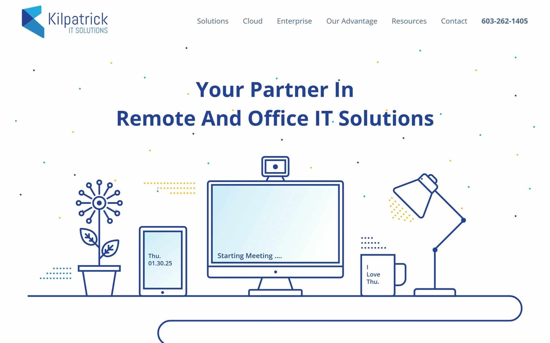
1. Kilpatrick IT Solutions
Why It’s Good: Modern minimalist design that balances professional aesthetics with intuitive user pathways.
What We Love Most:
- A restrained blue and white color palette for a clean browsing experience.
- Smart use of white space to guide visual focus.
- Seamless transition between desktop and mobile experiences.
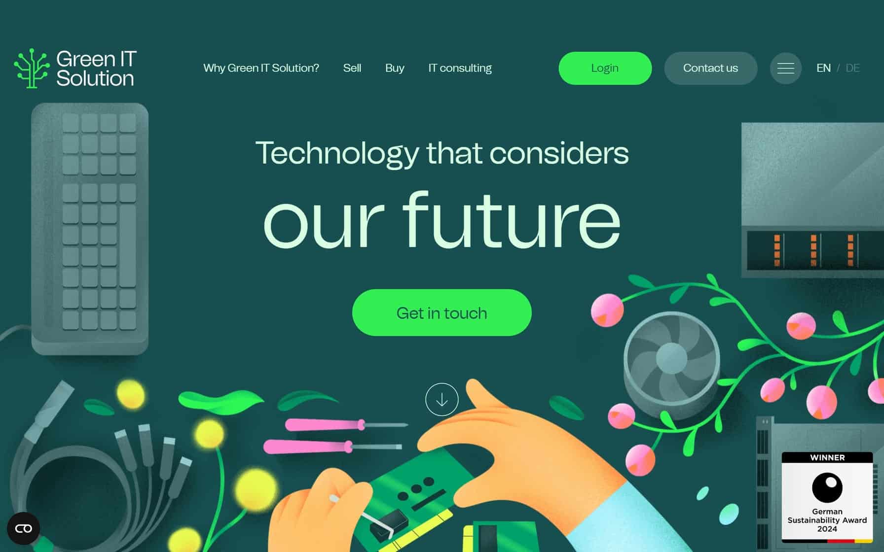
2. Green IT Solution
Why It’s Good: A vibrant, eco-conscious design that masterfully uses a green-dominated color palette.
What We Love Most:
- Dynamic color transitions that shift from deep forest greens to bright lime accents.
- Whimsical yet professional illustrations of plants and technology.
- Strategic white space utilization that lets bold colors breathe while maintaining content clarity.
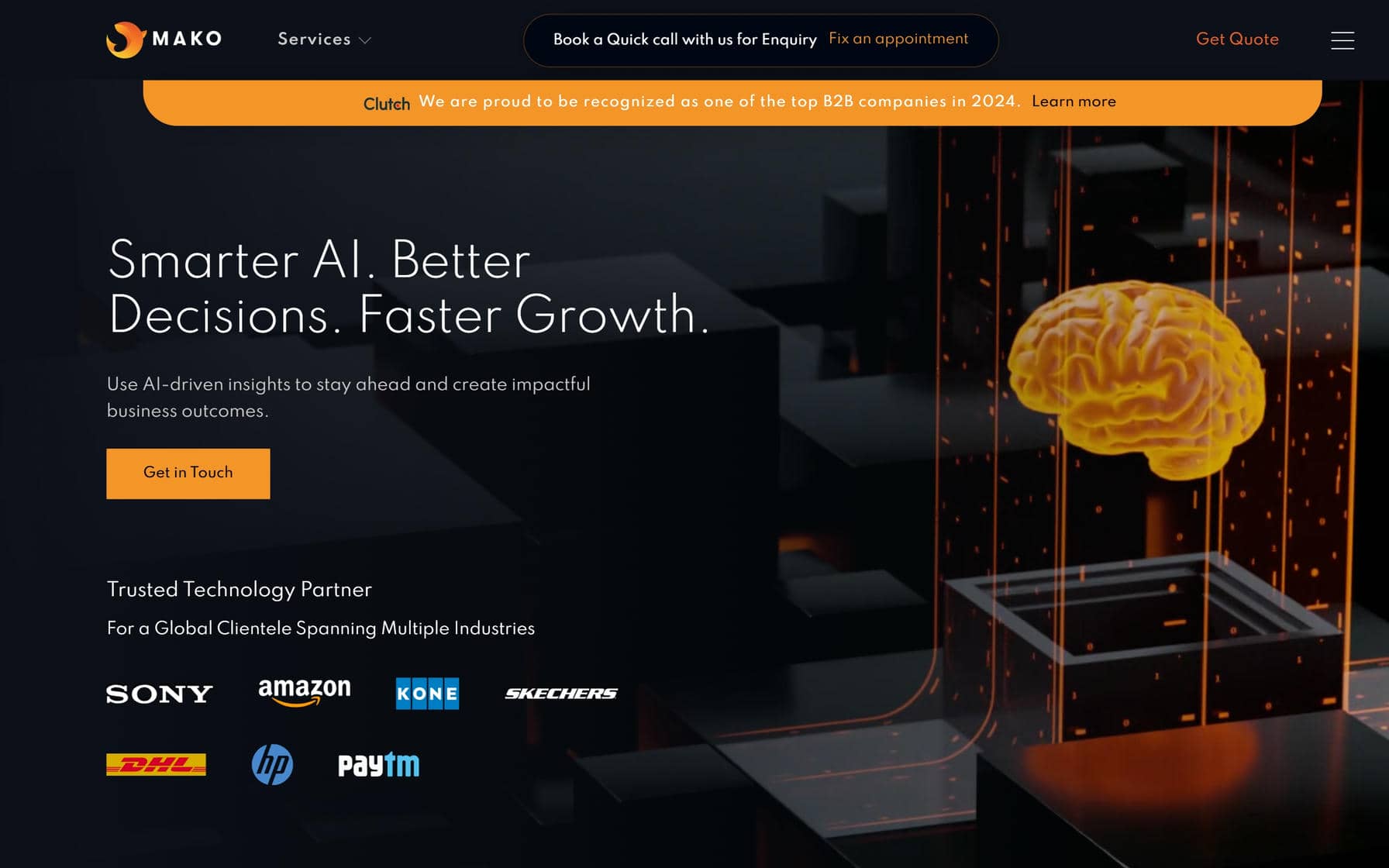
3. Mako IT Lab
Why It’s Good: This is a futuristic design that remains grounded by sticking with trusted design principles.
What We Love Most:
- Bold color contrasts from dark to light.
- Fantastic use of visual navigation cards.
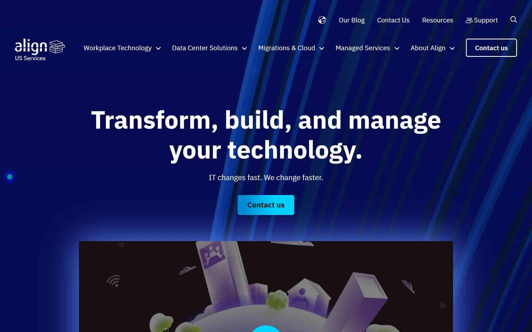
4. Align Communications, Inc.
Why It’s Good: This is a serviceable and clean IT company website design.
What We Love Most:
- Strategic video integrations in the design that add punch to other elements.
- Comprehensive and well-organized navigation that makes the site easy to browse.
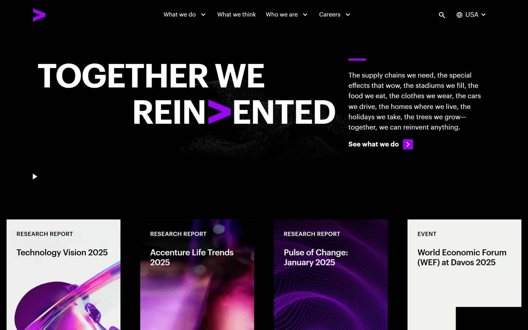
5. Accenture
Why It’s Good: This is a gorgeous IT website with a striking aesthetic, including its use of colors.
What We Love Most:
- A black background plus Accenture’s signature purple as an anchor for visual continuity.
- Large, easy-to-read font with a modern look and feel.
BEST IT COMPANY WEBSITES
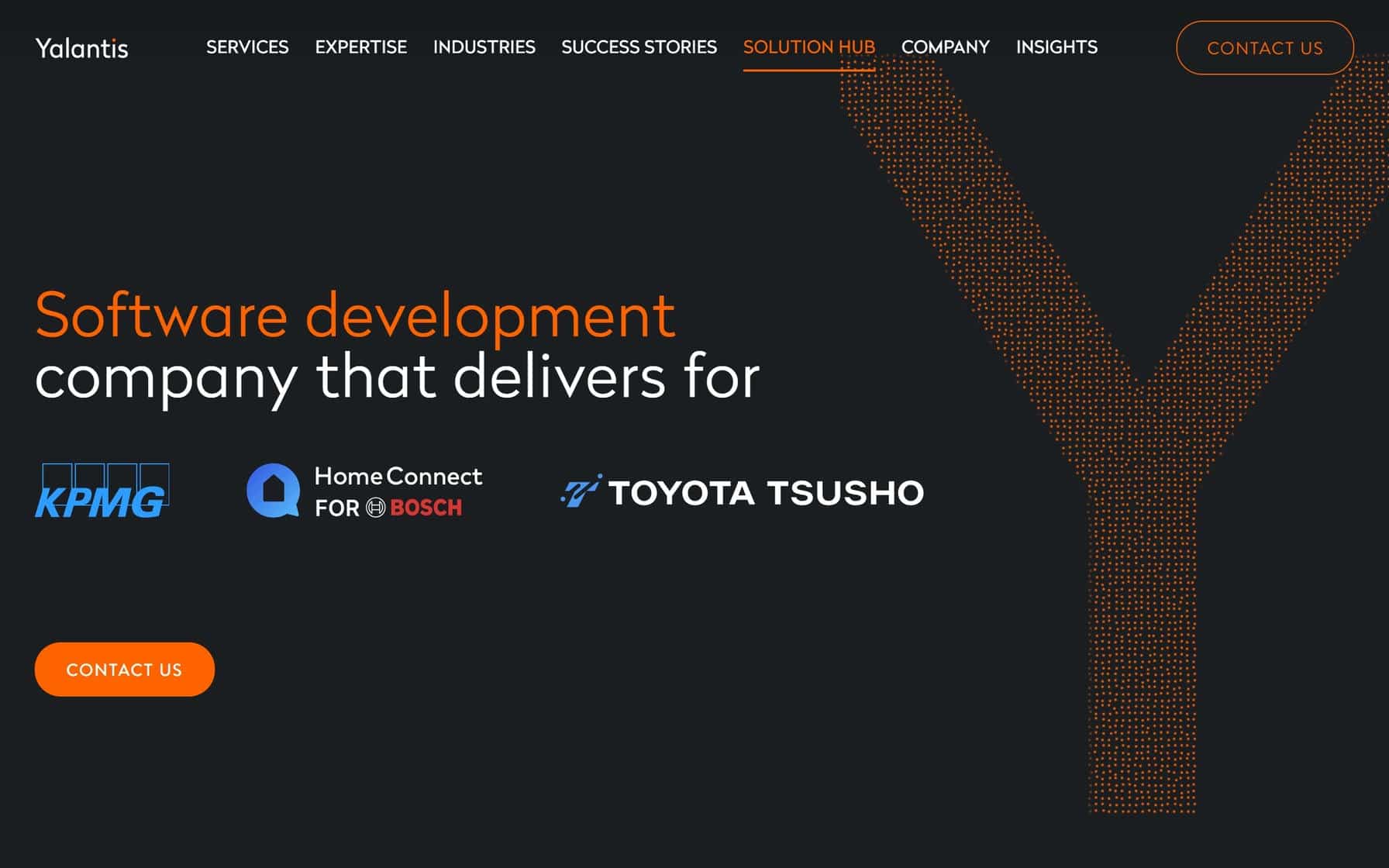
6. Yalantis
Why It’s Good: A masterclass in professional tech branding, combining crisp corporate aesthetics with intuitive browsing.
What We Love Most:
- Dynamic off-white and black color contrast.
- Consistency in typography and element spacing.
- Well-organized grid-like design that is easy on the eyes.
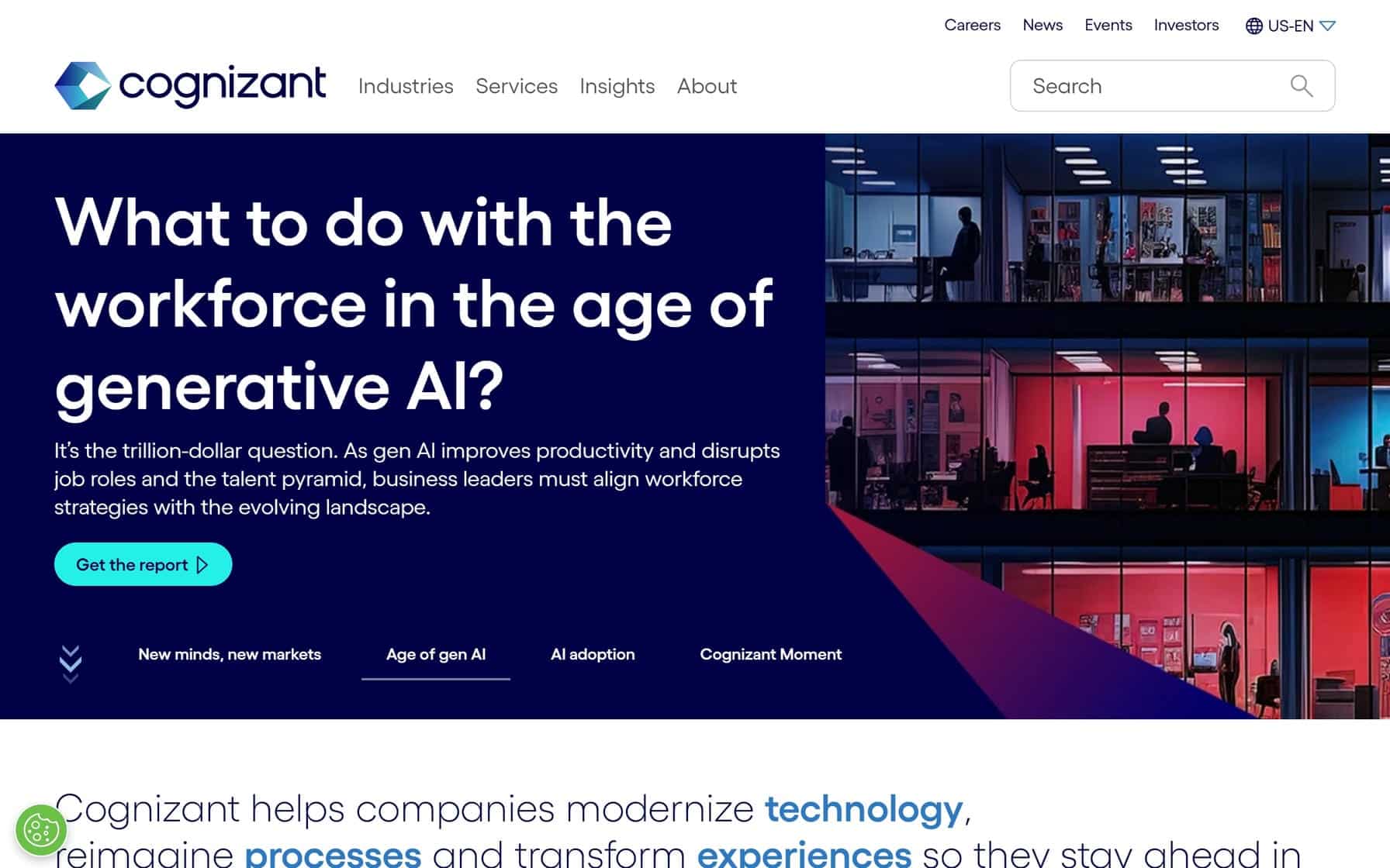
7. Cognizant
Why It’s Good: A polished design that emphasizes clarity and ease of navigation.
What We Love Most:
- Clean visual hierarchy that prioritizes key sections.
- Square and rectangular design elements that are easy on the eyes.
- Balanced typography for optimal readability across desktop and mobile views.
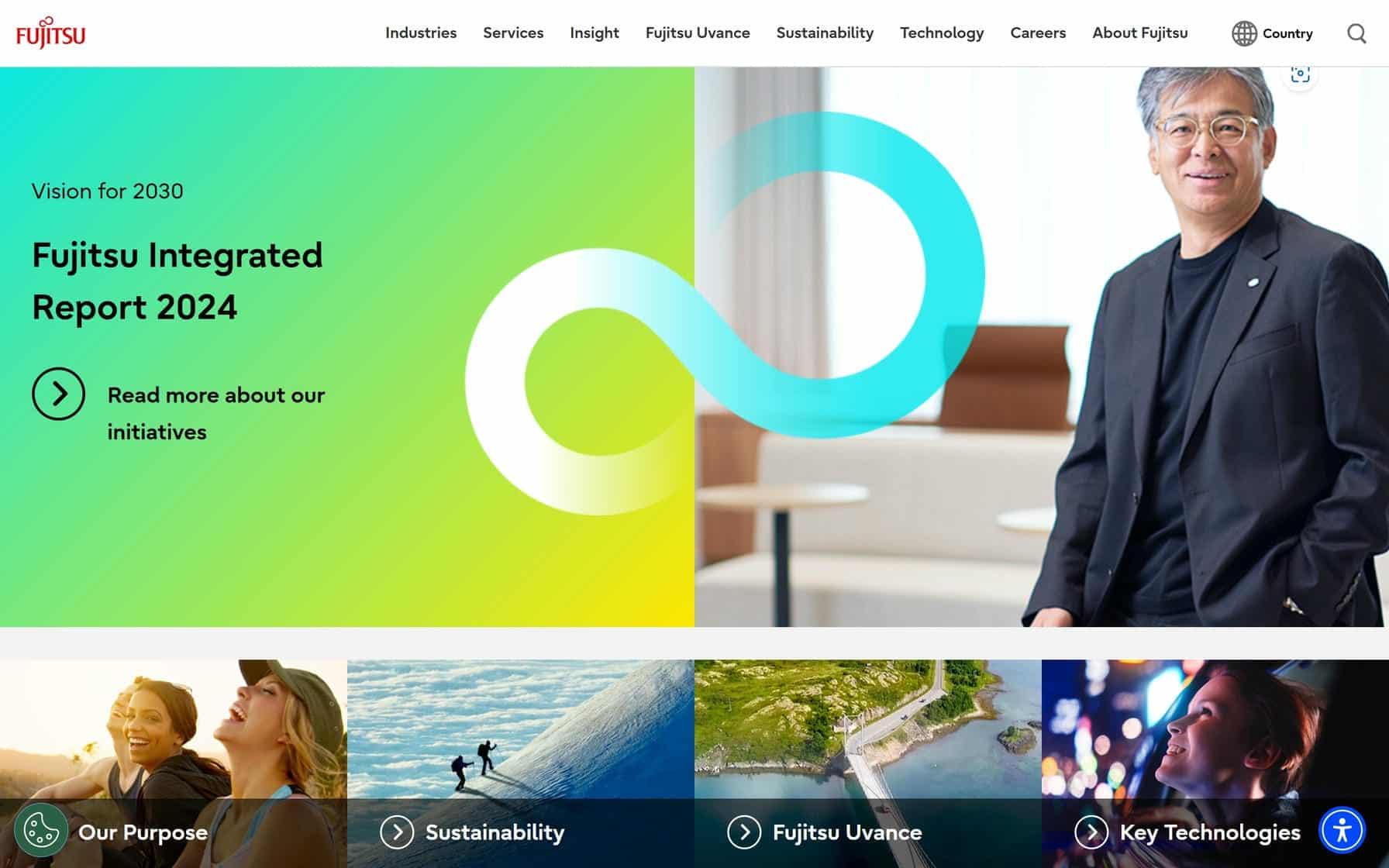
8. Fujitsu
Why It’s Good: This is a polished design that makes excellent use of images and easy-to-digest, paragraph-style text.
What We Love Most:
- Crisp typography hierarchy that balances dense technical content with ample white space for readability.
- Modular content organization with clearly defined sections.
- Responsive navigation cards that foster clarity and ease of navigation.
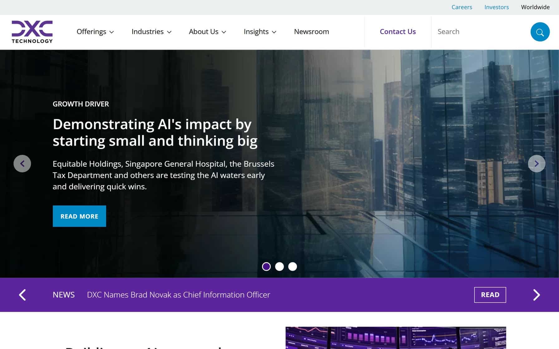
9. DXC Technology Company
Why It’s Good: This is a streamlined IT company website design with a sleek corporate feel.
What We Love Most:
- Strategic content prioritization that surfaces key design components, including calls to action.
- Subtle brand colors that maintain interest while browsing.
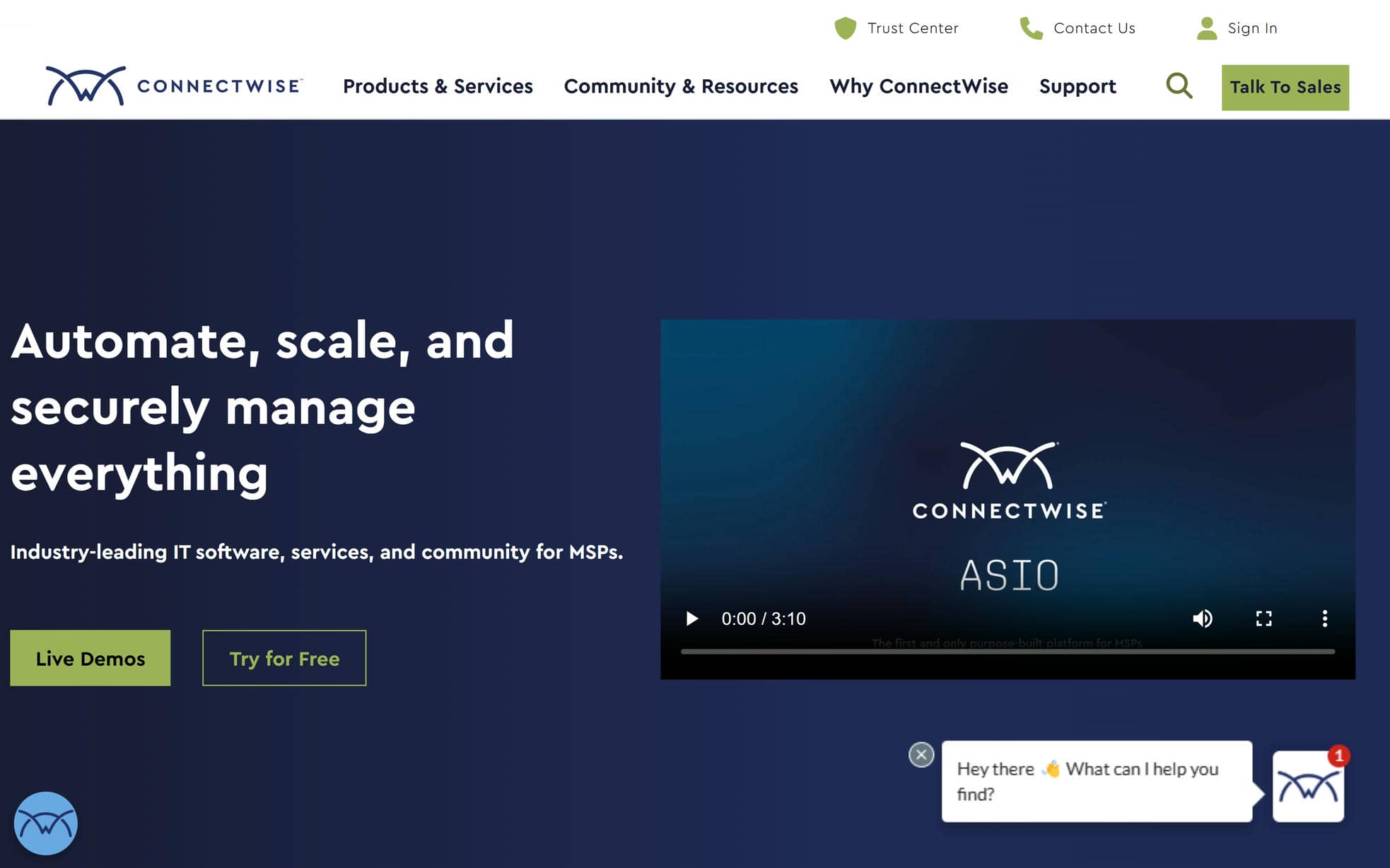
10. ConnectWise
Why It’s Good: This is a clean, well-structured design that does an excellent job of organizing dense information in a digestible way.
What We Love Most:
- Use of a three-column grid in certain sections for easier navigation.
- Healthy balance and images and text.
- Strategically placed calls to action.
IT COMPANY WEBSITE DESIGN
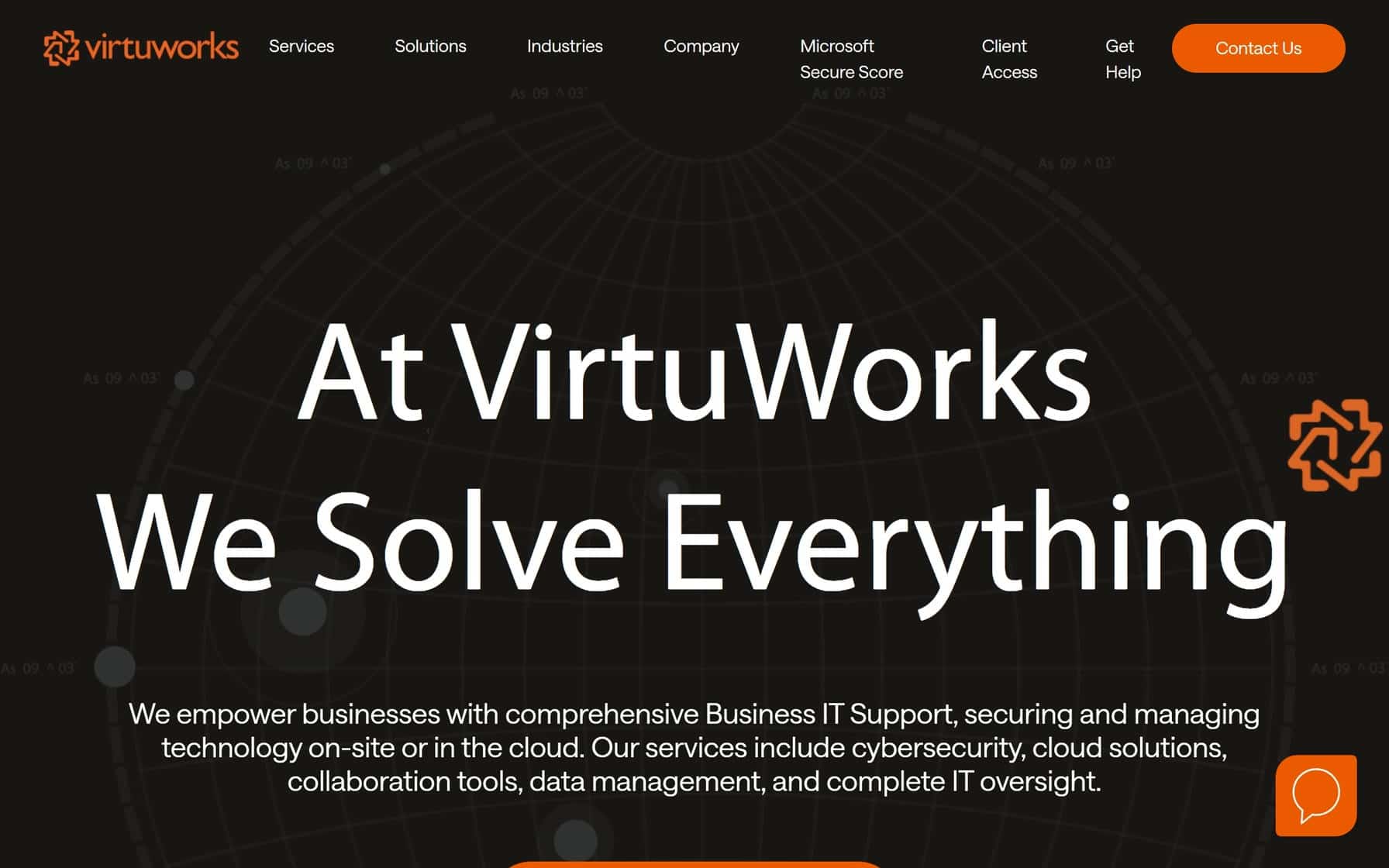
11. VirtuWorks
Why It’s Good: This IT company website has a bold, typography-driven design that uses massive text elements to create an assertive visual presence.
What We Love Most:
- Excellent use of oversized FAQ accordions.
- Large, unmissable text blocks for testimonials.
- Giant font sizes that catch your attention right away.
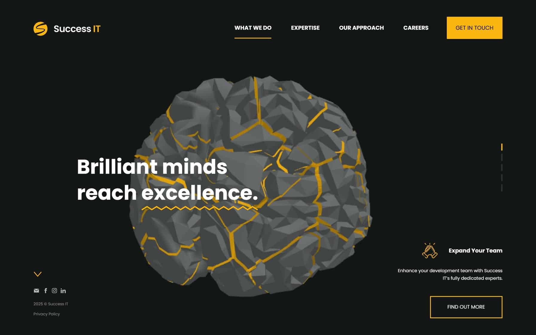
12. Success IT
Why It’s Good: A clean, creative design that utilizes interactive visuals and step-scrolling.
What We Love Most:
- Dynamic, interactive 3D images.
- Strategic repetition of simple CTAs across a few of the pages.
- Spare text utilized brilliantly throughout the design in a “less is more” style.
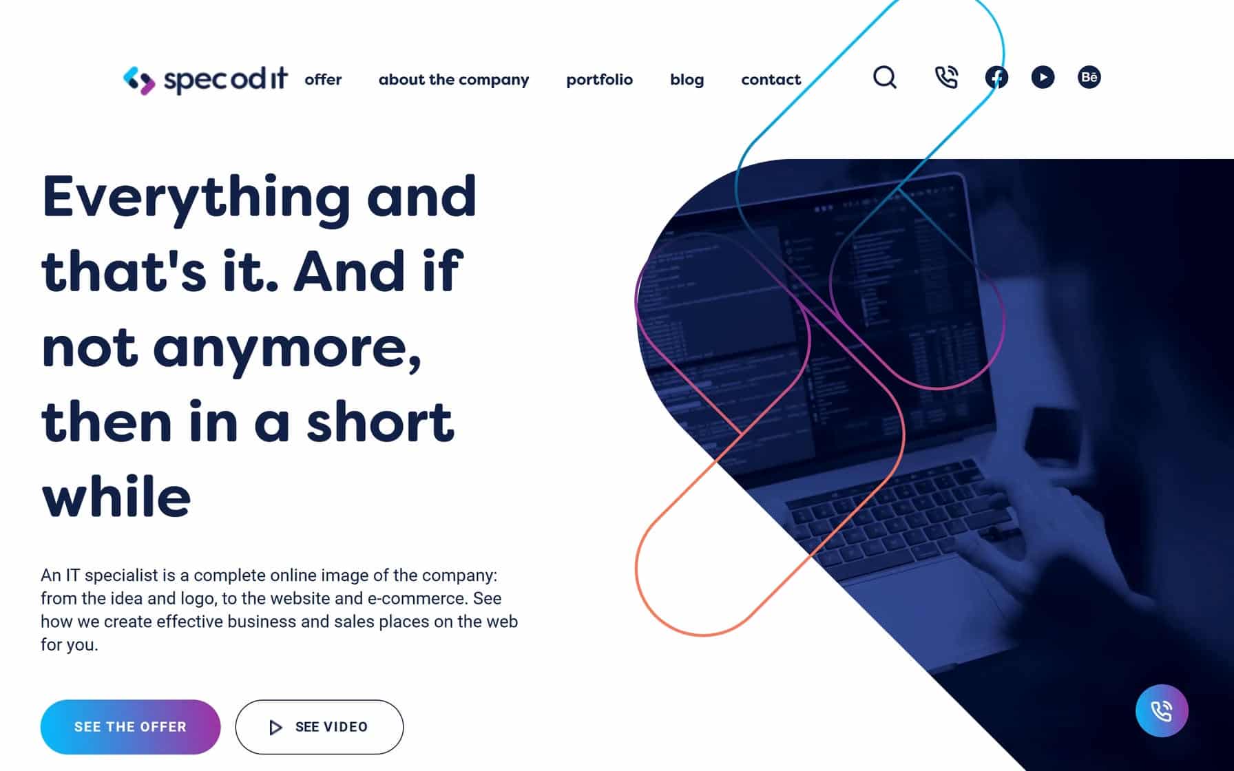
13. Spec od IT
Why It’s Good: This IT company website design is visually dynamic, well-balanced, and clean.
What We Love Most:
- Dynamic navigation cards that start white and then highlight navy blue when you hover.
- Phenomenal design flow and balance of images and text.
- Use of custom design shapes.
- Fun and subtle use of gradients.
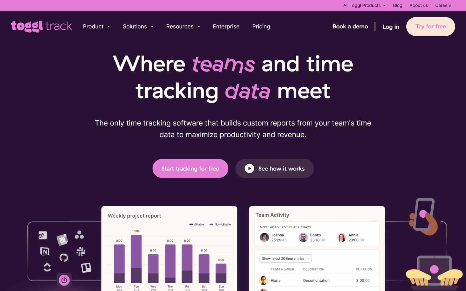
14. Toggl
Why It’s Good: This IT company website has a creative and quirky design that stands out with its playful yet professional aesthetic.
What We Love Most:
- Unique color palette of purple, pink, and white that adds vibrancy and personality to the site.
- Multiple creative and subtle uses of typography.
- Imaginative imagery and icons thoughtfully placed throughout the design to enhance visual interest and usability.
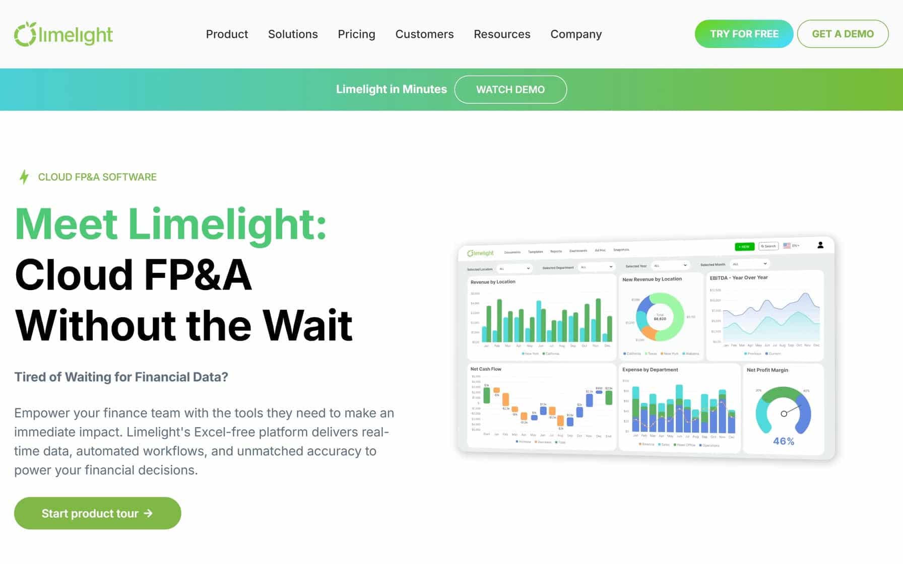
15. Limelight Software
Why It’s Good: This IT Company website has a clean design with excellent branding.
What We Love Most:
- Dynamic images that add color and pop to the white background.
- Branded showcases that highlight current and previous clients and build credibility.
- Strategically placed calls-to-action that guide users seamlessly through the site’s key offerings
IT COMPANY WEB DESIGNS
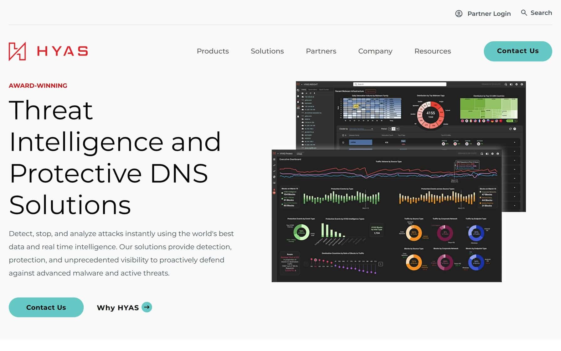
16. HYAS
Why It’s Good: This is a gorgeous IT website with several exceptional design aspects.
What We Love Most:
- Elegant color accents that stand out beautifully against the primarily white background.
- Thoughtfully arranged typography that enhances readability and complements the overall design.
- High-quality imagery that adds depth and professionalism to the site’s aesthetic.
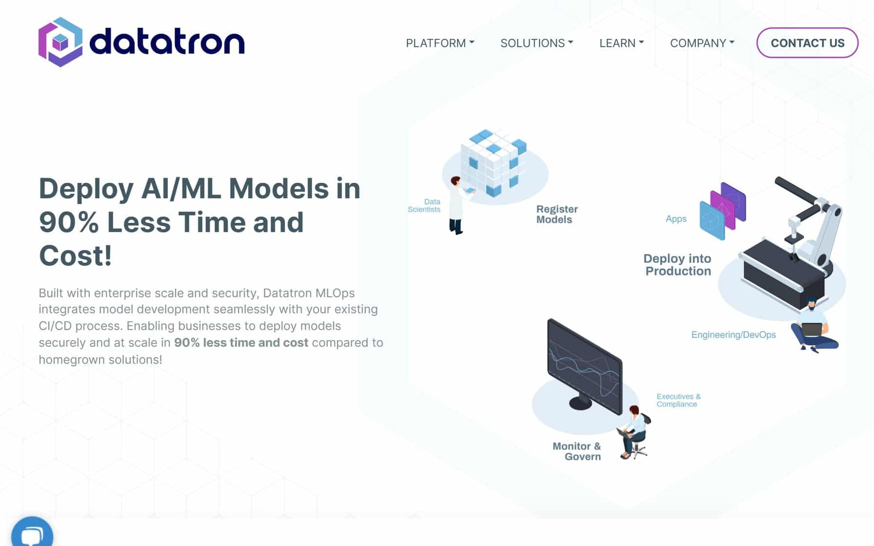
17. Datatron
Why It’s Good: This is a charming IT company website with a fantastic balance of professionalism and creative design elements.
What We Love Most:
- Dynamic cartoon illustrations that add personality and visual interest to the site.
- Clean, breathable layout with ample white space and concise text.
- Graphically enhanced images and icons thoughtfully integrated to complement the overall design.
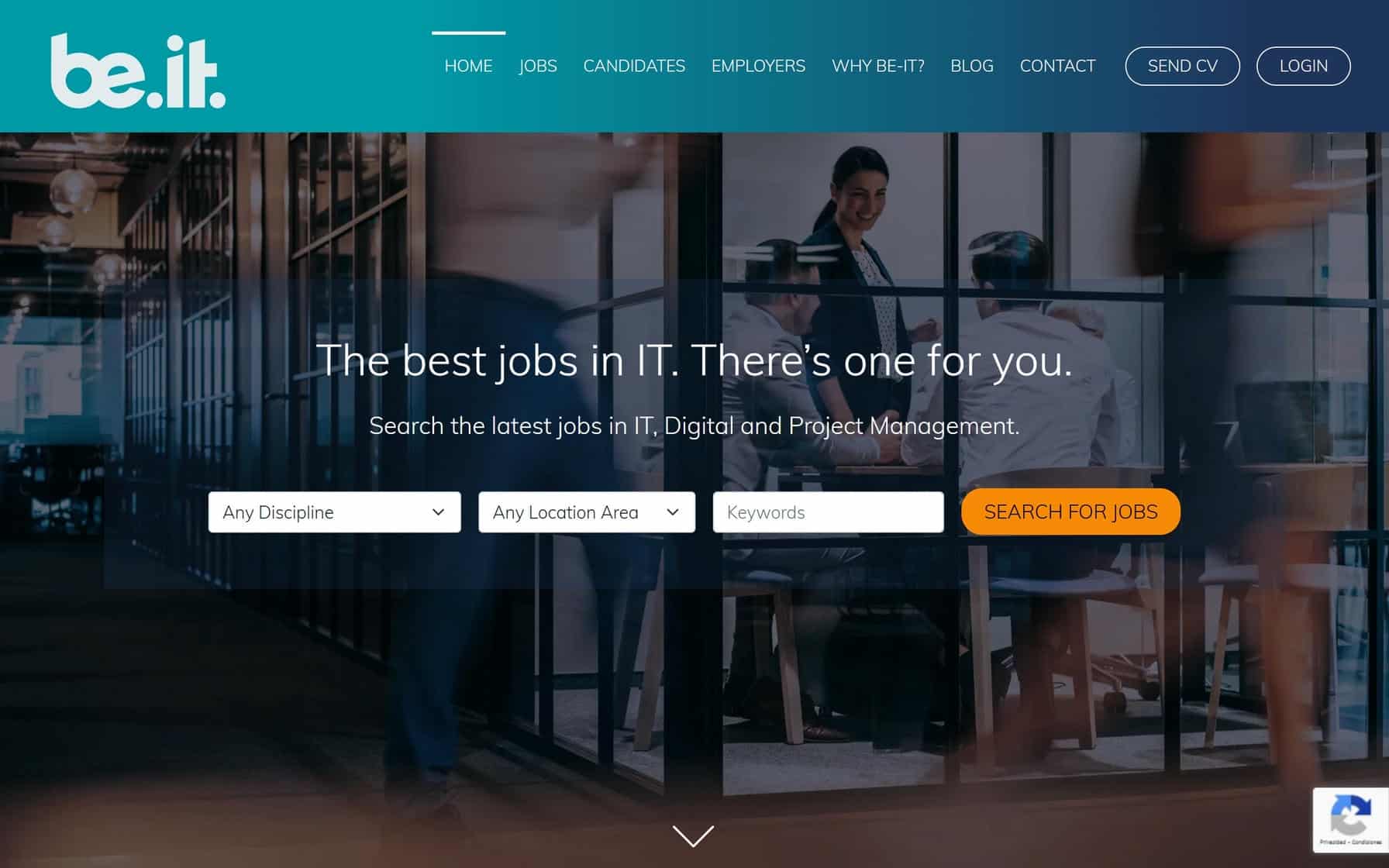
18. Be-IT
Why It’s Good: This is an image-heavy design with a convenient search feature.
What We Love Most:
- The full-width imagery.
- The easy-to-use “Search for Jobs” function.
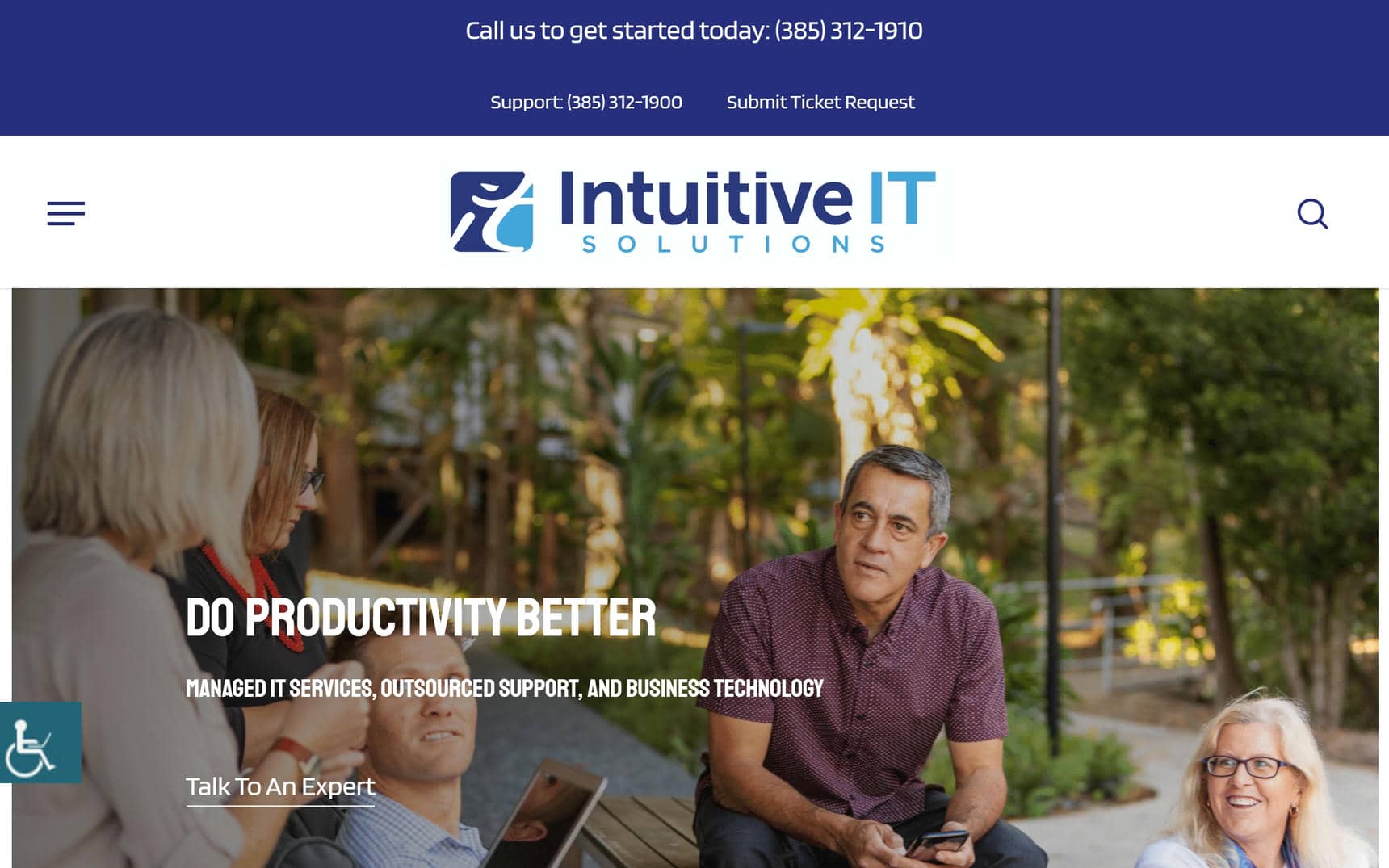
19. Intuitive IT Solutions
Why It’s Good: This beautiful IT company website design does an excellent job of organizing and sorting information.
What We Love Most:
- Reactive navigation menu that conveniently shrinks and expands depending on where you scroll.
- The appealing logotype.
- Simple, welcome branding.
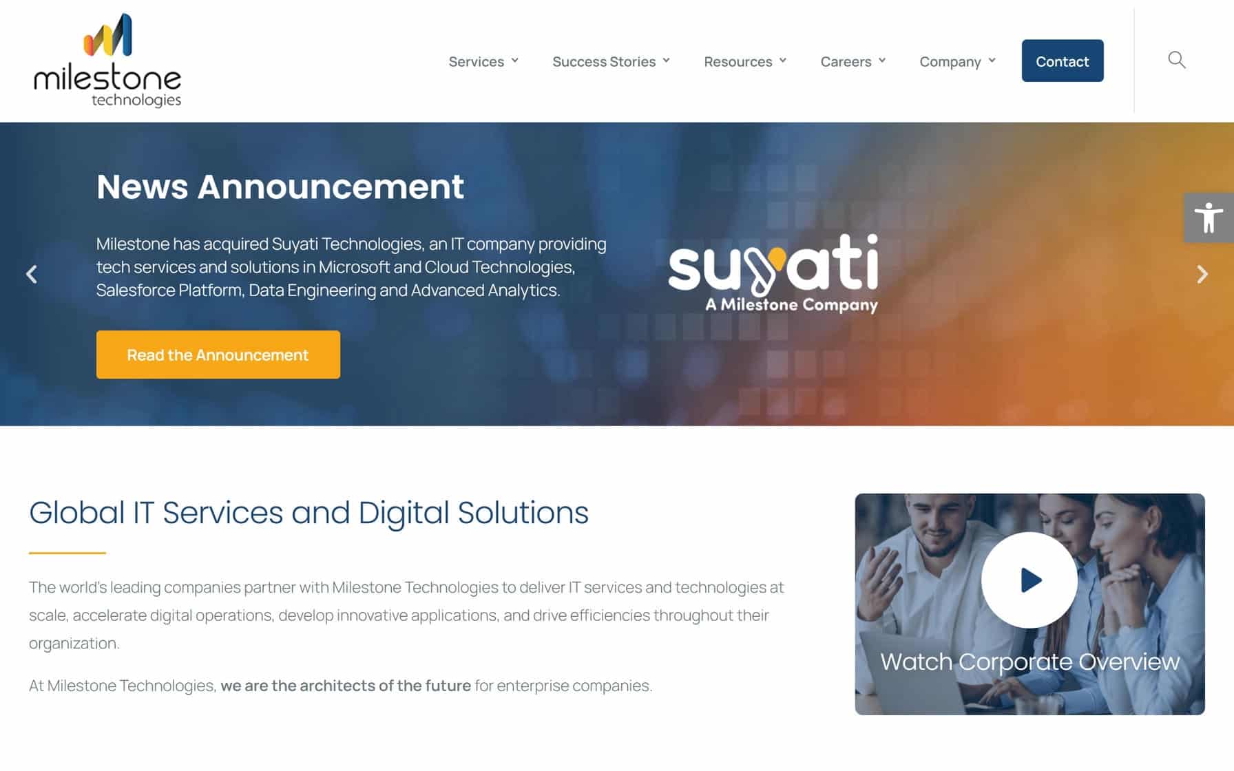
20. Milestone Technologies
Why It’s Good: Milestone Technologies’ website has a simple, straightforward, and effective design.
What We Love Most:
- Design that is easy on the eyes.
- Excellent organization of dense information.
IT COMPANY WEBSITE DESIGN EXAMPLES
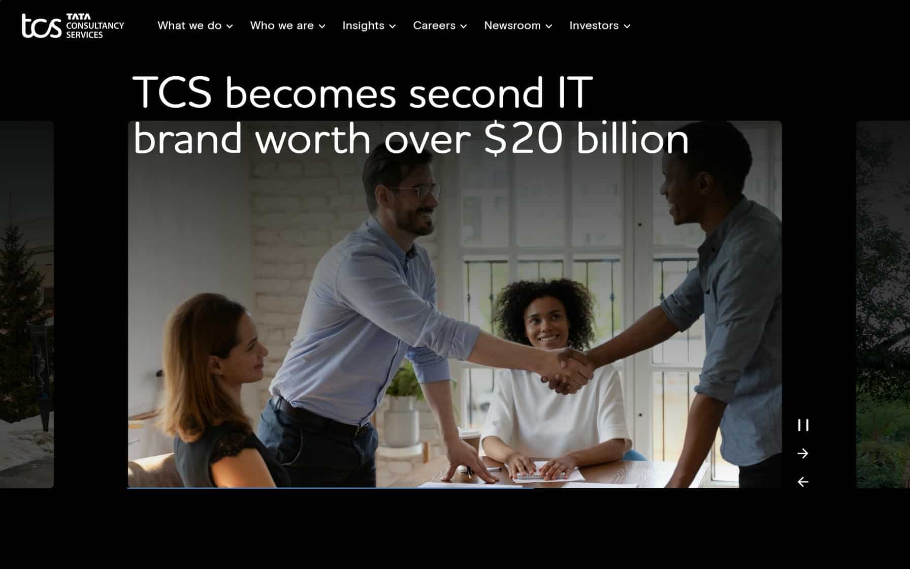
21. TATA Consultancy Services
Why It’s Good: A clean and modern design that alternates between black and white sections, creating a visually balanced and professional aesthetic.
What We Love Most:
- Elaborate yet intuitive navigation menu that organizes a wealth of information seamlessly.
- Consistent use of contrasting sections to guide the user’s focus while maintaining clarity.
- Engaging image sliders and full-width images that add visual depth and highlight key initiatives.
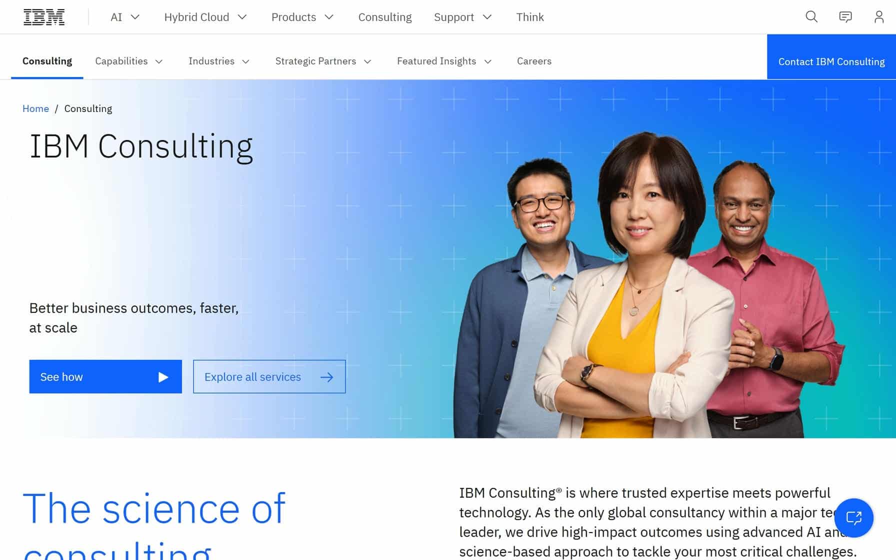
22. IBM Consulting
Why It’s Good: This is a sleek, modern design that uses well-structured layouts to present IMB’s services in a visually engaging way.
What We Love Most:
- Elaborate dual-level navigation menu that organizes dense information in a digestible way.
- Consistent branding elements that reinforce IBM’s reputation as a leader in technology and consulting.
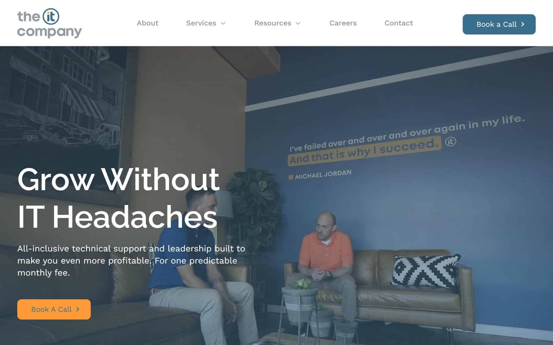
23. The IT Company
Why It’s Good: This IT website design hits all the right design beats for the industry. It’s excellent across multiple fronts.
What We Love Most:
- Dynamic use of white space to keep the design breathable and uncluttered.
- Strategic placement of client testimonials to build credibility and trust with potential customers.
- Full-width video and images in the page heroes.
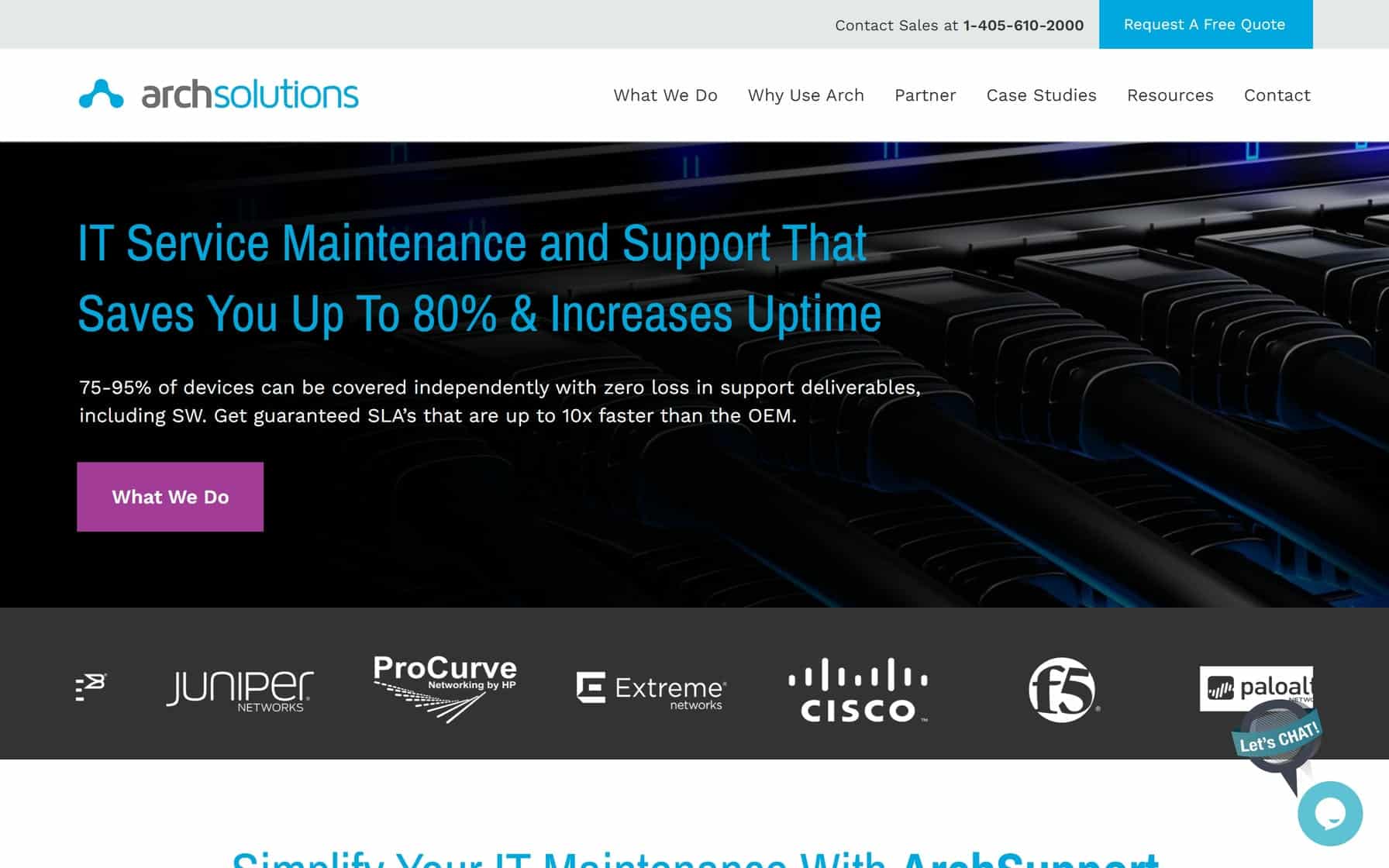
24. Arch Technology Solutions
Why It’s Good: This is a professional and approachable design that combines inviting colors with user-friendly features.
What We Love Most:
- Professional, inviting colors.
- Convenient integrated chat feature with a cartoon “Let’s chat!” image.
- Strategic “Request A Free Quote” in the header.
- Highly readable font choices.
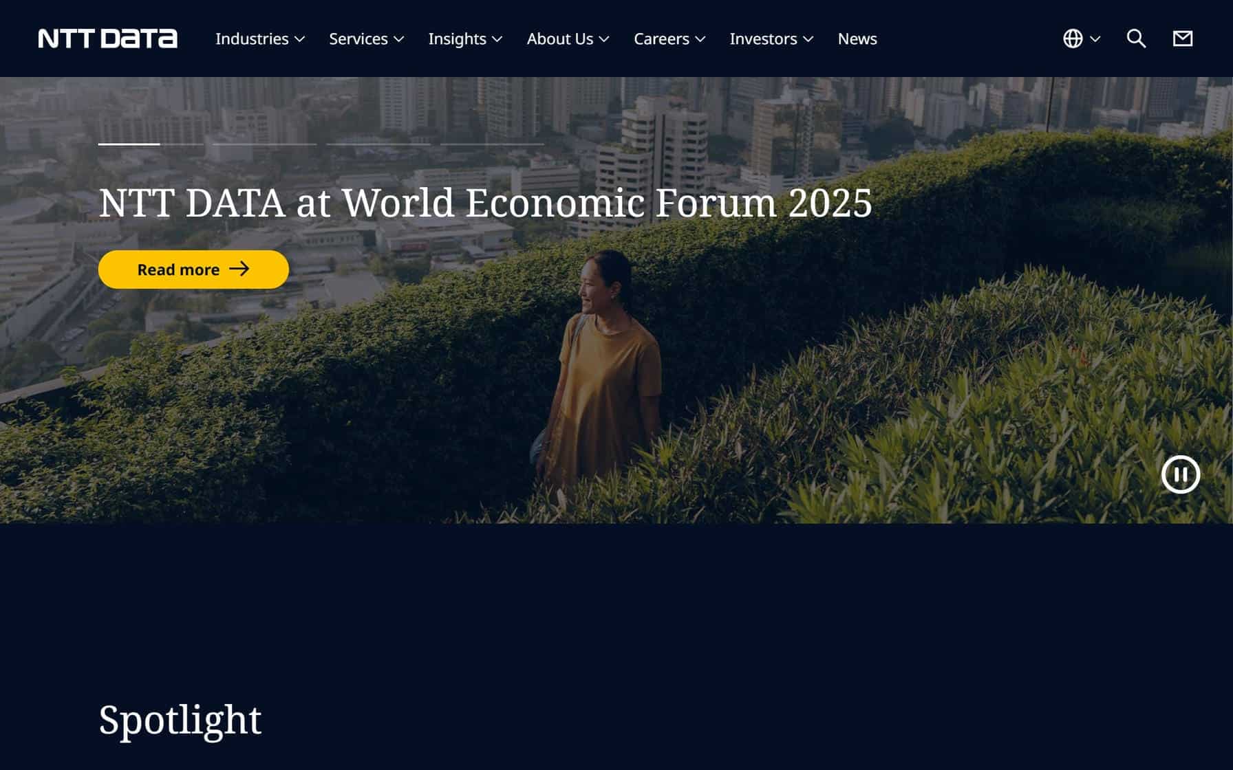
25. NTT DATA Group Corporation
Why It’s Good: This is an image-driven IT company website design that pairs high-quality visuals with a clean layout.
What We Love Most:
- Attractive navy blue and white color scheme that provides a polished and cohesive aesthetic.
- High-quality full-width images that add depth and visual appeal throughout the site.
- Straightforward rectangular design elements that keep the layout simple and easy to navigate.
IT WEBSITE EXAMPLES
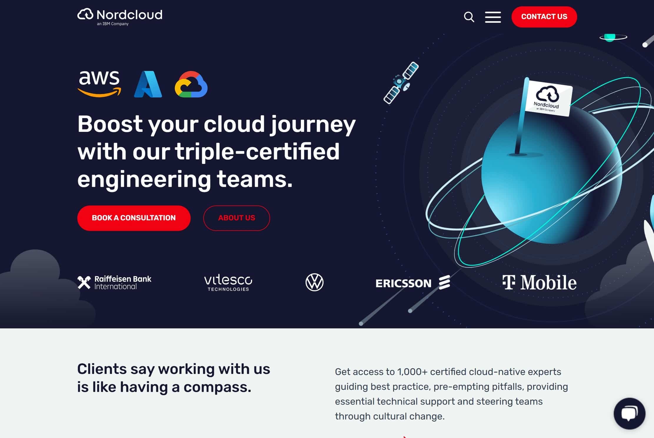
26. Nordcloud
Why It’s Good: This is an expertly branded design that combines playful illustrations with professional elements.
What We Love Most:
- Dynamic cartoon illustrations that add personality to the design.
- Consistent branding elements with thoughtful use of colors and visual motifs across all sections.
- Clean navigation enhanced by distinctive red arrows for intuitive user guidance.
- Well-structured footer.
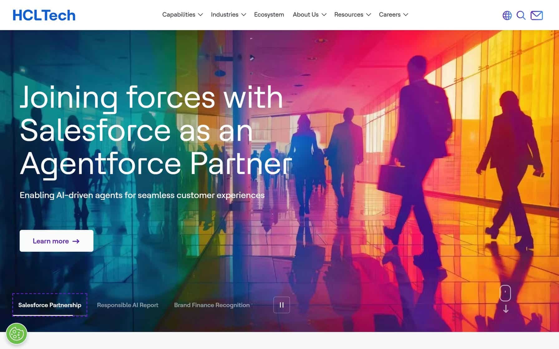
27. HCL Technologies
Why It’s Good: This is an appealing IT website with a corporate aesthetic balanced by fun brand colors.
What We Love Most:
- Strategic use of brand colors that create a nice visual hierarchy.
- Simple and effective collapsible, drop-down menu.
- Effective grid-like design elements.
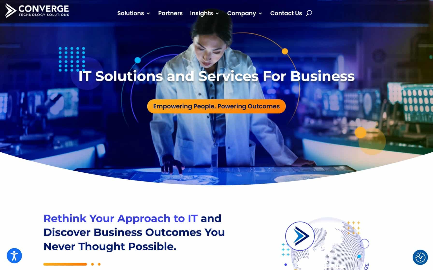
28. Converge Technology Solutions
Why It’s Good: This is a gorgeous, inviting IT website design with particularly beautiful colors.
What We Love Most:
- Pleasant color transitions between sections, using complementary tones to guide user focus.
- Card and button navigation elements that encourage engagement.
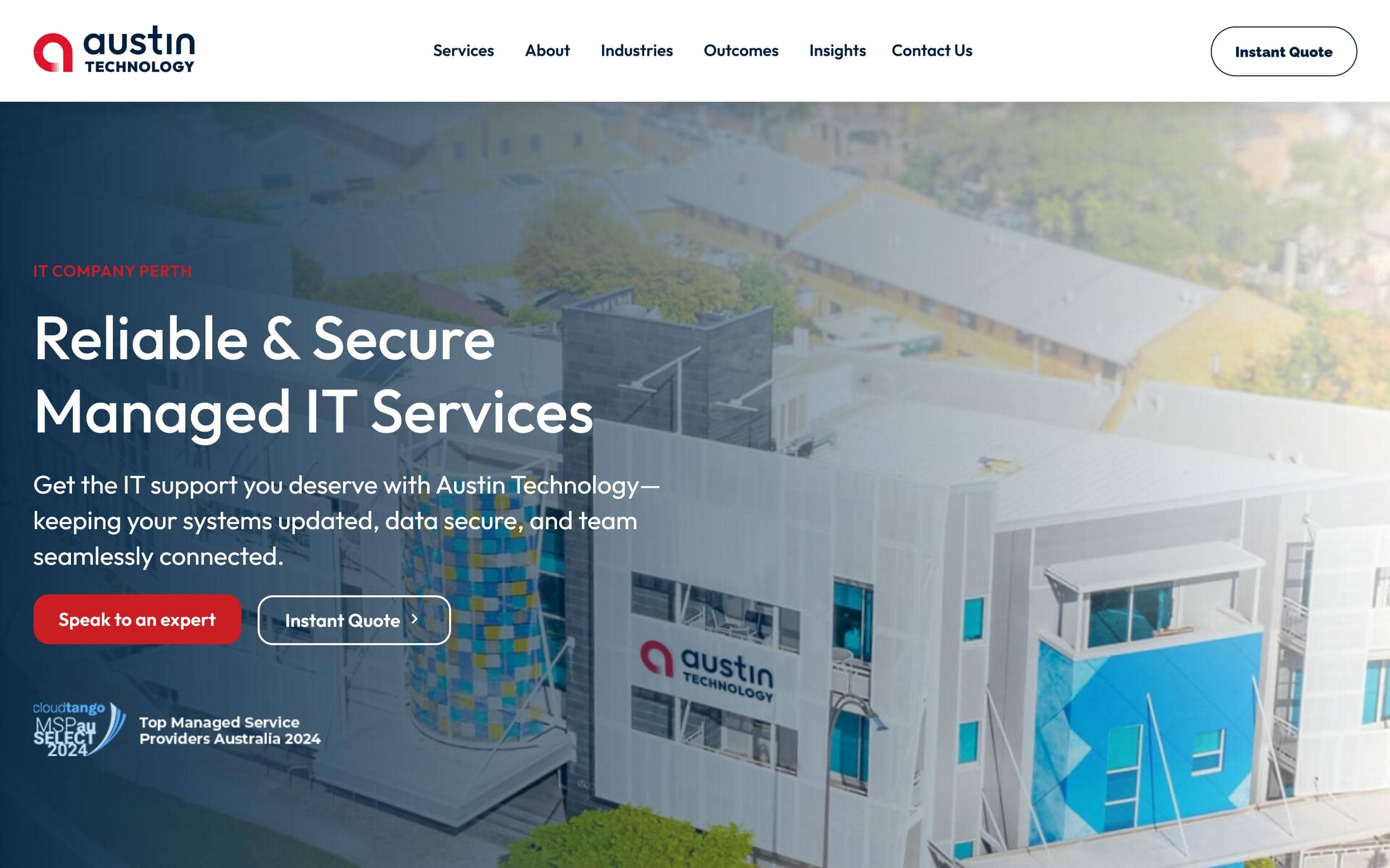
29. Austin Technology
Why It’s Good: This IT company website has a solid, serviceable design that prioritizes clarity and ease of navigation.
What We Love Most:
- Prominent “Instant Quote” CTA strategically placed for quick user conversions.
- Clean, grid design elements.
- Streamlined footer with clear contact options and solutions highlights.
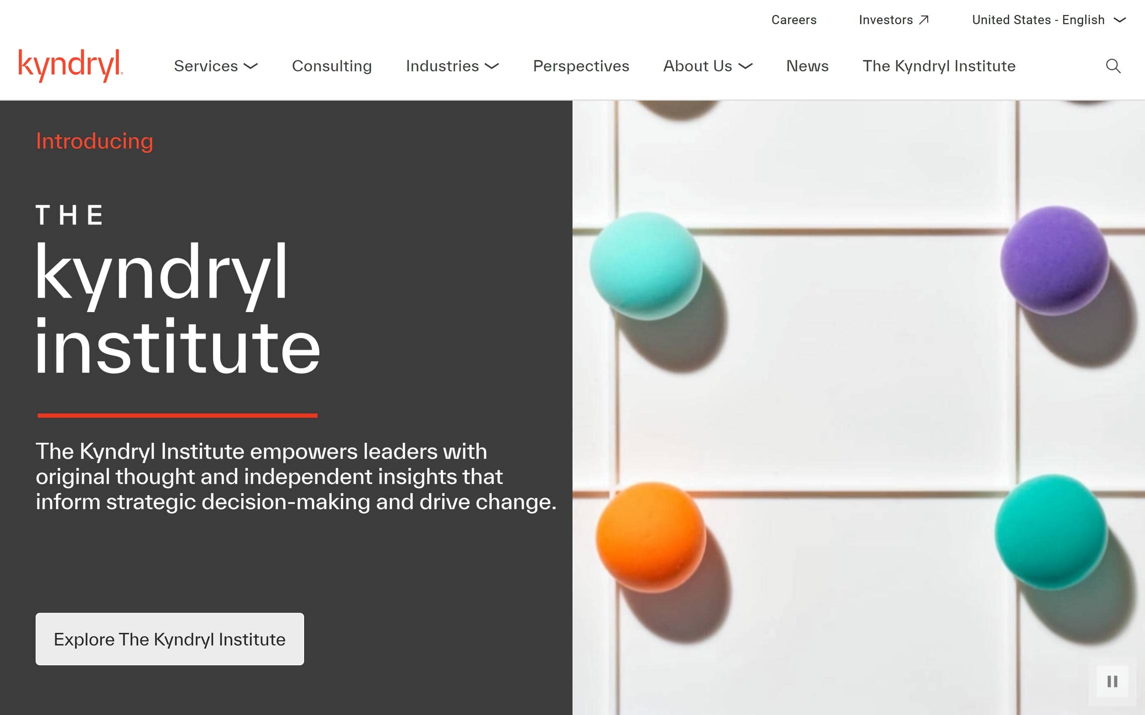
30. Kyndryl
Why It’s Good: This is a dense, enterprise-grade website with impressive professional polish.
What We Love Most:
- Large images that create immediate visual impact while framing core messaging.
- Creative video integrations on certain pages.
- Modular content blocks that alternate between imagery and text.
- Precision typography using controlled line lengths and spacing to maintain clarity.
Best IT Company Website Designs – Conclusion
These 30 IT Company Website Designs prove that information technology and creativity can coexist. Want a website that features the best of both?
Contact Sage Digital Agency. We specialize in creating custom websites tailored to your needs.