
Want to see some of the best home builder website designs online today? Check out the examples below. These are great to use as pointers, whether you’re creating a new site or updating an existing one.
Let’s get started!

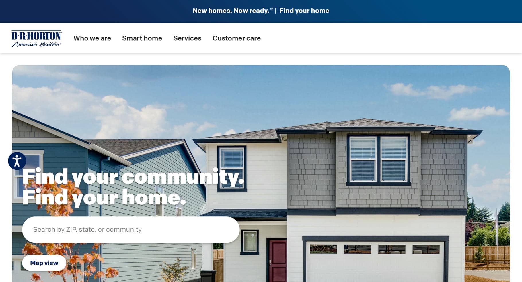
1. D.R. Horton
Why It’s Good: D.R. Horton’s website design is exceptional. We especially appreciate its light, engaging approach and healthy arrangement of top-notch authentic imagery and spare text.
What We Love Most:
- A dynamic image reveal that seamlessly integrates visuals into the design
- An area search section in the prefooter that guides users to a local map with pinned locations
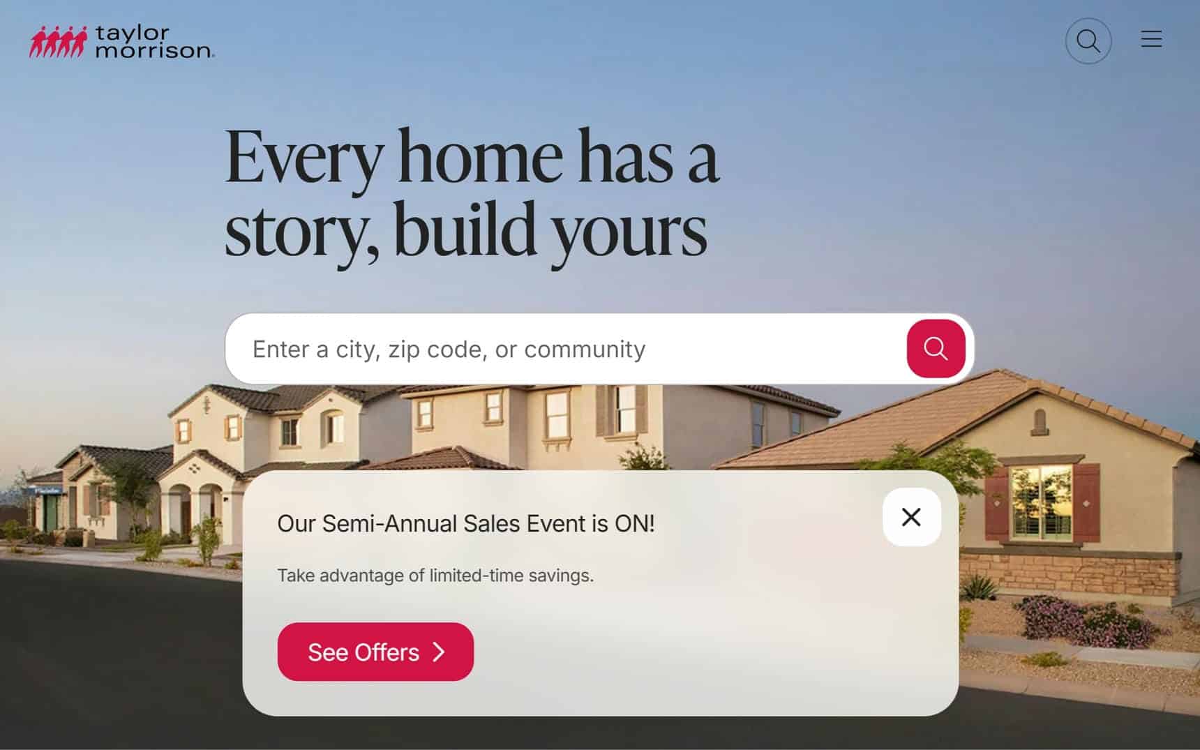
2. Taylor Morrison
Why It’s Good: Taylor Morrison’s website has a gentle, modern design that feels soft and inviting. The clean layout and well-balanced elements create a smooth, effortless browsing experience.
What We Love Most:
- Large, appealing fonts that enhance readability and visual appeal
- A sleek, modern design that is warm, welcoming, and easy to explore
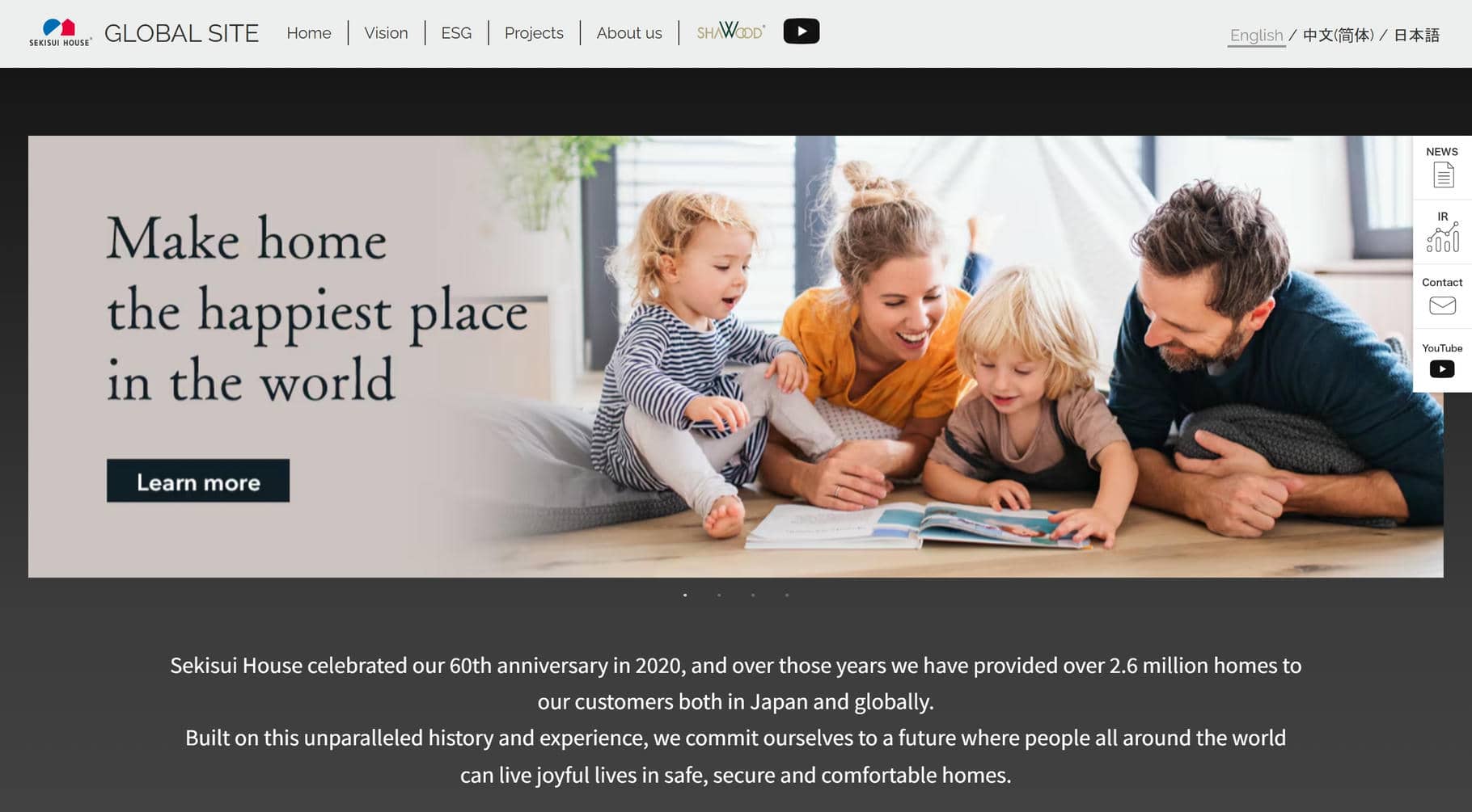
3. Sekisui House
Why It’s Good: This website design has a distinct character, pulling visitors in with clickable images that lead to engaging pages. Thoughtful details make exploring the site feel natural and enjoyable.
What We Love Most:
- A Projects page that showcases past work while reinforcing branding
- Clickable images that make aspects of the navigation more interesting
- Floating action button for quick access to YouTube, contact, etc.
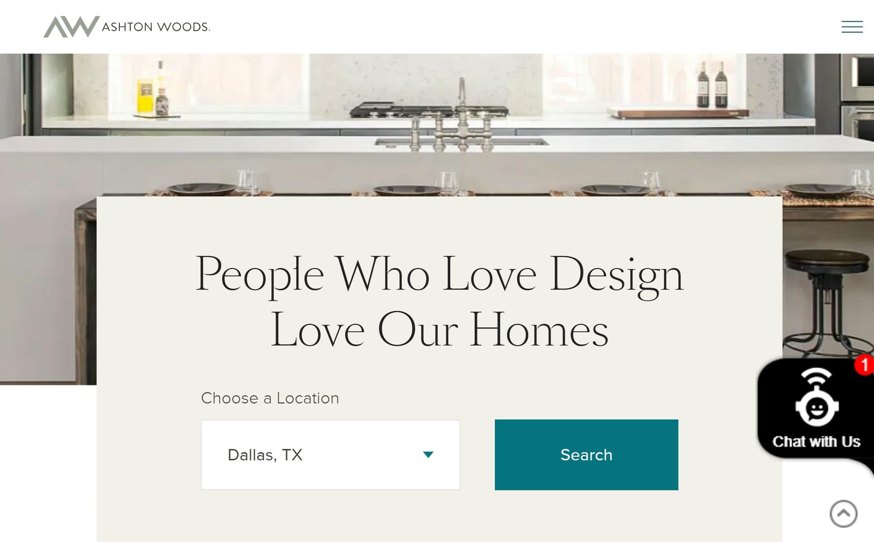
4. Ashton Woods
Why It’s Good: This website has a clean, breathable design that makes browsing effortless. The layout is visually very welcoming and easy on the eyes.
What We Love Most:
- An open, well-spaced design that enhances readability and usability
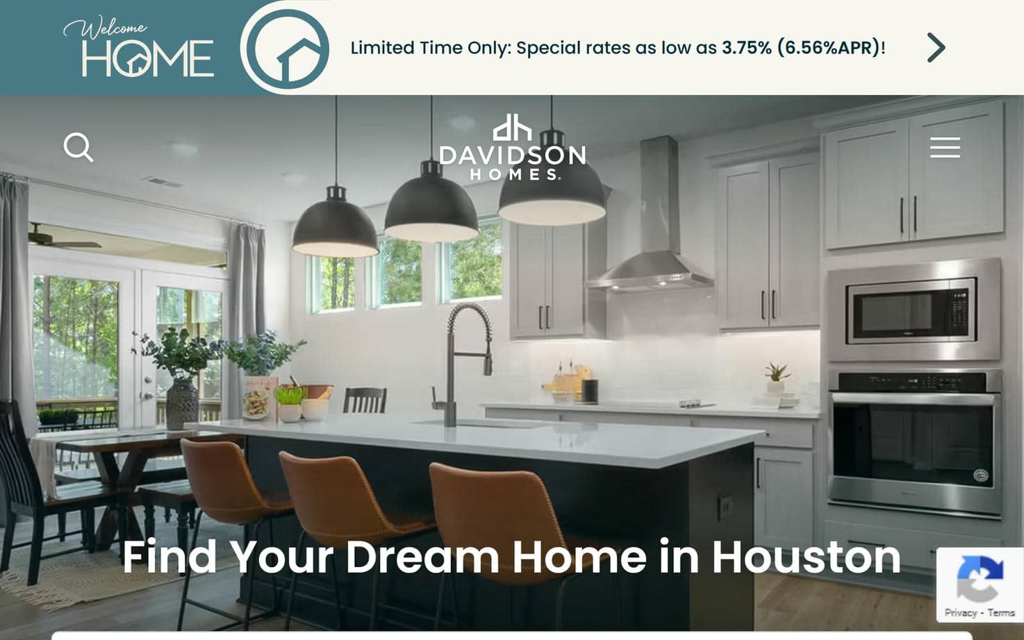
5. Davidson Homes
Why It’s Good: This home builder website design is visually impressive and thoughtfully structured. The Gallery page stands out with its well-organized layout, making it easy for visitors to explore homes by region.
What We Love Most:
- Clickable cards that open individual galleries with stunning location-specific images
- Expandable photos that provide detailed home information, including the floor plan and garage capacity
Best Home Builder Website Designs
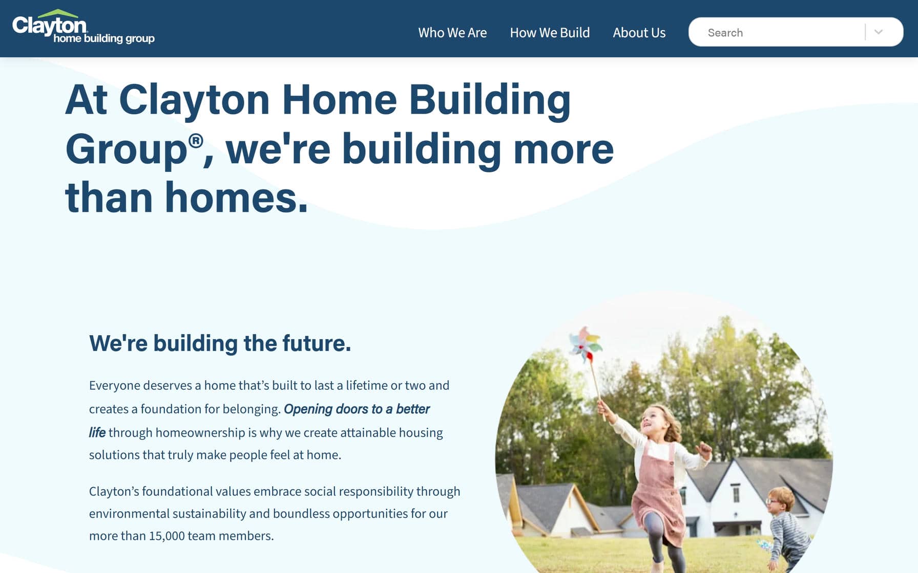
6. Clayton Home Building Group
Why It’s Good: This website keeps things simple and effective, making it a great example of a clean, straightforward home builder design. Every element is purposeful, ensuring a smooth user experience.
What We Love Most:
- An intuitive layout that makes navigation easy
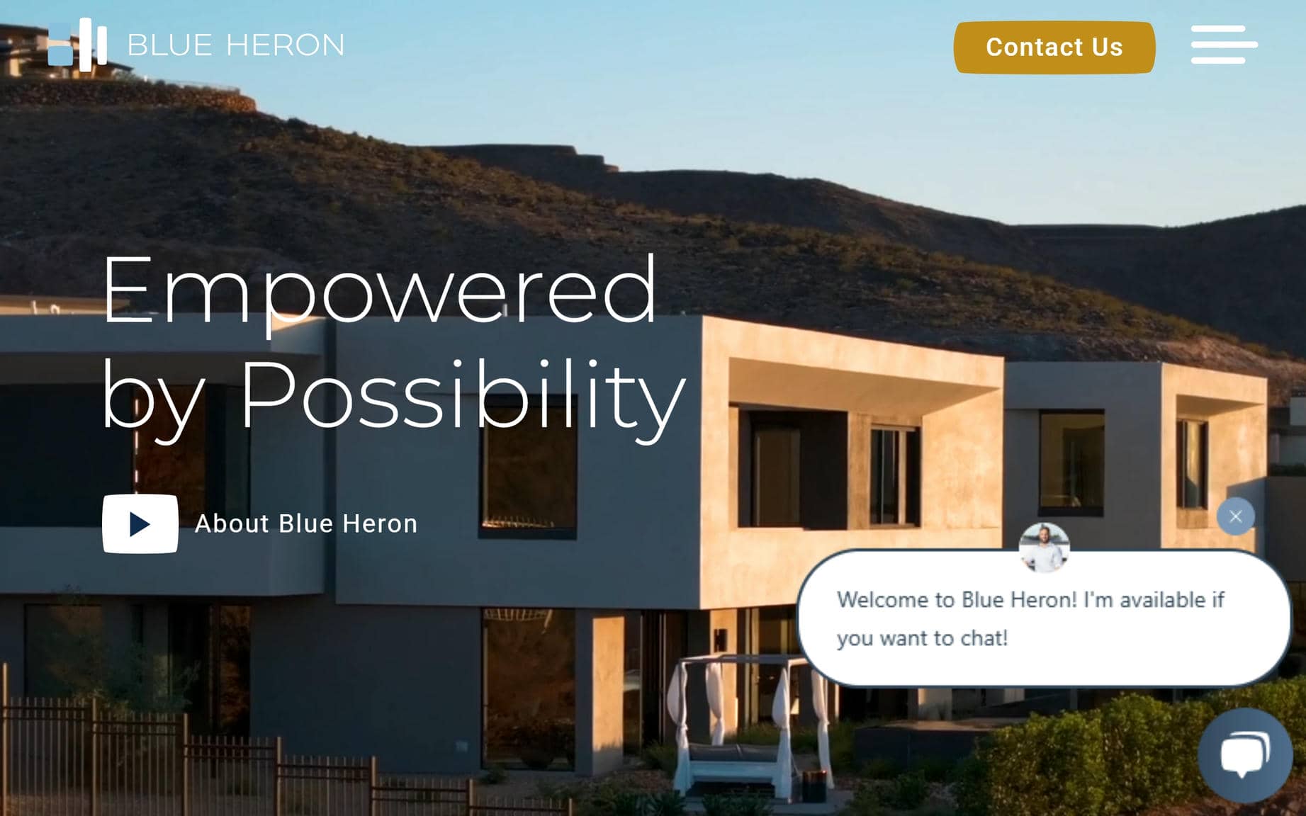
7. Blue Heron
Why It’s Good: Blue Heron’s website is gorgeous and very navigable. The design effectively uses calls to action to guide visitors effortlessly throughout the site.
What We Love Most:
- High-quality images that elevate the overall design
- A visually engaging layout that highlights the builder’s work
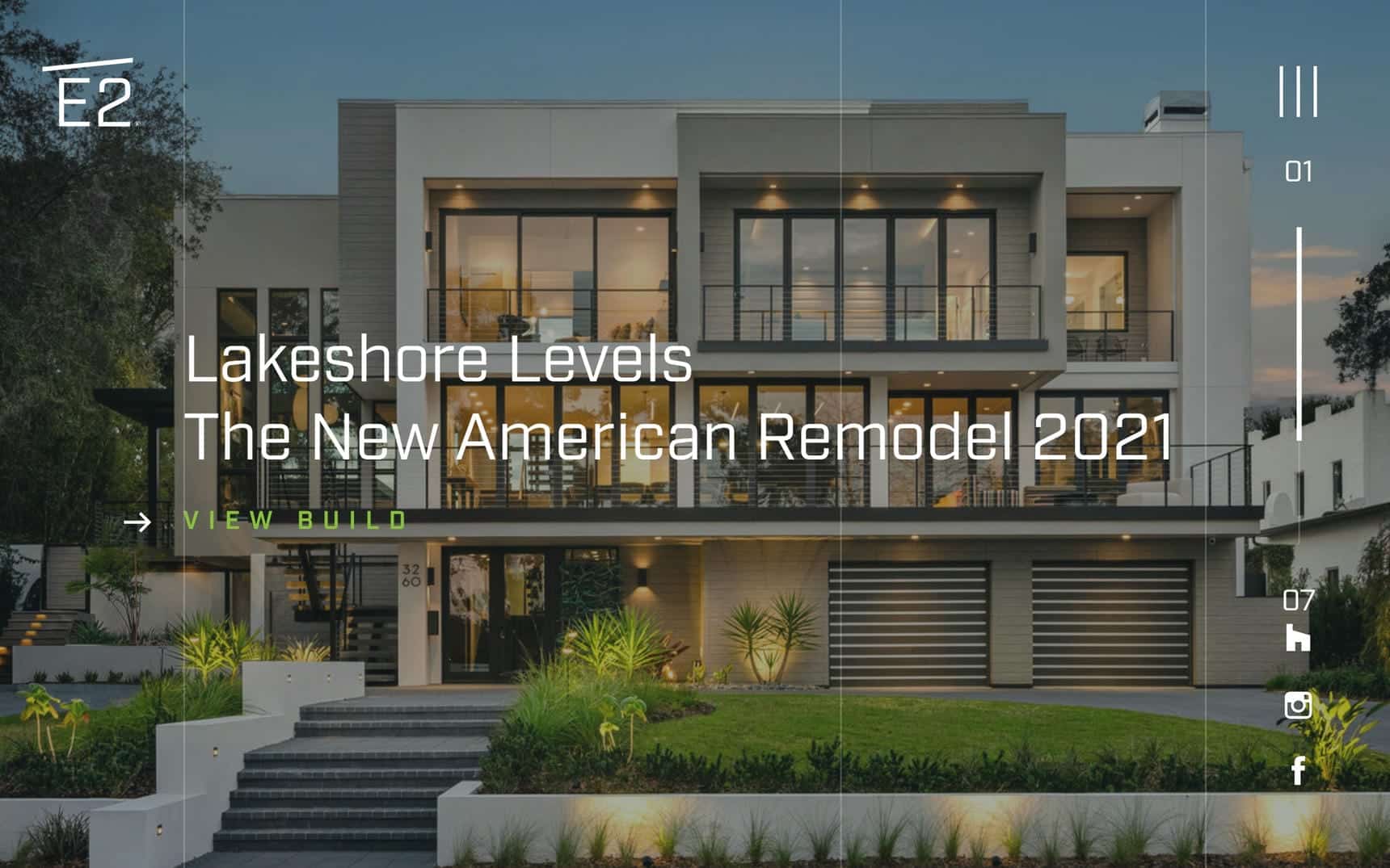
8. E2 Homes
Why It’s Good: E2 Homes has a bold, image-heavy design with full-width visuals, modern fonts, and a sleek layout. The result is a refined and visually striking website that feels both high-end and inviting.
What We Love Most:
- Full-width images that showcase projects in a striking way
- Clean, modern typography that adds to the site’s refined look
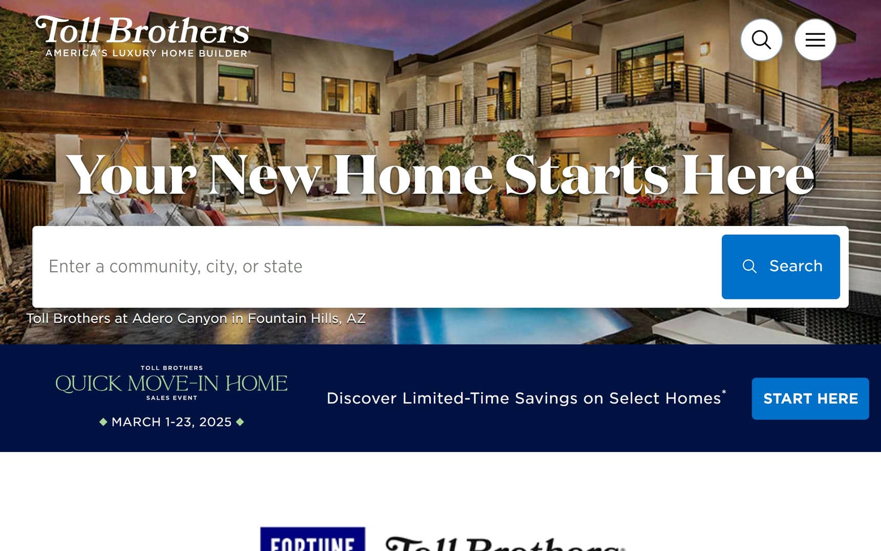
9. Toll Brothers
Why It’s Good: Toll Brothers’ home builder website has a slick, high-level design with multiple positive elements. It’s incredibly well conceived and worth taking pointers from if you want to create a similarly comprehensive home builder website.
What We Love Most:
- Gorgeous history/timeline page
- A convenient search function
- Stunning full-width images that enhance the visual appeal
10. Schumacher Homes
Why It’s Good: This beautifully designed website takes a unique, welcome approach by showcasing homes and locations as the primary focus.
What We Love Most:
- A home-focused design that highlights properties and locations first
- A buyer-oriented design that respects the user’s time

Home Builder Websites
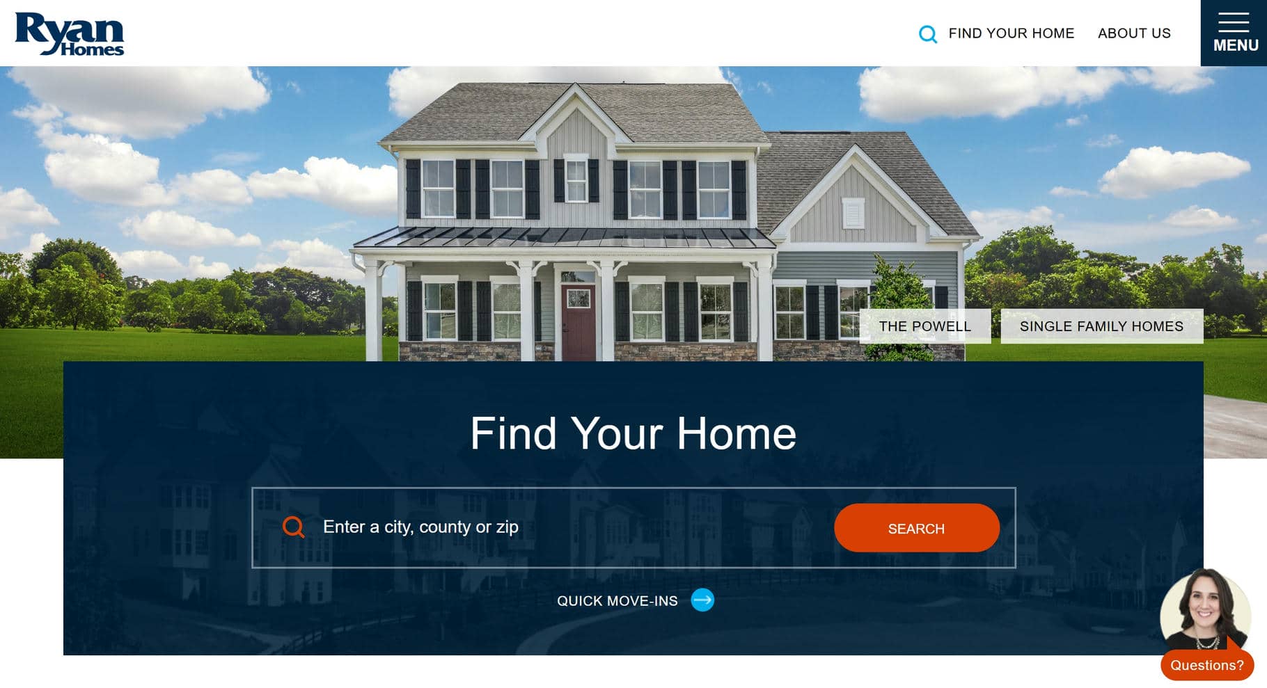
11. Ryan Homes
Why It’s Good: The design does a great job of providing all the tools users need to find what they’re looking for.
What We Love Most:
- A home search function with multiple filters
- A convenient contact widget that makes it easy to submit inquiries
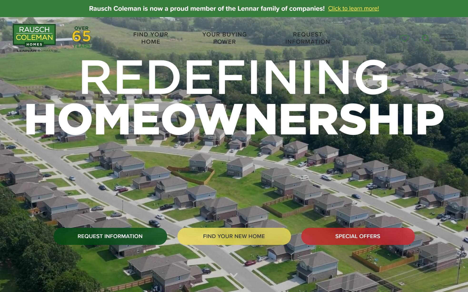
12. Rausch Coleman Homes
Why It’s Good: This website immediately grabs one’s attention with a hero video that expresses the brand. Strong branding is carried throughout the rest of the design, making the site feel focused and cohesive.
What We Love Most:
- An easy-to-use hamburger menu with intuitive search functionality
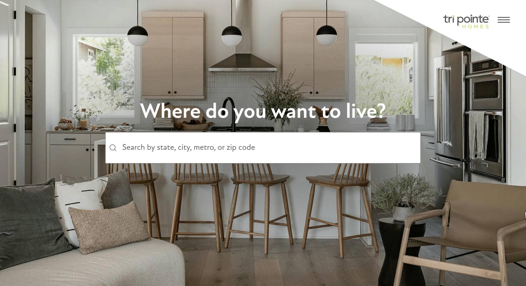
13. Tri Pointe Homes
Why It’s Good: Tri Pointe Homes has a clean, modern design that gets straight to the point. A home search function and gallery are front and center on the homepage, making it easy for users to dive right in.
What We Love Most:
- Beautiful use of images
- Stylish typography that adds personality to the design
- A breathable layout that feels open, uncluttered, and easy to explore
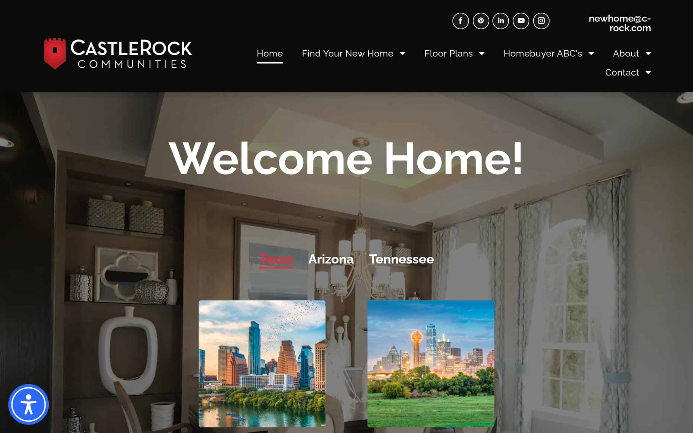
14. CastleRock
Why It’s Good: This site has a well-balanced design with a breathable feel, making navigation smooth and enjoyable. A convenient search feature is seamlessly integrated for easy access.
What We Love Most:
- Thoughtfully placed grid elements on the Floor Plans pages for clear organization
- An intuitive layout that enhances user experience
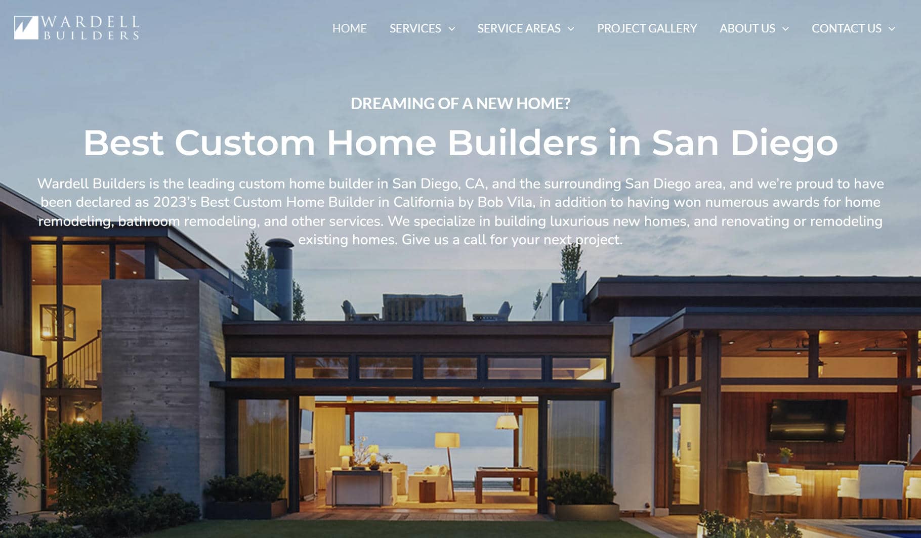
15. Wardell Builders
Why It’s Good: Wardell Builders has a visually appealing grid layout that keeps the design clean and well-organized. The straightforward approach makes navigation effortless while maintaining a polished look.
What We Love Most:
- A simple yet effective design that serves as a great example of a streamlined home builder website
Home Builder Website Design Examples
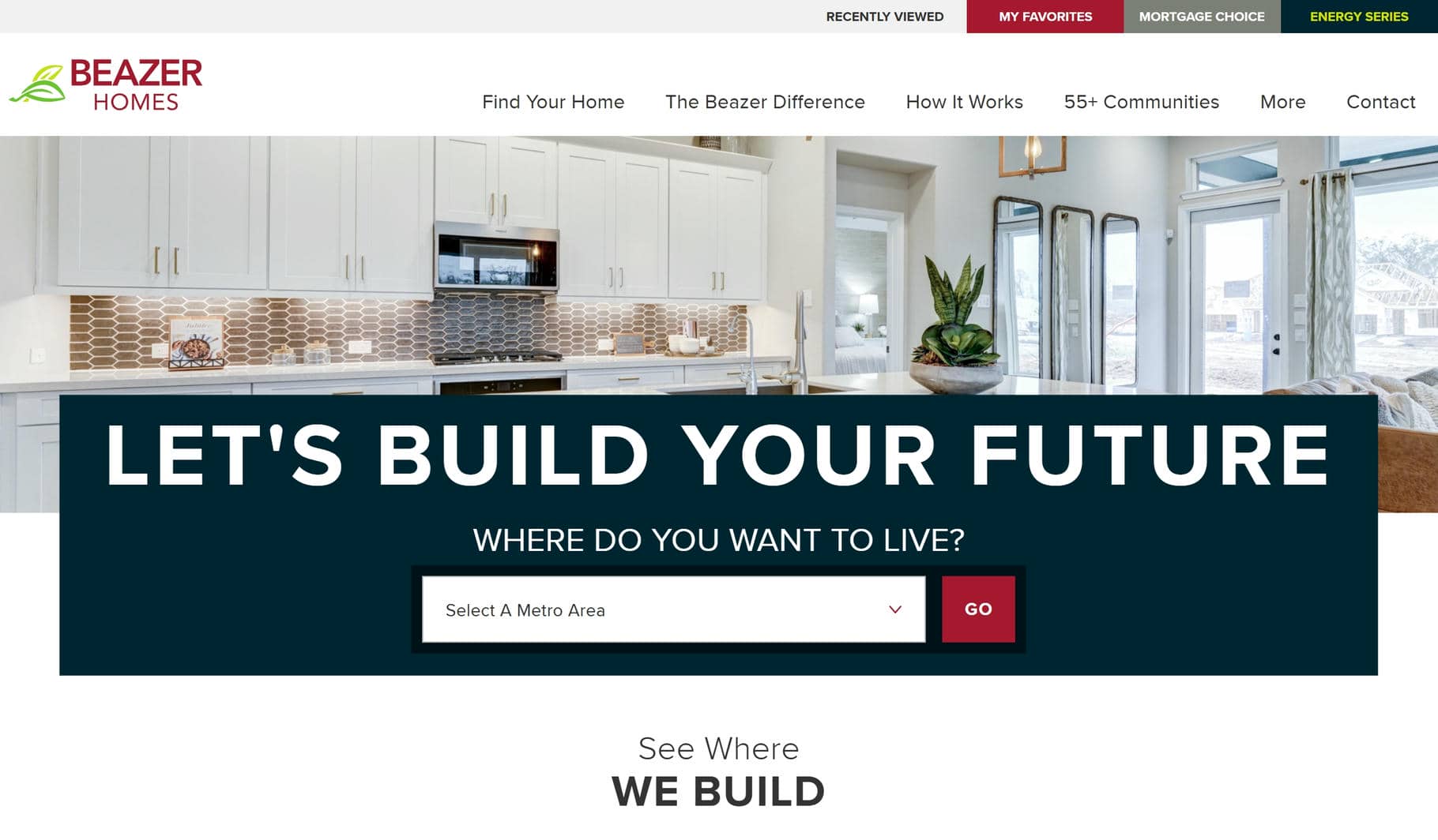
16. Beazer Homes
Why It’s Good: This website has a digestible design that balances images and text beautifully. It provides a seamless browsing experience while including all the essential features needed for searching homes.
What We Love Most:
- The overall design balance
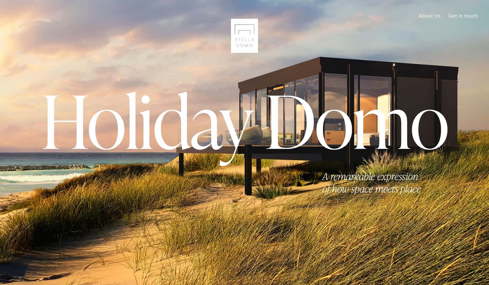
17. Stella Domo
Why It’s Good: Stella Domo’s website feels more like an interactive art piece than a typical home builder site. Instead of traditional scrolling, the design uses scroll-triggered effects, where elements change dynamically as you move through the page.
What We Love Most:
- Progressive illustration effect, where an image assembles like a drawing as you scroll
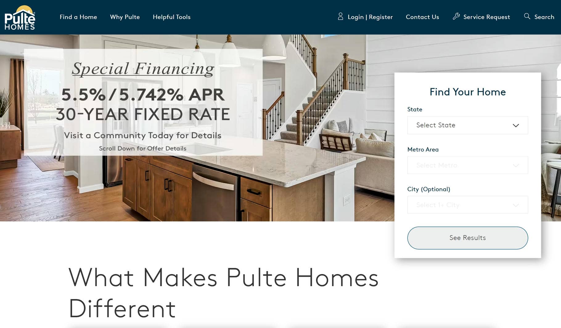
18. Pulte Homes
Why It’s Good: Pulte Homes has a well-structured design that makes browsing easy and intuitive.
What We Love Most:
- A well-designed drop-down menu that keeps navigation simple
- A grid layout with some catalog-style design elements
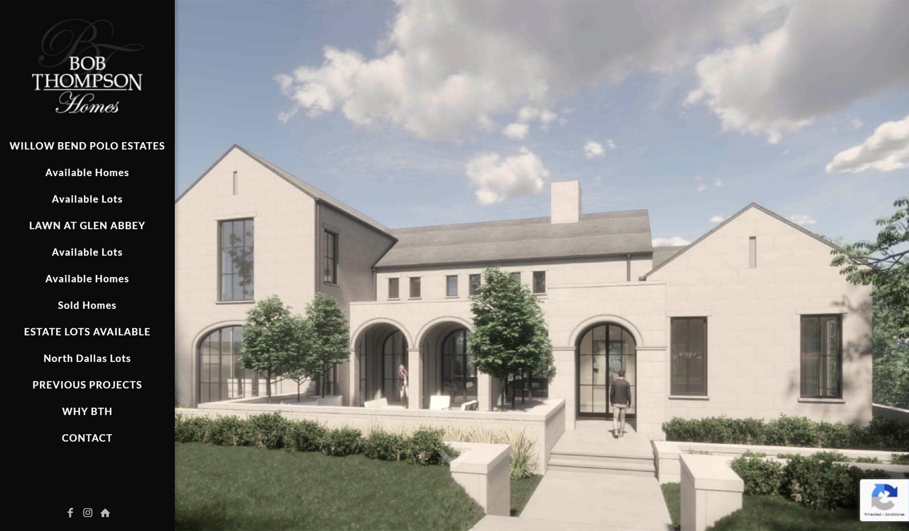
19. Bob Thompson Homes
Why It’s Good: Bob Thompson Homes has a brochure-style layout that is refreshing and unique.
What We Love Most:
- A brochure-inspired design that presents information in a polished, engaging way
- Beautiful, large images seamlessly integrated into the design
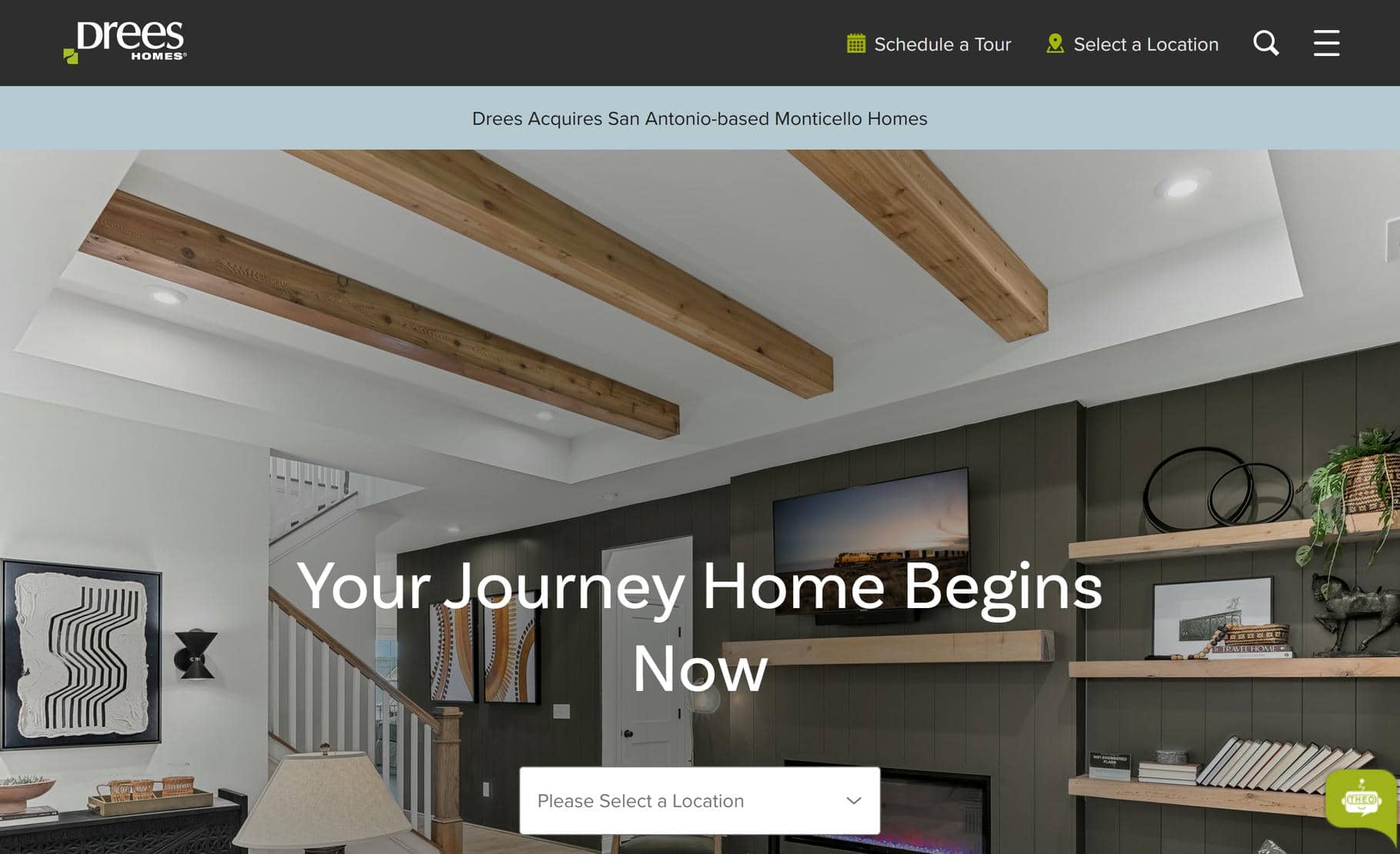
20. Drees Homes
Why It’s Good: This website has a smooth design flow driven by large images and punctuated by thoughtfully placed, minimal text. The result is a clean colorful layout that is a joy to browse.
What We Love Most:
- The “Schedule A Visit” feature
- The About/Drees Story page that showcases the brand beautifully
Home Builder Website Design Inspiration
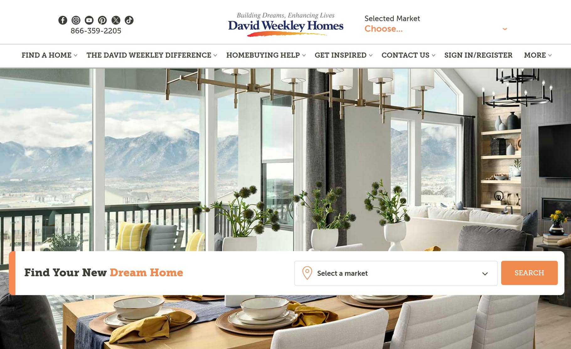
21. David Weekley Homes
Why It’s Good: This website has a beautifully structured presentation with a clear sense of purpose. Every design element feels intentional, making it a pleasure to visit.
What We Love Most:
- A clean, well-placed central logotype that reinforces branding
- A search function that lets users filter by market
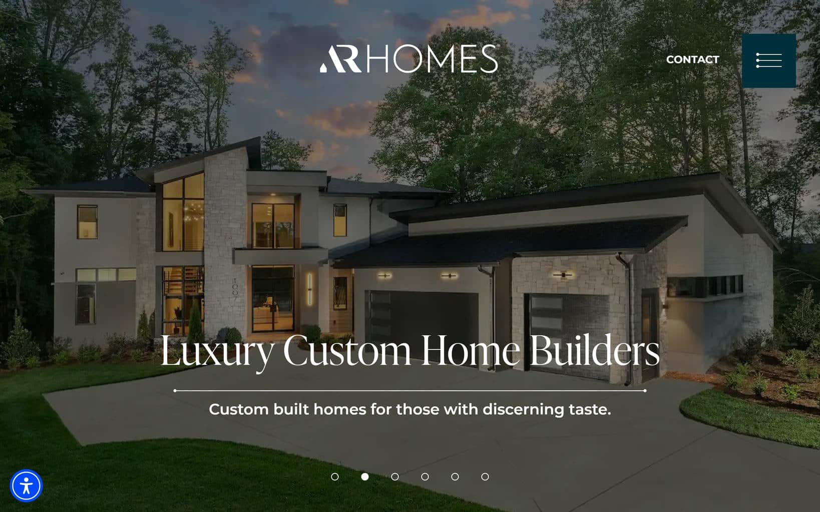
22. AR Homes
Why It’s Good: This website has a classy, well-executed design that hits the right notes for a home builder website.
What We Love Most:
- High-quality, full-width images that enhance the site’s polished look
- Dynamic background that changes while you scroll, giving the site a lively quality
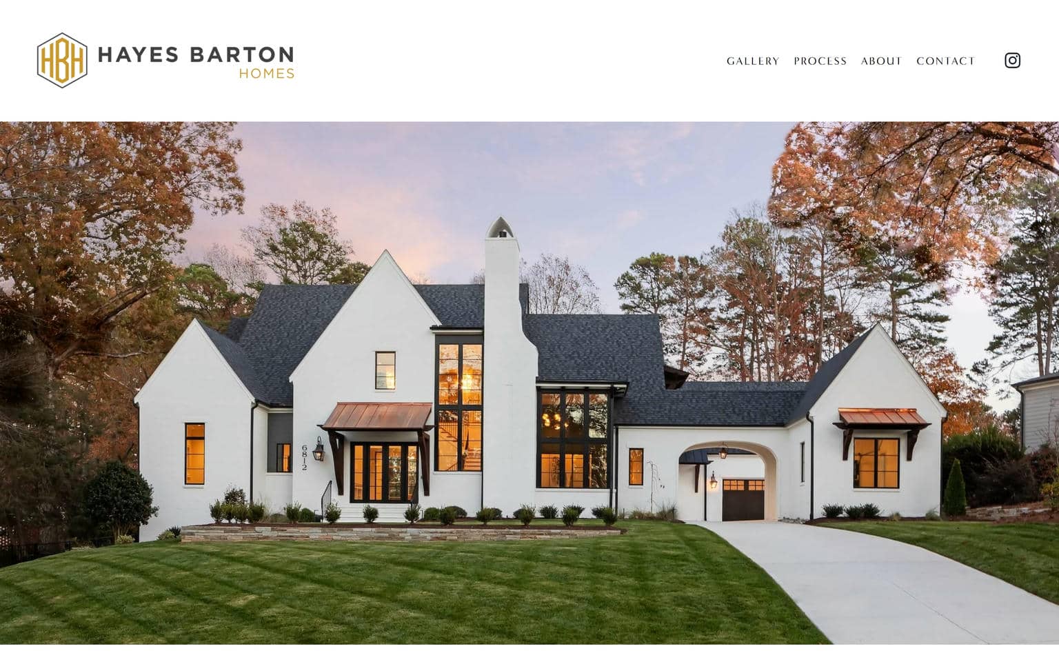
23. Hayes Barton Homes
Why It’s Good: This website has a clean, minimalist design that proves less is more. It takes a lighter, more focused approach, making it a great example to emulate if you want a less heavy project.
What We Love Most:
- The minimalist design
- A great example of how simplicity can create a beautiful, high-impact website
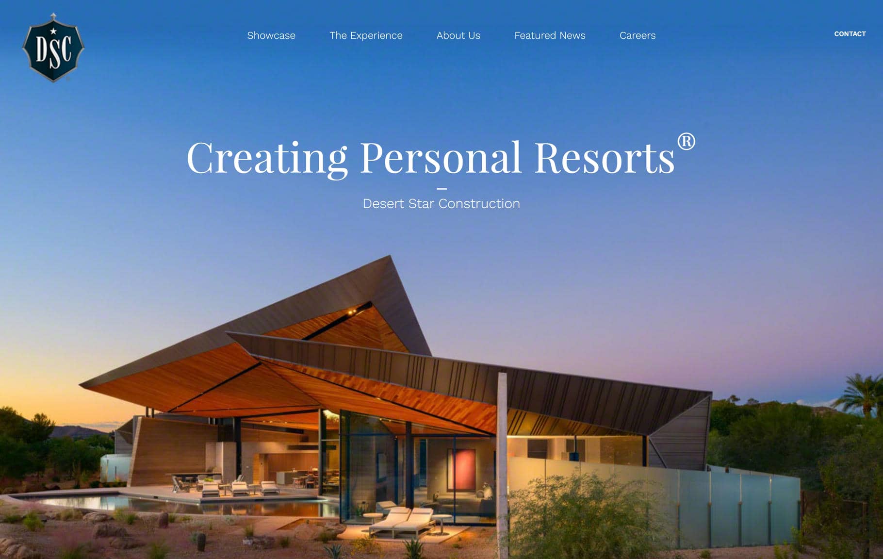
24. Desert Star Construction
Why It’s Good: This website lets the images do the talking, and in that, they do a superb job. Each image captures the beauty of the homes and the quality of the work and brings the design to life in such a fantastic way.
What We Love Most:
- A beautifully minimal approach that keeps the focus on high-quality imagery
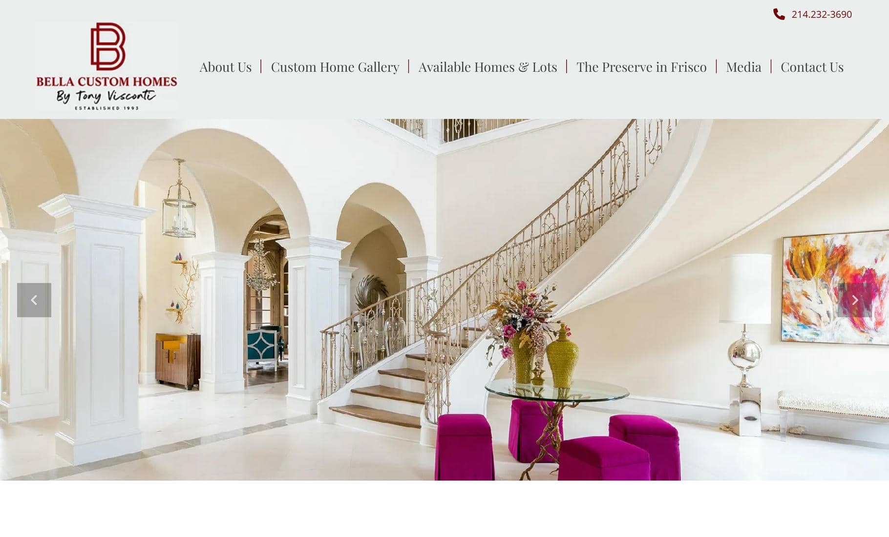
25. Bella Custom Homes
Why It’s Good: This design follows the core principles of home builder web design and executes them masterfully. It’s polished, well-structured, and tailored to its audience. What a great example to take design inspiration from.
What We Love Most:
- A refined, professional design that feels both welcoming and high-end
Best Home Builders Websites Out There
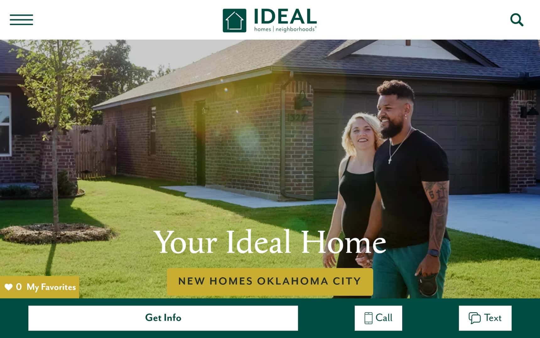
26. Ideal Homes
Why It’s Good: This website delivers an authentic home builder experience, with every element thoughtfully designed to streamline the home search process.
What We Love Most:
- Cleanly organized photo gallery, video gallery, and virtual tours
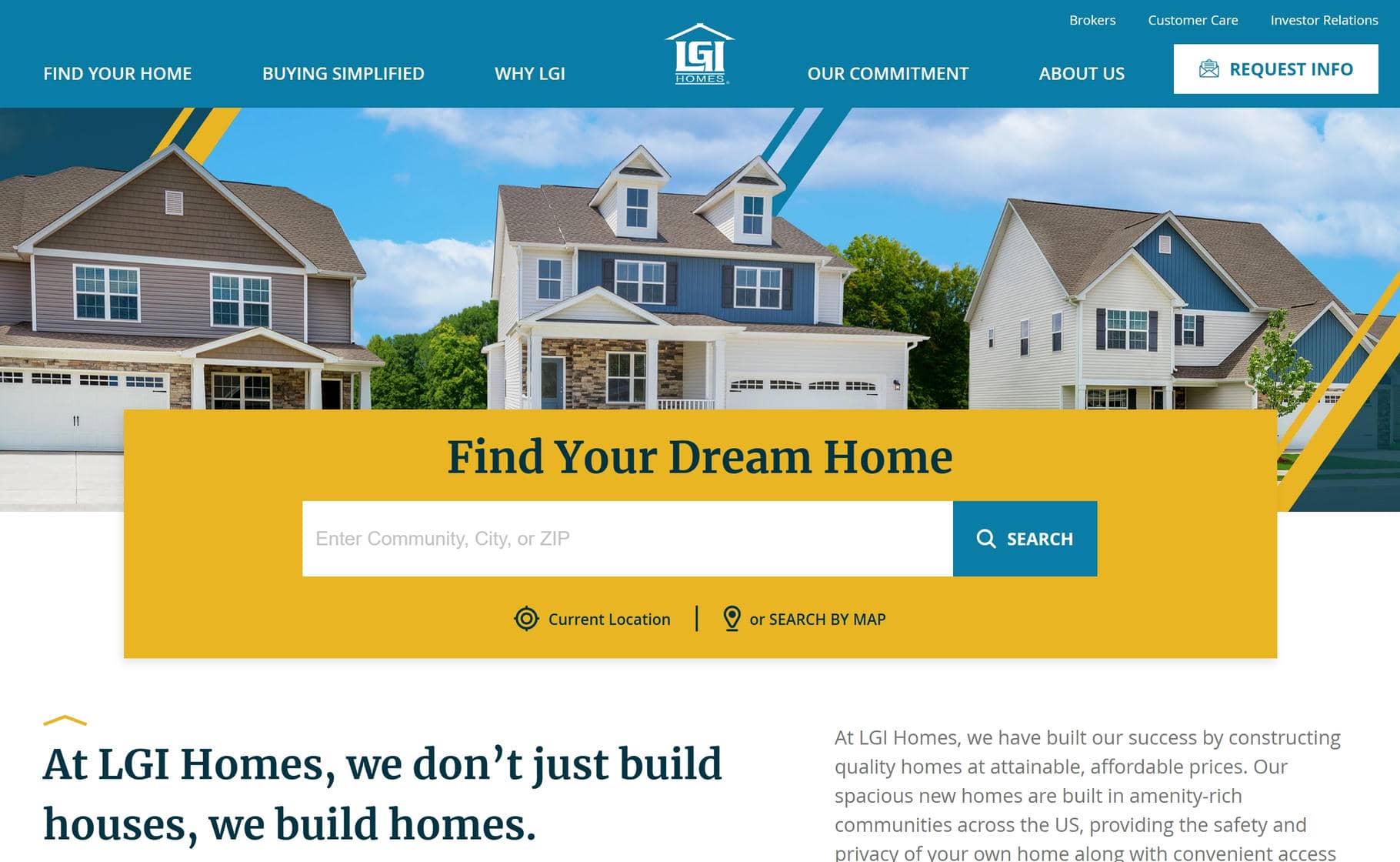
27. LGI Homes
Why It’s Good: LGI Homes has a bright, welcoming design that balances creativity with a slick, professional polish.
What We Love Most:
- A design that feels fresh and creative while maintaining a professional look
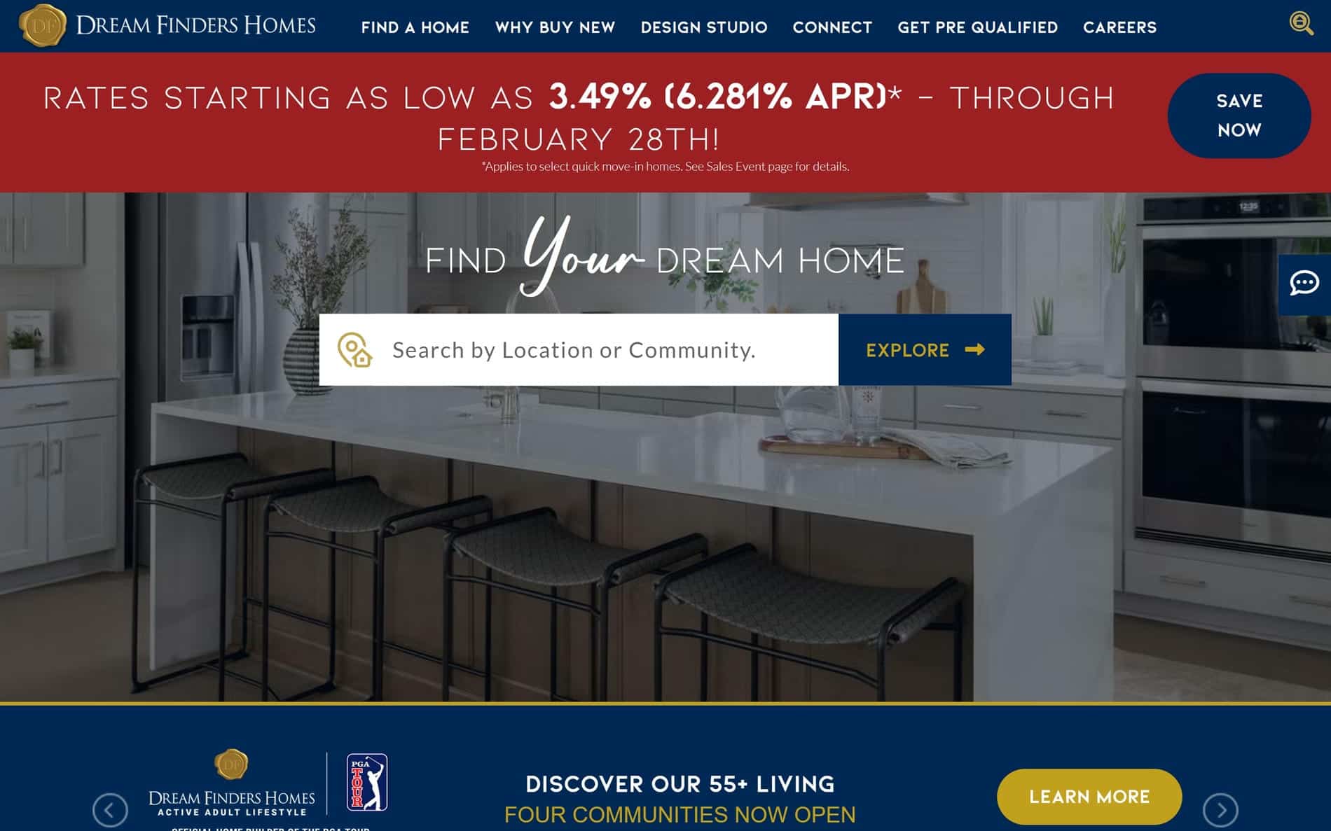
28. Dream Finders Homes
Why It’s Good: This website has an approachable design that makes searching by location simple and intuitive.
What We Love Most:
- Clean, structured design that keeps the focus on usability without feeling overwhelming
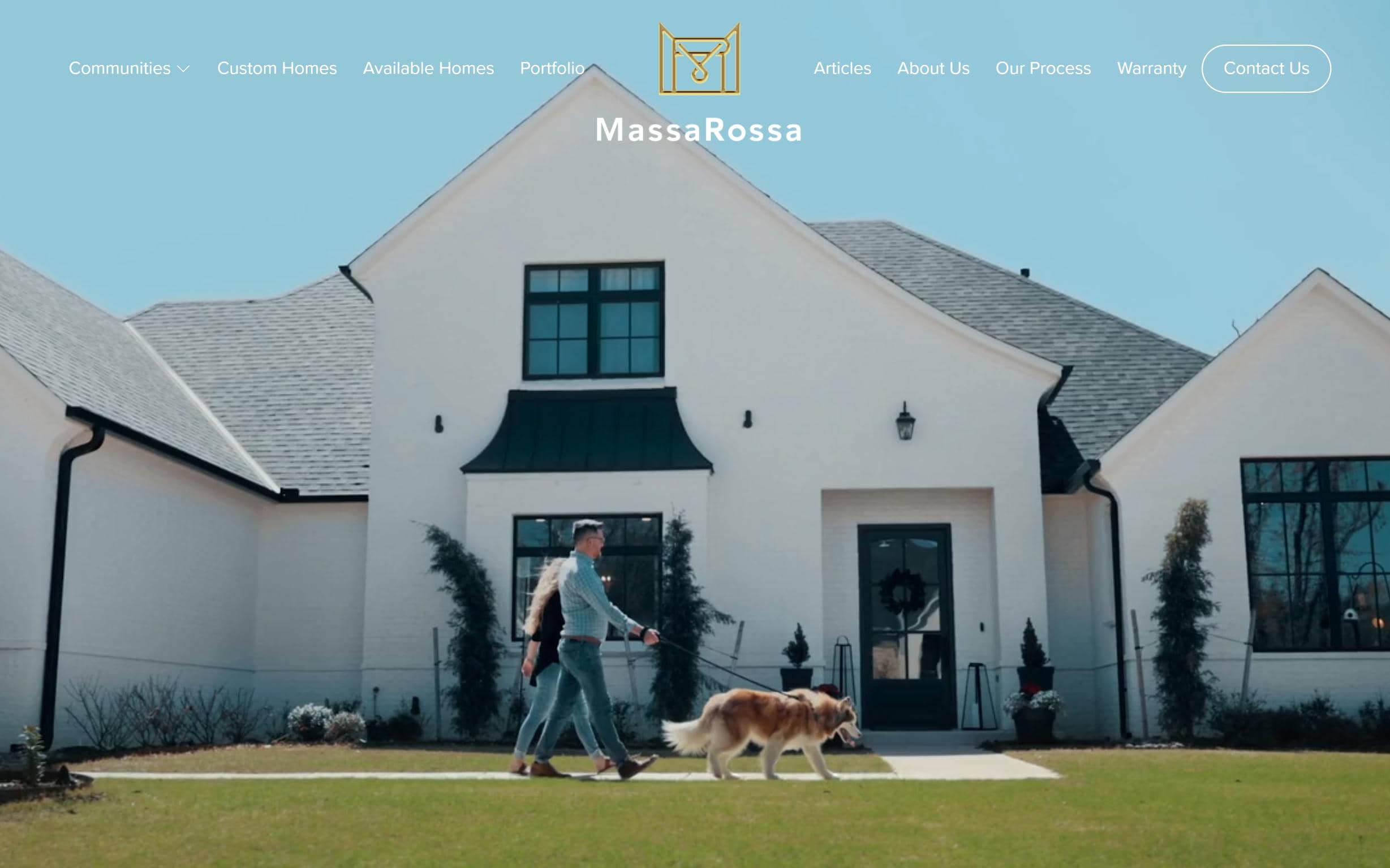
29. MassaRossa
Why It’s Good: Massa Rossa has a visually impactful design that makes a strong impression from the moment you land on the site.
What We Love Most:
- A stunning, high-impact visual presentation that captures attention instantly
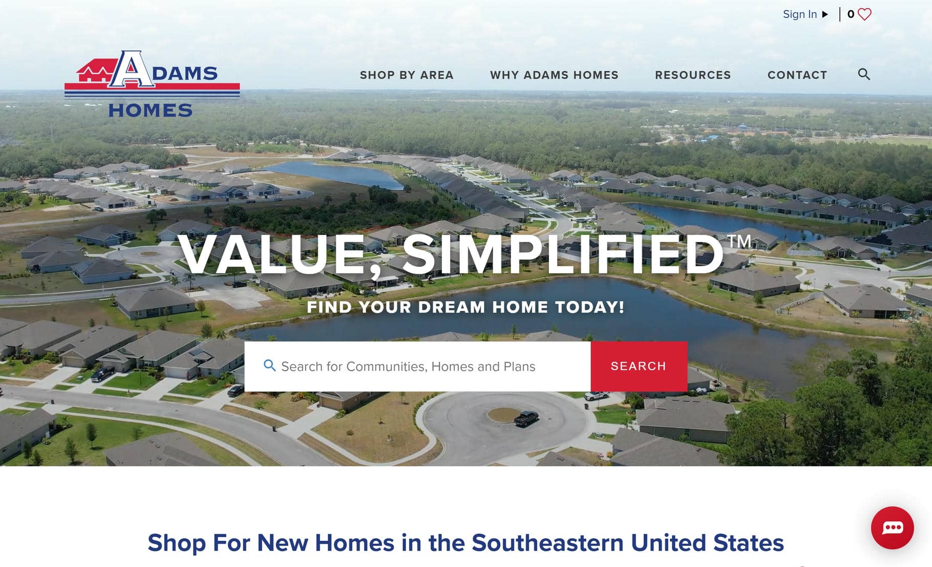
30. Adams Homes
Why It’s Good: Adams Homes has a well-executed design that integrates high-quality visuals without compromising readability. Additionally, the website has strong branding that is consistently applied throughout the design.
What We Love Most:
- Well-integrated branding that reinforces identity throughout the site
Best Home Builder Website Designs – Conclusion
Hopefully, this collection of home builder website designs has sparked ideas for your next project!
Ready to bring your vision to life? Schedule a meeting with us today!