In this article, we explore why Figma is the best design tool on the market from a custom web designer’s perspective. 🥇
Keep reading to learn about this amazing tool!
What Is Figma?
Figma is a cloud-based design software that is primarily used for creating websites and mobile apps. It’s used by web designers to draw, design, and prototype ideas before a project’s development phase begins.
With this tool, designers can work together to create layouts, add images, experiment with colors and fonts, and much more, all through a web browser.
Unlike traditional design software that needs to be installed on a computer, Figma is web-based and can be used on virtually any device with an internet connection. It is fairly easy to use and is very useful for facilitating communication.
Figma Is A Place For Designers and Clients
Importantly, Figma empowers web designers to collaborate on projects with their clients.
At Sage Digital Agency, for instance, we use Figma to show design iterations to our clients, provide project updates, and take and incorporate feedback.
How Would You Describe Figma In One Sentence?
In short, Figma is a collaborative, real-time digital canvas that brings designers and clients together, helping to actualize the true potential of web design projects.
Incredible Figma Facts and Statistics 🤯
Figma’s collaborative design tool was launched in 2016. Since then, Figma has seen massive growth financially and in its customer base.
Here are some eye-opening statistics:
From 2020 to the end of 2022, Figma’s annual recurring revenue (ARR) grew from $75M to $400M (Sacra).
In September 2022, Adobe acquired Figma for approximately $20 billion (Adobe).
Figma has 1,300+ employees (Bloomberg) *subscription required to access*
How Many People Use Figma?
Figma has over 3 million users monthly (ZipDo).
Figma.com, meanwhile, receives millions of visits a month. In October 2023 alone, it received 83.5 million visits, with roughly 19% of the traffic coming from the United States (Semrush).
Why Is Figma So Popular?
Figma is popular because it’s an incredibly well-designed, collaborative design tool—one of the best on the market. It offers multiple features and functions that empower web designers and their clients to succeed.
Why We Use Figma For Web Design
We use Figma primarily for its ease of use and collaborative features, but there are other reasons as well.
Firstly, Figma Makes Web Designs Better
Figma improves web designs in seven key ways:
- Streamlined Prototyping: Quick and interactive prototypes for immediate review
- Consistent Branding: Easy-to-use design templates for brand consistency
- Version Control: Tracks changes, making it easy to revert or compare versions
- Scalability: Adapts easily to projects of any size, from small websites to large apps
- Cross-Platform Design: Ensures designs work well on desktop, tablet, and mobile
- Efficient Workflow: Integration with other tools for a smoother design process
- Design Management: Centralizes design elements for consistency across projects
Secondly, Figma Is Fast
Thanks to Figma’s web-based infrastructure, it runs exceptionally fast. Its speed also stems from its lightweight design, which doesn’t burden your system like traditional software.
Figma allows us to design our client’s websites faster, saving time while maintaining exceptional design quality.
Thirdly, Figma Is An All-in-One Tool
Figma combines interface design, prototyping, and collaboration into one tool, reducing the need for additional software like InVision for prototyping.
Incidentally, Figma’s all-in-one approach helps us optimize designs for both desktop and mobile. This is because we’re able to create and test designs across different screen sizes within the same environment.
» MORE: See A Short Video On Our 5-Step Design Process
Additional Benefits of Using Figma
Figma offers additional advantages, such as:
Platform Independence
Unlike Sketch, which is exclusive to macOS, Figma is accessible to users on any full desktop operating system (macOS, Windows, Chrome OS, and Linux).
This is helpful for clients who utilize different operating systems and need access to their design projects.
User-Friendly Interface
Figma is known for its intuitive interface, which helps expedite the design process.
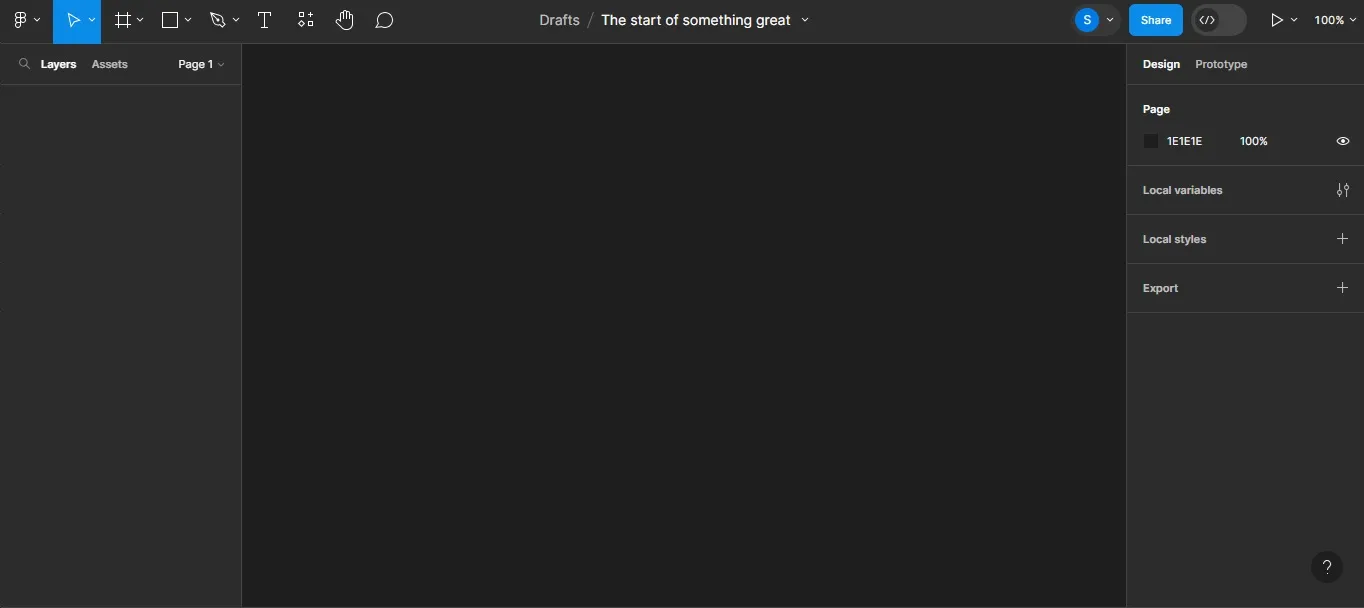
➡️ Click to expand the image below to see Figma’s clean and effective UI:
As you can see, Figma has four main areas: (1) Canvas, (2) Tool Bar, (3) Left Sidebar, and (4) Right Sidebar.
Each area offers a range of capabilities, from beginner to advanced.
Dynamic Reusable Components
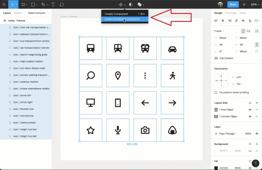
Figma utilizes dynamic, reusable components as a key feature of its design system.
These components are customizable and can be used across projects. If, for instance, you adjust a master component, you’ll see automatic changes reflected wherever that component is being used.
Figma’s reusable component feature. (Image source: “Create components to reuse in designs” help page in Figma Learn.)
In the image above, you’ll notice that Figma allows designers to either create a single component or multiple components. Figma also gives designers the ability to make sweeping changes that affect multiple components at once.
Let’s say we were to create a call-to-action button and place it on several of your web pages. We could, if needed, edit and change every button at once. We could also change your website header, footer, and more.
This is one way Figma helps us save time for clients. It allows us to quickly and universally implement design changes.
Efficient Design Handoff
Figma’s Inspect Feature
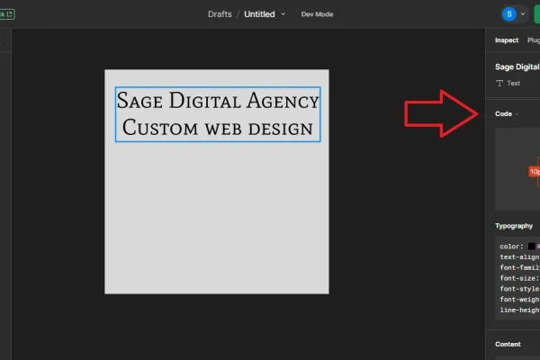
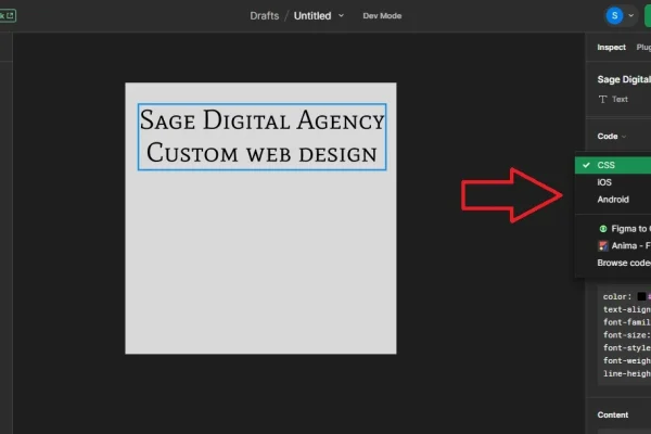
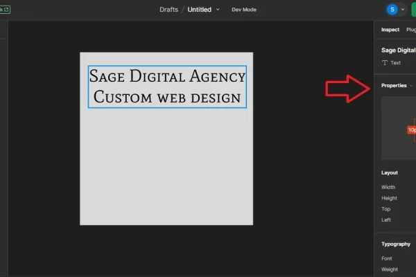
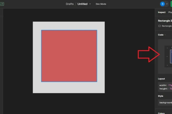
Figma’s Inspect feature facilitates sharing between designers and developers by allowing for inspection and copying of code from the design interface.
This simplifies communication and access to design elements, prototypes, and iterations.
Click to expand
In the examples above, we chose a simple font and square shape to show the type of information Figma’s Inspect feature provides.
Everything developers need to build a design, whether simple or complex, can be found inside Inspect’s Properties and Code areas. ✅
These areas are essentially a cheat sheet or blueprint that ensures the website looks exactly as intended by the designer.
For developers, this information is a game changer, especially if they are serving a client with very specific needs or working within a style guide.
Figma’s Read-Only Mode
Additionally, Figma has a read-only mode, which provides a clear view of what the final product should look like to developers.
The ultimate goal of these features is to streamline project flows, from design to development to launch.
Streamlined Development Process
Figma improves design handoffs to developers in several ways:
- Customizing file thumbnails for quick identification and project status
- Linking Figma design files in project documents for easy access
- Using “sticky note” components on the canvas to highlight design choices
- Applying export settings to keyframes, components, and assets for production
- Naming pages descriptively to indicate readiness for development
- Creating a dedicated page with instances of all components for central reference
- Organizing files with sections for better navigation
- Marking sections and files as “Ready for development”
- Giving styles and components descriptive names
- Inviting collaborators to view files and prototypes
- Enabling Viewers to select layers, view properties, add comments, etc.
- Allowing Viewers to access main components and link Dev resources in Dev Mode
- Implementing code by auto-generating CSS snippets for frames or objects
You can read more about these capabilities at Figma Learn: Optimize design files for developer handoff.
Community and Resources
Figma has a strong community and resource library, offering templates, plugins, and integrations that enhance its functionality and user experience.
Web designers can find a huge wealth of information by browsing feature categories, top tags, and Figma’s curated resource collections.
Learn more at Figma Learn: Guide to the Figma Community
Side Note About Figma’s Collaborative Power 👇
We’ve already mentioned it, but before moving forward, we want to reiterate the power of Figma to facilitate collaboration between designers and clients.
Figma has revolutionized how we interact with our clients, as it allows for comments, image uploads, and copying and pasting screenshots. This is extremely useful for pointing out areas in a design that need improvements.
Now vs Then
In traditional design workflows, client feedback like this often comes at the end of the design process. It’s possible in these scenarios to spend 30 days refining a development site only for the client NOT to approve of it. ❌
Figma empowers us to radically improve this process by making our clients integral to the project from start to finish.✅
» MORE: Our Custom Web Design Services
The Bottom Line: Building A Figma Website Is Better
Building a website with Figma is easier and better than using traditional design methods with no collaboration features.
Some web designers, for better or worse, still use Adobe Photoshop and Illustrator, which are powerful graphic design tools, but they aren’t collaboration tools in the same sense as Figma.
Figma is Better than Adobe XD and Sketch
Figma is also superior to other tools like Adobe XD and Sketch.
While these tools support collaborative work, Figma’s collaborative features are more robust, in our opinion.
Figma’s Superb Design Collaboration Software
You might want to see Figma’s software in action.
If so:
Check out this tutorial video from Figma’s YouTube channel:
Figma Helps Designers and Clients Communicate!
If you’ve hired a web designer in the past who:
- Didn’t effectively communicate with you about your design needs
- Missed a project deadline due to a lack of communication
- Didn’t explain his or her design process in a clear and direct way
…Then, choosing a proactive Figma designer is the way to go.
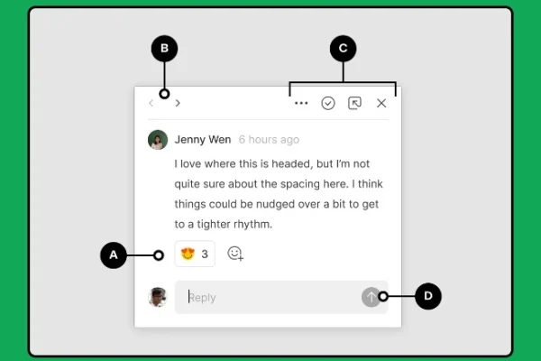
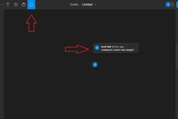
Check out the Comment Button in Figma. It empowers you to leave feedback in real time so you can achieve your intended design!
Figma’s comment feature. (Image source: “View and manage comments” help page in Figma Learn.)
Figma’s Cursor Chat Feature
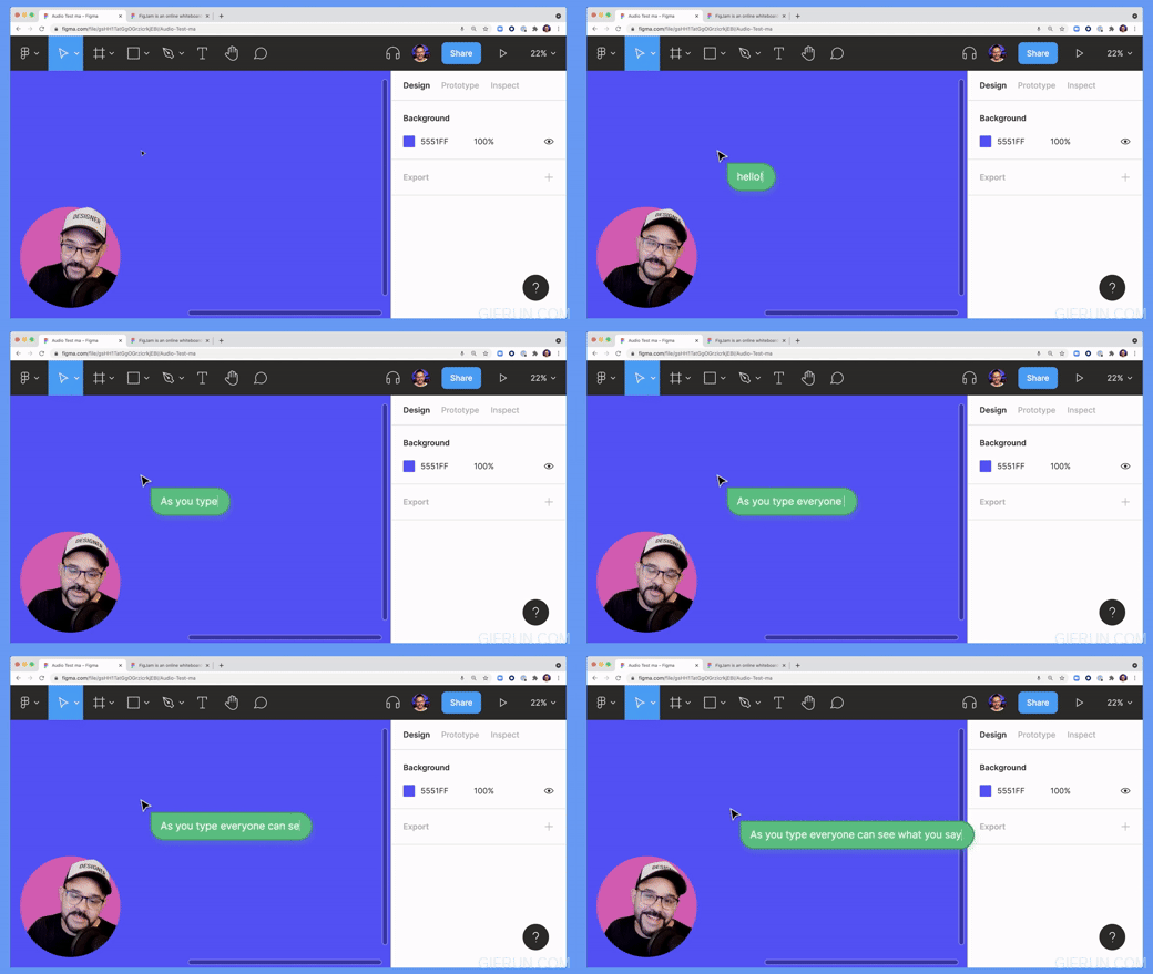
You can send us live chat messages with the Cursor Chat in Figma!
Benefits of Figma’s Cursor Chat include:
- Better communication (allows for clarifications, feedback, and more)
- Uncluttered workspace (Cursor Chat messages disappear after five seconds)
- Streamlined workflow
- More creativity
- Enhanced problem-solving
- Better collaborations and team dynamics
- Less email overload (moves discussions to the Figma canvas instead)
This feature was launched in 2021 and is one of many enhancements that have been added to Figma over the years.
GIF made by Sage Digital Agency using Figma’s Figma Tip: Using audio and cursor chat in Figma and Figjam Youtube tutorial video.
Figma’s Audio Chat Feature
Figma’s Audio Chat feature enables team members and clients to engage in voice conversations directly within the Figma workspace.
You can learn more about this feature at:
How To Use Figma For Web Design
Since there are already exhaustive answers out there about how to use Figma for web design, we want to focus on perhaps the single most important aspect—communication.
Here’s the thing: There are hundreds of Figma how-tos that are valuable and necessary. But the real secret to using Figma at a professional level and making clients happy is leveraging client feedback during the design process. During our web design projects, we always communicate with clients to ensure designs are done right the first time.
This approach is fundamental to getting the most out of Figma.
Want to Collab With Us Inside The Figma Desktop App?
If your answer to the question above is yes, we invite you to download the app today. The process is straightforward.
Figma Desktop Download Requirements:
The Figma desktop app is available on Windows and macOS.
Windows requirements: Windows 10 or later in a 64-bit environment
macOS requirements: macOS 11 or later.
To download the Figma desktop app:
1. Visit the Guide to the Figma desktop app page on Figma Learn
2. Scroll down to the “Download and install desktop apps” section and click “Download Figma for macOS” or “Download Figma for Windows,” depending on your system.
3. Click on the downloaded file to run the installer.
4. For macOS users, move the Figma icon to your Applications folder. For Windows users, there’s usually no need to move the app to a specific folder, as the installer typically takes care of the placement and setup.
5. Delete the Installer.
6. You should be good to go. Open the Figma app to start using it.
Figma FAQs
• As a client, do I have to pay to use Figma and see my project?
As our client, you will never need to pay to access your project inside Figma.
Sage Digital Agency keeps an account with Figma for our clients as part of our web design service.
• Can Figma be used offline or only on the cloud?
To access Figma’s full capabilities, such as adding comments or chatting live with our team, an internet connection is required.
• How safe is Figma?
Figma takes multiple steps to ensure your design project is safe.
If you’re concerned about losing your project due to a system error, hacking, or other issue, we encourage you to read through Figma’s Security page.
Contact Sage Digital Agency’s Figma Experts
If you’re looking for expert-level design in Figma and the final say in the outcome of your website, Sage Digital Agency is the right choice.
Reach out to start a conversation about your design needs.
For more information about our services, see our Are We A Fit? page.


