




Need inspiration for your next website? Check out some examples of the best private equity website designs today.
Let’s get started!
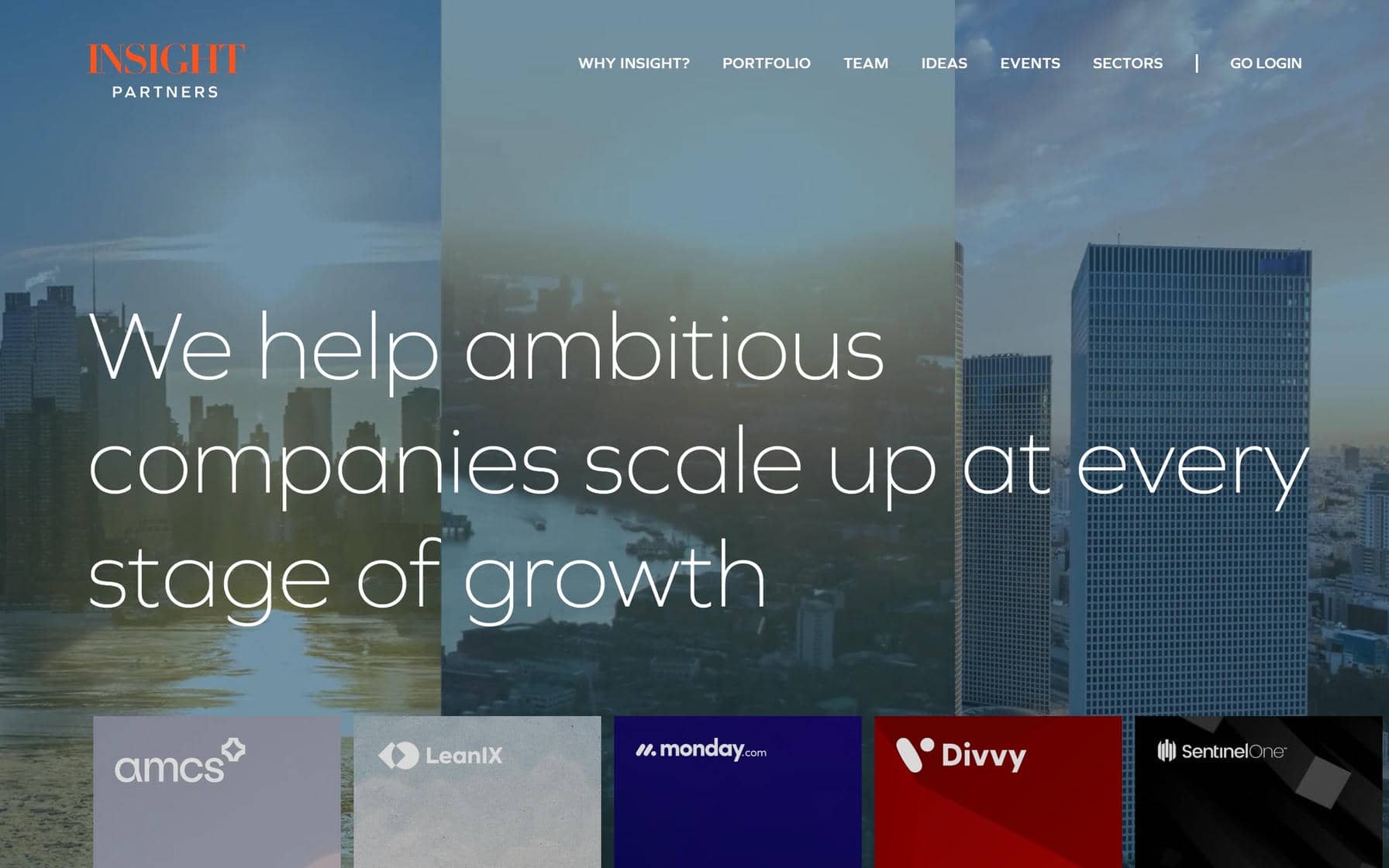
1. Insight Partners
Why it’s good: This website is bold and interesting and really hits home with high-impact imagery. It’s another great example to visit if you need design ideas.
What we love most:
- Image-heavy sections that create a strong visual narrative
- Bold background shifts with punchy text
- A standout example of image-driven design
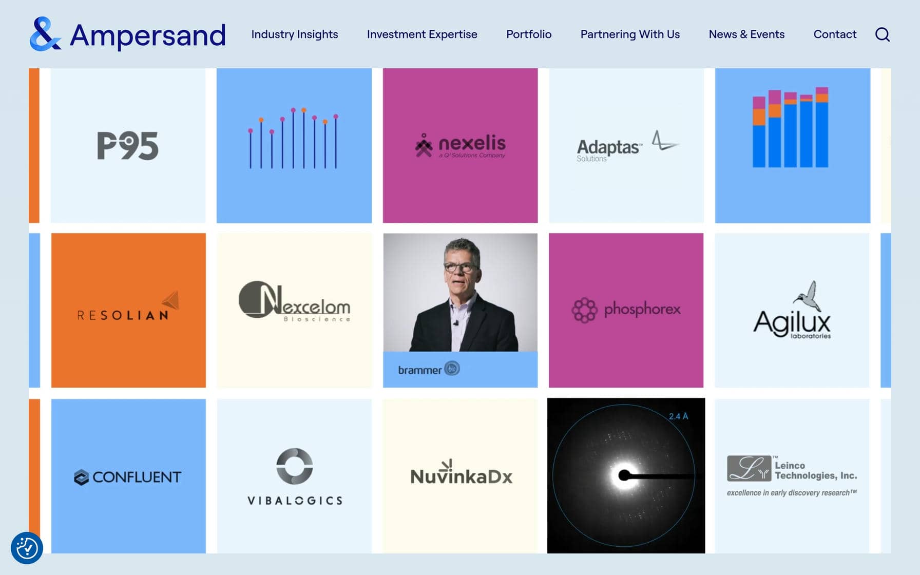
2. Ampersand Capital Partners
Why it’s good: Ampersand’s website has an incredible design. Polished, impactful, interactive—these are just a few words that describe it. It’s a standout example to reference if you need inspiration for a high-level private equity website.
What we love most:
- Use of looping videos throughout the design
- Interactive 3D globe for exploring locations
- Large, image-rich navigation cards
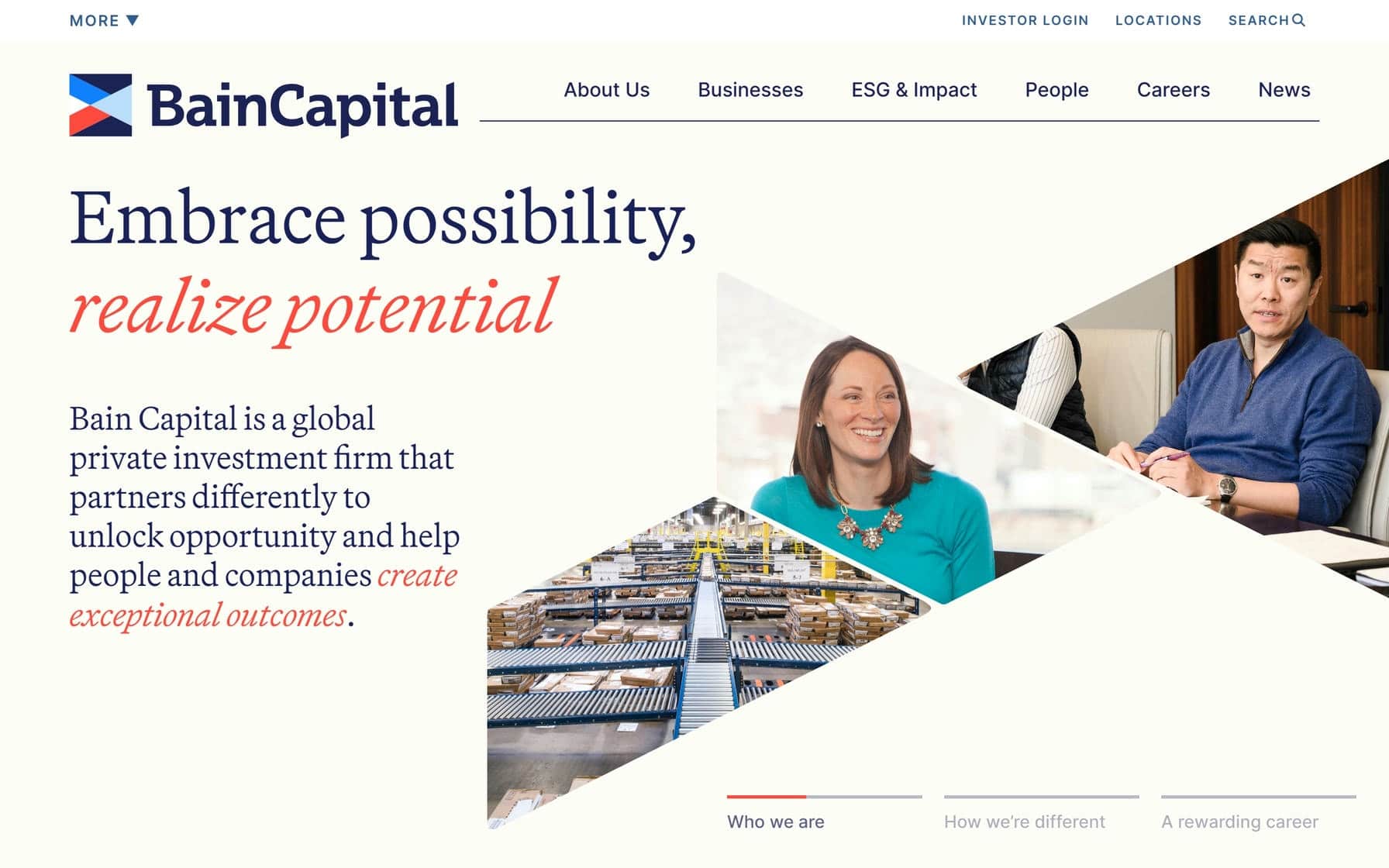
3. Bain Capital
Why it’s good: Bain Capital’s website impresses with a fresh, colorful, and creative design.
What we love most:
- Colorful and dynamic design
- A neat Global Presence map that visualizes their reach effectively
- Creative typography that adds visual interest without sacrificing readability
4. KKR
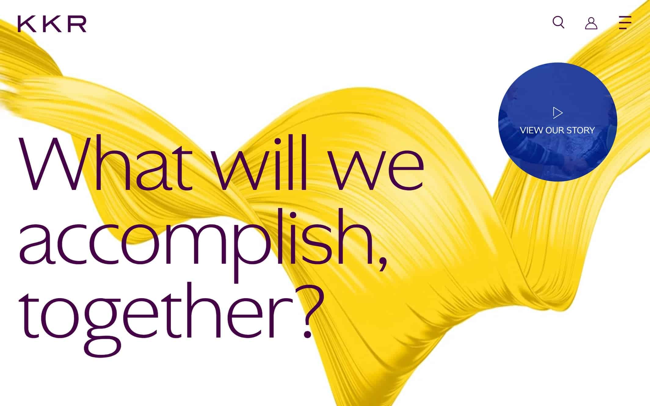
Why it’s good: KKR’s website makes a strong first impression with beautiful artistic elements. The design is also clean and easy to browse.
What we love most:
- Nice use of oversized fonts
- Exceptionally clean layout with plenty of white space
- A creative edge that complements the design’s professional tone
5. Advent
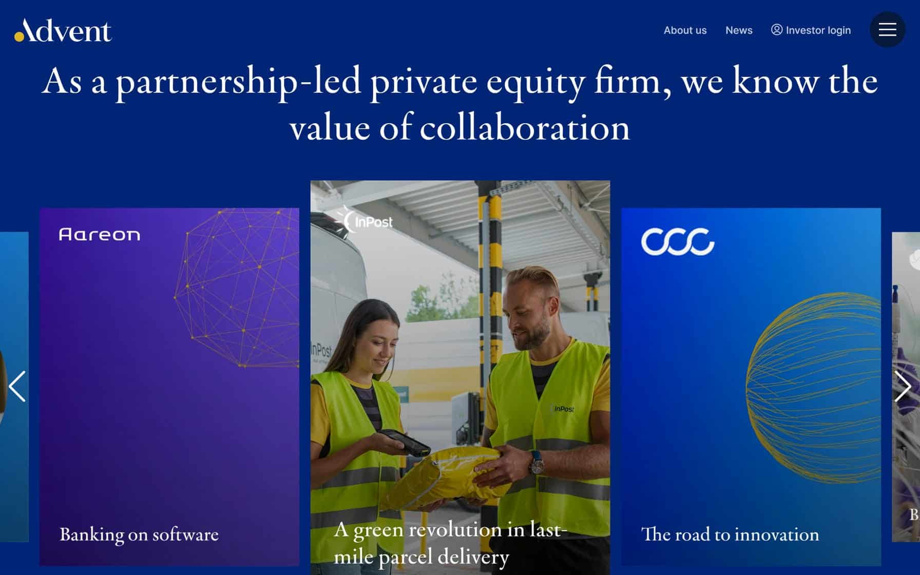
Why it’s good: Advent’s website has a striking design with lovely pops of color and an overall beautiful artistic quality.
What we love most:
- Unique homepage layout with large navigation cards
- Bold blue design with pops of color throughout
- Beautifully designed Global Reach pages
Best Private Equity Website Designs
6. CVC
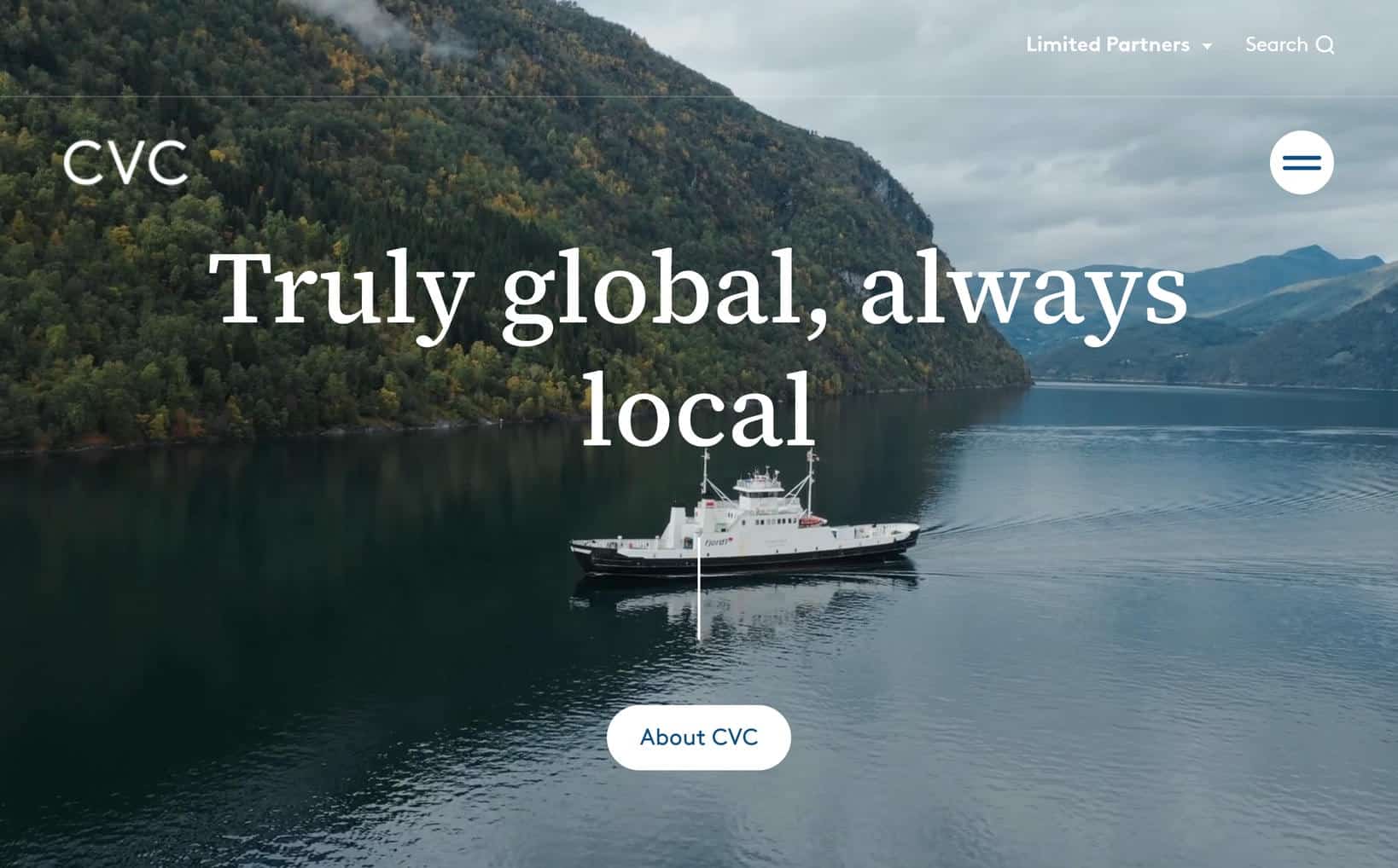
Why it’s good: CVC’s website is a standout example of high-level private equity design done right. It’s very polished and impressive.
What we love most:
- Slick, visually rich design with sharp details
- Large, readable font choices
- Gorgeous, well-executed Portfolio page
7. Thoma Bravo
Why it’s good: This design has an interesting, modern, gray-toned aesthetic. It’s very clean and has a nice feel.
What we love most:
- Well-executed branding throughout the design
- Well-organized footer that improves site navigation

8. New Mountain Capital
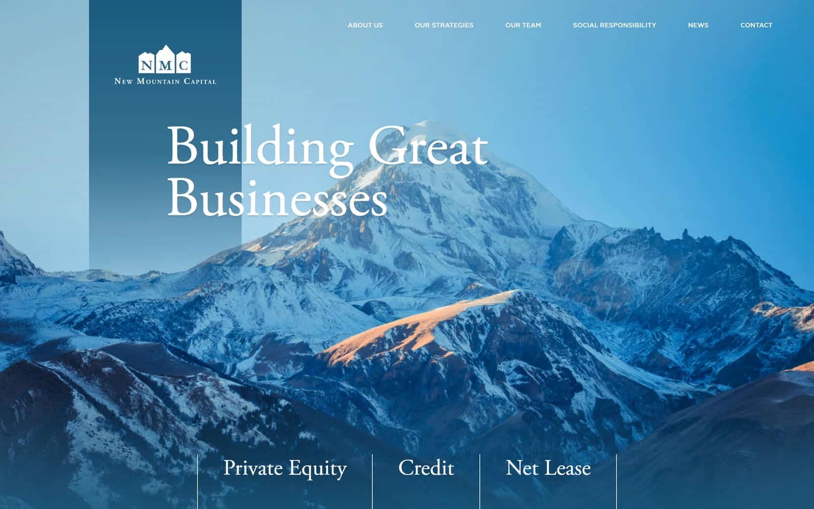
Why it’s good: New Mountain Capital’s website is fresh and crisp, with a cool-toned palette and a remarkably clean layout.
What we love most:
- Exceptionally well-designed Team page
- Clean, modern aesthetic
9. CD&R
Why it’s good: CD&R’s website has a beautiful, authentic design that makes an immediate impact.
What we love most:
- Large, authentic imagery that conveys the firm’s brand
- Clean, professional presentation that maintains visual interest

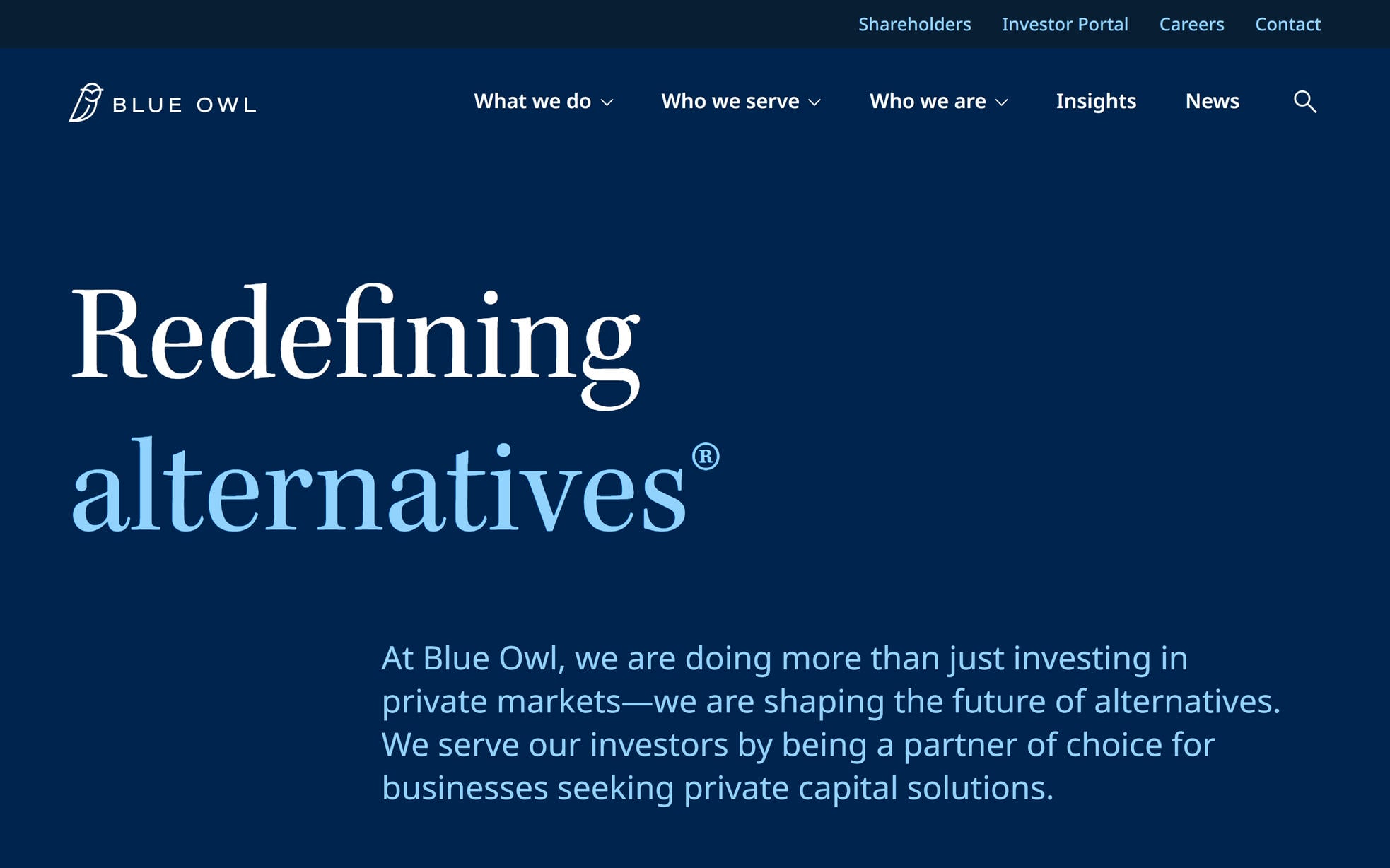
10. Blue Owl Capital
Why it’s good: Blue Owl’s website offers a seamless browsing experience from start to finish.
What we love most:
- Navy blue color palette that conveys trust and professionalism
- Huge, readable fonts that command attention
- Seamless integration of dynamic video content
- Exceptionally smooth and cohesive user experience
Best Private Equity Websites
11. EQT
Why it’s good: EQT’s website has a distinct, creative feel that sets it apart. The design is playful while maintaining top-notch professionalism.
What we love most:
- Thoughtful touches of pastel colors and cartoon illustrations throughout the design
- Clickable in-page sections

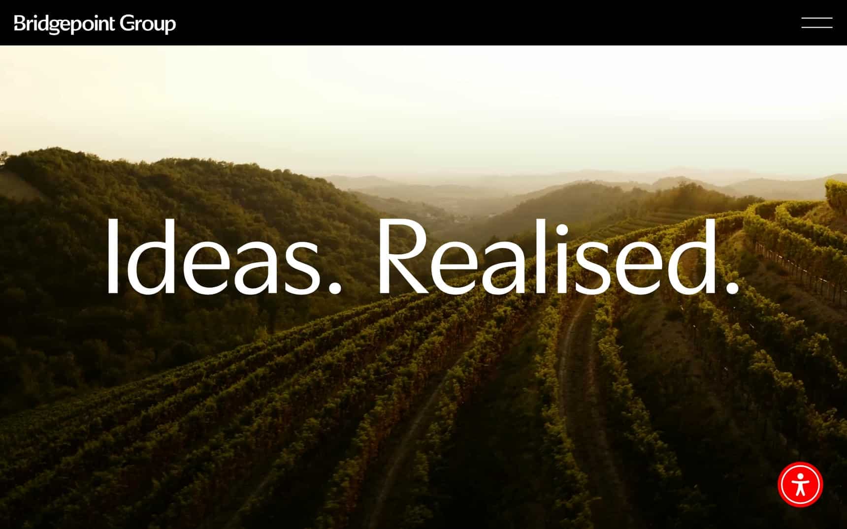
12. Bridgepoint Group
Why it’s good: This site nails the fundamentals with a clean, well-balanced, visually impactful design tailored to the private equity space.
What we love most:
- Fantastic visuals
- Strong fundamentals that serve as an excellent reference for private equity site design
13. Oak Hill Capital
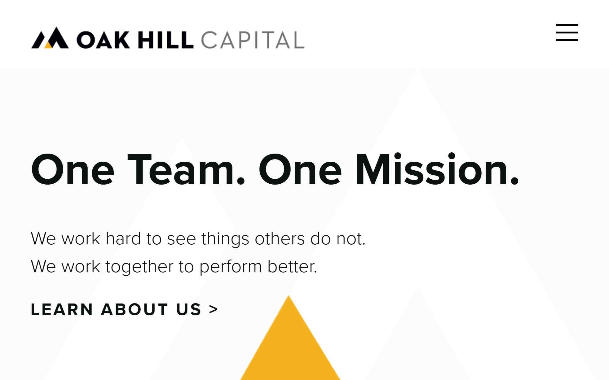
Why it’s good: Oak Hill Capital’s site has a modern, minimalist feel that is supplemented by classy photography and a sharp color palette.
What we love most:
- Classy black, white, and yellow color palette
- Striking photography that integrates seamlessly into the design
- Modern black-and-white sections with a polished look
14. AlpInvest Partners
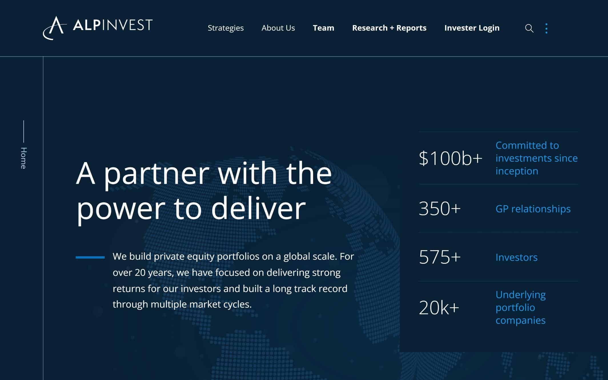
Why it’s good: This website design is visually engaging and easy on the eyes.
What we love most:
- Split scroll elements that create visual interest
- Simple graphic illustrations that effectively highlight key messaging
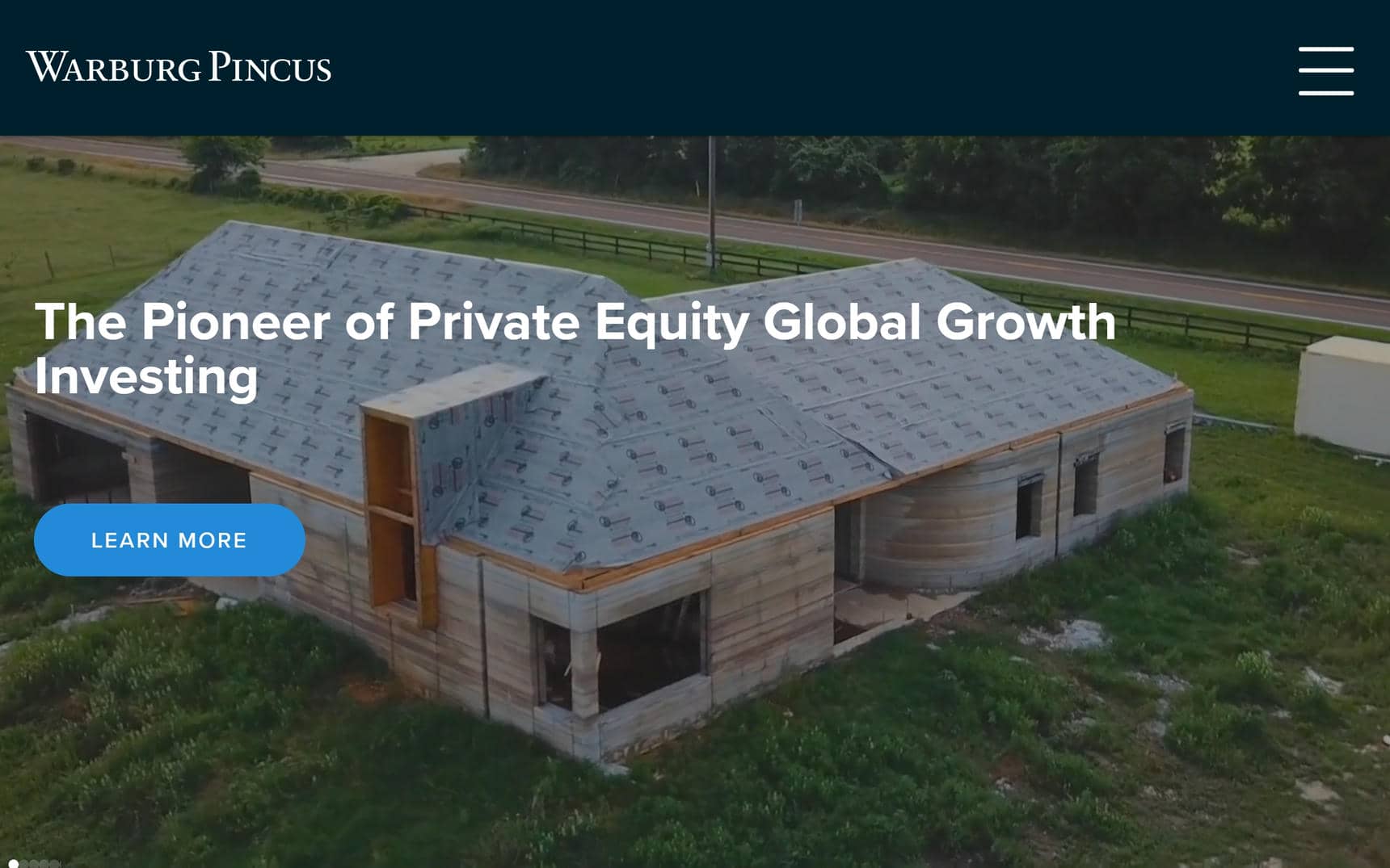
15. Warburg Pincus
Why it’s good: This design is focused and efficient, delivering information quickly without distraction.
What we love most:
- Oversized typography that draws attention to key messages
- Clean, easy-to-browse Investments page
- Short pages that stay focused and to the point
Private Equity Website Design Inspiration
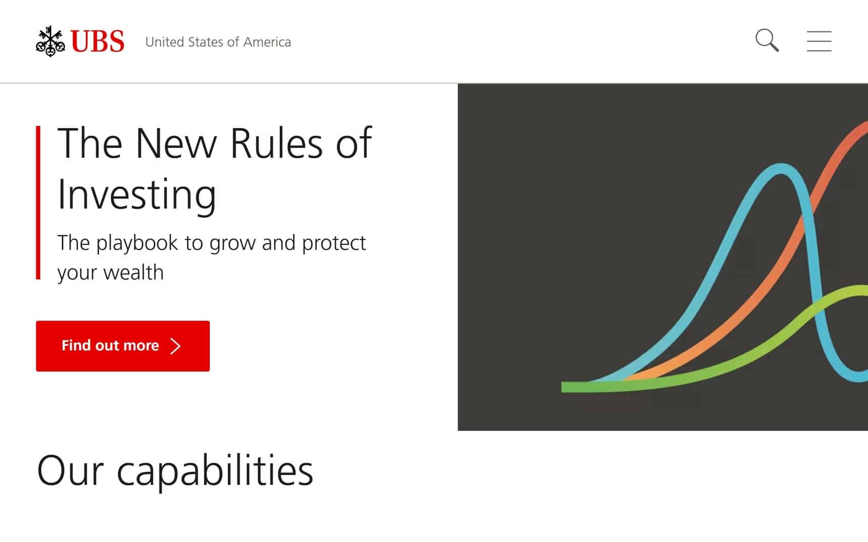
16. UBS
Why it’s good: UBS’s website has a clean, light, and breathable design.
What we love most:
- Clean, breathable layout
- Light creative touches, including subtle illustrations
- Heavy use of square design elements
- Nicely organized footer that supports user-friendly navigation
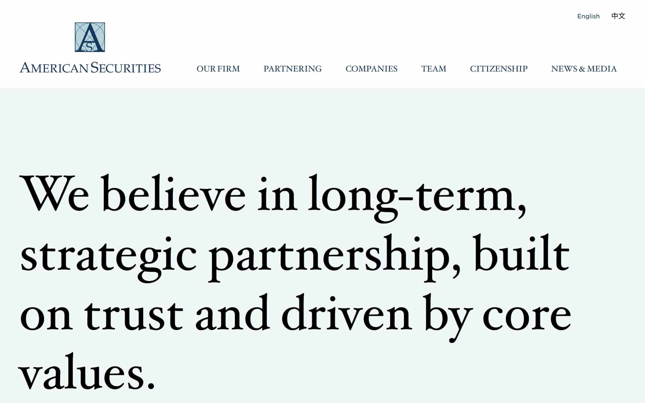
17. American Securities
Why it’s good: This website offers a great example of how to weave brand messaging into a design.
What we love most:
- Oversized fonts that enhance readability
- Clear, linear page layouts that guide the user
- The layout uses big headings to highlight key messages
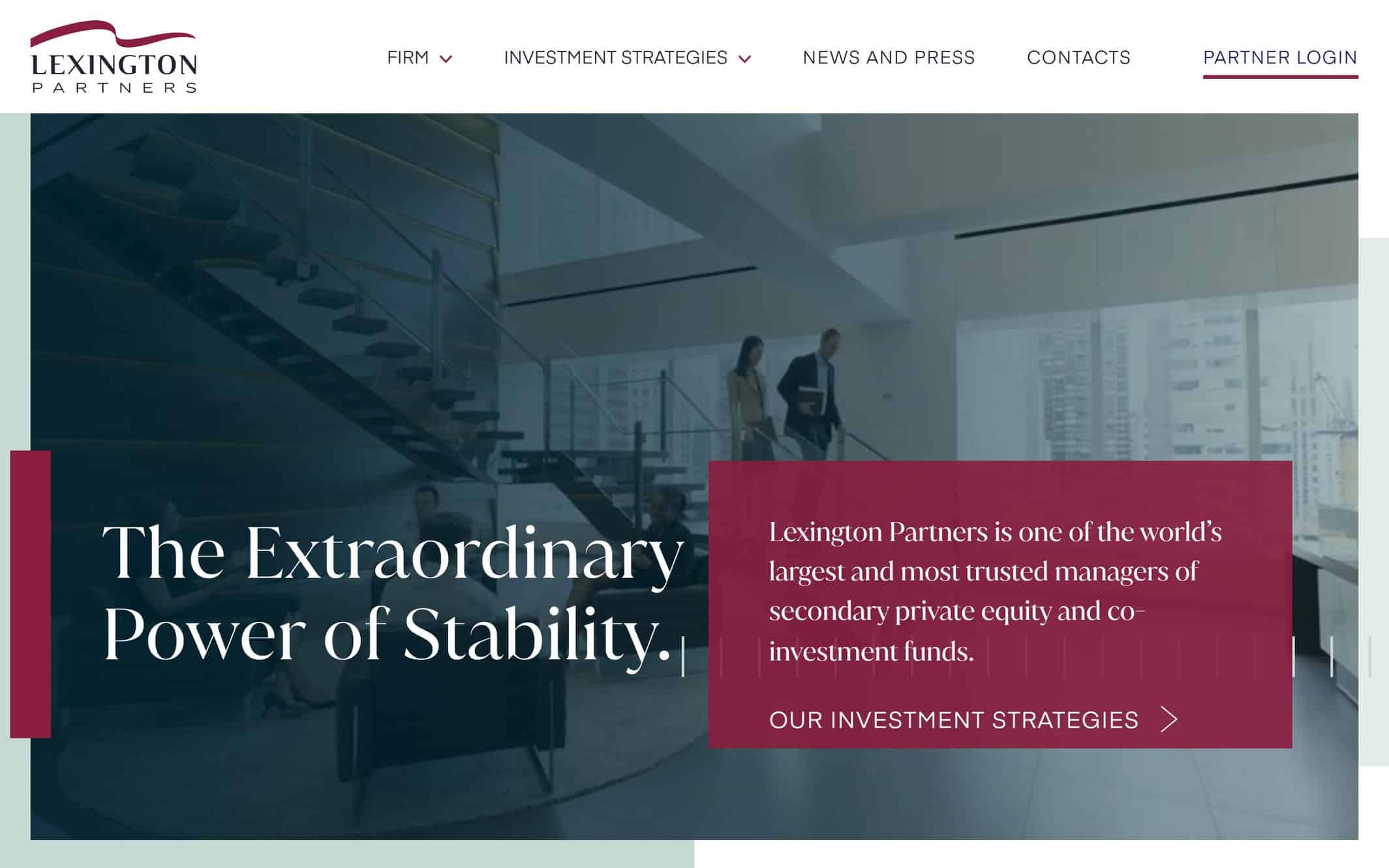
18. Lexington Partners
Why it’s good: Lexington Partners’ website handles the fundamentals exceptionally well. It’s a strong reference point for anyone wanting to build a website in the private equity space.
What we love most:
- Hover-to-expand elements that add movement and interactivity
- Subtle creative touches
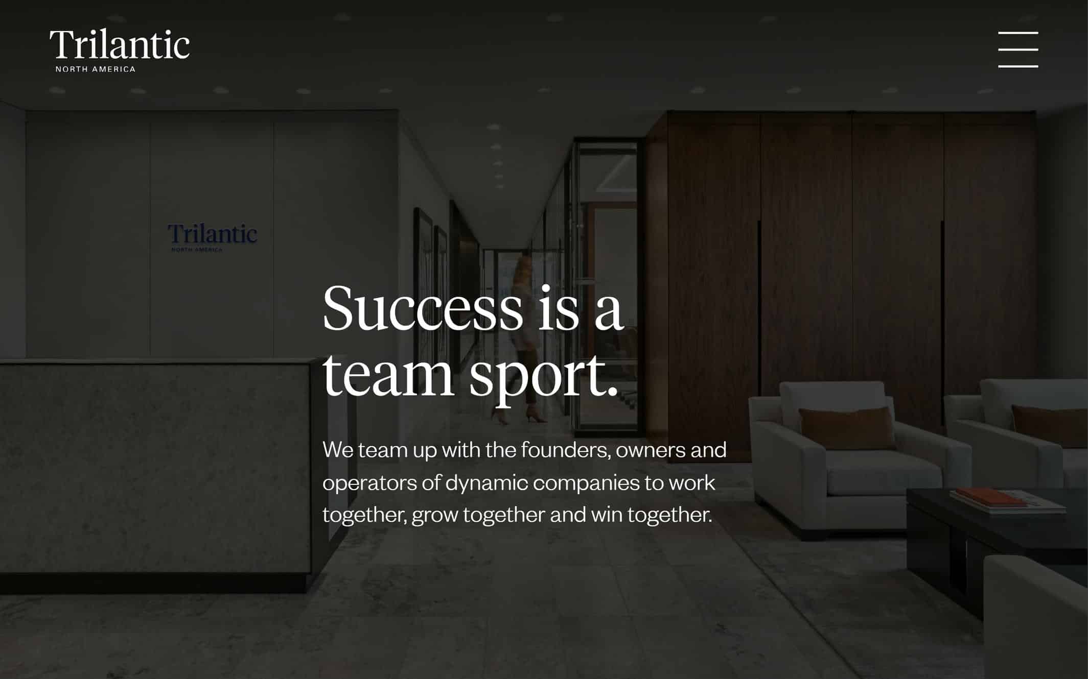
19. Trilantic North America
Why it’s good: This site has a clean, well-structured design that presents content clearly and effectively. Strategic visual elements are used thoughtfully to support the overall flow.
What we love most:
- Muted image backgrounds
- Clean Team page featuring an image gallery layout
20. Summit Partners
Why it’s good: This website has a cool-toned, professional design with subtle creative touches and a well-balanced layout.
What we love most:
- Powerful opening video that makes a strong first impression
- Cool-toned palette ranging from white to deep blue

Private Equity Website Design Examples
21. Patient Square Capital
Why it’s good: This site has a straightforward, genre-appropriate design that aligns well with the firm’s focus on healthcare investments.
What we love most:
- Clean, no-nonsense layout that prioritizes clarity
- Strong alignment between design and industry focus

22. Francisco Partners
Why it’s good: From the opening video to the overall layout and flow, every aspect of this design is masterfully implemented.
What we love most:
- Beautiful opening video that sets the tone
- Classy, consistent branding throughout
- Large, readable fonts that make the messaging stand out

23. Vista Equity Partners Management
Why it’s good: This site has a sharp, modern feel and a layout that’s clean, professional, and visually dynamic. Every section is intentional and smartly conceived.
What we love most:
- Creative use of layout and design elements
- Secondary navigation that improves usability
- Well-executed, visually cohesive footer

24. Charlesbank Capital Partners
Why it’s good: This design gets the fundamentals right, with a clean layout, strong visuals, and easy-to-read typography. It’s a pleasure to browse.
What we love most:
- Clean layout with breathable, well-spaced sections
- Large fonts that enhance readability
- Thoughtful use of imagery throughout
- The News page is styled like a text-based article feed

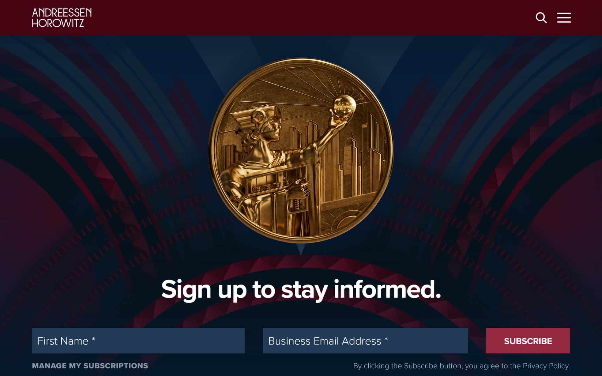
25. Andreessen Horowitz
Why it’s good: This design is beautiful and supremely well organized.
What we love most:
- Phenomenal organization of the News & Content page
- Creative use of backgrounds and typography on the About page
Private Equity Sites
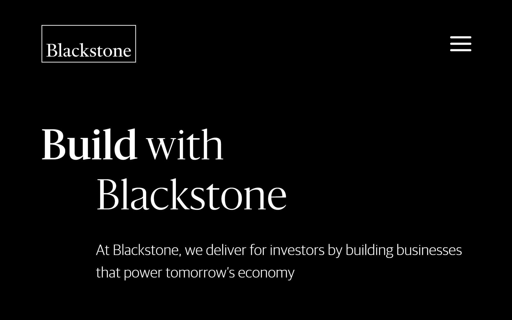
26. Blackstone
Why it’s good: Blackstone’s website has a refined and authoritative look and feel.
What we love most:
- Strong black-and-white color scheme
- Smooth transitions between light and dark sections
- Creative but restrained use of typography
- Clean, well-organized navigation menu
27. Silversmith Capital Partners
Why it’s good: Silversmith’s site is a great example of clean, effective design done right. It sticks to the fundamentals with clarity and polish, making it a good example to reference.
What we love most:
- Strong, well-executed branding
- Clean, readable layout that enhances usability

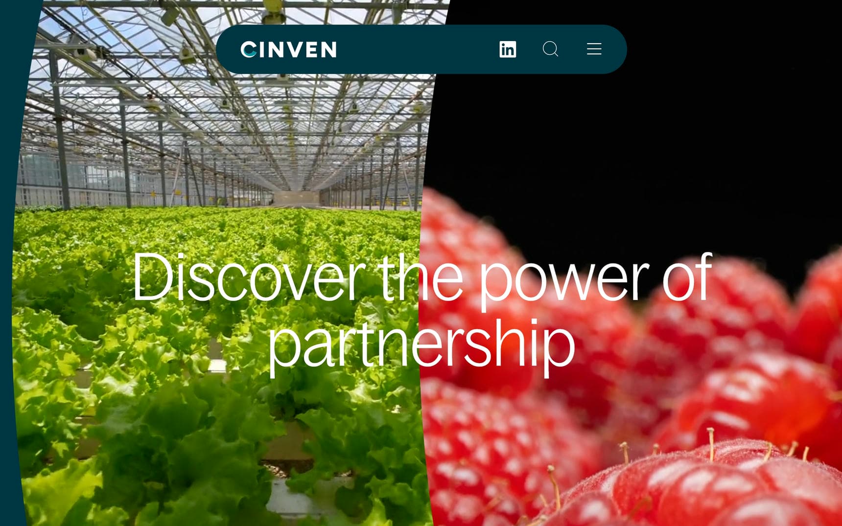
28. Cinven
Why it’s good: This design is sleek, polished, and has a modern, cutting-edge feel.
What we love most:
- Smooth, user-friendly layout
- Gorgeous site aethestic
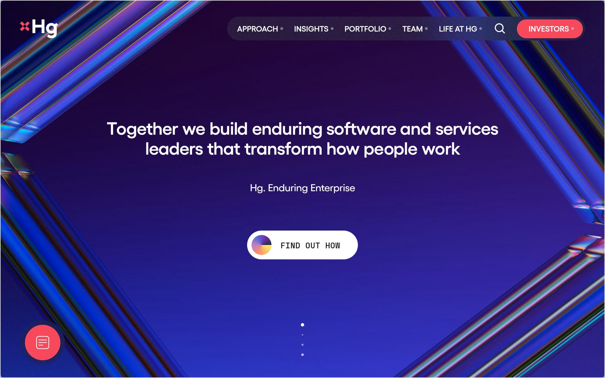
29. Hg
Why it’s good: Hg’s website is fantastic. What else can we say? Every page offers something new and unexpected.
What we love most:
- Unique branding throughout the design
- Impressive 3D branded background elements that transform while scrolling
- Looping video integrations
- Interesting color transitions between sections
30. Apax Partners
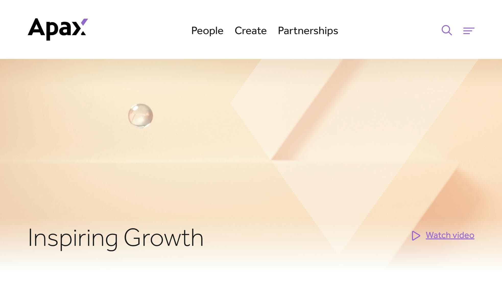
Why it’s good: Apax’s site is a standout example of creative, visually dynamic design in the private equity space.
What we love most:
- Dynamic visual elements that add movement and energy
- Dual navigation system with both a short menu and a hamburger menu
- Convenient search feature
- Well-designed People pages that are easy to browse and navigate
Best Private Equity Website Designs Conclusion
We hope this roundup of the best private equity website designs has sparked some ideas for your own site.
Ready to take the next step? Let’s talk about your vision and create something that sets you apart.