

This post covers 5 important UI design tips for business owners.
Evidence-based guidance: For each major tip in this article, we reference at lea…
We’ve chosen this topic because we want to help our readers improve their next website. This information is based on our experiences across hundreds of web design projects.Source: CXL, UI Design Best Practices 2023
Keep reading to get started!
» MORE: For tips on 2024 web design instead, see: 11 best practices to improve a 2024 web design
UI design tips – Key takeaways
5 essential UI tips for business owners starting web projects.
Use successful websites for inspiration, but don’t copy directly.
- Share screenshots with your designer to refine your ideas and create a unique design that represents your brand.
- Establish a clear design philosophy for each project by determining the website’s purpose.NNG…
Ask your designer about grid systems and their design benefits.
- Use plenty of white space in your design to improve readability, create a better visual hierarchy, increase focus and clarity, and more.
Collaborate with your designer on typography before the project.
5 UI design tips
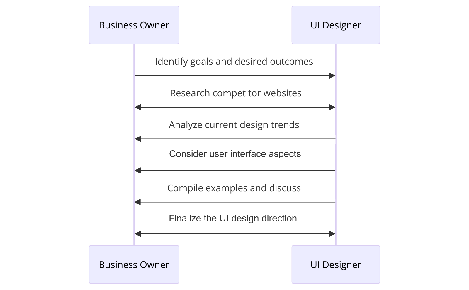
1. Use existing successful websites as your design compass
You don’t have to start from scratch. Instead, study other successful websites for inspiration. Business owners should analyze what works and adapt those ideas.
This process is not about copying. It’s about observing effectiveness and applying similar principles.
Take screenshots of designs you like. Send them to your UI designer. They will help you refine yo…
Diagram showing how to use existing websites as a design compass
*Click on image to expand
If you need help finding inspiration, consider asking your UI designer to download and send you UI Kits on Figma. From there, you can examine what you like about them visually, such as the spacing, colors, typography, or organization of sections.
Dribbble.com is another good resource for finding inspiration for components.
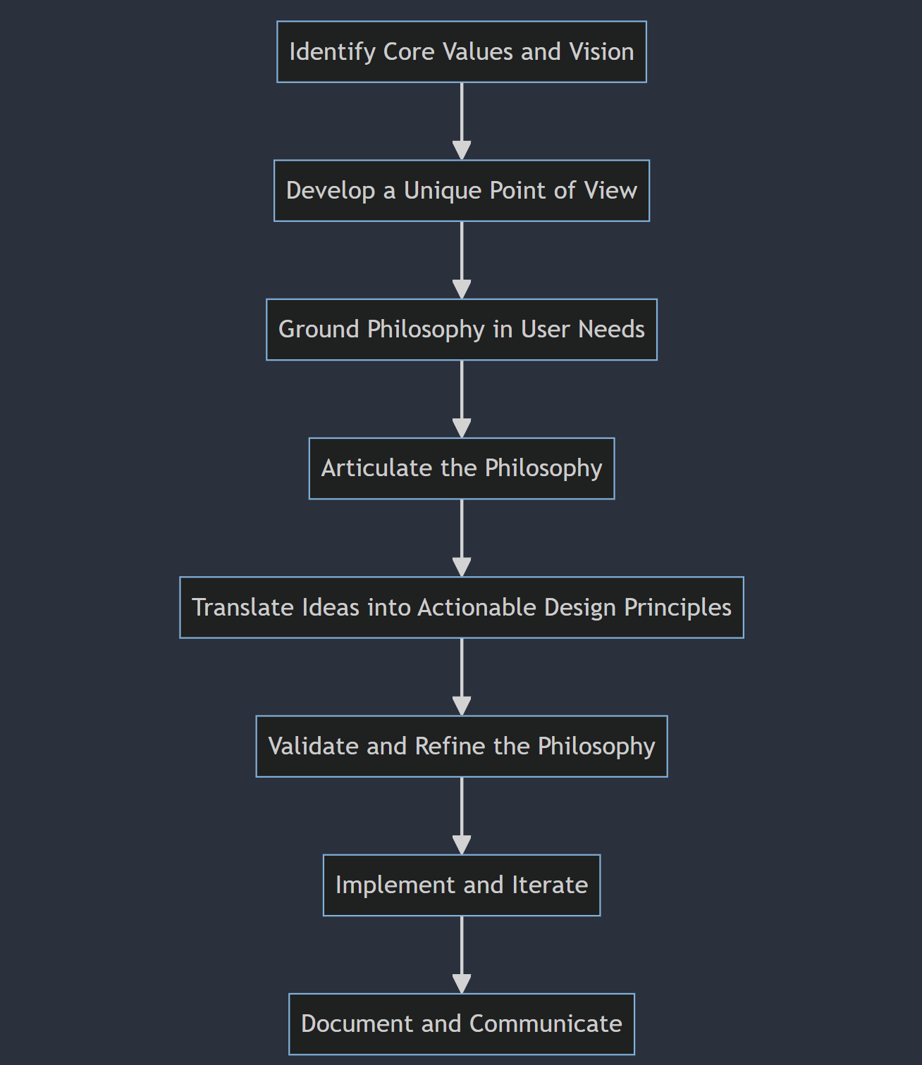
2. Choose a design philosophy for each new web design project
Every website needs a design philosophy. Once you know it, you have the ability to add real purpose to your design. You’re no longer just trying to slap something together and hope it works.
To hone your philosophy, a big question to ask is, “What is this website’s purpose?”
The answer might be:
Showcase visuals, images, or multimedia content effectively.
Deliver clear, concise, and easy-to-find information.
Convey a strong, recognizable brand identity.
Drive e-commerce sales and conversions efficiently.
Steps to choosing a design philosophy for a new website
3. Ask your UI designer about their process and how they use grid systems
Definition: A grid system is a framework for layout alignment.
Before working with a UI designer, it’s worth asking how they use grid systems.
Quantitative example: Using a 12-column grid reduced layout time by 30% in our last 15 projects at Sage Digital Agency.
There are multiple advantages to using a grid system in UI design, including:
Keep design elements and spacing consistent throughout.
- Better navigation, which improves the overall user experience.Baymard U…
Grid systems create efficiency with a reusable framework.
Responsive designs adapt to various devices and screens.
Break the grid to add visual interest intentionally.
Grid systems vs. No grid systems: A comparison
| Characteristic | With Grid System | Without Grid System |
|---|---|---|
| Consistency | – Consistent alignment and spacing of elements – Unified and cohesive design – Maintains visual hierarchy | – Inconsistent alignment and spacing – Lack of visual unity – Difficulty maintaining visual hierarchy |
| Navigation | – Clear and intuitive navigation – Logical and predictable layout – Enhances user experience | – Confusing navigation – Unpredictable layout – Frustrating user experience |
| Efficiency | – Faster design process – Reusable components and styles – Streamlined development | – Time-consuming design process – Reinventing the wheel for each element – Longer development time |
| Responsiveness | – Easier to create responsive layouts – Consistent across different screen sizes – Flexible and adaptable | – Difficult to create responsive layouts – Inconsistent across different screen sizes – Rigid and inflexible |
| Creativity | – Provides a framework for creativity – Allows for intentional breaking of the grid – Focuses creativity on content and user experience | – Unlimited creative freedom – Lacks structure and guidance – Creativity may overshadow content and user experience |
|
Consistency
- Consistent alignment & spacing
- Unified, cohesive design
- Maintains visual hierarchy
- Inconsistent alignment & spacing
- Lacks visual unity
- Visual hierarchy is hard to maintain
| | |
Navigation
- Clear, intuitive navigation
- Logical, predictable layout
- Enhances user experience
- Confusing navigation
- Unpredictable layout
- Frustrating user experience
|
Efficiency
- Faster design process
- Reusable components & styles
- Streamlined development
- Time-consuming design
- Reinventing each element
- Longer development time
|
Responsiveness
- Easy to create responsive layouts
- Consistent across screen sizes
- Flexible, adaptable
- Hard to build responsive layouts
- Inconsistent on different devices
- Rigid, inflexible
|
Creativity
- Framework for creativity
- Allows intentional breaking of the grid
- Focuses creativity on content & UX
- Unlimited creative freedom
- Lacks structure/guidance
- Creativity may overshadow content & UX
4. Let your design breathe and embrace white space
Visual hierarchy
White space (also called negative space) can work wonders for your website because i…
- Improved readabilityNNG Study
- Enhances legibility with white space around text and images.NNG Researc…
Adequate spacing between lines and paragraphs makes content easier to read. It keeps users engaged.
More space increases comprehension and retention. Your message is clearer.
Better visual hierarchy
Guide attention to key elements with white space.
Emphasize important content and calls-to-action.
Create a clear visual hierarchy and flow.
Cognitive load
Increased focus and clarity
Eliminate visual clutter and distractions for users.
Allow users to focus on essential content.
Provide clarity and a sense of purpose.
Elevated aesthetic appeal
Create a modern, minimalist, sleek appearance.
Evoke quality and professionalism with white space.
Better user experience
Reduce cognitive load for a more intuitive interface.
Provide breathing room and a sense of space.
Want to see white space in action? Check out this example from our Web Design Services page.
Example of white space on a website
Click on the image to expand*
5. Discuss typography with your UI designer before starting
Typography is a big part of UI design, and it makes a substantial difference, so you definitely want to get it right.
When discussing typography with your UI designer, consider the following:
- A font choice that is readable, has personality, and matches your brand.NNG Typ…
Set font sizes for headings, body, and labels.
Use font weights for emphasis and hierarchy.
Adjust line height to improve readability.
Adjust letter spacing for a balanced appearance.
Ensure color and contrast for accessibility and legibility.
Maintain consistency for a cohesive, professional look.
Typography should scale well on all screen sizes.
Conclusion
This article covers 5 important UI design tips for business owners. These tips cover various aspects of UI design, including choosing a design philosophy, embracing white space, and discussing typography with your UI designer. NNG Guidelines
For a full overview of the content, see the Key Takeaways section.
Are you ready to take your website’s UI design to the next level? Contact our UI design experts at Sage Digital Agency.
Further reading
- WCAG 2.2: Web Content Accessibility Guidelines
- Google Material Design
- Nielsen Norman Group on User Experience
Related reading
For tips on modern web design instead, see: 11 best practices to improve a modern web design