


In this article, we explore 11 less-mentioned best practices for modern web design that can help make a better website.
This information is based on our years of experience in the web design industry, working with a wide range of clients and projects.
Let’s examine how these best practices can help you avoid bad websites and ultimately benefit from a site that takes you to the next level.
Best practices for modern web design – Key takeaways
- Balance minimalism and information density to ensure user-friendliness and functionality.
- Offer Dark Mode and Light Mode options to meet user preferences.
- Avoid scroll hijacking to prevent user frustration.
- Be mindful of endless scrolling so as to provide easy access to all site content.
- Prioritize scrolling over clicking as a general rule.
- Use sparingly intrusive elements like pop-ups and ads to avoid annoying users.
- Stick to one font for a cohesive and streamlined look and feel.
- Incorporate your main color in the website’s images for a consistent brand identity.
- Strike a balance between usability and creativity on your website.
- Design for mobile, but don’t neglect desktop users and their needs.
- Draw inspiration from old-school websites to create a trustworthy, familiar, and easy-to-navigate site.
11 best practices for web design today
We’ve all heard the following advice before when it comes to web design:
- Maintain visual consistency
- Incorporate white space
- Create an information hierarchy
- Optimize for mobile
- Focus on navigability
- …and so on.
Now, let’s look at other ways to improve modern web design.
1. Balance minimalism and information density
Today, websites NEED a better balance of minimalism and information density. This is because modern websites often swing to extremes, either over-stuffing designs or oversimplifying them.
CNN’s home page is a good example of an over-stuffed page. It is quite dense with information and somewhat disorienting. CNN Lite, meanwhile, has an extremely simple design.
By the way, it’s worth noting that CNN Lite was intentionally designed this way to provide a streamlined, fast-loading alternative to the main CNN website. However, it does illustrate the extreme simplicity that some modern websites gravitate toward, often prioritizing speed and ease of use over depth of content.
*Click on the image gallery to see a comparison of CNN’s home page and CNN Lite.
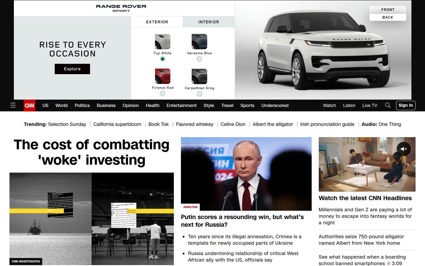
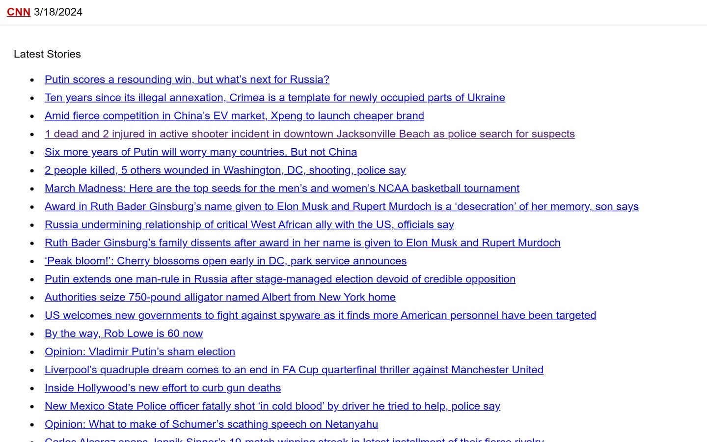
These two examples sit on opposite ends of the web design spectrum, with the ideal balance somewhere in between.
Achieving this balance can be challenging since users now expect websites to offer robust, app-like experiences. As a result, developers might be tempted to over-engineer solutions to showcase their skills or, conversely, utilize an ultra-minimalistic approach to achieve a trendy, modern design.
Finding the right balance means:
Prioritizing user needs over design trends, providing clear, easily navigable interfaces, and avoiding clutter and overwhelming visuals. ✅
2. Make options for Dark Mode and Light Mode, if feasible
Dark Mode and Light Mode are two popular design trends with divided user preferences, and the debate over which is better (if either) encompasses a range of factors.
Given the divide, one approach to modern web design is to offer both modes and let users choose. YouTube is a good example of this approach put into action.
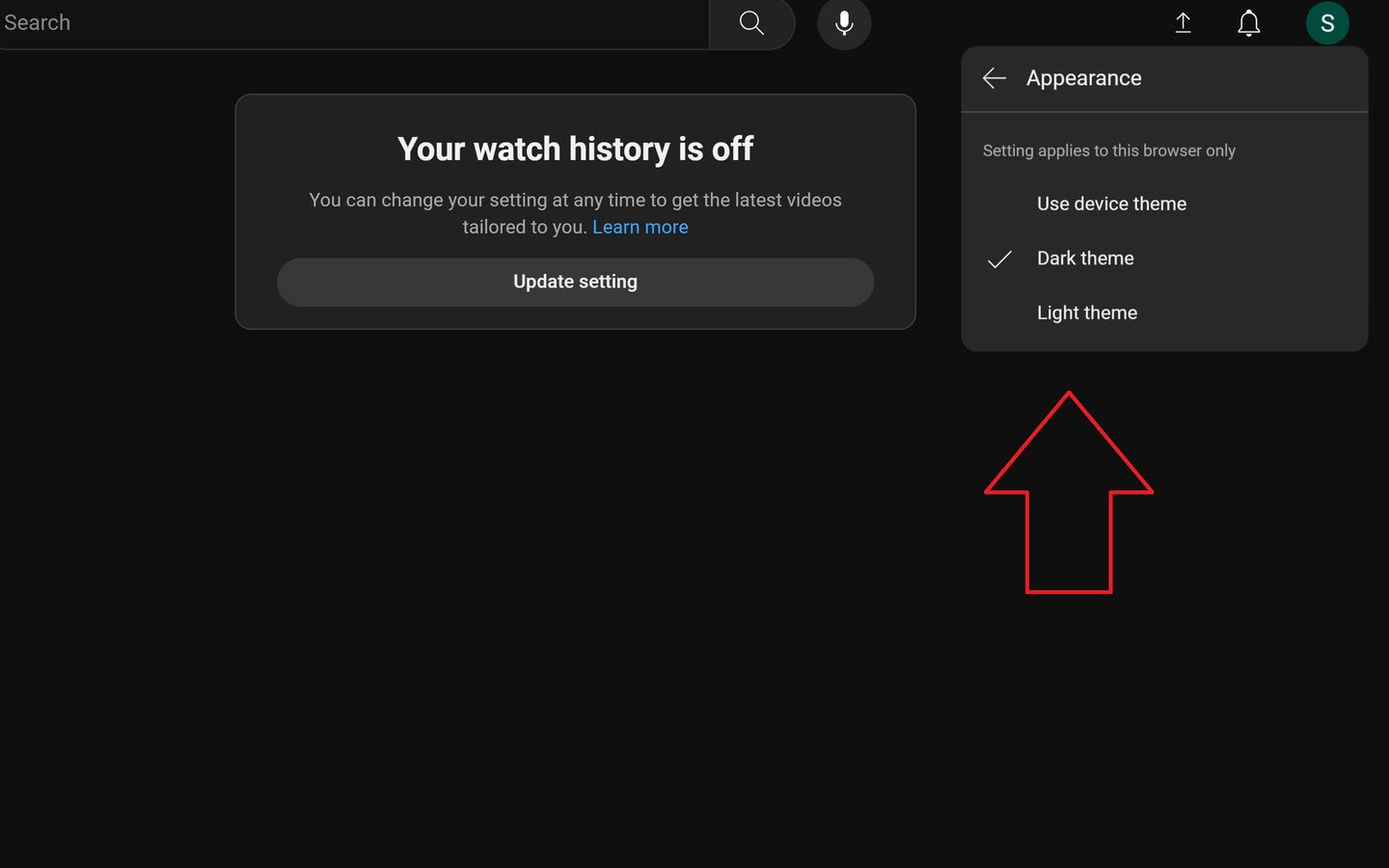
YouTube allows users to change between modes by clicking on the Profile button/Account icon at the top right corner of the screen and then clicking on Appearance. From there, YouTube offers three options: Use device theme, Dark theme, and Light theme.
Other websites besides YouTube have their own ways of allowing users to switch between modes, such as automatic switching based on sunrise/sunset. If no apparent mode switch is available, you can also use Dark Reader. Dark Reader is an extension that enables you to use Dark Mode on Google Search, Facebook, Amazon, and many other websites.
Why don’t more websites use Dark Mode?
There are core reasons why a lot of websites today lack Dark Mode:
- It requires at least double the work to design and implement.
- It is more expensive to add both Light Mode and Dark Mode.
- Implementing Dark Mode can introduce compatibility challenges across different browsers and devices.
- Many clients avoid requesting Dark Mode.
- Extensions already exist that can turn a website dark, such as Dark Reader.
Many web users LOVE Dark Mode
Despite the challenges it presents to design, many web users prefer Dark Mode, meaning it could be worth factoring into a web design.
In a small-scale survey run by Narola Infotech (Gitnux), 95% of respondents preferred Dark Mode over Light Mode. Moreover, according to EarthWeb, 81.9% of smartphone users will use dark mode in 2024.
3. Do not hijack scrolling
Scrolljacking is when a website manipulates your scrolling experience, usually with the goal of improving the user experience or showcasing a narrative or product in a more engaging way.
If you’re not familiar with scrolljacking, imagine trying to scroll down a webpage as usual, but instead of moving smoothly at your own pace, the page jumps or slides to specific sections on its own.
Mind map of ways websites use scrolljacking:
*Click image to expand
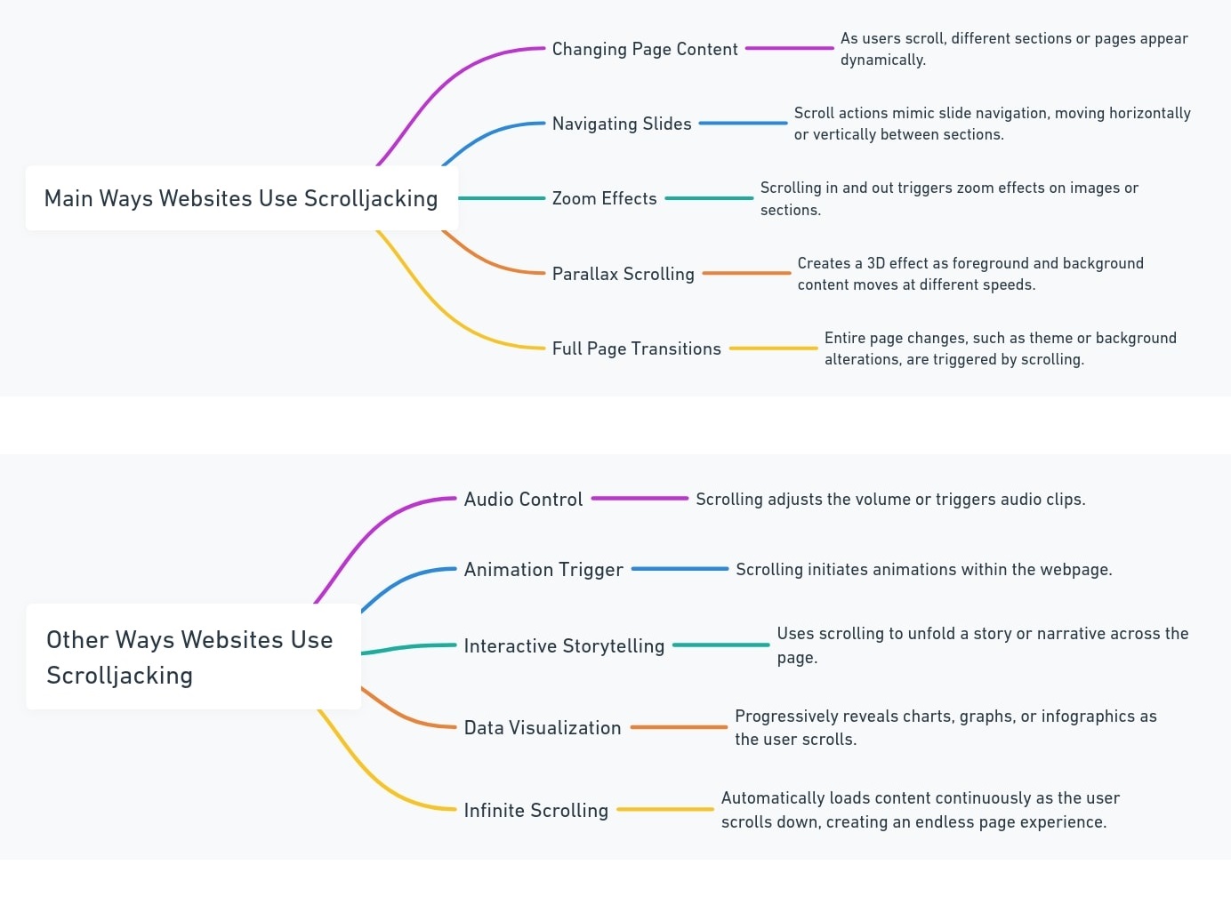
Unfortunately, these interventions can make the user experience worse by undermining the user’s control and expectations. In fact, scrolljacking often causes frustration and disorientation among users, which is why it is almost always better left unused or used minimally.
To avoid the adverse effects of scrolljacking, best web design practice suggests the following:
• Maintain a natural scroll rate.
• Preserve standard scrolling sections.
• Keep consistent scroll directions.
• Avoid variable text lengths.
• Test across devices and browsers after any implementation of scrolljacking.
4. Be careful with endless scrolling and don’t overdo it
Endless scrolling is a modern web design trend fueled by smartphones and social media.
It is a frequent nuisance for web users today who want to find a specific piece of information but end up bombarded with new content as they scroll.
Beyond simple annoyance, there are a number of drawbacks to infinite scrolling. See the table below for the main ones.
Table of infinite scrolling drawbacks:
| Category | Issue | Description |
|---|---|---|
| User Experience | Difficult to Reach Footer | Important links in the footer become hard to access. |
| Overwhelming Content | Users may feel overwhelmed by the never-ending stream of content. | |
| Performance | Memory Usage | Continuously loading content can increase memory usage, leading to sluggish performance. |
| Slow Load Times | The initial load might be fast, but performance can degrade as more content loads. | |
| Accessibility | Difficult Navigation | Not all assistive technologies cope well with dynamically loaded content. |
| Content Discovery | Harder to Find Specific Information | Without clear endpoints, users may struggle to locate specific content or judge how comprehensive their search has been. |
| Engagement Metrics | Skewed Analytics | Time on site and other metrics can be inflated, giving a misleading picture of user engagement. |
Infinite scrolling can be especially bad in ecommerce stores
While infinite scrolling can be more or less tolerable on a regular website, and even useful if implemented correctly, it can be an absolute nightmare in ecommerce.
Picture an online clothing store with endless scrolling, where instead of looking through a grid of products, you have to scroll through an infinite feed of individual items.
Naturally, you might exhaust yourself after scrolling past dozens or hundreds of irrelevant products, never finding the item you were looking for. See the problem?
Why infinite scrolling is often used
Despite its drawbacks, infinite scrolling remains popular for the following reasons:
- It can be effective for content that is consumed passively and continuously, such as social media feeds.
- Infinite scrolling can keep users on a website by providing an uninterrupted browsing experience.
- For mobile users, infinite scrolling can be easier to navigate than clicking through multiple pages.
- Infinite scrolling can be used to present long-form content, such as articles or blog posts, in a more user-friendly manner.
With this in mind, when implementing infinite scrolling, websites should remember the following:
Users should be able to easily find the website’s content. ✅
Prioritizing UX over trendy designs is best. ✅
Consider using page sections to organize content logically when needed. ✅
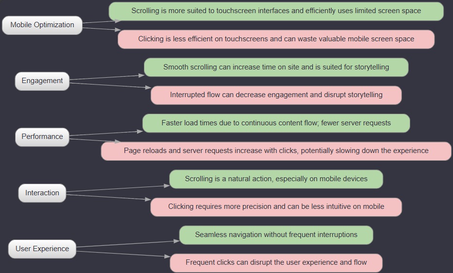
5. Remember scrolling first, clicking second
In the past, scrolling web pages was cumbersome, requiring users to click and drag scroll bars.
However, with the rise of mobile devices and improved input methods, scrolling has become easier and more intuitive than clicking, especially on smaller screens.
As a result, modern websites usually prioritize scrolling over clicking.
Advantages of scrolling over clicking:
6. Go easy on intrusive (and annoying) elements
Browsing the internet today is different from 10 years ago, and for many people, it has become a frustrating experience.
Intrusive elements like ads are common, and many websites use them too often, which ultimately detracts from the UX.
For example, the Innovation > Games page on Forbes contains multiple somewhat distracting advertisements.
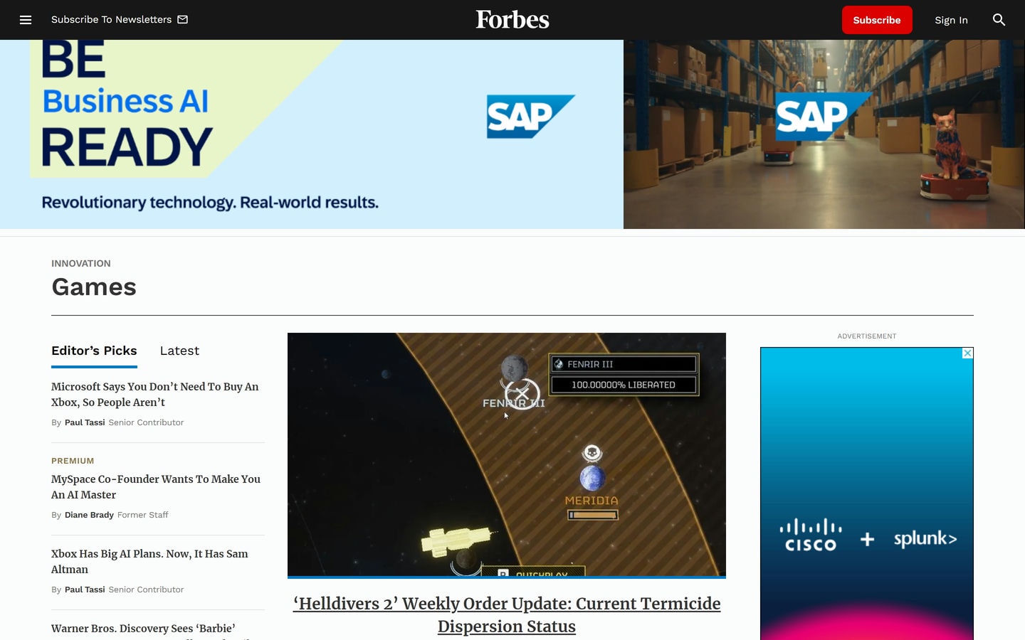
To be fair, Forbes is far from the worst offender. Some websites have so many ads they nearly ruin the browsing experience entirely. It’s frustrating, it’s annoying, and it’s a surefire way to drive people away.
We all get it. Ad money helps keep the lights on. But there’s a fine line between monetizing your site and overwhelming your users with a barrage of ads.
Intrusive elements to avoid as a best practice in web design include:
• Too many ads or sticky ads
• Multiple pop-ups
• Multiple flashing or blinking elements
• Auto-playing videos (These are doable, but audio-playing sound is generally frowned upon by users.)
• Disguised ads (You think you’re clicking on a legitimate link or button, but it’s really an ad in disguise. The worst!)
• Full-page ads (You’re scrolling through a website when your screen is hijacked by a full-page ad, and you can’t continue until you find that elusive “X” button.)
• Forced sign-ups or subscriptions (You want to read an article or access basic information, but the website demands that you create an account or subscribe first.)
• Pagination for the sake of ads (You’re reading an article, and just when you’re getting to the good part, you have to click “next page” only to find a single paragraph and another ad.)
7. Use only one font
While more than one font can be used if needed, we suggest sticking with a single, high-quality font with multiple weights as a best practice for web design.
There are a handful of reasons for this.
Consistency and coherence: Using a single font creates visual consistency and coherence throughout your website.
Brand alignment: Using one font helps focus your website’s brand identity.
Improved readability: Selecting one high-quality font that reads well in long-form content makes your website easier to read and understand.
Simplified design process: Working with a single font simplifies the design process, as you don’t need to worry about ensuring multiple fonts work well together.
Enhanced accessibility: A single, easy-to-read font makes your content more accessible to a wider audience, including those with visual impairments.
Note: It’s common practice to pair a complementary font for headings with the body text font to create visual hierarchy and interest. Using one or two fonts in total is acceptable, depending on what approach you prefer.
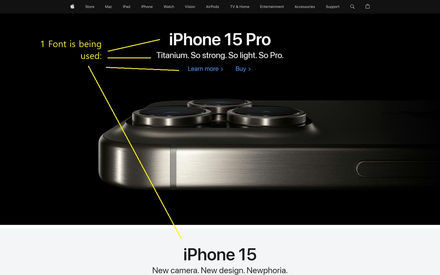
As you can see from the Apple example, one font can do the job. However, selecting a font is just the beginning. The next step is to consider how to implement and style it.
When implementing a font in your designs, keep these best practices for web design in mind:
> Use uppercase text sparingly, reserving it for short headings or emphasis. Overuse can hinder readability, especially in longer passages.
> Experiment with the size and weight of your chosen font to establish a clear visual hierarchy. This helps distinguish between different levels of information.
> If a brand font is mandatory, consider using it exclusively for main headers and rely on your selected font for the rest of the content.
> When choosing a font, prioritize those that perform well in long-form content.
8. Use your main color in your images
Using your brand color in your images is a good practice for modern web design. While you don’t need to use your brand color on every single design element, it does help to use it throughout your website to create a more cohesive look and feel.
You can see an example of this from Checkout.com, where their blue brand color is integrated into various images and text.
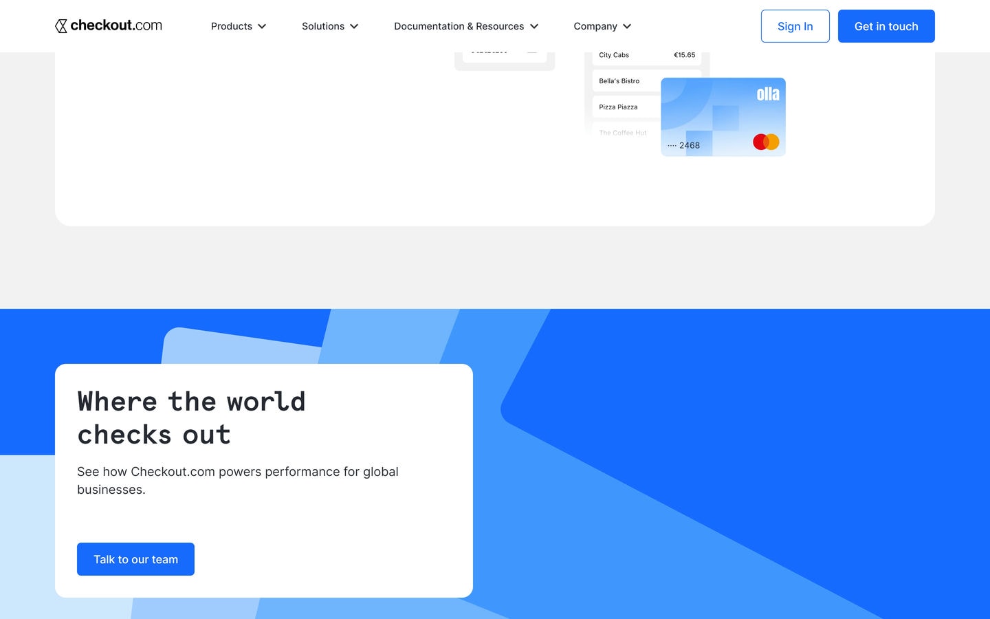
Note: Overusing your main color can make your website feel monotonous or overwhelming, while underusing it may not effectively communicate your brand identity.
A good way to strike the right balance is to use it in small accents and backgrounds. You can also explore various shades and tints of your main color.
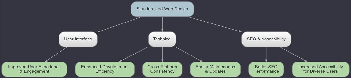
9. Optimize usability, but remember creativity and your unique value
While the early internet saw an explosion of creative and experimental designs, today, the focus has shifted towards standardization.
This is largely because users have come to expect low-friction, high-quality experiences that allow them to quickly find the information they need. Standardized web design makes it easier to offer these kinds of experiences.
Benefits of standardized web design chart:
*Click the image to expand.
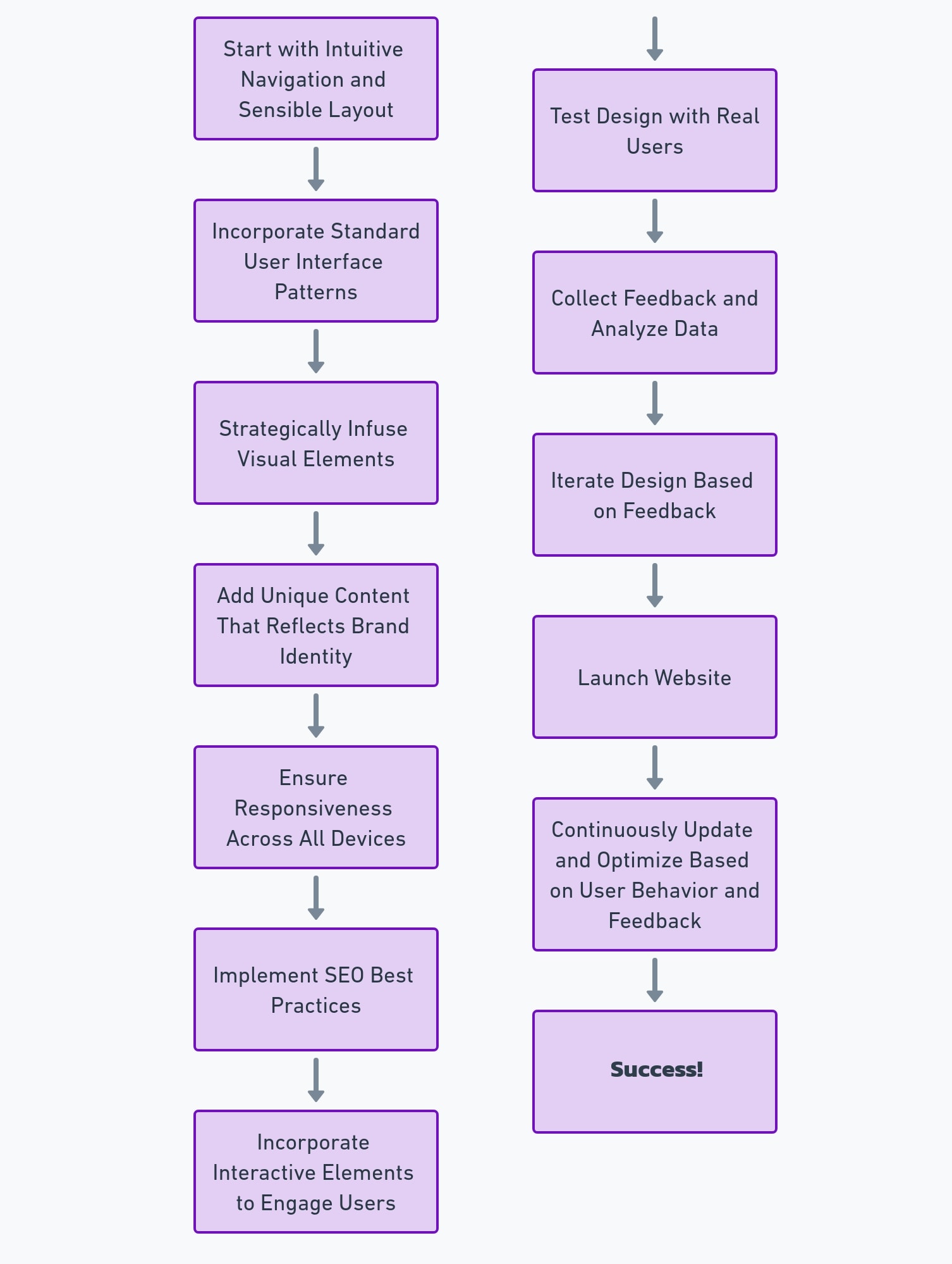
How to make a creative website the right way
While standardization is important, it doesn’t mean that creativity has no place in modern web design.
To find the right balance, designers should follow the general process in this flowchart:
10. Mobile is important, but don’t neglect desktop
Today, finding a balance between mobile and desktop is another challenge, especially now that smartphones have forced many designers to take the mobile-first approach.
To meet this challenge, a best practice for modern web design is to prioritize the design for the primary user platform (be it a desktop or a phone) and then adapt the design to other needs.
This approach avoids the pitfalls of mobile-first design, which can lead to oversimplified desktop versions. ✅
Strategies for balancing mobile and desktop design:
| Strategy | Description |
|---|---|
| Audience Prioritization | Tailor design strategy to the primary platform used by your audience, adapting as necessary for secondary platforms. |
| Design Adaptability | Create designs that are easily adaptable across platforms. |
| Mobile-First Limitations | Be aware of scenarios where mobile-first design may not be the best fit, especially for predominantly desktop applications. |
| Performance Efficiency | Keep an eye on performance efficiency across devices, especially when scaling designs from mobile to desktop. |
| Functionality Focus | Utilize mobile-first to prioritize essential functions and simplify the user interface across devices. |
| CSS and HTML Strategy | If needed, start with mobile-first CSS and HTML for practical styling and layout, then adjust for desktop. |
| Balanced Design Philosophy | Adopt a balanced approach that values both mobile and desktop experiences from the start. |
| Flexible Development Approach | Design and develop for desktop first or mobile first as needed. |
| User Experience | Ensure a cohesive UX across all devices, avoiding oversimplification for desktop users. |
| Strategic Design Decision | Base the choice between mobile-first and desktop-first design on user analytics and specific project goals. |
11. Take some inspiration from old-school websites
Ironically, drawing inspiration from old-school websites can be a smart move in crafting modern web designs.
After all, there’s value in the simplicity and straightforward functionality of older websites like Warren Buffet’s website Berkshire Hathaway Inc.
*Click the image to expand.
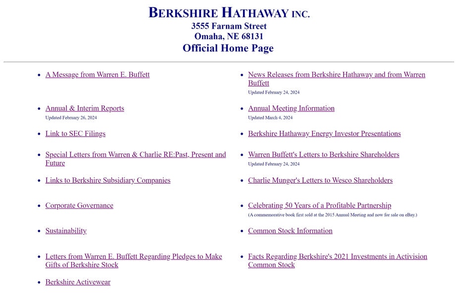
Embracing elements from these timeless designs can satisfy and surprise modern web users. In our opinion, it’s a healthy practice to look at the past to illuminate modern web design approaches.
Best Web Design Practices for Websites – Conclusion
In this post, we covered 11 best practices for modern web design.
These practices include balancing minimalism and information density, offering Dark Mode and Light Mode options, avoiding scroll hijacking, and being cautious and sparing with intrusive elements. See the Key Takeaways in the introduction for a complete list of topics covered.
If you need a new website or a website redesign, these best practices will put you on the right track. If, on the other hand, you need our help implementing these web design best practices, visit our Connect page.
We’d love to hear about your project and work with you to create an exceptional website!