Want to see the worst websites on the internet today?
Look no further….On this list, we’ll be showing you 30 of them.
PS Some of these websites get millions of visitors a year. Imagine that!
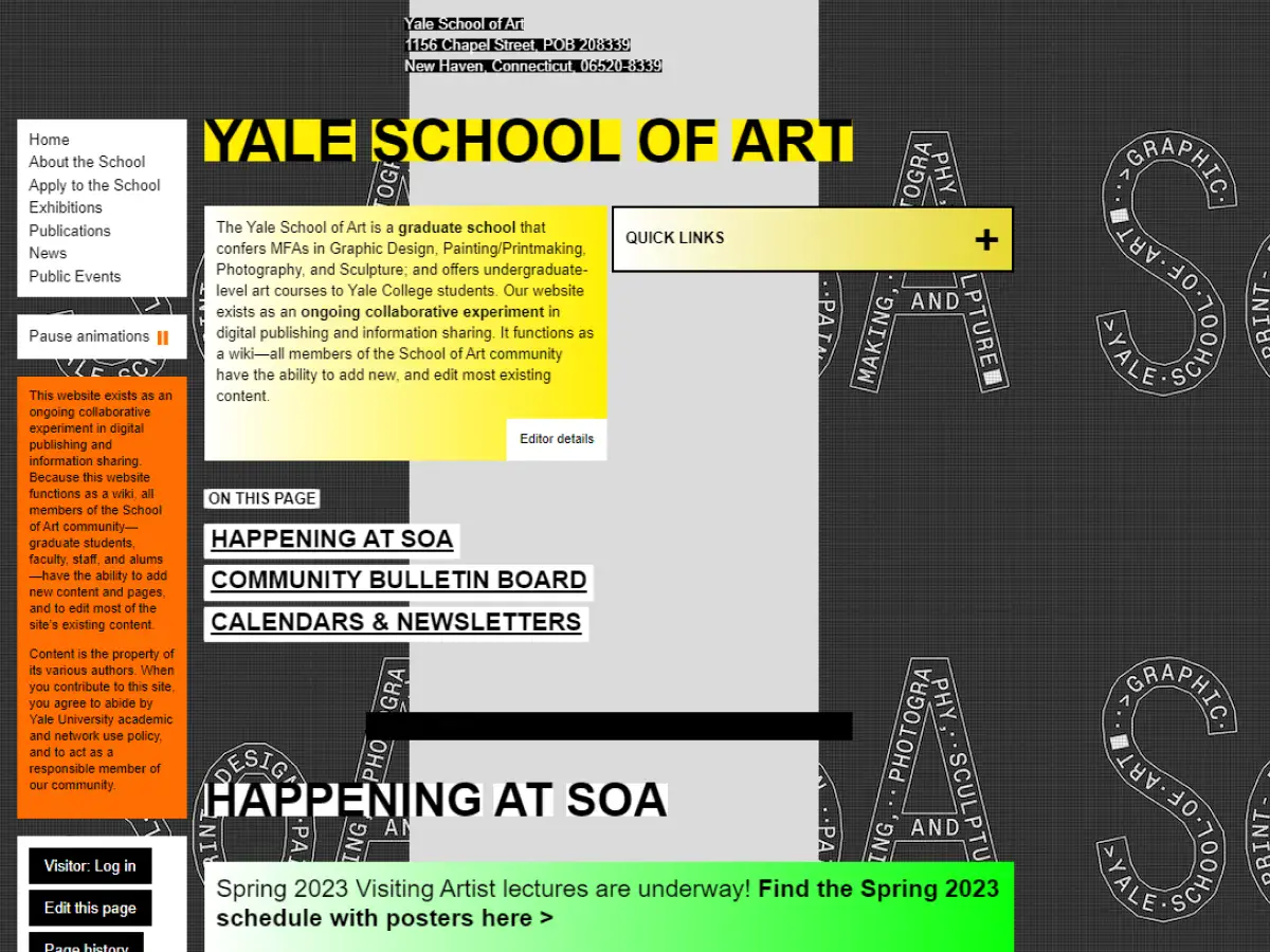
1. Yale University School of Art
Why it’s bad: The layout is bizarre, to say the least, and the font is too small. Plus, the backgrounds on each page aren’t exactly what you’d call appealing.
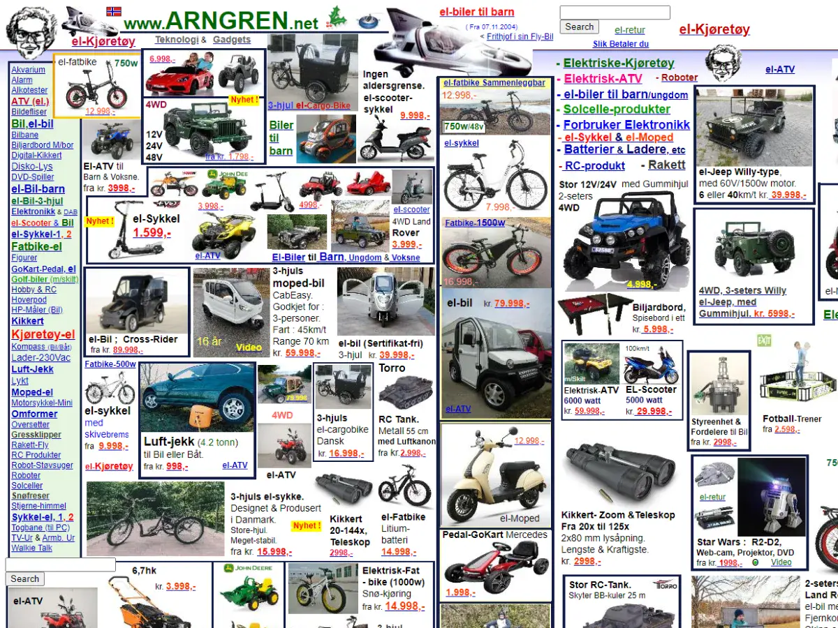
2. Arngren
Why it’s bad: Holy smokes, this is one of the most cluttered websites we’ve ever seen.
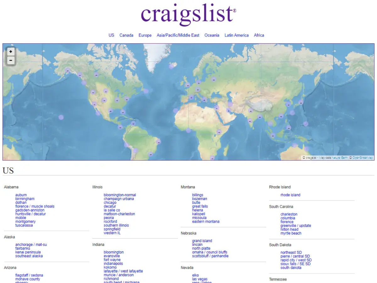
3. Craigslist
Why it’s bad: Craigslist feels like it’s been stuck in the late 90s forever. Then again, the site does have a certain charm to it. What do you think?


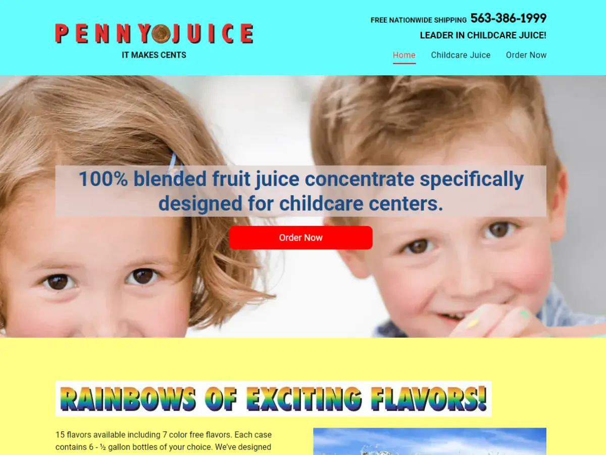
4. Penny Juice
Why it’s bad: We blame the website’s header for intruding on the layout. Also, the site’s font and color choices need some serious work.
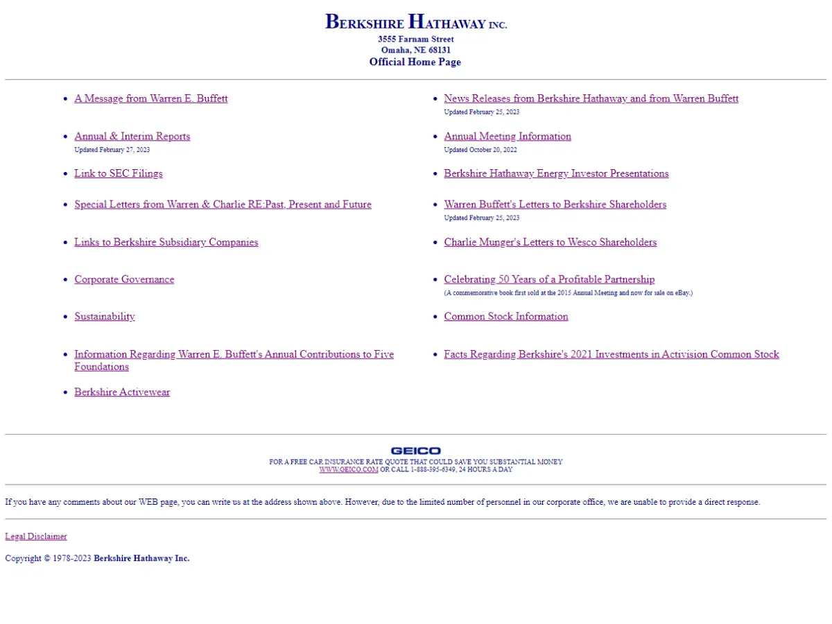
5. Berkshire Hathaway
Why it’s bad: This is a very simple design that lacks creative elements. It almost feels like a placeholder for a website that should replace it and become the final product.
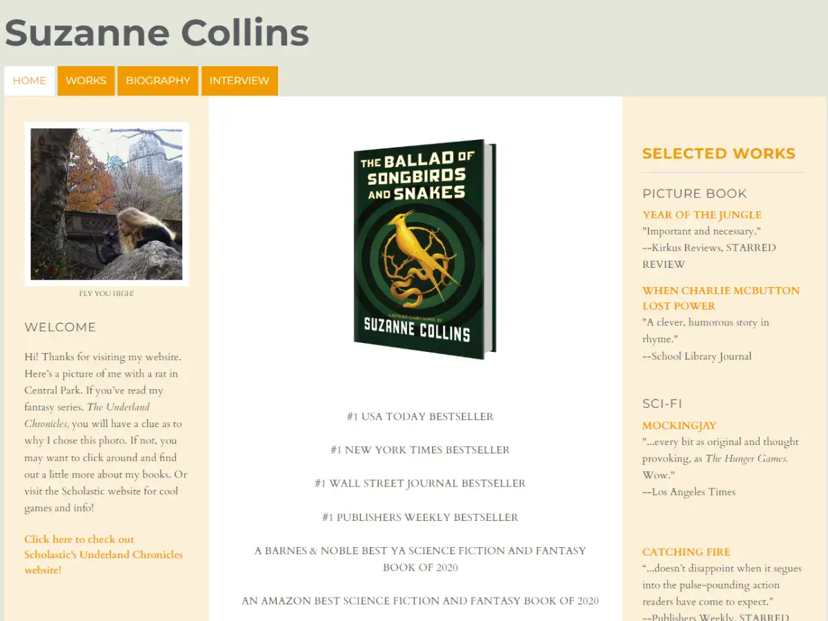
6. Suzanne Collins
Why it’s bad: We love Suzanne Collins as an author, but her website doesn’t hit the mark. The site feels like a free blog page rather than a robust portal to a world-class writer.
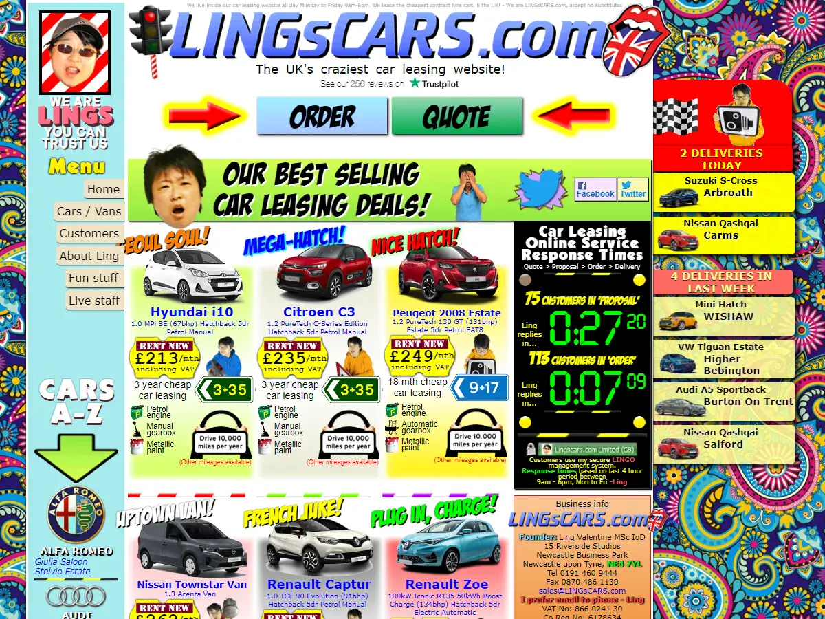
7. LINGsCARS
Why it’s bad: This website looks like it was designed on acid. This is, without question, the LAST design that you would expect from a car leasing company.
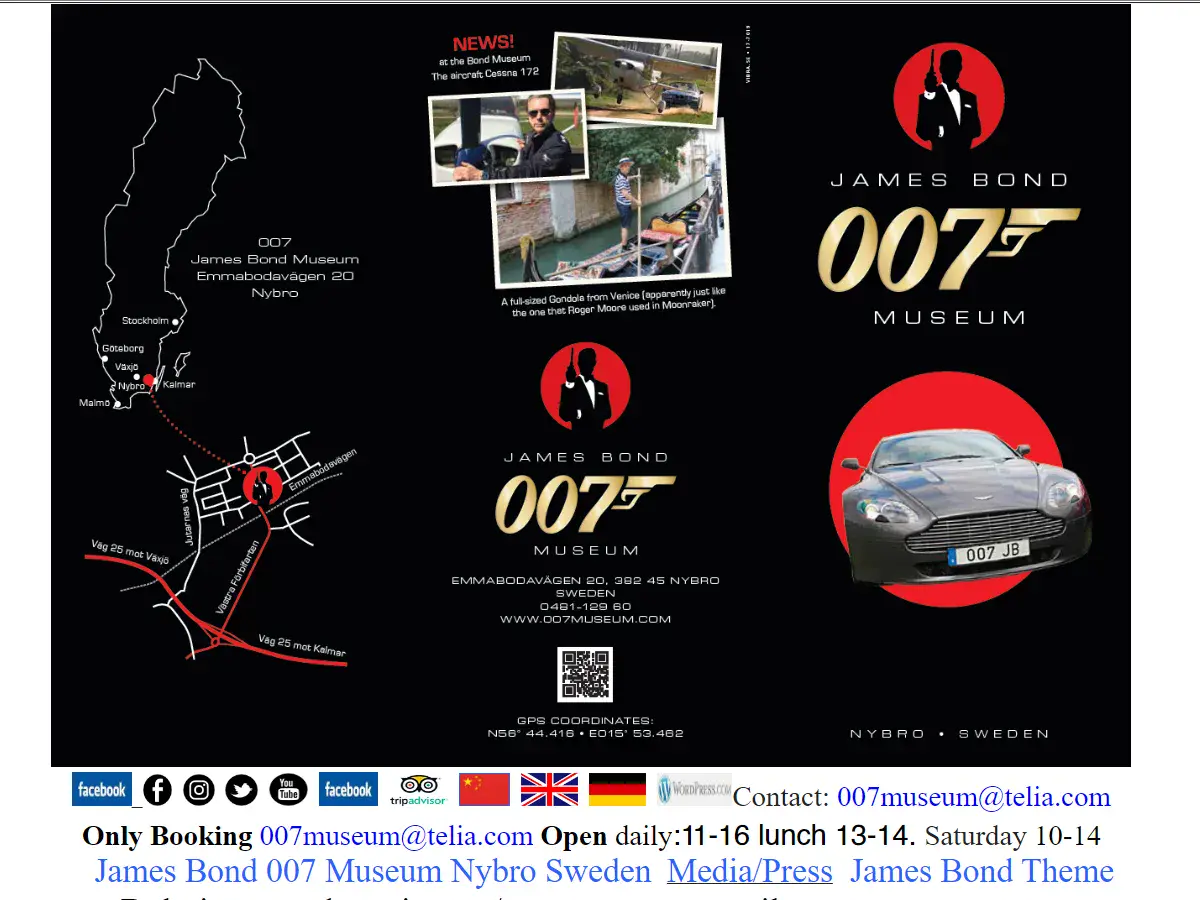
8. James Bond Museum
Why it’s bad: The website’s navigation is the main problem here. All of the content is packed on a single page that scrolls for what feels like forever.

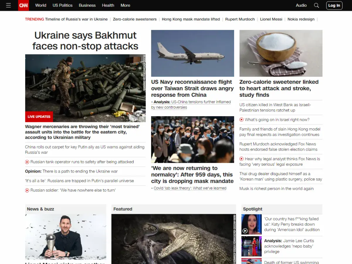
9. CNN
Why it’s bad: CNN’s website suffers from information overload. There is so much detail squeezed into each page that it’s difficult to process what’s going on and find a single thread to follow.
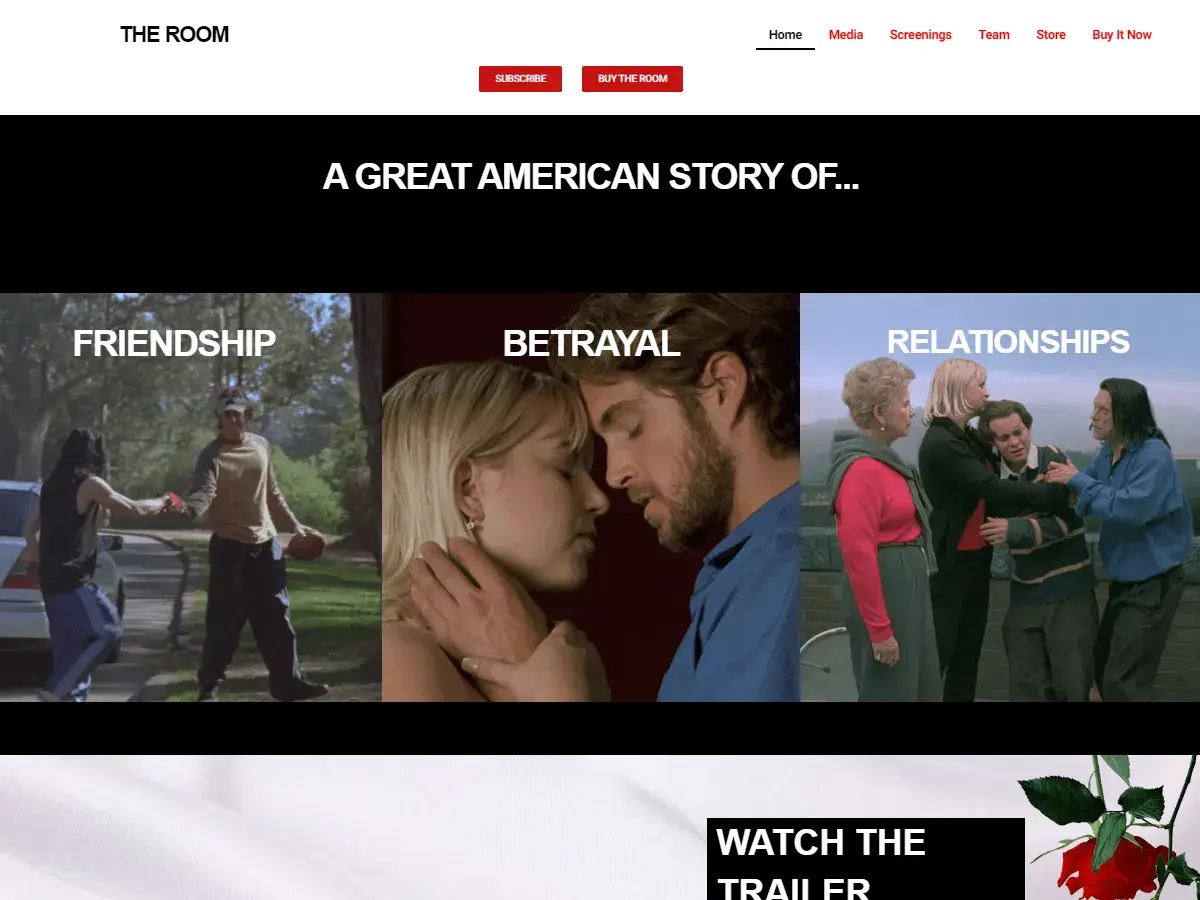
10. The Room
Why it’s bad: The design is very meat-and-potatoes and also pretty quirky. Then again, the quirkiness is undeniably appropriate. If you haven’t seen the movie, we recommend it.
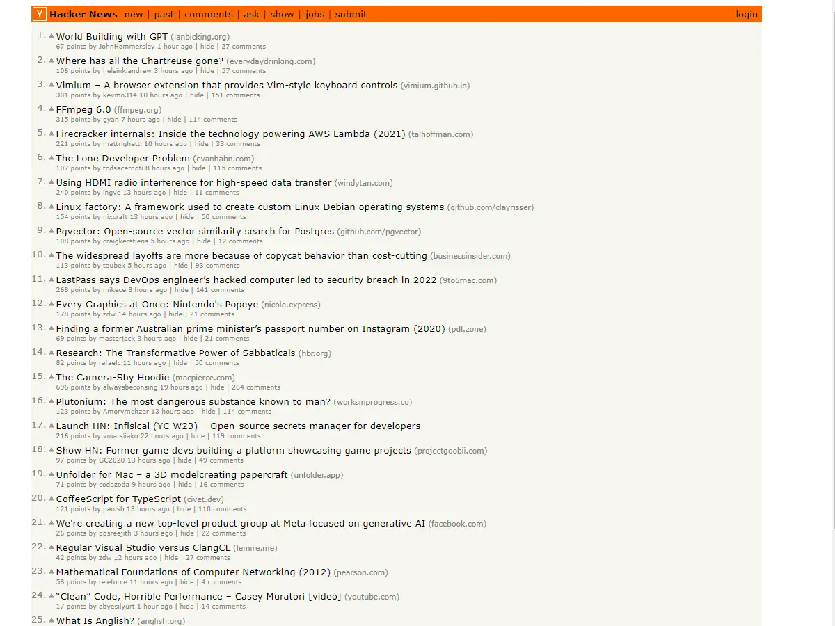
11. Hacker News
Why it’s bad: The small font and closely packed information make reading the content difficult.
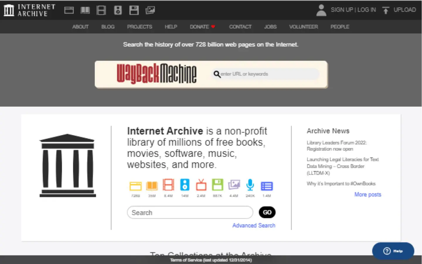
13. Internet Archive Wayback Machine
Why it’s bad: We love the Internet Archive, but the design is outdated, and the color scheme is very bland.

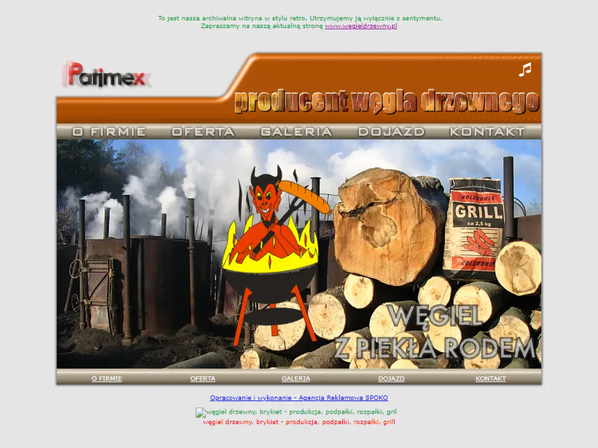
14. Patimex
Why it’s bad: This is a very sparse website with an out-of-place picture on its home page. The other pages contain very little information, although at least the contact page has the company’s hours of operation, address, and contact details posted.
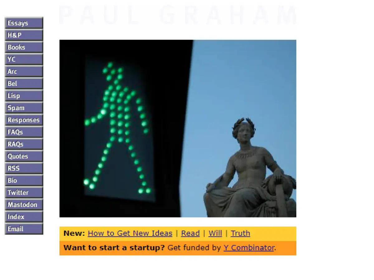
15. Paul Graham
Why it’s bad: Tiny text and an overly condensed menu make this site unsightly and somewhat difficult to navigate.
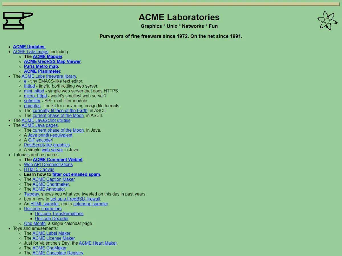
16. ACME Laboratories
Why it’s bad: It has an outdated design that lacks the creative spark needed to generate interest from a younger audience.
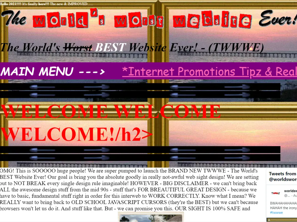
17. The World’s Worst Website Ever
Why it’s bad: The design is bad on purpose, and boy, does it do its job. You have to see this for yourself.
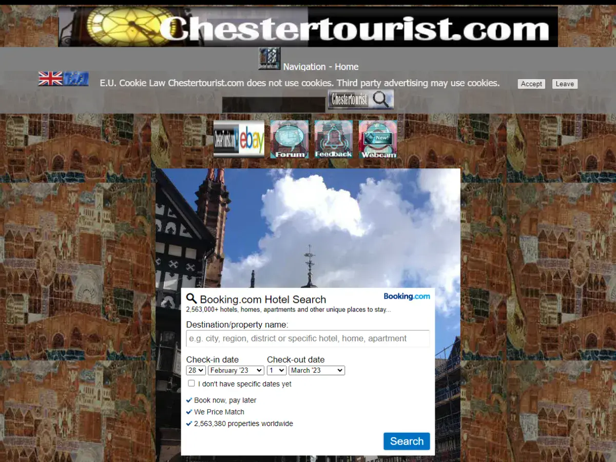
18. Chester Tourist
Why it’s bad: This website has a fairly convoluted background, in the center of which is a poorly placed navigation menu, low-resolution screenshots, and bland text.


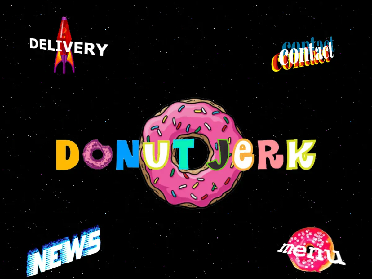
19. Donut Jerk
Why it’s bad: For some reason we like this design, although it’s objectively terrible. The design is very cartoonish, and the pages themselves aren’t very coherent. This is so bad, we almost want to order a dozen!
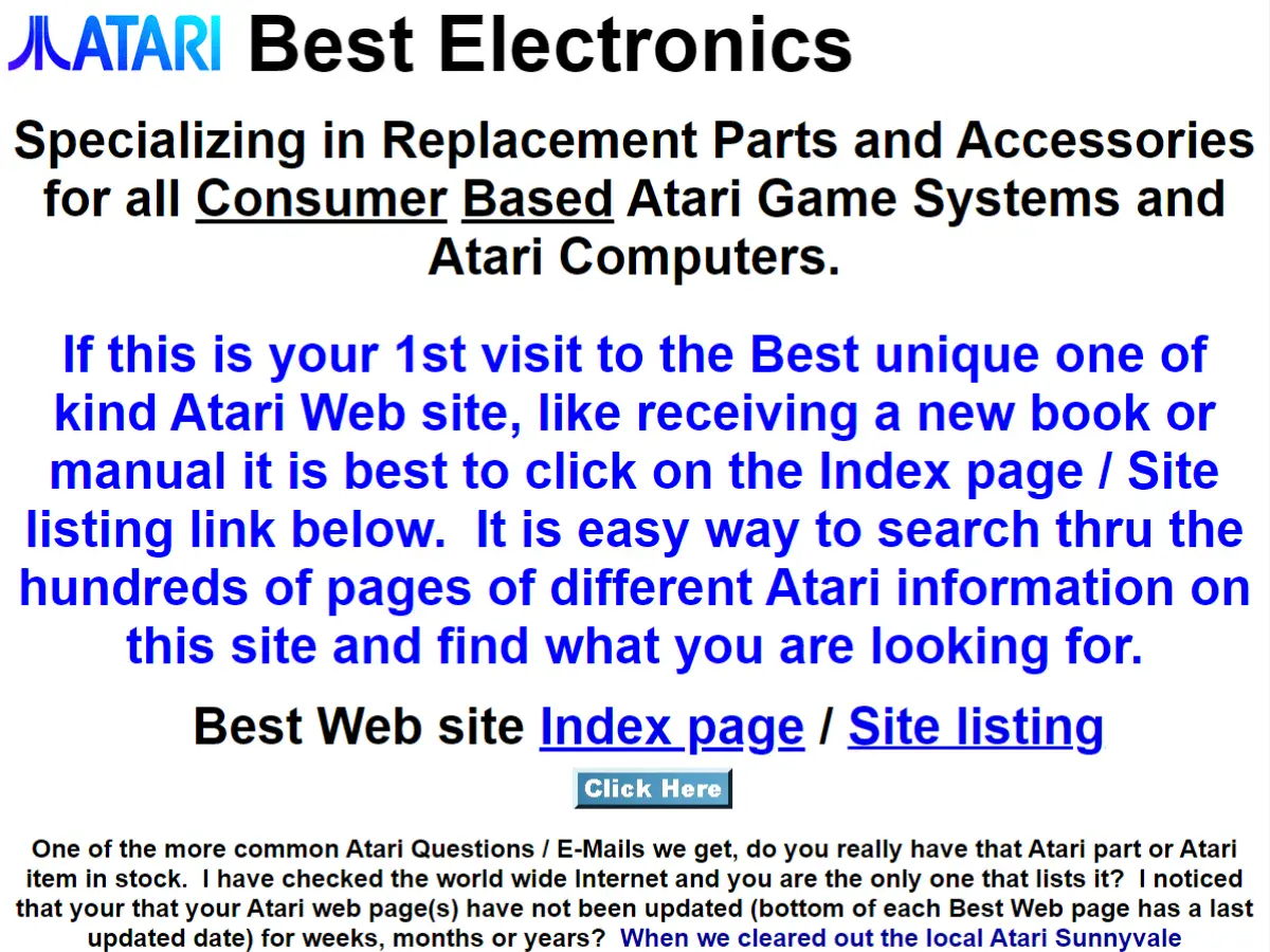
20. Atari Best Electronics
Why it’s bad: This site is essentially a giant wall of text with pictures and random hyperlinks interspersed throughout.
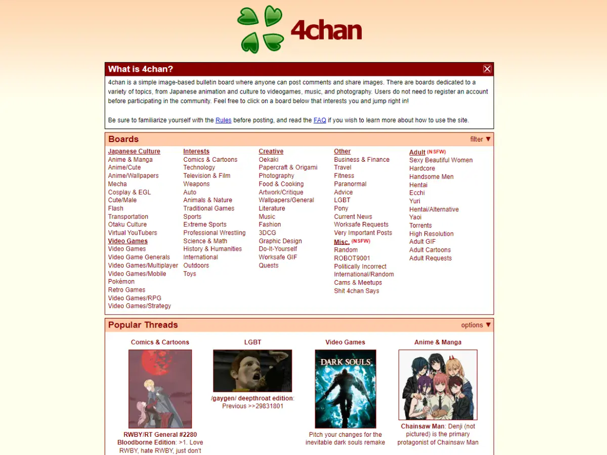
21. 4chan
Why it’s bad: The website has a very basic feel to it. While it’s not the worst design ever, it could use some sprucing up, especially given how popular the site is.
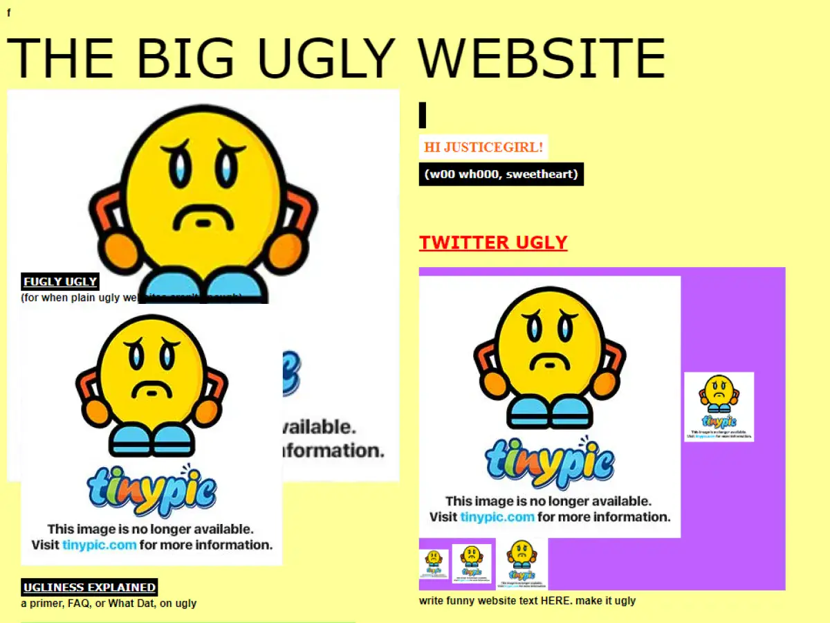
22. The Big Ugly Website
Why it’s bad: The website has a very basic feel to it. While it’s not the worst design ever, it could use some sprucing up, especially given how popular the site is.
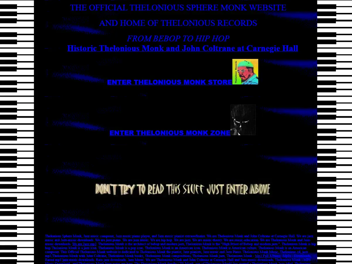
23. The Monk Zone
Why it’s bad: Busy backgrounds combined with long walls of text make this website difficult to read. Oh, our eyes!

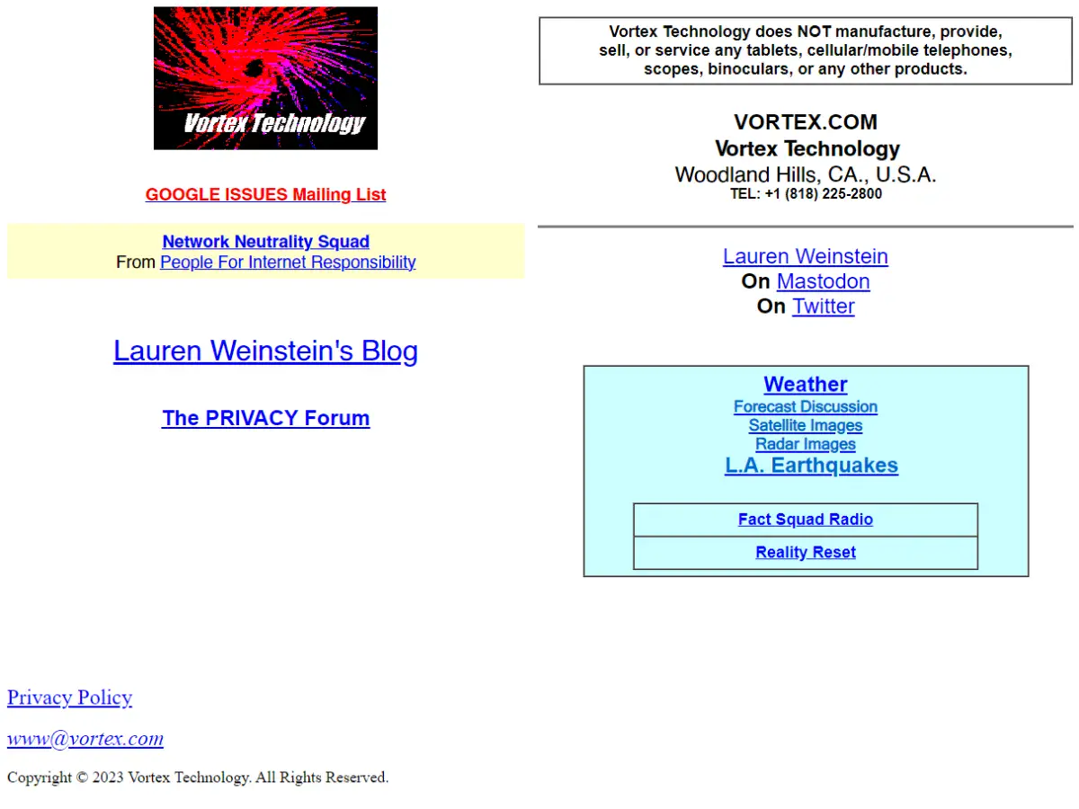
24. Vortex Technology
Why it’s bad: The website’s logo is probably one of the worst we’ve seen. It looks like a granulated infrared hurricane from an 80s computer screen, informed by fundamentally abysmal font.
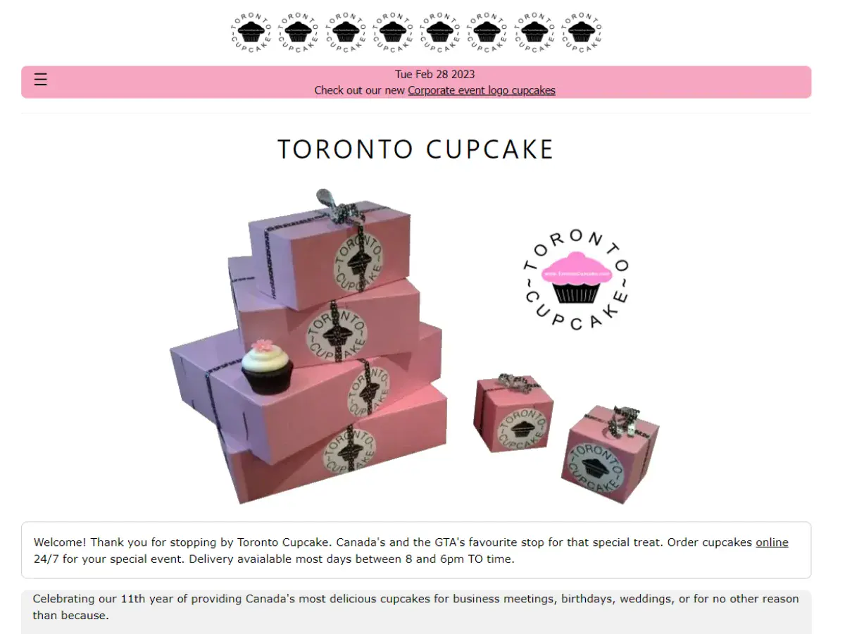
25. Toronto Cupcake
Why it’s bad: The design feels like it was cooked up using a pre-packaged template. Also, the picture on the home page is fuzzy. The products themselves look amazing! This site just needs some love.
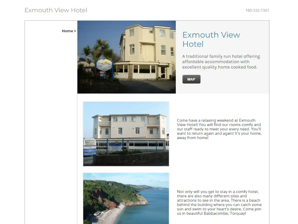
26. Exmouth View Hotel
Why it’s bad: The main problem with this design is that it doesn’t feel like a hotel website. It feels more like an obscure ad listing.
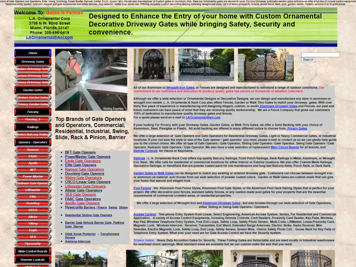
27. Gates N Fences
Why it’s bad: The website’s navigation menu is a million miles long, and there is too much text on each page. This seems like a great company and service, but their site design needs to be streamlined.
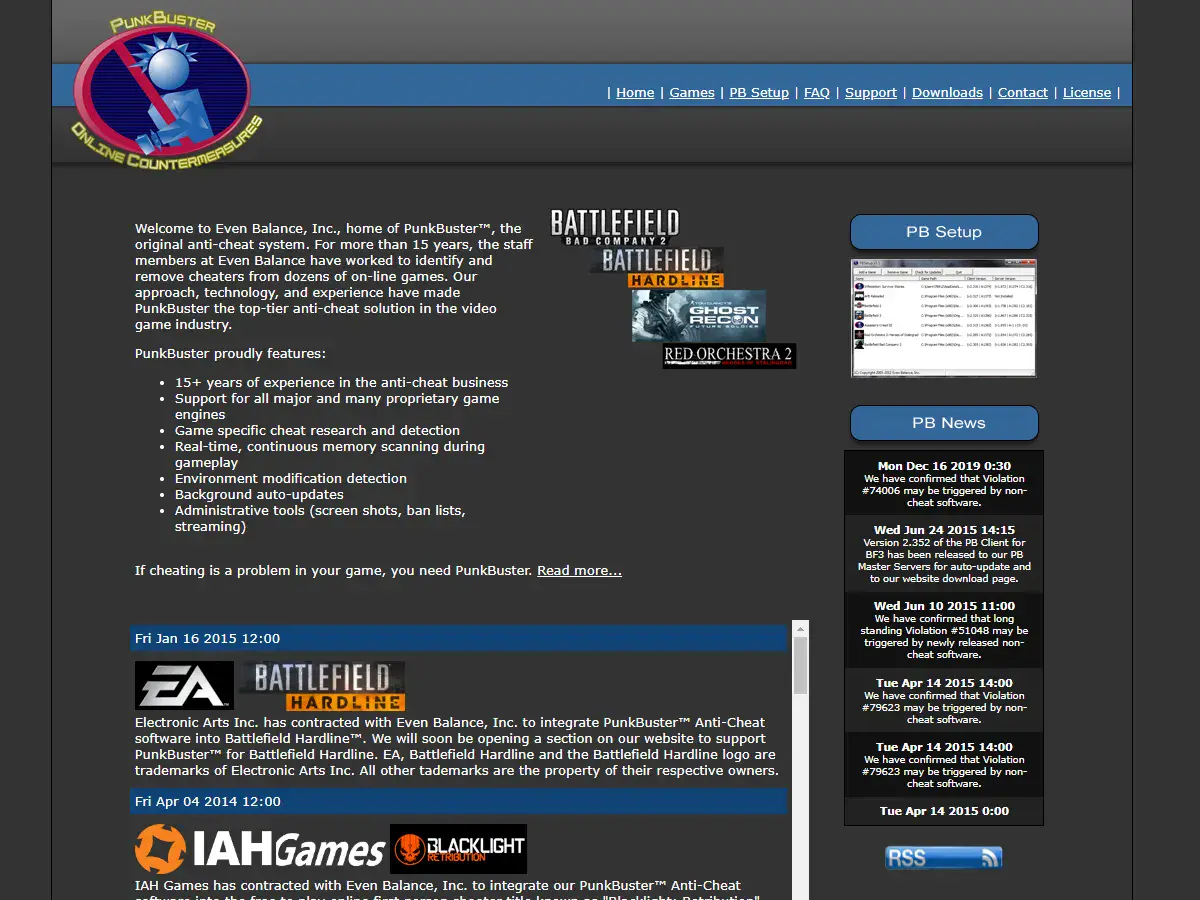
28. Even Balance
Why it’s bad: The design is extremely mechanical and subdued. A little bit of color to brighten up the empty gray background would do some good.
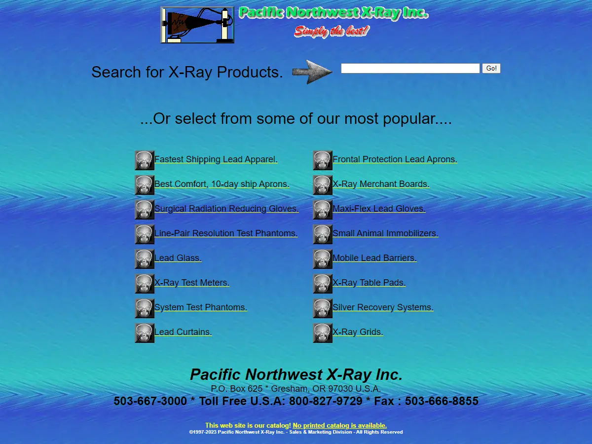
29. Pacific Northwest X-Ray Inc.
Why it’s bad: There is no “About” information on the website. Not to mention, the background looks like it was created while the designer was in a slight hypnotic trance.
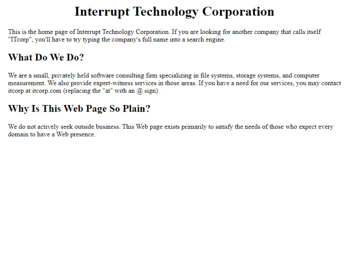
30. Interrupt Technology Corporation
Why it’s bad: This website is essentially a parking space for a company that doesn’t seek outside business.
Bad Websites – Conclusion
We hope you’ve enjoyed this list of 30 bad websites with terrible designs, some of which still manage to attract millions of visitors every year.
While having a bad website design may not necessarily result in low traffic, it is still crucial for website owners to prioritize the design and usability of their website. This is because a poorly designed website can negatively impact a user’s experience, potentially driving them away from the website and towards competitors with better designs. Ultimately, having a well-designed website is an important aspect of maintaining a successful online presence.
Looking to improve your website’s design and user experience? Contact Sage Digital today! Our team of experts can help you create a modern and user-friendly website that will attract and retain visitors. Don’t let a poor website design hold you back – let Sage Digital help you take your website to the next level.