
Web design is an ever-changing field, with new trends popping up all the time. With so many websites available today (far too many to ever see), the real question is, what are the best website designs?
To answer this question, we’ve compiled a list of our 50 favorite designs.
From minimalist designs to advanced platforms with numerous interactive features, we’ve chosen websites that will show you just how far web design has come in recent years and what’s possible with the right team behind your design project.
50 Best Website Designs
1. Hyer
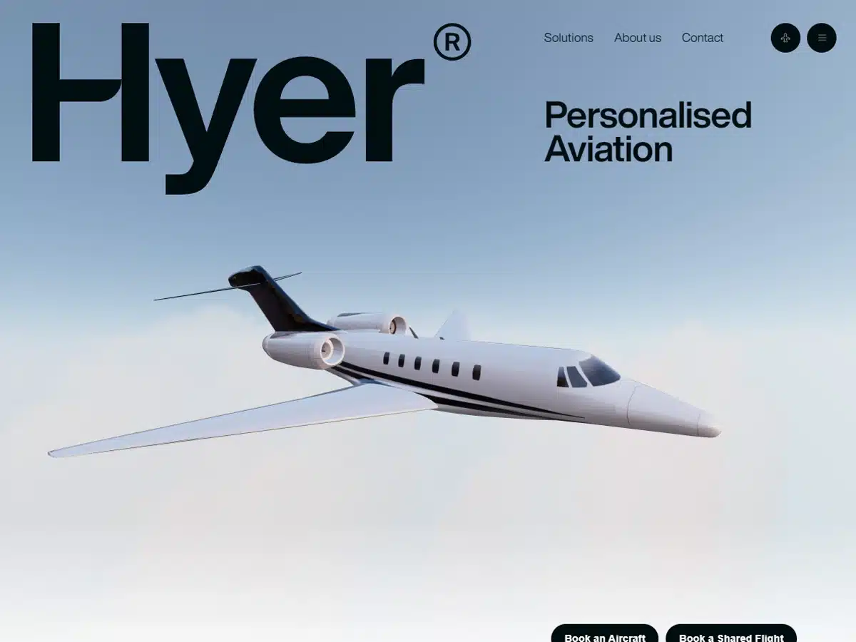
Award: Website of The Day (2022 Jan 23) From CSS Design Awards
Although Hyer’s website is dedicated to the private jet charter business, it has a certain innocence and “play” to it that we admire.
The design is humble and doesn’t add unnecessary elements. This is about flying in style, and the site conveys that spirit well.
This is also a very navigable website.
2. Superlist
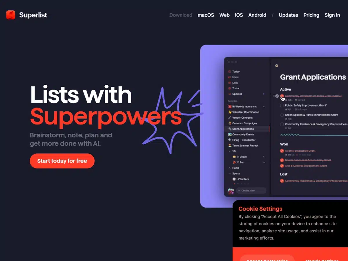
Award: Site of the Month (April 2021) From Awwwards
Superlist makes it easy for you to share individual tasks with multiple people with just a few simple clicks.
We mention this because simplicity seems to be the company’s go-to approach, not only with their product but also with their website design.
Granted, there is plenty of complexity here for visitors to appreciate, but nothing feels blown out of proportion or overstuffed.
Overall, this website is creative and engaging, and simply bursting with heart. It’s the perfect, paradoxical combination of busy and clean.
3. Nomadic Tribe
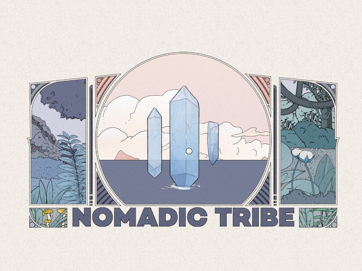
Award: Site of The Year Nomination (2019) From Awwwards
Nomadic Tribe’s website features an opening, interactive page that leads you on a short adventure. It feels like the intro to a full-blown video game. The artwork and sound design are that good.
Once you pass the intro, you come to the website proper, which has a straightforward design that looks like it was created by a computer engineer.
We find the juxtaposition between creative and analytical here very appealing.
***
A resource to help you create your best website designs: How to create an interactive website.
4. 1917: Into the Trenches
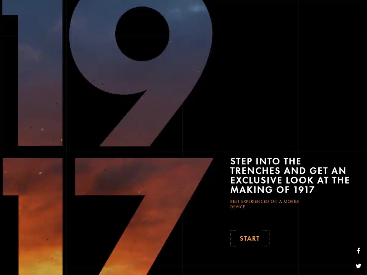
Award: Awwwards’ Site of the Day (2020 March 1)
Highly interactive and at times gut-wrenching, this website tells the story of World War I as seen through the eyes of its soldiers.
Created by a team of volunteers with an interest in remembering our past, it takes users on a journey through the trenches of France and Belgium.
We love everything about this website, from the sound design to the graphics to the history.
If you’re looking for more information about World War I, we recommend checking it out.
5. The Octopus: A Design Blog By IDEO
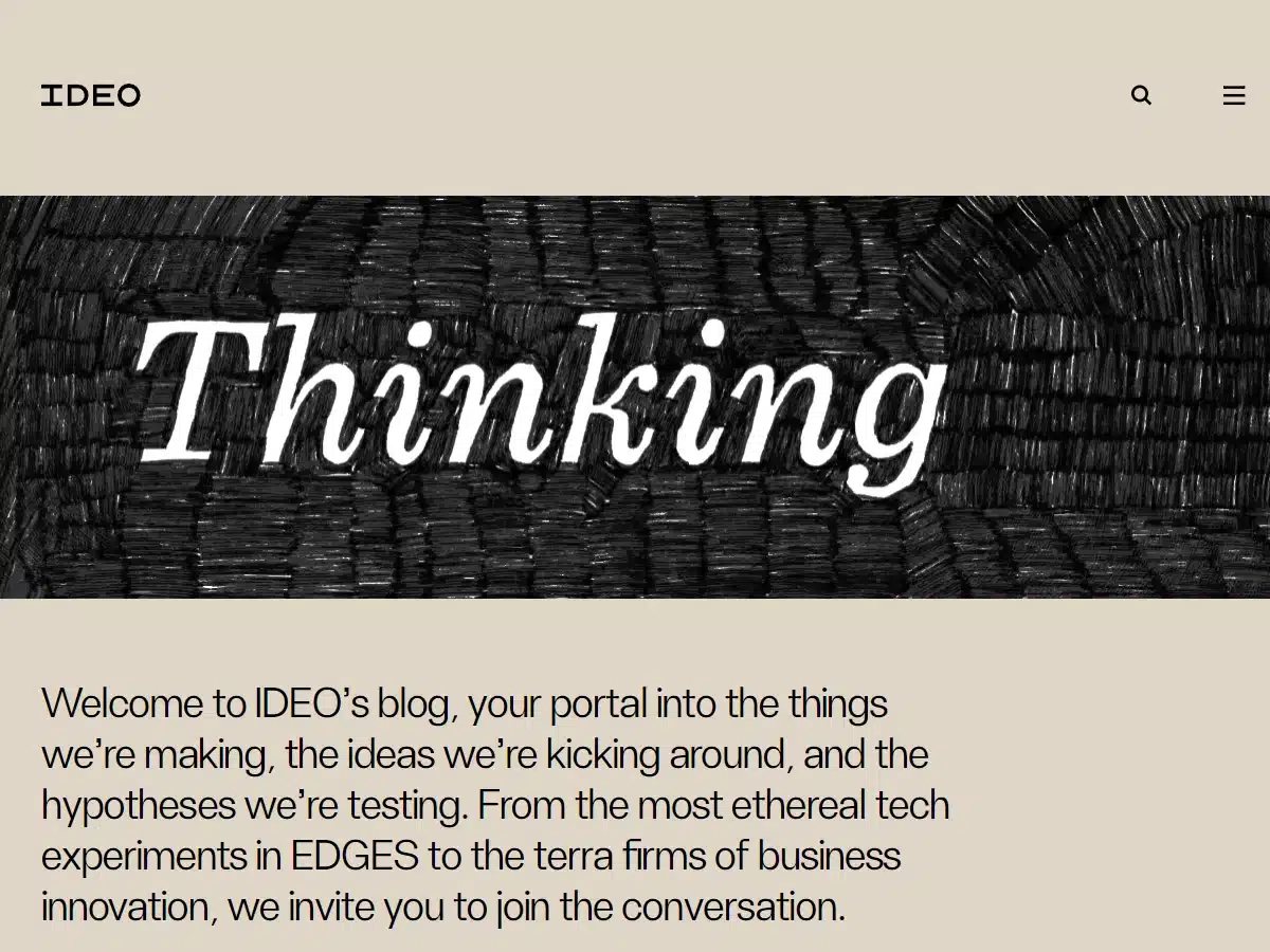
Award: Websites and Mobile Websites/Business Blog—2019 Webby Winner
With a somewhat quirky design, IDEO’s blog, The Octopus immediately catches your attention.
The website’s founders believe that good website design is not about following a set template but rather coming up with unique and innovative solutions to improve the user experience.
Their blog certainly reflects this belief. It packs a lot of information into a tight space in a fun and workable way.
6. Fly By Jing
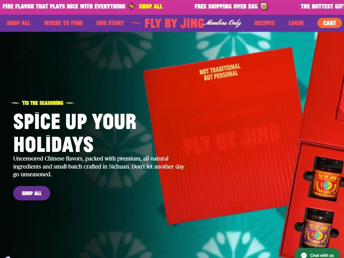
Reason: We love the website design’s creativity.
Fly By Jing feels like it was created by a team of experienced professionals passionate about beautiful and creative website designs.
There is a lot to take in here, although much of the detail is subtle. In short, the design is aesthetically pleasing and highly functional. We recommend checking this website out.
***
A resource to help you create your best website designs: Elements of an aesthetic website.
7. George Nakashima Woodworkers
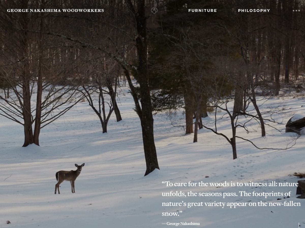
Award: Websites and Mobile People’s Voice Winner—Webby 2019
George Nakashima Woodworkers’ website is the quintessential small business platform that every family-owned business wants to have.
Warm, subdued, but vibrant, this website is appropriate for a company dedicated to making exquisite, high-quality furniture and providing world-class customer service.
8. Evrone
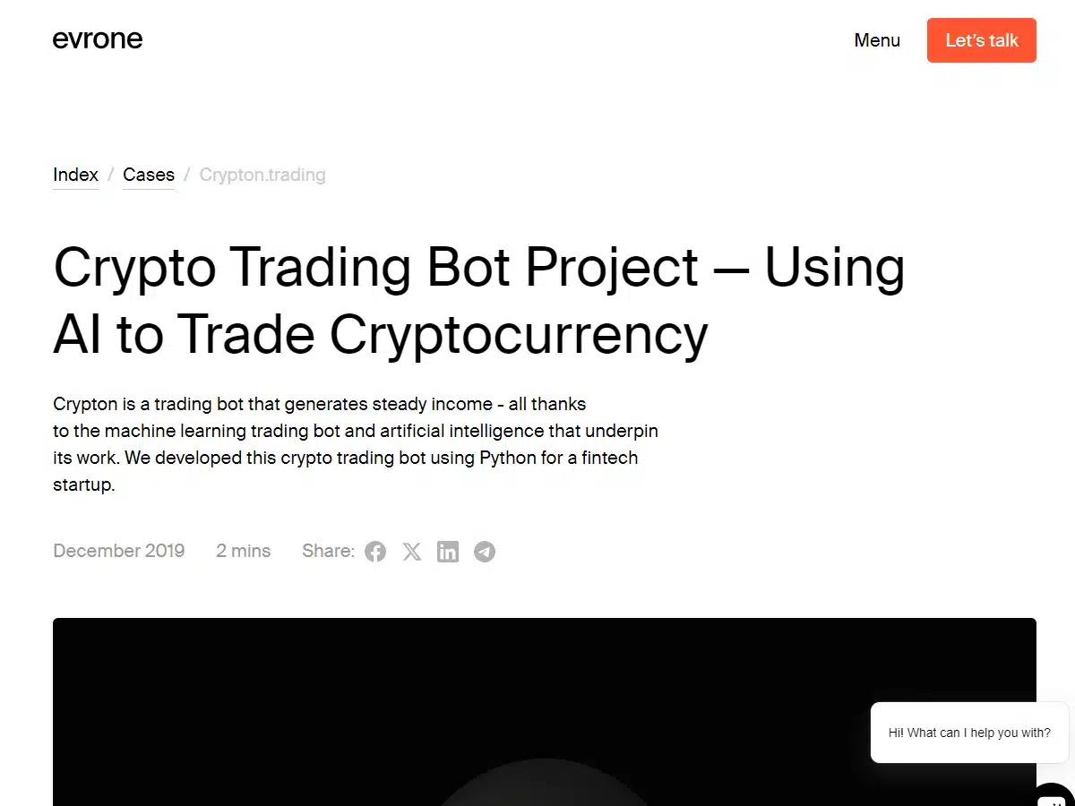
Award: CSS Design Awards—Special Kudos 2021
Sometimes less is more, a principle that certainly applies to Evrone.com.
With its user-friendly interface, basic artwork, and a handful of simple graphics, it manages to get its core message across in just the right way.
Although not as complex as some of the other websites on this list, we love the feel of this one.
***
A resource to help you create your best website designs: The power of simple website designs.
9. Frans Hals Museum
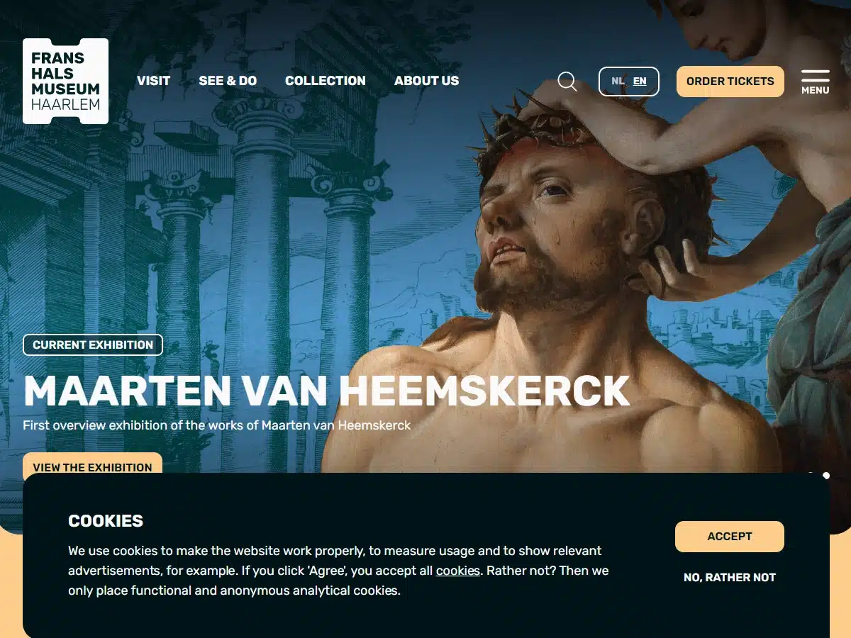
Award: One of The Sites of The Year (2018) From Awwwards
The website for the Frans Hals Museum was created by a team of designers who took into consideration every detail…and it really shows.
With a beautiful, clean design and a vintage color palette, visitors feel the museum’s inviting atmosphere the moment they enter the home page.
The site makes it easy to find ticket prices, look through photos, and keep up with the museum’s latest news.
10. NOWNESS
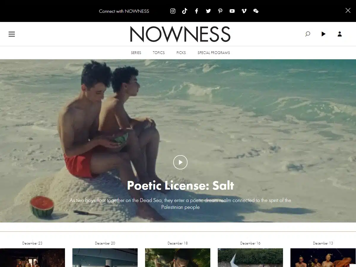
Award: Best Cultural Blog/Website (2017) From The Webby Awards
The design for Nowness.com has a very “modern gallery” feel to it, which works well for its subject matter.
Nowness offers up a variety of different articles and videos, ranging from fashion to travel, but the material never feels cluttered on the page.
Whoever designed this website’s layout had a really good eye for space and how to use it to sort different topics.
Overall, this is a 5-star design.
***
A resource to help you create your best website designs: How to create a photo gallery website.
11. Rainforest Guardians
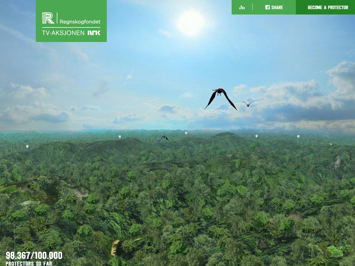
Award: Best Activism Website (2016)/People’s Voice Winner—Webby Awards
With its interactive design, this website really hits the nail on the head.
Interested in taking a virtual tour through the Amazon Rainforest? If so, we recommend checking out the site’s interactive map, which comes with plenty of interesting photos and videos.
***
A resource to help you create your best website designs: Further examples of activism websites.
12. ETQ
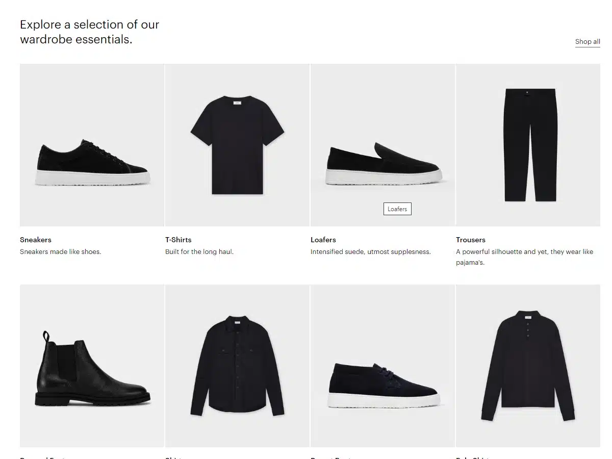
Award: Site of the Day (2015 May 19) From Awwwards
When it comes to online shoe shopping, there’s nothing like a good website that makes it easy to find the products you’re looking for. And that’s exactly what ETQ Amsterdam’s site does.
Their website is ultra clean and super easy on the eyes. Plus, as far as products go, they have an amazing selection!
13. Simply
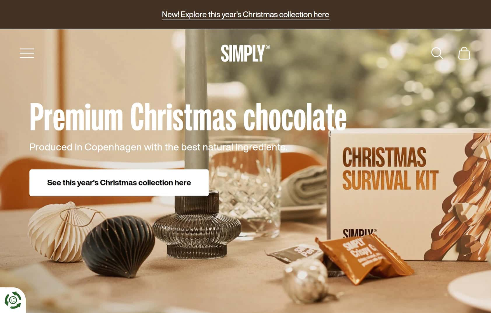
Reason: One of the best website designs for product layout and imagery
Simply’s website design does a fantastic job of conveying what’s special about their brand.
14. Miracle Noodle

Reason: Miracle Noodle makes excellent use of creative images throughout its design
Miracle Noodle’s website works because it owns what it is—a quirky and creative food store.
Centered around the Shop pages, this website is an excellent example of what web designers can do when offering food products.
***
A resource to help you create your best website designs: Secrets to improving your online portfolio.
15. Squarespace
Award: Websites and Mobile/Best Homepage/People’s Voice Winner 2014—Webby Awards
Squarespace has a contemporary design that hits all the right design notes and leaves one with little to complain about.
Stylistically, it has a somewhat blocky feel to it. In fact, the entire layout feels like a giant elaboration on squares and rectangles.
With its fairly straightforward color palette and bold, plain font, this design conveys the company message with stark utility.
***
A resource to help you create your best website designs: Using a grid in your website design.
16. Feedmusic
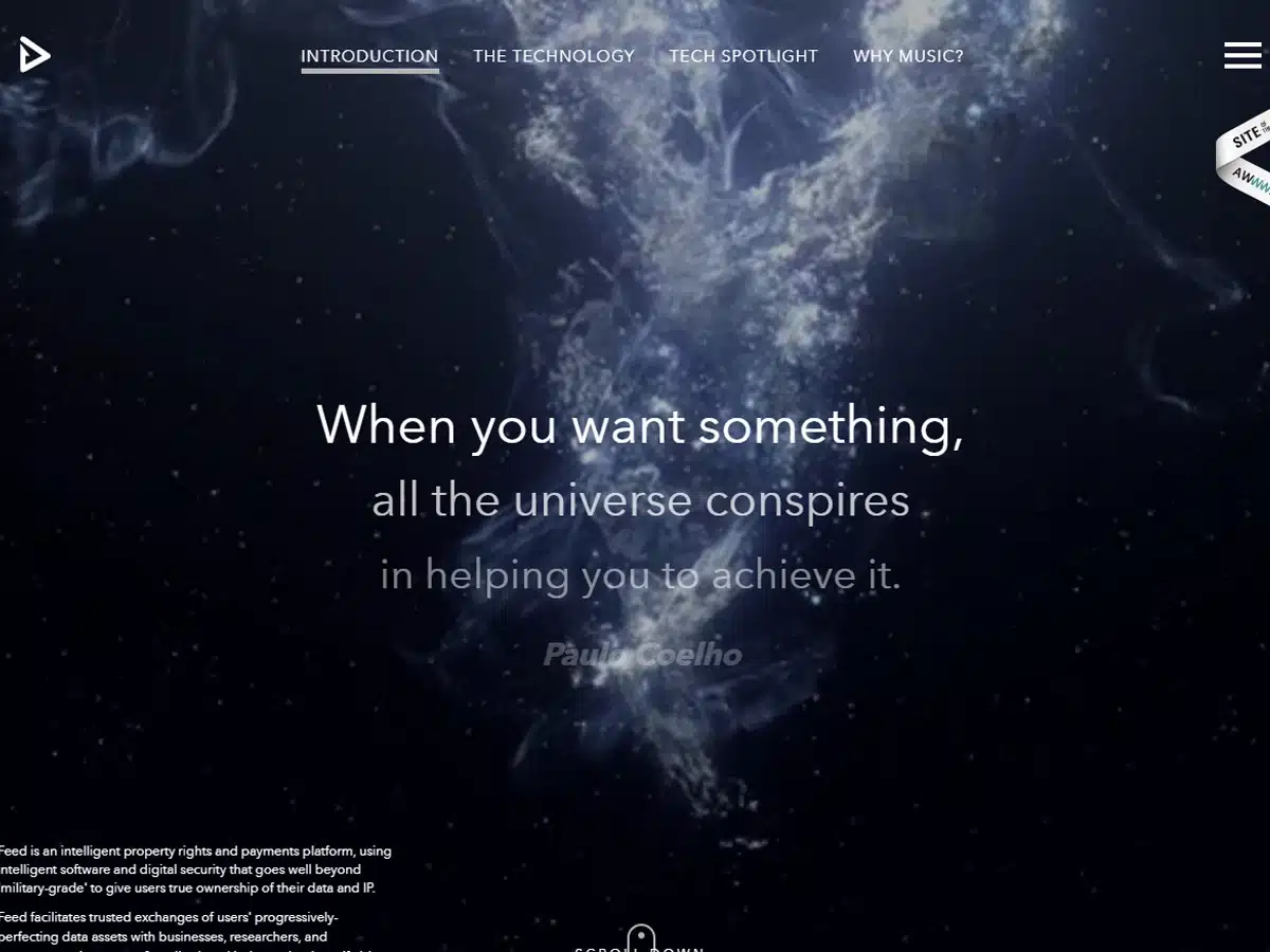
Award: Site of the Day (2015 June 6) From Awwwards
Chosen as the Site of the Day by Awwwards in June 2015, Feed (also known as Feedmusic) is truly special.
Their website design is so good that we found ourselves perusing their content without even thinking about it.
Feed’s main page features a central scroller that directs user attention to a couple of important company videos that explain who they are and what they do—a vital component of web design.
Feed’s ability to seamlessly direct visitors through its website is proof that what you put on your site and how you present it are two sides of the same coin.
***
A resource to help you create your best website designs: Tips for streamlining your website.
17. Newest Americans
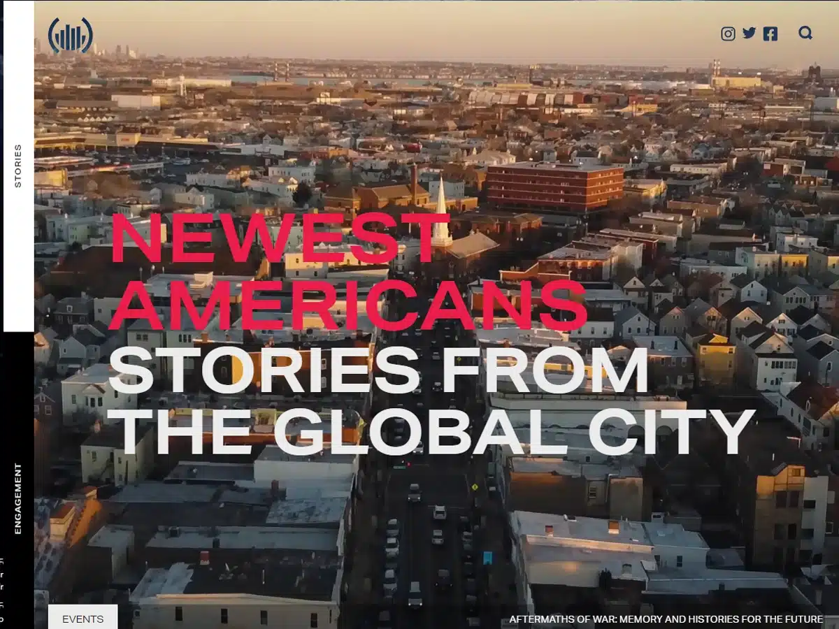
Award: Honorable Mention/Nominees (2020) From Awwwards
The Newest Americans website utilizes a unique “four corners” design that makes it stand out from your average platform.
On each corner of the front page are different navigation options – About, Education, Stories, and Engagement.
This layout is somewhat rare and a little unorthodox, but we feel it’s worth mentioning because we love the creative approach.
***
A resource to help you create your best website designs: More unique website design examples.
18. Swab the World
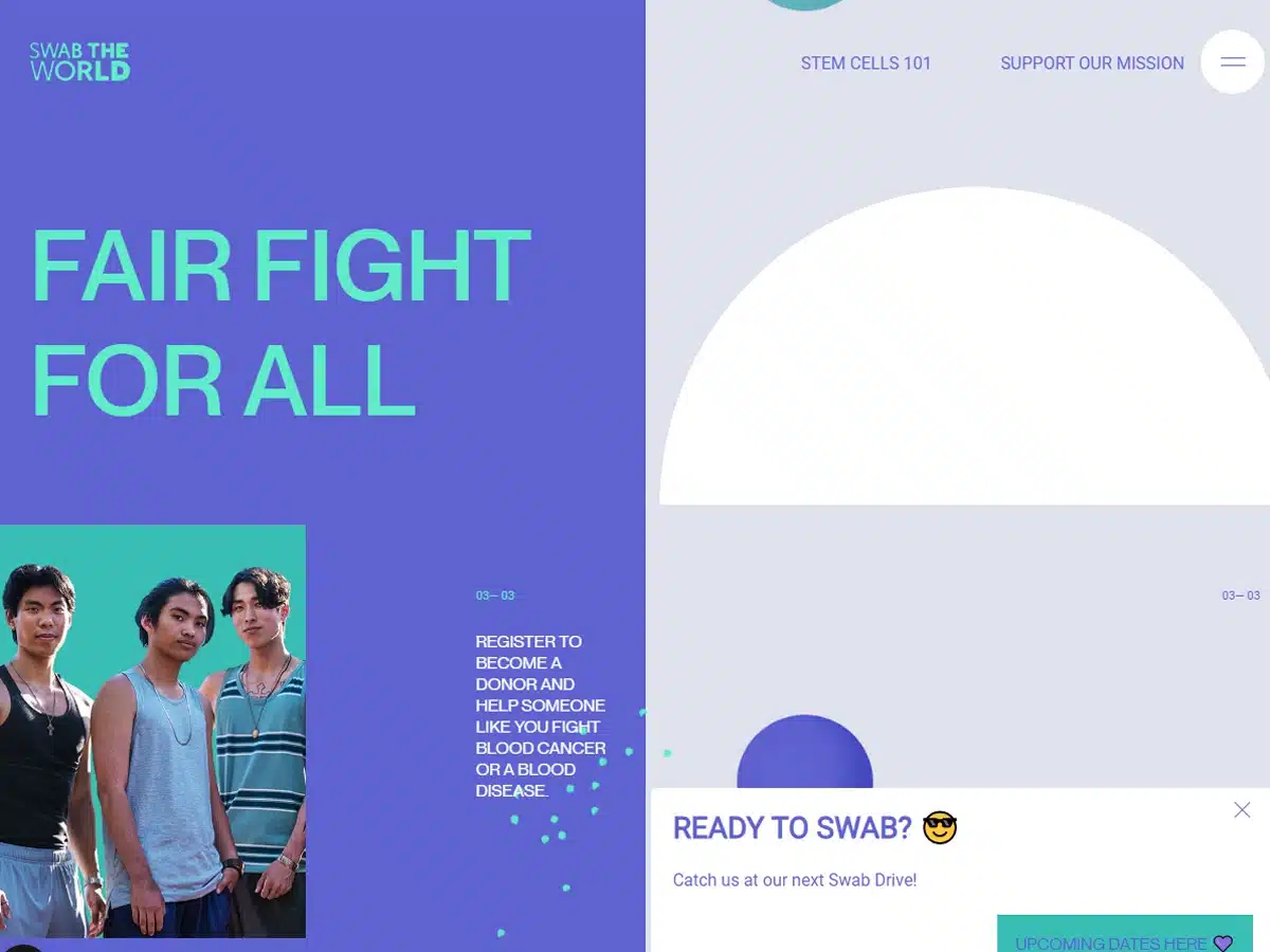
Award: Site of the Day (2020 Feb 11) From Awwwards
Our favorite part of Swab the World is its clear, focused, and compelling calls to action.
The moment you visit the website, you know exactly who they are, what they’re about, and what they want from you.
To us, Swab the World’s design feels like a clear-flowing current in a world full of murky ponds.
***
A resource to help you create your best website designs: Creating a powerful call-to-action for your site.
19. Spotify Design
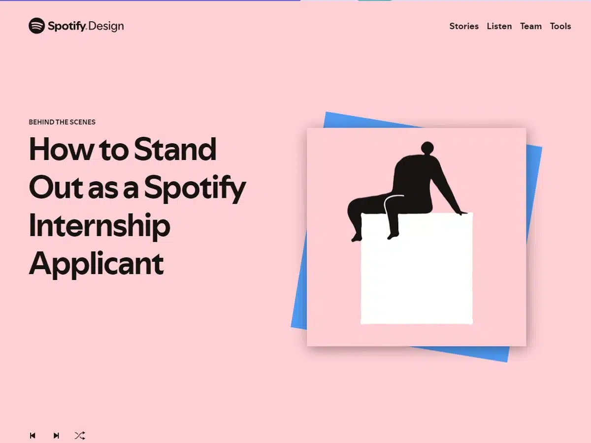
Award: Honorable Mention/Nominees (2020) From Awwwards
With such a polished design, you can tell Spotify Design was made by experienced professionals.
The opening page features scrolling info cards that quickly and succinctly explain what the website is about and clarify its purpose.
Beneath the info cards, you find an airy and energetic design space that is certain to appeal to younger audiences. The colors are bright and optimistic and creatively reflect the website’s overall tone.
A resource to help you create your best website designs: Inside look at building a website w/ creative features.
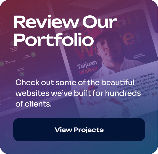
20. Taijuan Walker
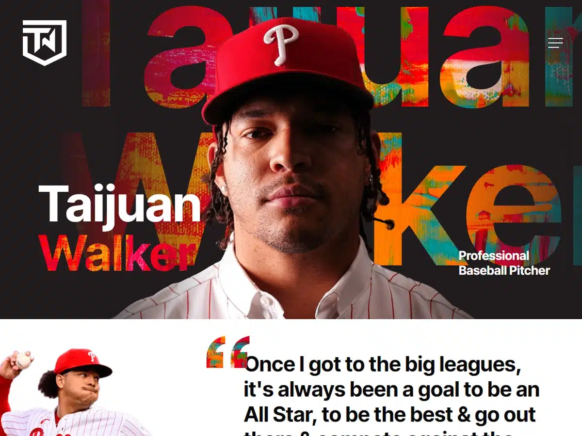
Reason: This website expertly incorporates authentic, high-quality imagery throughout its design
This website offers an intriguing look at professional baseball pitcher Taijuan Walker. The layout is simple and brought to life with gorgeous, high-quality images. While visiting the site, you may find yourself wanting to learn more.
21. Dragonfly Energy
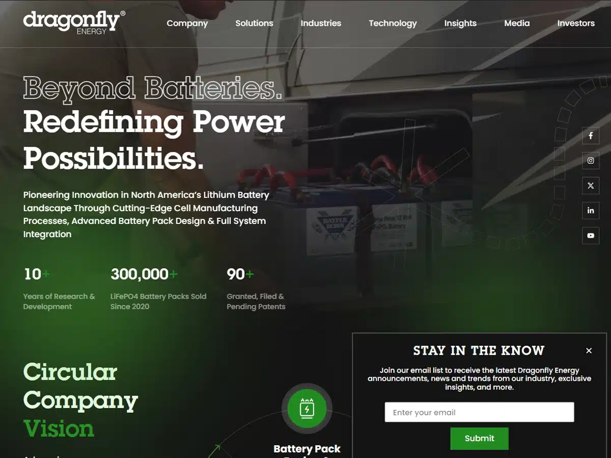
Reason: This website design does an excellent job of conveying the company’s brand
Dragonfly Energy’s website uses a lot of design space to convey its brand message. The result is a focused design that is clear about its purpose.
The website also features a well-organized navigation menu, which makes the site easy to navigate.
Have we mentioned the color palette yet? We couldn’t help but appreciate the branded colors.
***
A resource to help you create your best website designs: 10 helpful eCommerce design tips.
22. Overflow
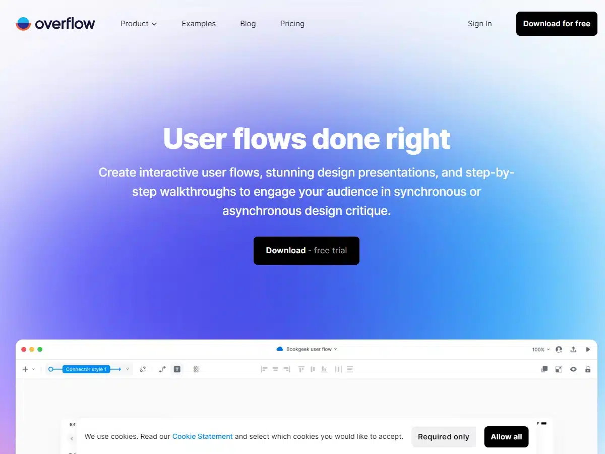
Award: SOTD (2018 March 20) From Best Website Gallery
Overflow’s world-class website is every new web designer’s dream project. It’s not easy building a platform like this.
The site is orderly, fast, comprehensive, and otherwise immaculately constructed.
If you talk to most people in the design field, they’ll agree that sites like Overflow’s are the gift that keeps on giving.
23. Skai
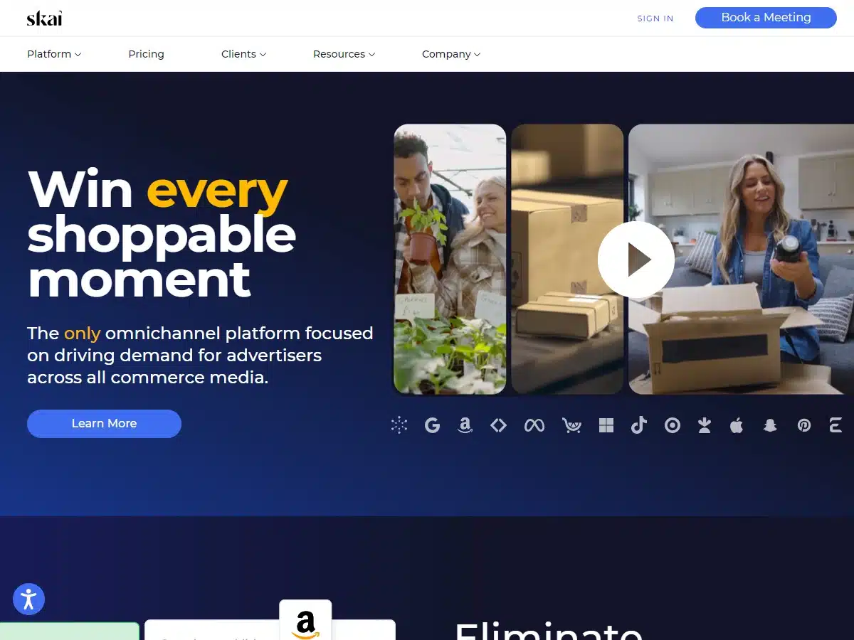
Reason: This site is an amazing example to emulate for your website design ideas
The best thing about Skai’s website is that it packs a lot of information into a very digestible format. We’ve seen many website designs fail over the years because they tried stuffing too much information into only a handful of pages.
Skai’s designers clearly were aware of this problem and avoided it by creating a strategic layout to accommodate a lot of information.
24. Zillow
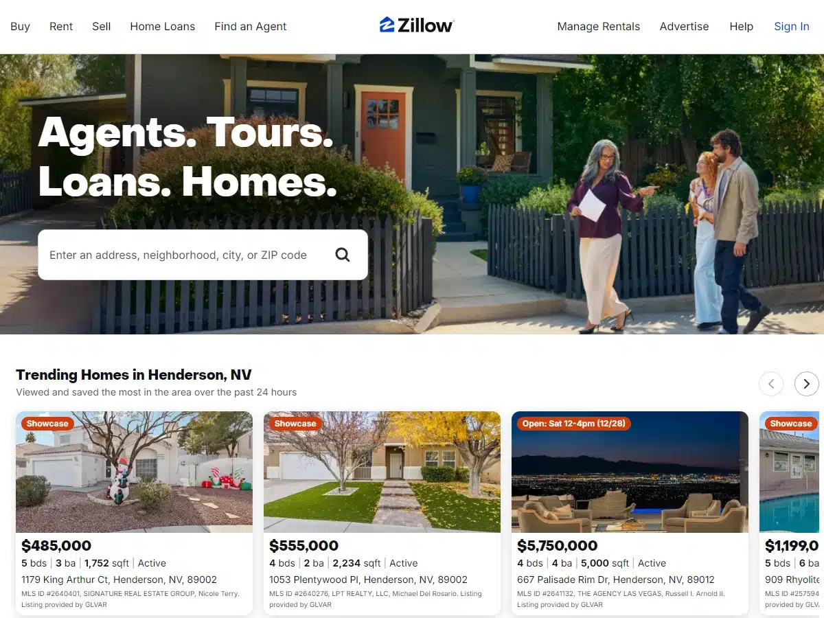
Reason: One of the most well-organized website designs
Zillow may be a famous website that is probably represented in a hundred design lists already, but it’s worth mentioning here for one very important reason—it’s a masterwork of organization.
It’s very difficult to build and maintain a website with over 100 million users, not to mention a sheer mountain of real estate listings. Zillow’s website is amazingly smooth, fast, and intuitive, all things considered.
From the homepage to its detailed product pages, everything is arranged in a way that helps you find what you’re looking for quickly. Additionally, Zillow offers some of the best home-selling features out there, like personalized listings and instant feedback on offers.
If you’re looking for a well-designed website that you can imitate for your real estate business, Zillow is definitely it.
25. FPP
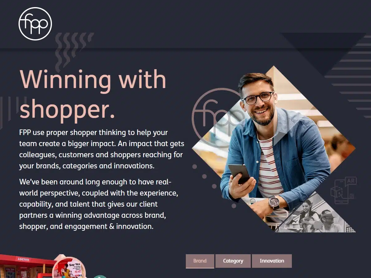
Award: Website of The Day (2020 Jan 7)—CSS Design Awards
FPP is a “shopper marketing agency” with a website that replicates the experience of walking through a grocery store.
Boasting 3D items and a “scroll to walk” feature, the site takes you on a journey of discovering what FPP is all about.
This website’s design and user experience are what grabbed our attention.
26. Virgin
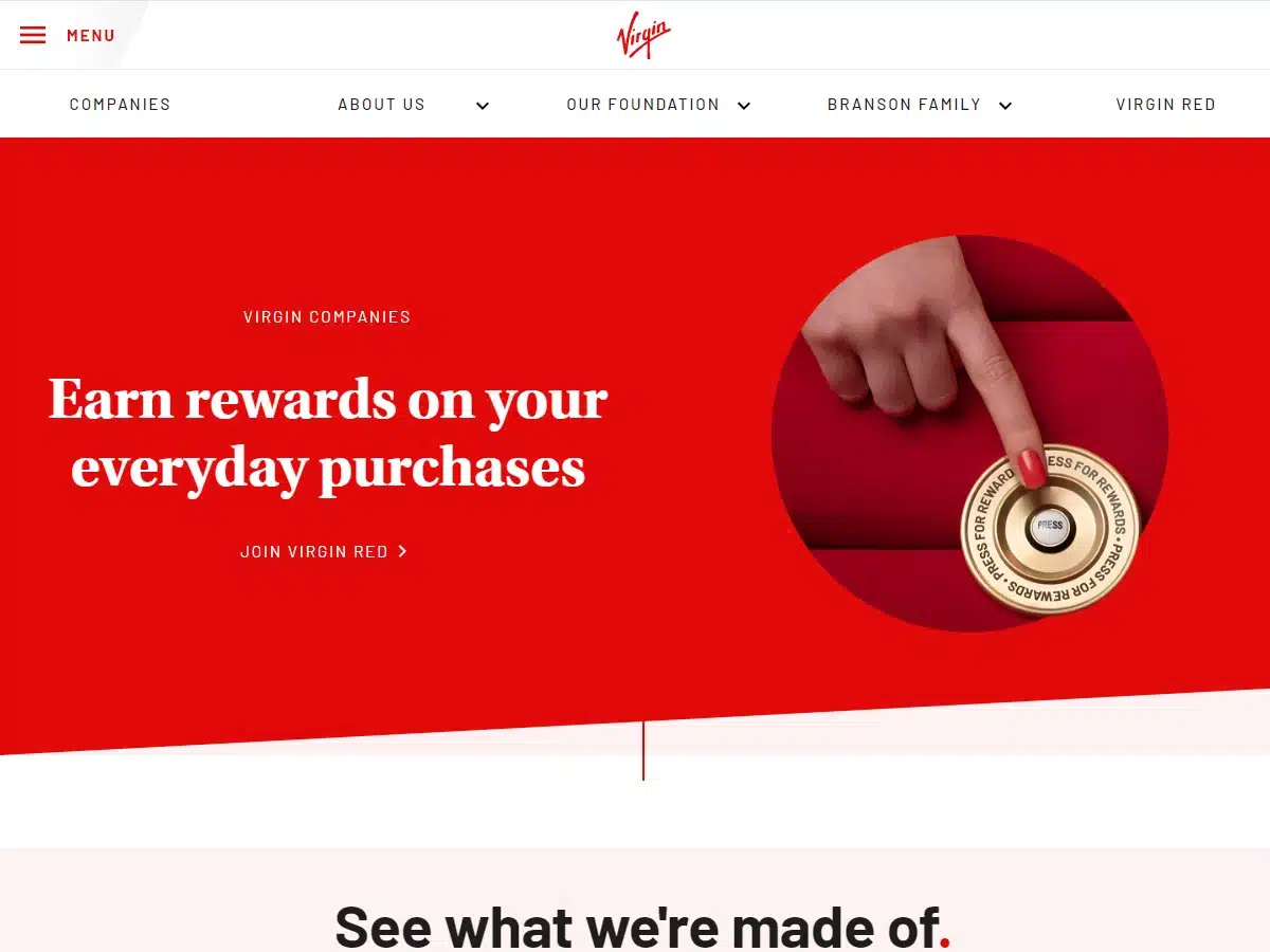
Reason: Easy to navigate website with a great color scheme
Virgin’s informational website is represented here because of how well-organized and easy to navigate it is. Plus, who doesn’t love the iconic Virgin Red color?
27. World of SWISS
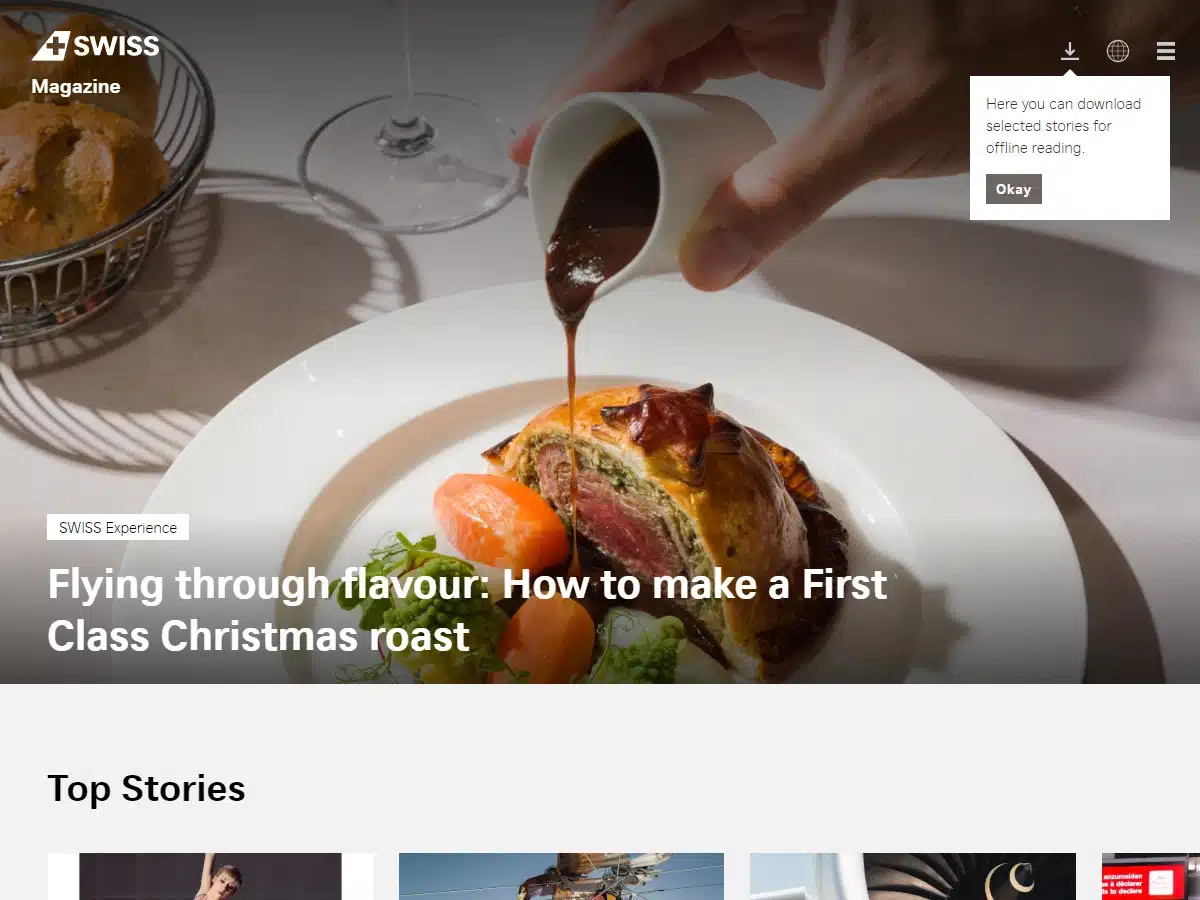
Award: One Page Website Award from One Page Love (applies only to the original design)
Note: The original website is no longer available online, but we still love the new site!
What we like about World of SWISS’s updated website is that it makes booking and managing flights seamless. With its convenient “Flights” search bar, you can find flights, rental cars, and hotels to your travel destination in just a few minutes.
The dominance of the Flights bar on the home page illustrates the design team’s understanding of what people booking flights want to see.
To find the Flights search bar, all you have to do is click on the link above, then once you’ve arrived at the World of SWISS home page, click on the SWISS logo, and you’ll be taken to a secondary home page.
28. Torgerson Design Partners
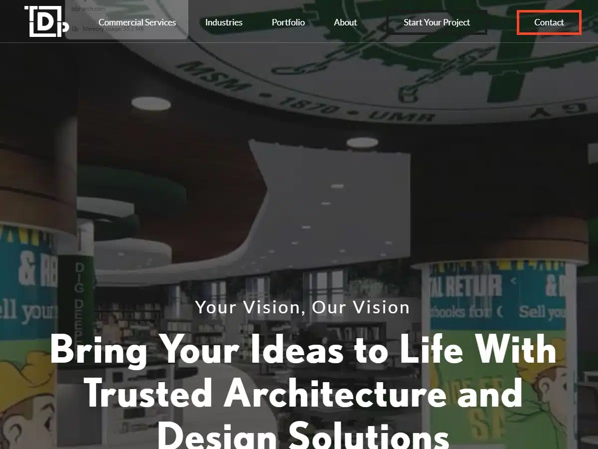
Featured by Awwwards as a Nominee (2022)
Torgerson Design Partners is a full-service architecture firm and commercial design group. Not surprisingly, their website’s design is all about utility.
It’s funny how you can tell the difference between a website built for engineers and one built for artists. TDP’s site almost navigates like a builder’s manual and certainly lands squarely on the engineering side of the spectrum as far as designs go.
29. MA
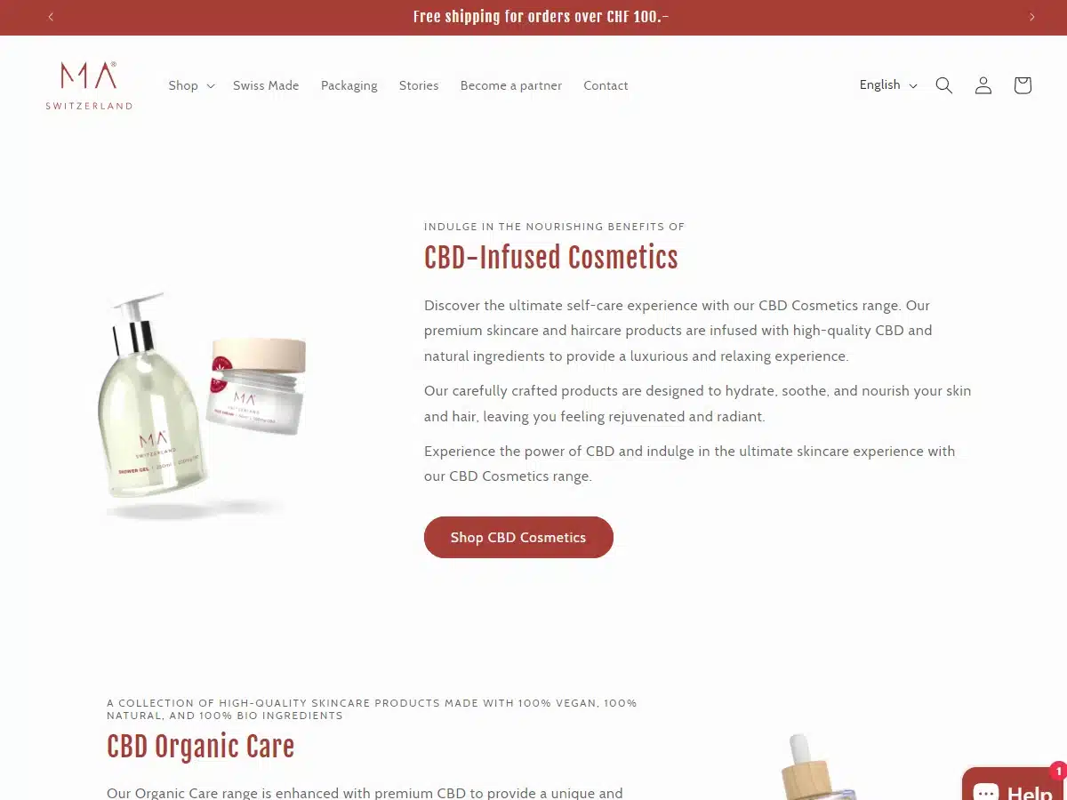
Award: Site of The Month (2019 Oct 16) From Awwwards
Matruecannabis.com has one of the best logos and color palettes of any website on this list. Entering the site makes you feel like you’ve suddenly found yourself on the beach—an effect due to the site’s dusky gold lettering and natural gold, pink, raspberry, and blue tones.
Everything on this website moves and flows effortlessly, as if you’re being ushered around by a few friendly staff members in a small streetside smoke shop. The site’s design team undoubtedly understood an important principle: Getting people to buy your products is not just about what you say but how you make them feel.
30. King
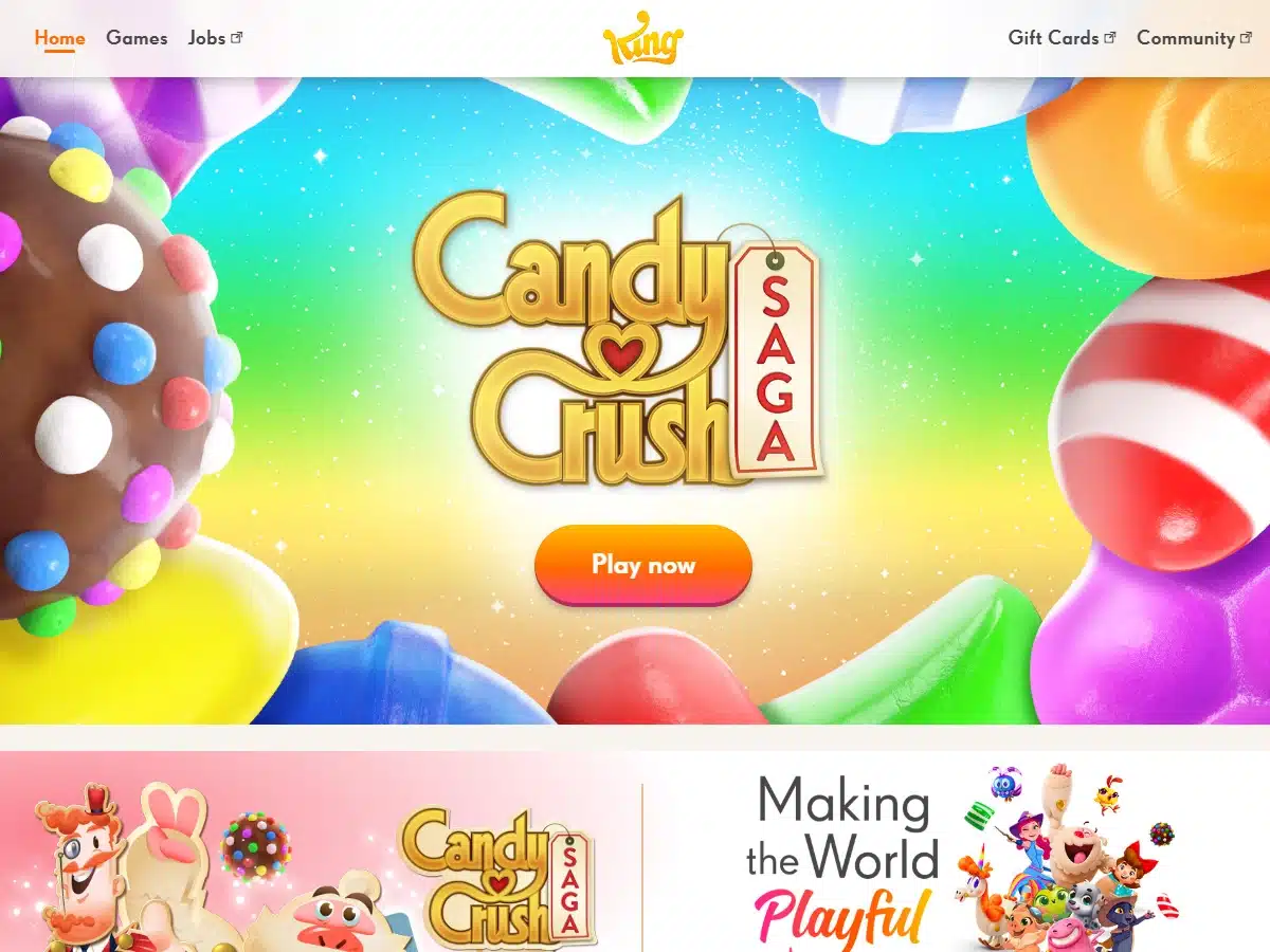
Reason: We love cool website designs like this one
Not all websites have to be serious in nature or massively complex. Sometimes websites can be fun and a bit wacky and still get their messages across. King’s website is one such example.
The mobile entertainment company chose well when it settled on this colorful, energetic design, which is eccentric enough to keep you interested and packaged so well you know they mean business. We can tell this company knows what it’s doing and has a keen understanding of the design space.
31. Alan Menken
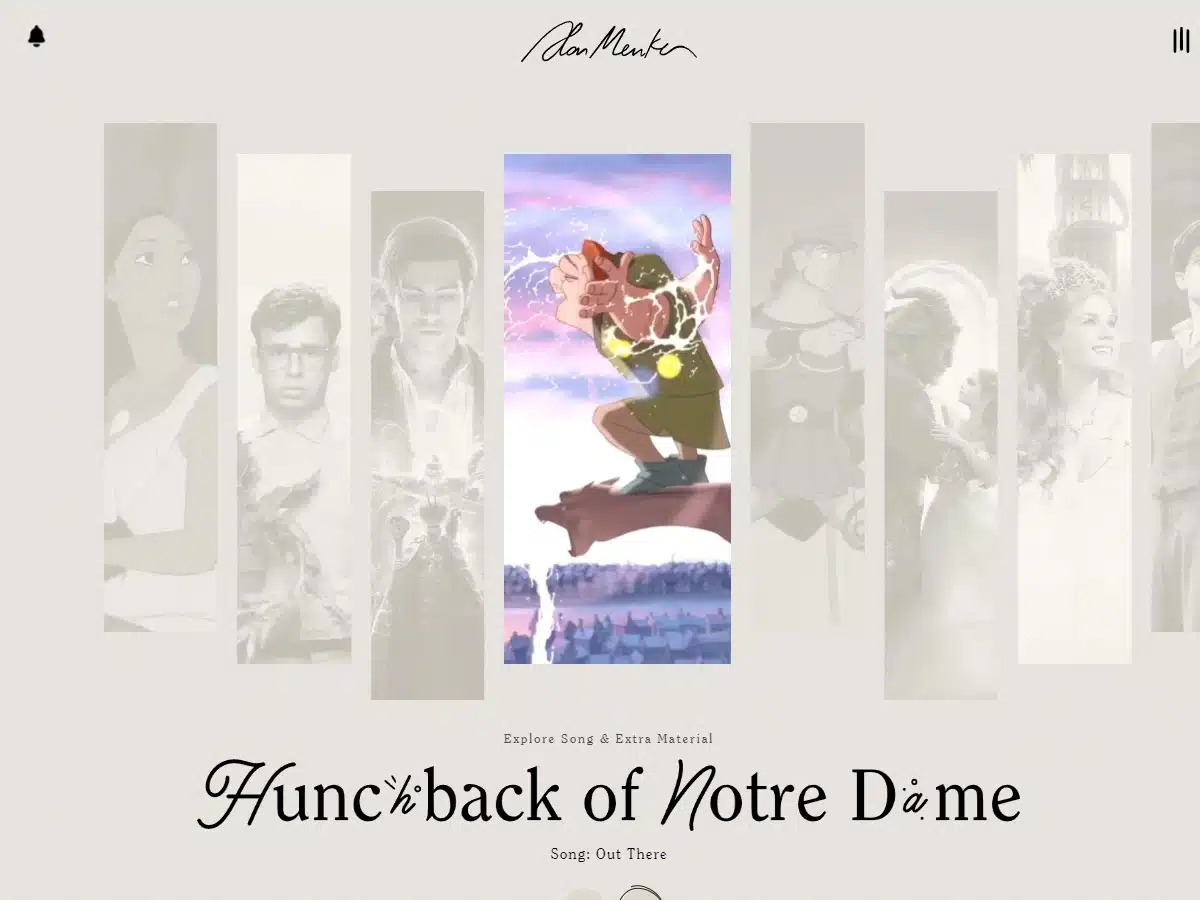
Award: Professional Services & Self-Promotion Websites/People’s Voice Winner (2020)—Webby Awards
The home website for Alan Menken truly blew us away and is one of our favorites. If you don’t know who Alan Menken is, he’s the composer behind some of Disney’s most iconic movies, such as The Little Mermaid, Beauty and the Beast, and Aladdin.
One of the things that make his website so special is its high aesthetic quality, and of course, the potent nostalgia. Every page feels like it was discovered in a leather-bound Disney novel and then elegantly transformed (through magic no doubt) into digital form.
We encourage you to check this site out if you want style inspiration for your next design project.
32. Apple
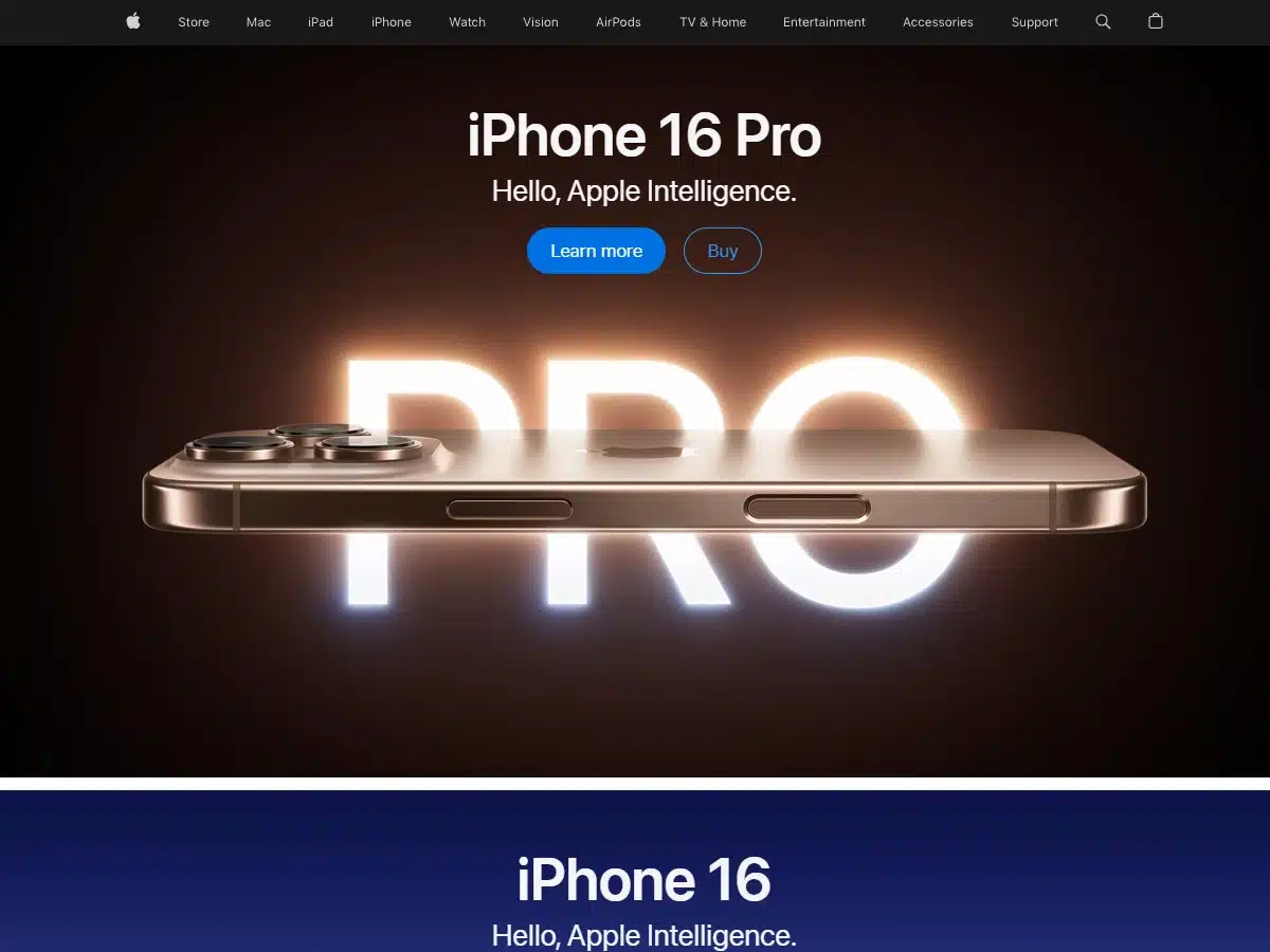
Reason: This is one of the best website designs of all time
We know that Apple is a multi-billion dollar corporation with nearly unlimited resources, but we had to include their website here. It’s simply too good to ignore.
If you want to know what a good design looks like, go to Apple’s home page. It’s the result of several world-class professionals working very hard over the course of years to ensure 5-star functionality, design relevance, fresh content, and more.
Apple’s website is more than just a design. It’s an ongoing evolution that continues to impress.
33. Samsung
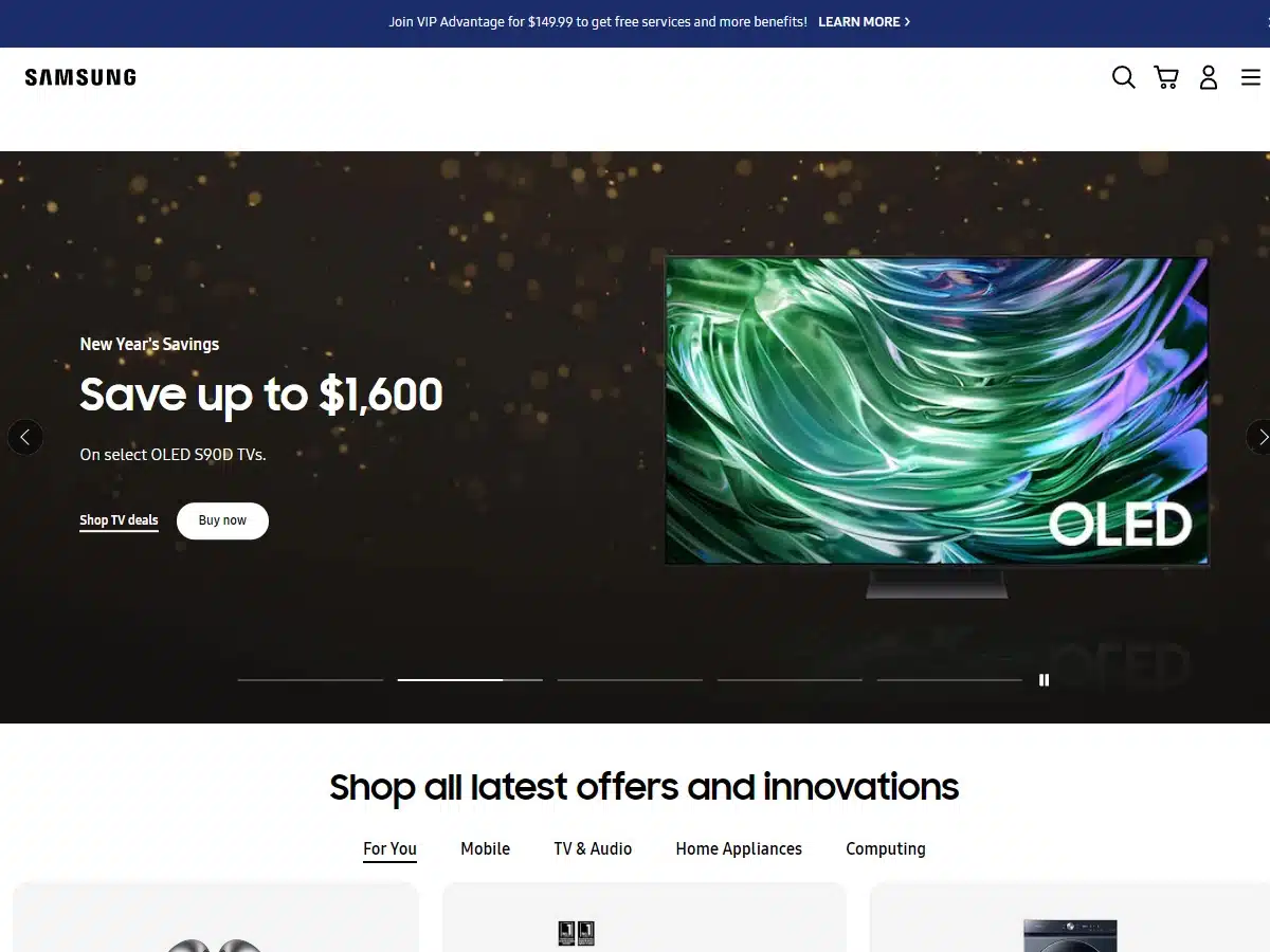
Reason: This is one of those website design ideas brought to life through enormous effort
This list wouldn’t be complete without Samsung’s website, which follows all the textbook design rules for a large corporate enterprise. The site’s best feature (among many good ones) is its nearly endless cache of high-quality product photos and advertising graphics.
Sure, Samsung has bolted together an eCommerce behemoth capable of handling huge volumes of traffic and who knows how many orders per day with its ultra-efficient shopping cart, but it’s the sheer effort that went into the product listings that blows our minds.
34. Tesla
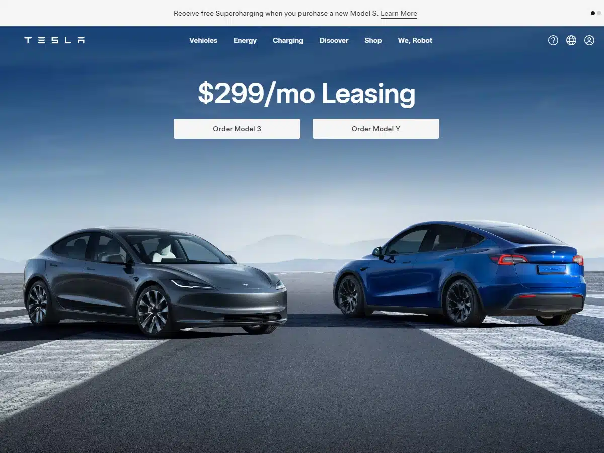
Reason: Well-packaged automotive website with succinct page design
It’s easy to appreciate Tesla’s web design. It’s minimalistic, contemporary, and skillfully draws attention to its core products. In short, it has all the qualities that a web designer looks for: ease of use, helpful resources, and aesthetic appeal.
35. Pepsi
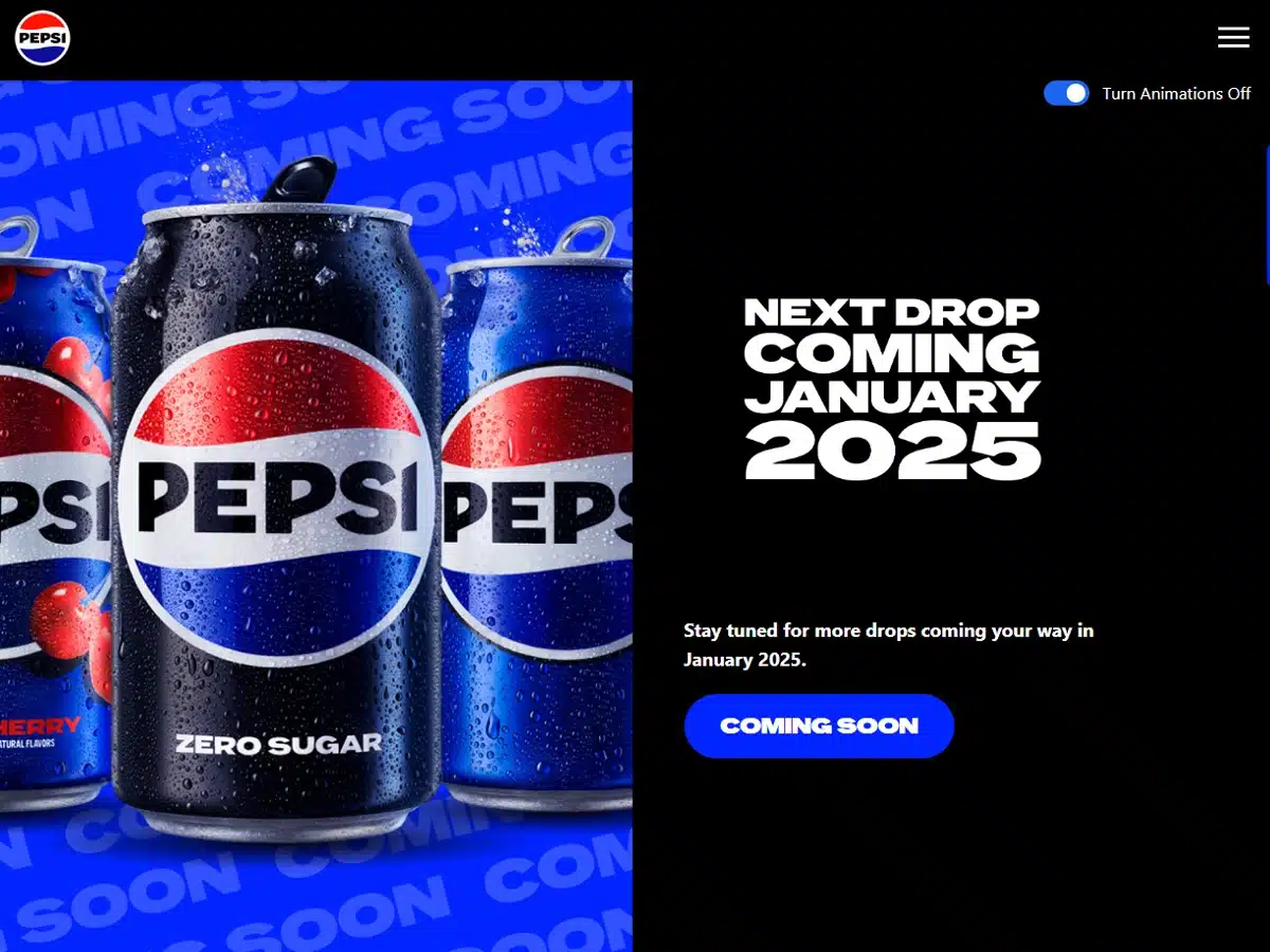
Reason: Excellent eCommerce website design
Pepsi’s website is a masterpiece of product placement. Everything about it just screams “buy me now and don’t think about it”—from the pictures of delicious ice cold drinks and crispy nachos to punchy typography and insistent calls to action.
You can literally feel the craving for a cold beverage tickle your senses as you scroll through the home page. You won’t find a better example of a product-focused website. If you plan on designing an eCommerce platform that sells, take a page from Pepsi’s book.
36. ESPN
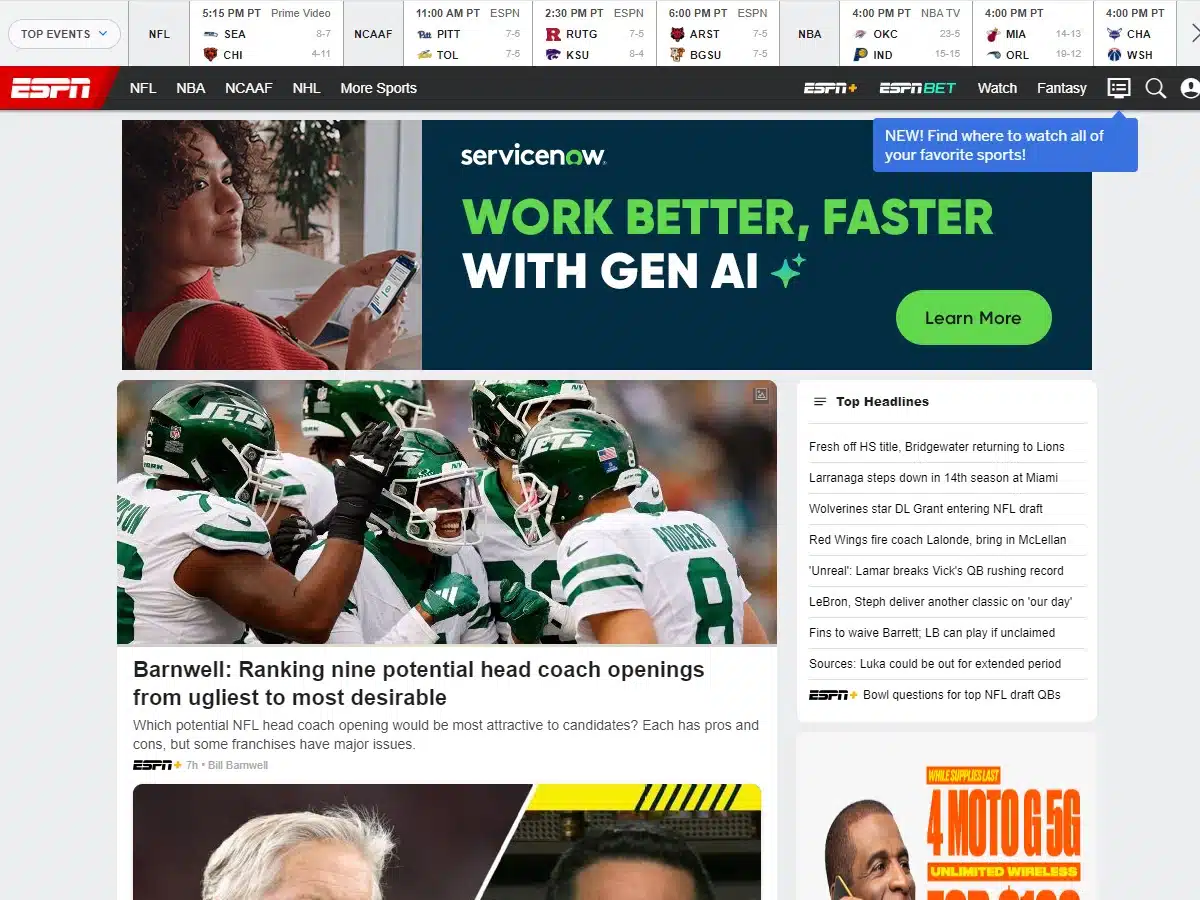
Reason: Powerful and information-packed sport website design
Like some of the other sites on this list, what makes ESPN’s design so good is how it packs a huge amount of information into a digestible format. We particularly admire the site’s “T” shaped design structure, which places the most important articles and videos in the middle of the screen and arranges supplementary information, such as Quick Links, out to the side.
Other bonuses of this website include easy-to-read fonts, a sharp, eye-catching color palette, livestreaming of certain events, and a comprehensive navigation menu.
37. Mixbook
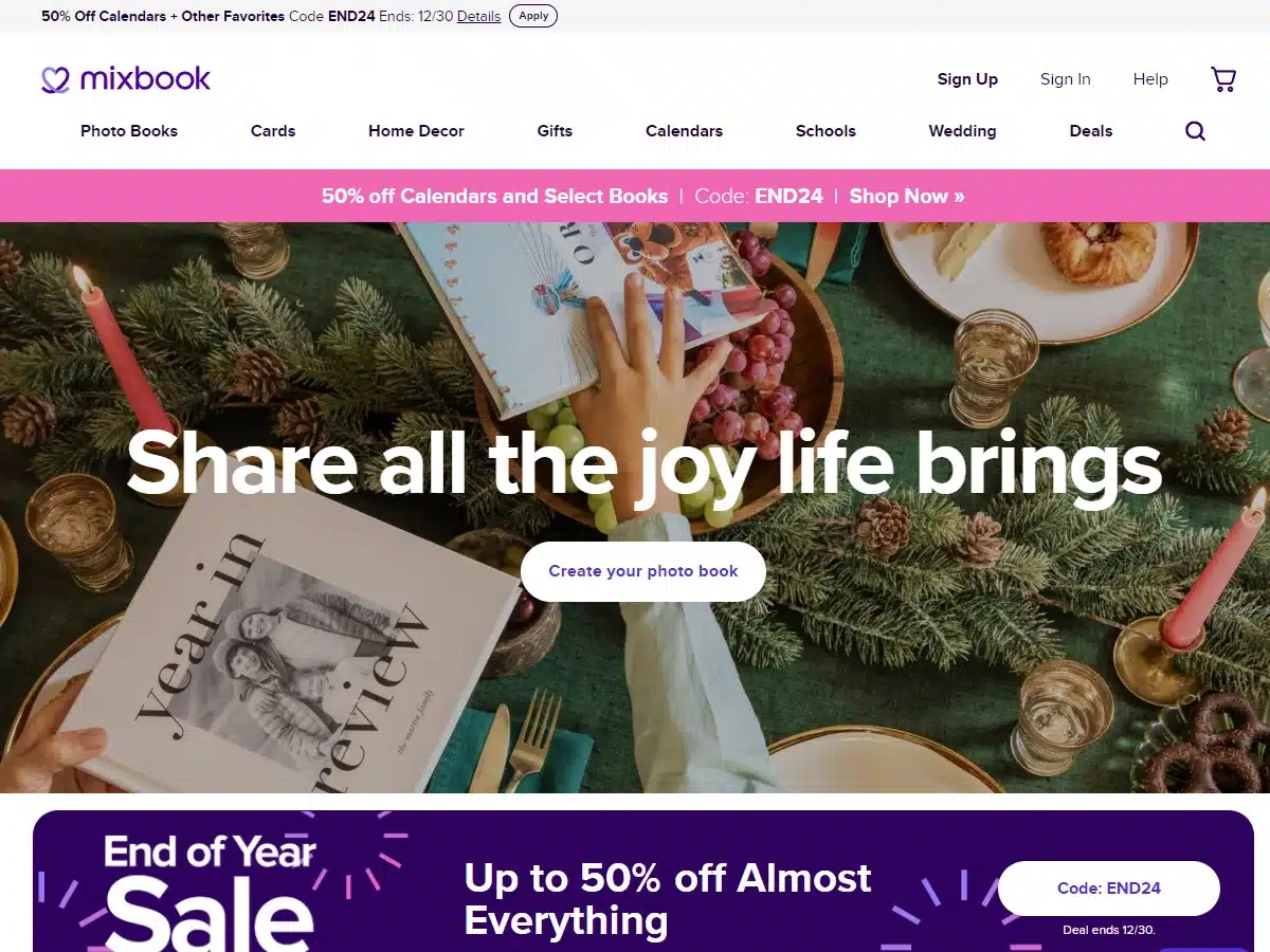
Reason: This is perhaps the best photo book website today
If you want an example of a picture-heavy design that works, look no further than Mixbook’s website. From the user interface to the layout, everything about this site feels great and simply bursts with visual appeal.
Now, this may be a small component, but we especially appreciate the site’s central heading: “Beautiful Designs Made Easy,” and the accompanying font options, which are the perfect mix of modern and elegant. We could go on complimenting all the intricate design details of this website, but the bottom line is: This is possibly THE top photo book website of 2024 and 2025.
38. Figma
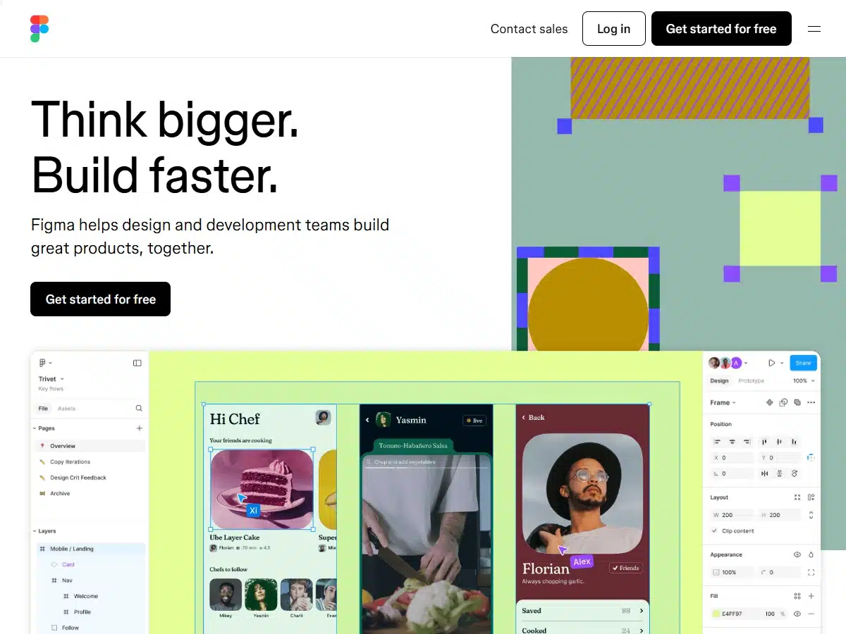
Reason: This is a world-class collaborative design tool website
As a collaborative design tool, you’d expect Figma’s website to have a top-notch design. Well, it does. This site is so complex that it’s more or less a living digital organism at this point, albeit one hidden inside a deceptively sleek body.
One of our favorite aspects of this design is the split scroller. Once you get past the headline and the first call to action box, the left side of the screen continues scrolling while the right side highlights important Figma features in the form of advanced flashcards.
39. Adobe
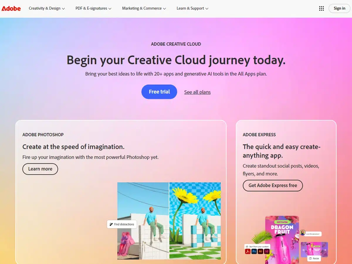
Reason: This design is the true embodiment of the phrase, “Websites as art”
Adobe’s site deserves to be on this list due to its visual impact. Rarely do we come across a website with more flair.
While the site’s design components are what you’d expect from any major corporation with a nearly endless budget, Abode has always distinguished itself by pushing the limits of what’s possible visually, and it shows on every page. The digital art here is stunning, and it’s what makes the website so special.
40. ClickUp
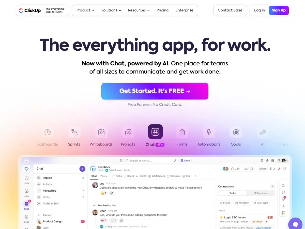
Award: Orpetron Web Design Awards (2020)
ClickUp’s fresh, inviting design comes with all the staples that you’d expect from a professional web team—a clean layout, a concise message, and a comprehensive navigation menu.
But there is more to ClickUp’s website than just these components. It may be the site’s animated infographics, the enthusiastic calls to action, or the nifty icons that inspire our appreciation, but we think it’s more than that. The design has a subtle allure to it that makes one pause and seriously consider using ClickUp’s product.
41. Canva
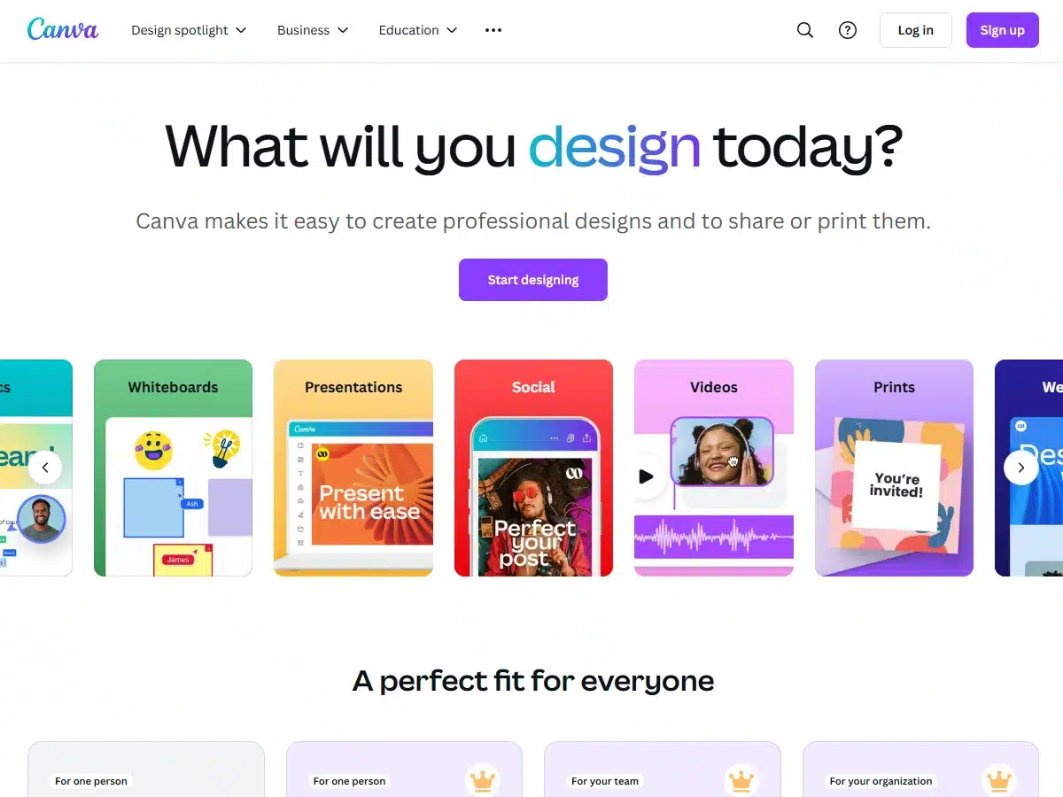
Reason: This is a five-star design platform
Our favorite part of Canva’s website is its immense utility. The site seemingly has it all, from educational resources for teachers to design tools that anyone can use. Designing something so useful (and comprehensive) takes work…on multiple levels. Just thinking about it makes us want to grab multiple cups of coffee.
One additional point: We thoroughly appreciate how well the website utilizes its web copy. The text is beautifully arranged and is lucid, direct, and succinct.
42. Webflow
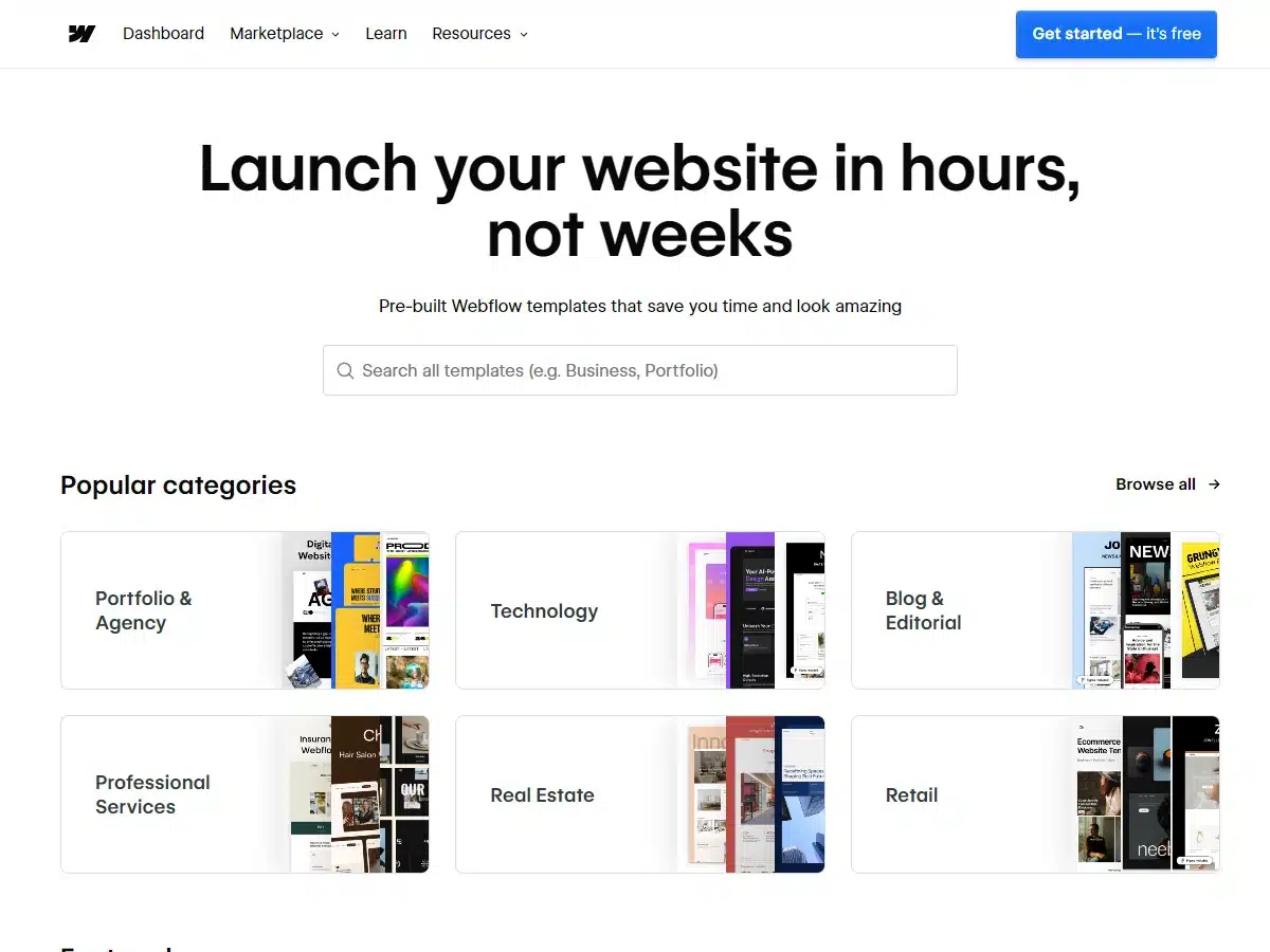
Reason: This is an impressive web designer website
Webflow’s design is user-friendly and easy on the eyes. Everything from the web copy to the navigation menu lends itself well to the user experience. Webflow’s website follows all of the classic design rules and is worth studying if you have an interest in pushing the limits of your work.
43. Platinum Injury Law
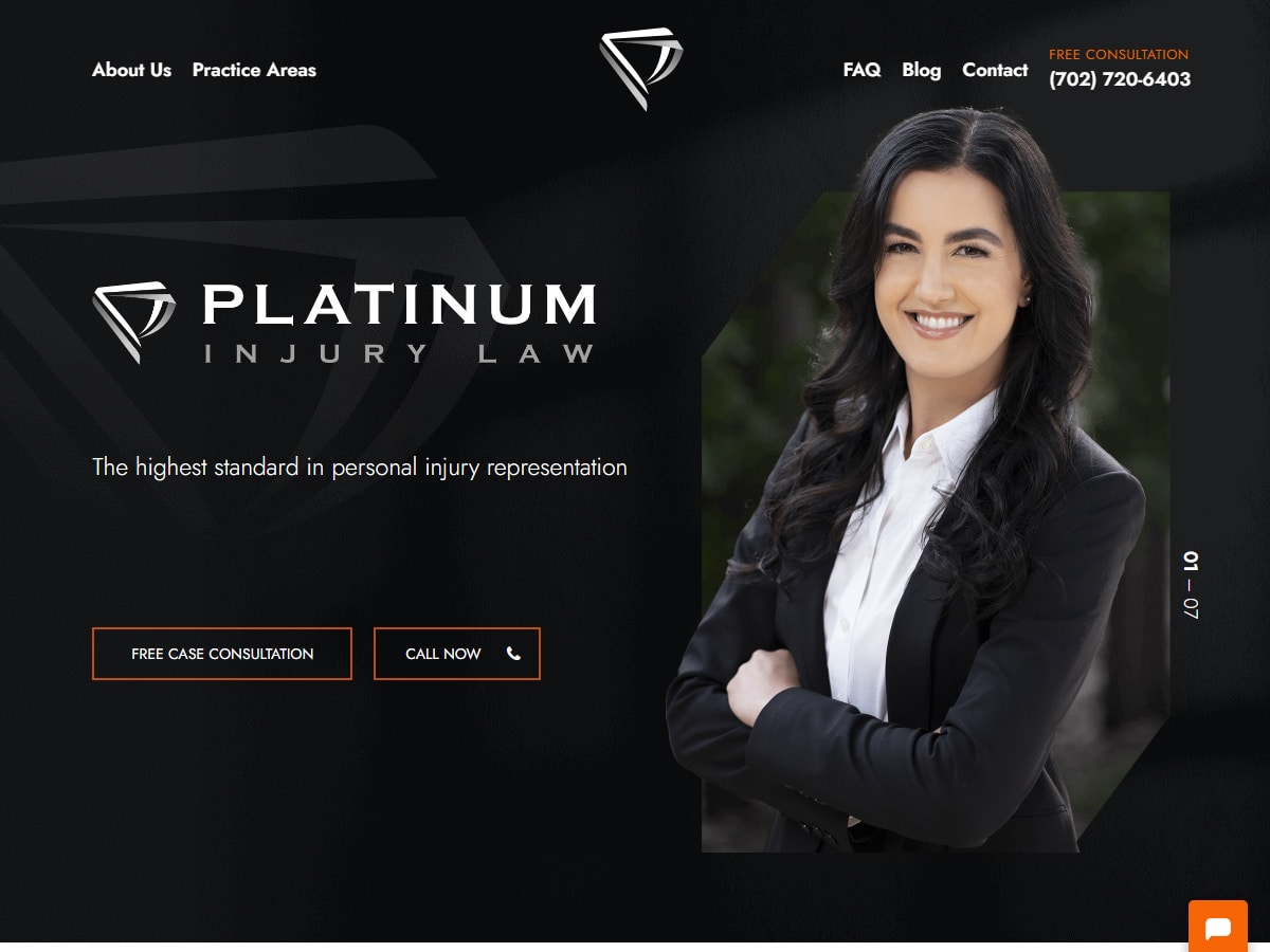
Reason: This is a cohesive law firm website design that gets straight to the point
Fill disclosure: Platinum Injury Law is one of our client websites. What makes this site work is the strong presence of website owner Josie Sansone. With her picture on the front page strategically positioned next to an unmissable “Call Now” button, visitors know right away who will be representing them and how to get in touch.
When designing Platinum Injury Law, we utilized a black-and-white color scheme, which serves the subject matter well and creates a compelling, no-nonsense atmosphere.
44. Planetary
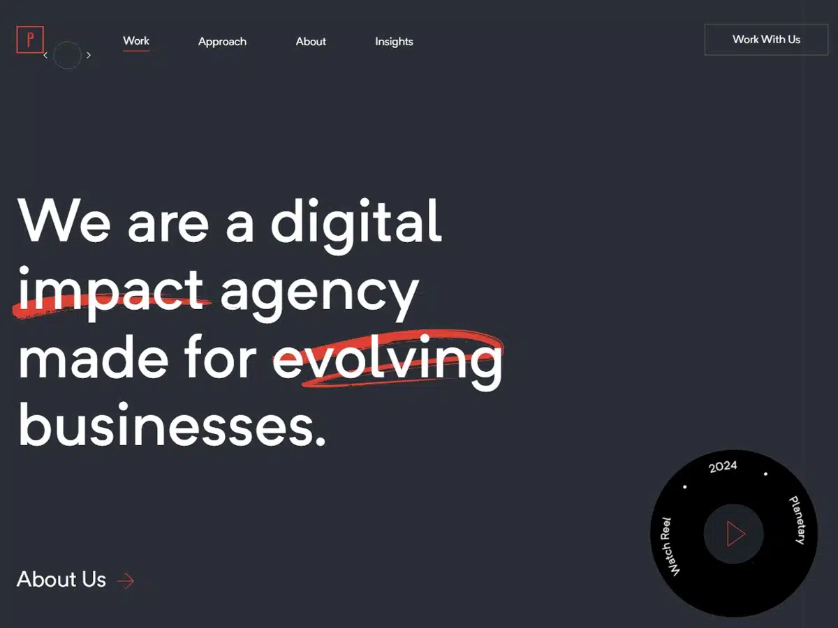
Award: Site of The Day (2019 June 6)—Awwwards
If you’re a fan of websites that try something different, you’ll love Planetary’s website design. The site’s Work page, which sort of doubles as the home page, features a left-right scroller rather than a vertical layout.
While other pages on the site do use the classic vertical spec, we appreciate Planetary’s decision to invert the normal approach on one of their most important pages. Overall, this website has a fresh and sophisticated feel, and we’re sure it’ll impress visitors.
45. Khan Academy
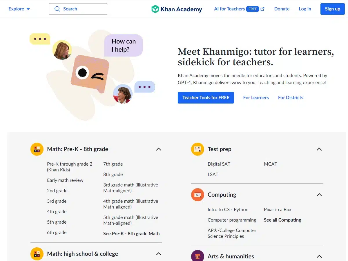
Reason: This is a premier educational website design
We’ll say this much….The team that designed Khan Academy’s website really knows how to use white space. Dotting the spacious canvas, you find perfectly placed web copy, creative icons, and static graphics, which make each section feel slightly like its own colorful island.
We just love how pure this design is.
46. Los Angeles Times
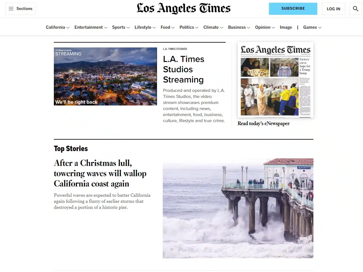
Reason: This is a superb news website design
Say what you will about the news these days, but there is no arguing that L.A. Times’ website is expertly designed. With careful attention paid to the layout, color palette, font choices, and much more, we see why this website receives millions of visitors each month.
Regarding the layout, we were impressed by how the home page is broken up into several components based on visitors’ likely goals for browsing the site.
47. Monday
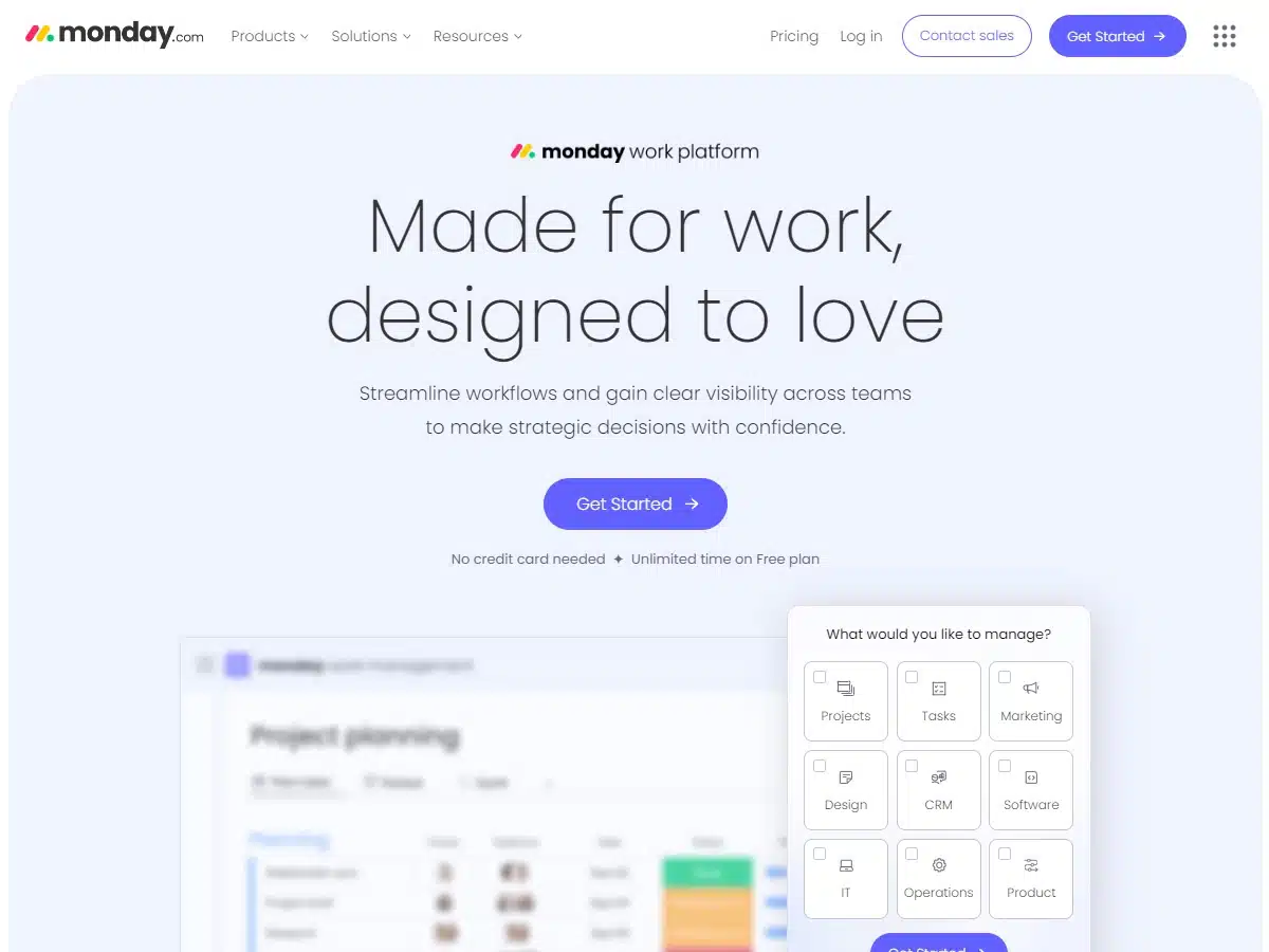
Reason: This is a phenomenal project management website
Monday.com utilizes colors brilliantly, which is why it’s on this list. We absolutely adore the color scheme here, especially the rich navy blue. It acts as the perfect background for the site’s brighter colors—red, yellow, green, and pink.
There is so much good we could say about this design. It’s subtly interactive. The graphics are excellent and pulsing with a life of their own. The company offerings are clearly delineated with strategically arranged text. The use of bolded fonts is superb. Seriously, we could go on.
If you want to know how to use color and font styles well, bookmark this website as a reference point.
48. RH
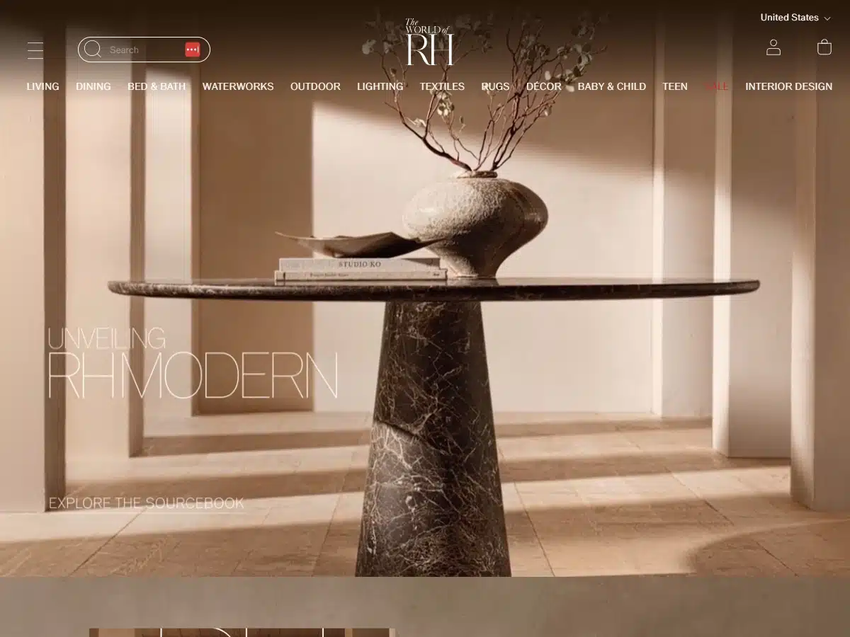
Reason: This is an immaculate home furnishings and furniture website
Web page layouts have advanced greatly from the early days of the internet, which is why websites like rh.com are possible today. This is such a terrific design for many reasons.
For one, the opening is huge and bold and is an undeniable statement about the company’s culture. For two, the color scheme is excellent. Rich and luxurious, it makes you realize that you’re looking at some of the best home furnishings in the world.
One interesting element of this website is that it supplements imagery with text rather than the other way around. We’ve seen many websites that utilize text to great effect. RH certainly utilizes text well, but it mainly relies on high-quality photos and slow-moving video previews to convey its message.
49. Adidas
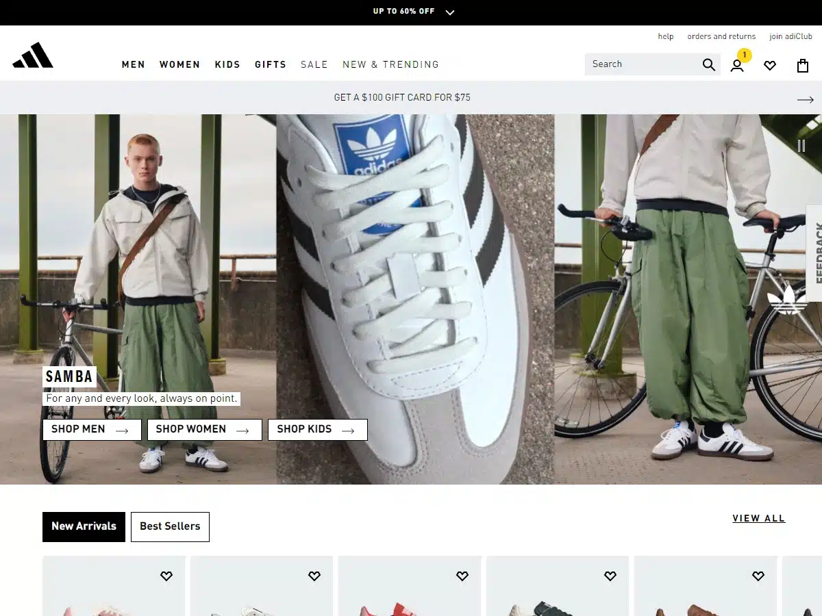
Reason: This is an easy-to-navigate eCommerce website design
Adidas boasts a top-tier website that is worth checking out if you enjoy contemporary eCommerce designs. As a corporate website, this highly polished platform does exactly what you’d expect—function smoothly and faithfully herald the brand’s core message.
Of all the design components, our favorite is the header, which offers a humble navigation menu that might just be perfect. Sometimes it’s easier to find products when you only have so many search options to choose from.
50. Active Theory
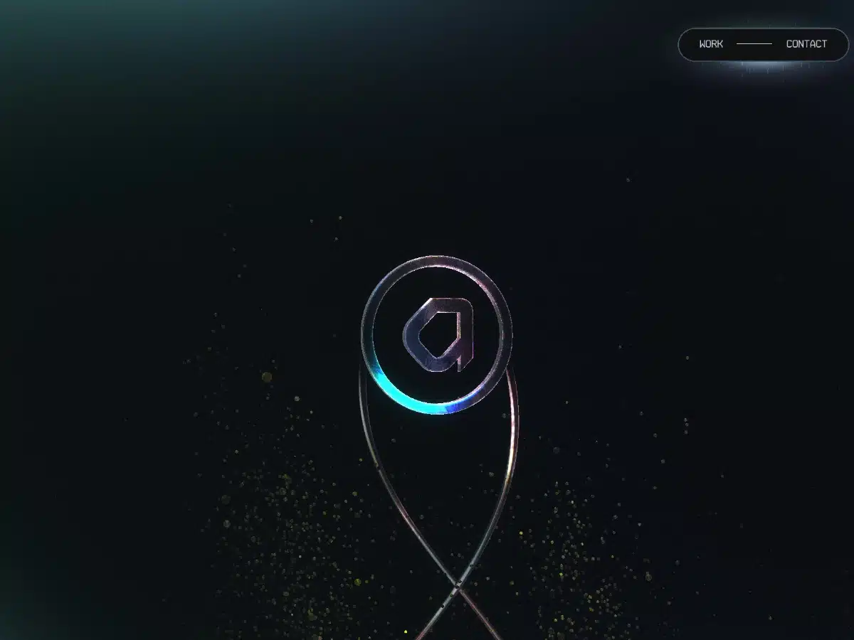
Award: Nominee for Technical Achievement—Webby Awards
Although at times disorienting, Active Theory’s interactive web design made a definite impression on us. Uniquely weird and most certainly intriguing, we appreciate the site’s futuristic, high-powered, and immersive energy.
Active Theory’s website relies heavily on large, enveloping ambient videos, which are quite appropriate for a VR and AR company that specializes in immersive experiences. Visiting the site almost feels like piloting through a subset of the matrix. We highly recommend checking it out.
Conclusion
Whether it’s a creative layout or an eye-catching color combination, all of our picks for “best website designs” have something to teach.
If you’re a designer, we hope you’ve taken inspiration from our selection! On the other hand, if you’re an individual or business owner looking for a trustworthy web design company that can offer you some of the best website designs today, let’s connect.
More About Best Website Designs With Sage
When asked, everyone has a different opinion about what the best website designs are. This is why we go over the specific things that you’d like to see on your website. We’re here to create something special for you!
To ensure we create the best website designs possible for our clients, we follow a proven five-step design process. For more details, watch our video on the subject or call us for our free, no-pressure consultation.
Our consultations are always friendly and never meant to push you into making a decision you aren’t ready for. We’re here to provide you with top-quality service.