
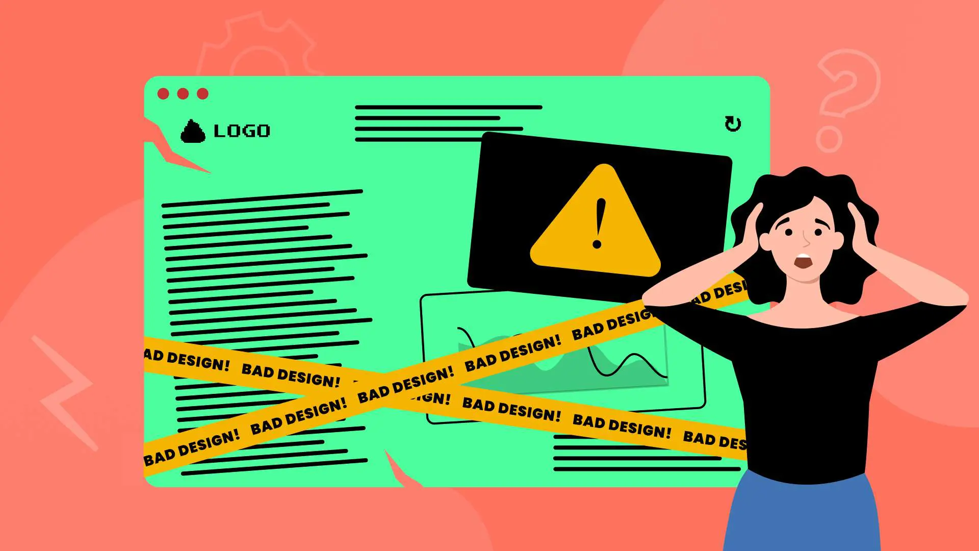
13 Website Mistakes That Are Killing Your Business (And How to Fix Them)
Your website is bleeding potential customers, and you might not even know it. Every day, visitors land on your site, get frustrated, and leave for your competitors. The hard truth? Most business websites are broken in ways that directly impact revenue, credibility, and growth.
At Sage Digital Agency, we’ve audited hundreds of websites across Las Vegas and beyond. The patterns are clear: the same critical mistakes appear again and again, costing businesses thousands in lost opportunities. The good news? These problems are fixable when you know what to look for.
Why Website Problems Cost You More Than You Think
Bad websites don’t just look unprofessional—they actively hurt your business. When visitors can’t find what they need, can’t navigate your site, or encounter broken functionality, they make split-second decisions to leave. We fix bad websites because we understand that your website is often the first impression potential customers have of your business.
Let’s break down the most common website killers and the proven solutions that turn visitors into customers.
1. User Experience Disasters That Drive Visitors Away
The Problem
Nothing kills conversions faster than confusing navigation. When users land on your site and can’t figure out where to go next, they bounce. Common UX disasters include unintuitive user flows, hidden navigation elements, and “under construction” pages that scream unprofessionalism.
Hard-to-close popups are another major frustration. Visitors feel trapped when they can’t easily dismiss overlays or promotional messages. Scroll hijacking—where the website controls how users scroll—creates an uncomfortable, unnatural browsing experience.
The Solution
Map your complete user journey before making any design decisions. Start with your most common visitor goals: getting a quote, learning about services, or making contact. Each path should be logical and friction-free.
Use real user testing and screen recordings to identify where people actually get stuck. Tools like Hotjar or Crazy Egg show you exactly where visitors click, scroll, and abandon your site. Remove unnecessary steps that don’t add value to the user experience.
Implementation timeline: 2-3 weeks for a complete UX audit and redesign.
What Success Looks Like
Visitors should be able to complete their primary goal within 3 clicks. Every interaction should feel purposeful and guide them toward taking action, whether that’s requesting a quote or scheduling a consultation.
2. Page Speed Issues That Kill Conversions
The Problem
If your website takes more than 2-3 seconds to load, you’re losing customers before they even see your content. Unoptimized images are often the biggest culprit—large file sizes and wrong formats create unnecessary loading delays.
Autoplay videos and background animations might look impressive, but they slow down your site and frustrate mobile users. Too many external scripts, fonts, and tracking codes create a cascading effect that makes every page element load slower.
The Solution
Target under 2 seconds on mobile devices. Run regular speed tests using Google PageSpeed Insights, GTMetrix, or Pingdom to identify specific performance bottlenecks.
Convert images to .webp format and use compression tools like TinyPNG to reduce file sizes without losing quality. Implement a content delivery network (CDN) to serve your content from servers closer to your visitors.
Minimize CSS and JavaScript files by removing unused code and combining multiple files where possible. Avoid autoplay videos and heavy animations that don’t directly contribute to conversions.
Performance benchmarks: 90+ PageSpeed score, under 2-second load time.
What Success Looks Like
Fast-loading pages keep visitors engaged and improve your search engine rankings. Every second of improvement in load time can increase conversions by 7-10%.
The Problem
Hidden navigation menus, especially hamburger menus on desktop, force users to work harder to find what they need. Icon-only navigation without text labels leaves visitors guessing about page content.
Missing search functionality is a major oversight, especially for service businesses with multiple offerings. When visitors can’t quickly search for specific services or information, they often leave to find answers elsewhere.
The Solution
Use a clear top-level menu with familiar labels that match how your customers think about your services. Include a visible search bar, particularly if you offer multiple services or have extensive content.
Follow standard layout patterns that visitors expect. Put your logo in the top left, navigation across the top, and contact information in the header or footer. Use breadcrumb trails to show visitors where they are in your site structure.
Resource requirement: 1-2 weeks for navigation overhaul.
What Success Looks Like
Visitors should never feel lost or confused about how to find information. Clear navigation reduces bounce rates and increases the likelihood that visitors will explore multiple pages.
4. Mobile Responsiveness Problems
The Problem
More than half of web traffic comes from mobile devices, yet many websites still break on phones and tablets. Overlapping elements, tiny tap targets, and content that requires horizontal scrolling create frustrating mobile experiences.
Menus that don’t work on touch screens are particularly problematic for service businesses where mobile visitors want to quickly find contact information or service details.
The Solution
Adopt a mobile-first responsive design approach. Design for mobile devices first, then scale up to desktop rather than trying to squeeze desktop layouts onto smaller screens.
Test on actual devices, not just browser emulators. Different phones and tablets can render your site differently, so real-device testing catches problems that emulators miss.
Ensure tap targets are at least 44 pixels wide and have adequate spacing. Test all interactive elements—buttons, forms, menus—on multiple mobile devices.
Implementation: 3-4 weeks for full responsive redesign.
What Success Looks Like
Mobile visitors should have the same easy experience as desktop users. All functionality should work smoothly on touch screens, and content should be easily readable without zooming.
5. Typography Problems That Hurt Readability
The Problem
Fonts smaller than 16px are difficult to read, especially on mobile devices. Poor contrast between text and background—like light gray text on white backgrounds—strains visitors’ eyes and reduces comprehension.
Using too many different fonts or font sizes creates a chaotic, unprofessional appearance. Decorative fonts might look creative, but they often sacrifice readability for style.
The Solution
Stick to 2-3 typefaces maximum. Use a minimum of 16px for body text and 24px or larger for headings. Limit line length to 50-75 characters for optimal readability.
Ensure strong contrast between text and background colors. Test your color combinations for accessibility compliance using tools like WebAIM’s contrast checker.
Create a consistent font hierarchy with clear distinctions between headings, subheadings, and body text. This helps visitors scan your content and find information quickly.
What Success Looks Like
Visitors should be able to easily read your content without squinting or struggling. Clear typography builds trust and keeps people engaged with your message.
6. Visual Design Issues That Undermine Credibility
The Problem
Too many colors or clashing color palettes make websites look unprofessional and overwhelming. Excessive gradients and animations can distract from your core message and slow down site performance.
Crowded layouts without breathing room make it difficult for visitors to focus on what’s important. Distracting background images or videos compete with your content for attention.
The Solution
Use a consistent color palette with 3-5 colors maximum. Choose colors that reflect your brand and maintain contrast for accessibility and clarity.
Balance white space intentionally to guide attention to important elements. Don’t crowd elements together—give each section room to breathe and be noticed.
Use animations sparingly and only when they serve a purpose, like drawing attention to calls-to-action or providing helpful feedback during form submissions.
What Success Looks Like
Professional visual design builds trust and credibility. Visitors should feel confident about your business based on the polished appearance of your website.
7. Call-to-Action Failures That Waste Opportunities
The Problem
Vague CTA labels like “Click Here” or “Submit” don’t tell visitors what will happen next. Too many competing buttons on a single page create decision paralysis—visitors don’t know which action to take.
CTAs placed in illogical locations or designed to be barely visible waste conversion opportunities. Mobile-unfriendly CTAs that are too small or too close together frustrate touch-screen users.
The Solution
Use clear, action-oriented copy that tells visitors exactly what they’ll get. Instead of “Submit,” use “Get Your Free Quote” or “Schedule Your Consultation.”
Limit yourself to 1-2 primary CTAs per page. Repeat your main CTA in strategic locations—at the top of the page, in the middle of your content, and at the bottom.
Make sure CTAs are easily clickable on mobile devices with adequate spacing and size. Use contrasting colors that make buttons stand out without clashing with your overall design.
What Success Looks Like
Visitors should know exactly what action to take next. Strong CTAs guide users through your conversion funnel and turn browsers into customers.
8. Accessibility Problems That Exclude Customers
The Problem
Missing alt text for images prevents screen readers from describing visual content to visually impaired visitors. Poor color contrast makes your site difficult to use for people with visual impairments.
Elements that can’t be navigated with a keyboard exclude users who can’t use a mouse. Inconsistent heading structure confuses screen readers and makes content harder to understand.
The Solution
Follow WCAG 2.1 AA guidelines for accessibility compliance. Add descriptive alt text to all images, especially those that convey important information.
Test color contrast ratios to ensure they meet accessibility standards. Use semantic HTML and ARIA labels to help assistive technologies understand your content structure.
Make all interactive elements keyboard-navigable. Test your site using only a keyboard to identify areas that need improvement.
What Success Looks Like
Your website should be usable by everyone, regardless of their abilities. Accessible design not only serves more customers but also improves your search engine rankings.
9. Content Strategy Problems That Confuse Visitors
The Problem
Long walls of text without breaks overwhelm visitors and reduce comprehension. Jargon-heavy content that doesn’t speak to your customers’ actual needs and concerns creates disconnect.
Outdated or incorrect information damages credibility and can lead to confused or frustrated customers. Content that doesn’t answer the questions visitors are actually asking fails to provide value.
The Solution
Make your content scannable with headings, bullet points, and short paragraphs. Write clearly and directly, focusing on what your customers want and need to know.
Avoid industry jargon unless you’re targeting an audience that expects it. Instead, explain concepts in terms your customers understand and use.
Update your content regularly to keep information current and accurate. Create content that answers the real questions your customers ask during sales conversations.
What Success Looks Like
Visitors should be able to quickly scan your content and find the information they need. Clear, helpful content builds trust and positions you as an expert in your field.
10. Trust and Credibility Issues That Raise Red Flags
The Problem
Missing contact information or company details make visitors question whether you’re a legitimate business. Sites without SSL certificates (showing “HTTP” instead of “HTTPS”) trigger security warnings that scare away potential customers.
Fake testimonials or reviews, gimmicky countdown timers, and artificial scarcity tactics damage trust and make your business appear unprofessional.
The Solution
Display real contact information prominently, including your physical address, phone number, and email. Use authentic photos of your team and actual customer testimonials with permission.
Implement SSL certificates to encrypt data transmission and display security badges where appropriate. Create clear privacy policies and terms of service pages.
Avoid gimmicky tactics like fake countdown timers or artificial scarcity messages. Instead, focus on genuine value propositions and authentic social proof.
What Success Looks Like
Visitors should feel confident about doing business with you. Trust signals reassure potential customers and increase conversion rates.
11. Technical SEO Problems That Hide Your Business
The Problem
Missing or duplicate meta tags make it harder for search engines to understand and rank your content. Broken links create poor user experiences and hurt your search rankings.
Disorganized heading structures confuse both users and search engines. Bloated code slows down your site and makes it harder for search engines to crawl and index your content.
The Solution
Create unique, descriptive title tags and meta descriptions for each page. Use proper heading hierarchy (H1, H2, H3) to structure your content logically.
Regularly audit your site for broken links and fix them promptly. Use internal linking strategically to help visitors find related content and improve your search rankings.
Clean up your code by removing unnecessary elements and optimizing file sizes. This improves both site speed and search engine crawling efficiency.
What Success Looks Like
Search engines should be able to easily find, crawl, and understand your content. Better technical SEO leads to higher search rankings and more organic traffic.
12. Form Problems That Block Conversions
The Problem
Long, overwhelming forms that ask for unnecessary information create friction that prevents conversions. Required fields that don’t make sense—like phone numbers for simple information requests—frustrate users.
Forms without clear success or error messages leave visitors confused about whether their submission worked. Poor labeling makes it unclear what information is expected.
The Solution
Only ask for information you actually need. For initial contact forms, name and email are often sufficient. You can gather additional details during follow-up conversations.
Use clear labels and group related fields together. Mark required fields clearly and explain why certain information is necessary.
Provide immediate feedback when forms are submitted successfully or when errors occur. Make it easy for users to correct mistakes and resubmit.
What Success Looks Like
Forms should feel quick and easy to complete. Reducing form friction can significantly increase your conversion rates and lead generation.
13. Cluttered Design That Overwhelms Visitors
The Problem
Trying to communicate everything at once creates visual chaos that prevents visitors from focusing on what’s important. Too many popups, competing CTAs, and overlapping messages create decision paralysis.
Lack of white space makes content feel cramped and difficult to process. Visitors need visual breathing room to understand and engage with your message.
The Solution
Focus on one main goal per page. Use white space strategically to guide attention to important elements like your value proposition and primary call-to-action.
Limit popups and promotional messages to avoid overwhelming visitors. Break up content visually with headings, images, and adequate spacing between sections.
Create a clear visual hierarchy that leads visitors through your content in a logical order, from attention-grabbing headlines to compelling CTAs.
What Success Looks Like
Visitors should feel calm and focused when browsing your site. Clean, organized design helps people process information and take action.
Key Takeaways: Transform Your Website from Liability to Asset
Your website should work as your best salesperson, not as a barrier between you and potential customers. Here’s what you need to do next:
• Audit your current site using the 13 problem areas outlined above • Prioritize fixes based on impact – start with speed, mobile responsiveness, and navigation • Test everything on real devices – don’t rely on desktop-only testing • Focus on user goals – make it easy for visitors to contact you or request services • Implement trust signals – SSL certificates, contact information, and authentic testimonials • Optimize for mobile first – more than half your traffic comes from mobile devices • Monitor performance regularly – website optimization is an ongoing process
Ready to Fix Your Website?
At Sage Digital Agency, we specialize in transforming problematic websites into conversion-focused business assets. Our Las Vegas-based team has helped hundreds of businesses eliminate these common website problems and achieve measurable results.
We fix bad websites because we understand that your online presence directly impacts your bottom line. Whether you need a complete redesign or targeted improvements, we have the expertise to get your website working for your business instead of against it.
Don’t let website problems continue costing you customers. Contact Sage Digital Agency today to schedule your comprehensive website audit and discover how we can transform your online presence into a powerful business tool.
Frequently Asked Questions
How long does it take to fix a bad website?
Most website improvements can be completed in 4-8 weeks, depending on the scope of problems. Critical issues like page speed and mobile responsiveness can often be addressed within 2-3 weeks.
Should I redesign my entire website or just fix specific problems?
This depends on the extent of your website’s issues. If you have multiple problems across design, functionality, and performance, a complete redesign is often more cost-effective than piecemeal fixes.
How can I tell if my website is actually driving away customers?
Look for high bounce rates (over 70%), low average session duration (under 1 minute), and poor conversion rates. Use tools like Google Analytics to track these metrics.
What’s the most important website problem to fix first?
Page speed is typically the highest priority. If your site takes more than 3 seconds to load, you’re losing potential customers before they even see your content.
How much does professional website repair cost?
Investment varies based on the scope of work needed. Simple fixes like speed optimization might cost $1,000-$3,000, while comprehensive redesigns typically range from $5,000-$15,000.
Can I fix these problems myself, or do I need professional help?
While some basic improvements can be DIY projects, complex issues like mobile responsiveness, performance optimization, and professional design require specialized expertise.
How do I know if my website is mobile-friendly?
Use Google’s Mobile-Friendly Test tool, or better yet, test your site on actual mobile devices. Look for text that’s too small, buttons that are hard to tap, and content that requires horizontal scrolling.
What makes a website trustworthy to visitors?
Key trust signals include SSL certificates (HTTPS), clear contact information, professional design, authentic testimonials, and transparent business practices.
How often should I update my website?
Content should be updated regularly to stay current, but major design and functionality updates are typically needed every 2-3 years to keep up with technology and user expectations.
What’s the difference between a website that converts and one that doesn’t?
Converting websites focus on user needs, have clear calls-to-action, load quickly, work well on mobile devices, and guide visitors toward taking specific actions. Non-converting sites often have unclear messaging, poor navigation, and technical problems.
Want to see the worst websites on the internet today?
Look no further….On this list, we’ll be showing you 30 of them.
PS Some of these websites get millions of visitors a year. Imagine that!
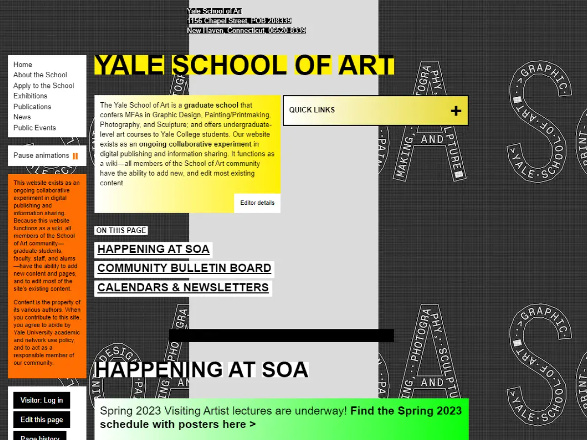
1. Yale University School of Art
Why it’s bad: The layout is bizarre, to say the least, and the font is too small. Plus, the backgrounds on each page aren’t exactly what you’d call appealing.
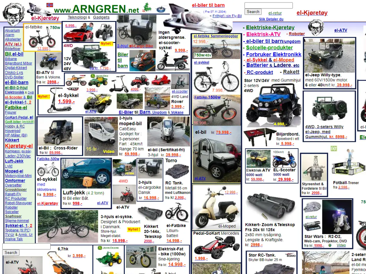
2. Arngren
Why it’s bad: Holy smokes, this is one of the most cluttered websites we’ve ever seen.
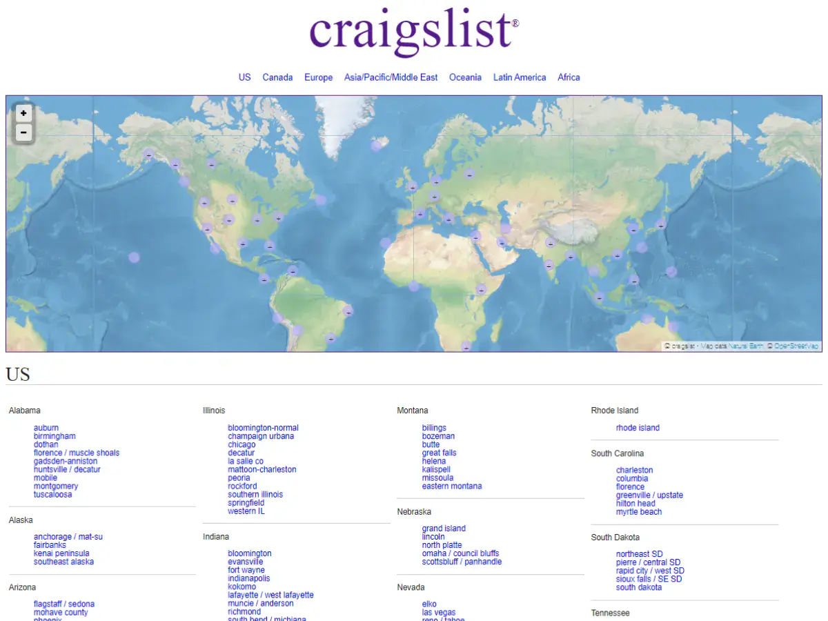
3. Craigslist
Why it’s bad: Craigslist feels like it’s been stuck in the late 90s forever. Then again, the site does have a certain charm to it. What do you think?


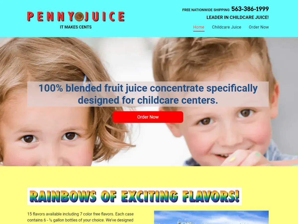
4. Penny Juice
Why it’s bad: We blame the website’s header for intruding on the layout. Also, the site’s font and color choices need some serious work.
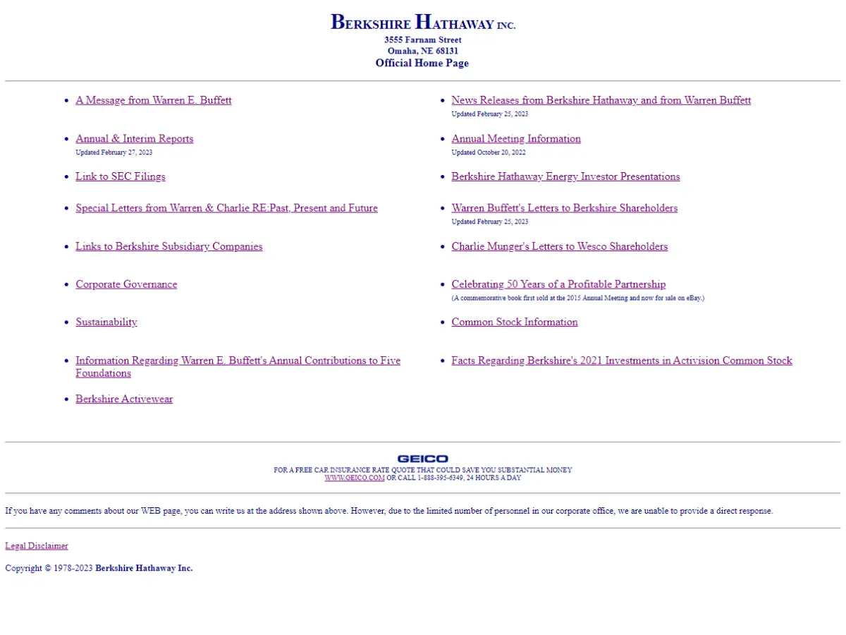
5. Berkshire Hathaway
Why it’s bad: This is a very simple design that lacks creative elements. It almost feels like a placeholder for a website that should replace it and become the final product.
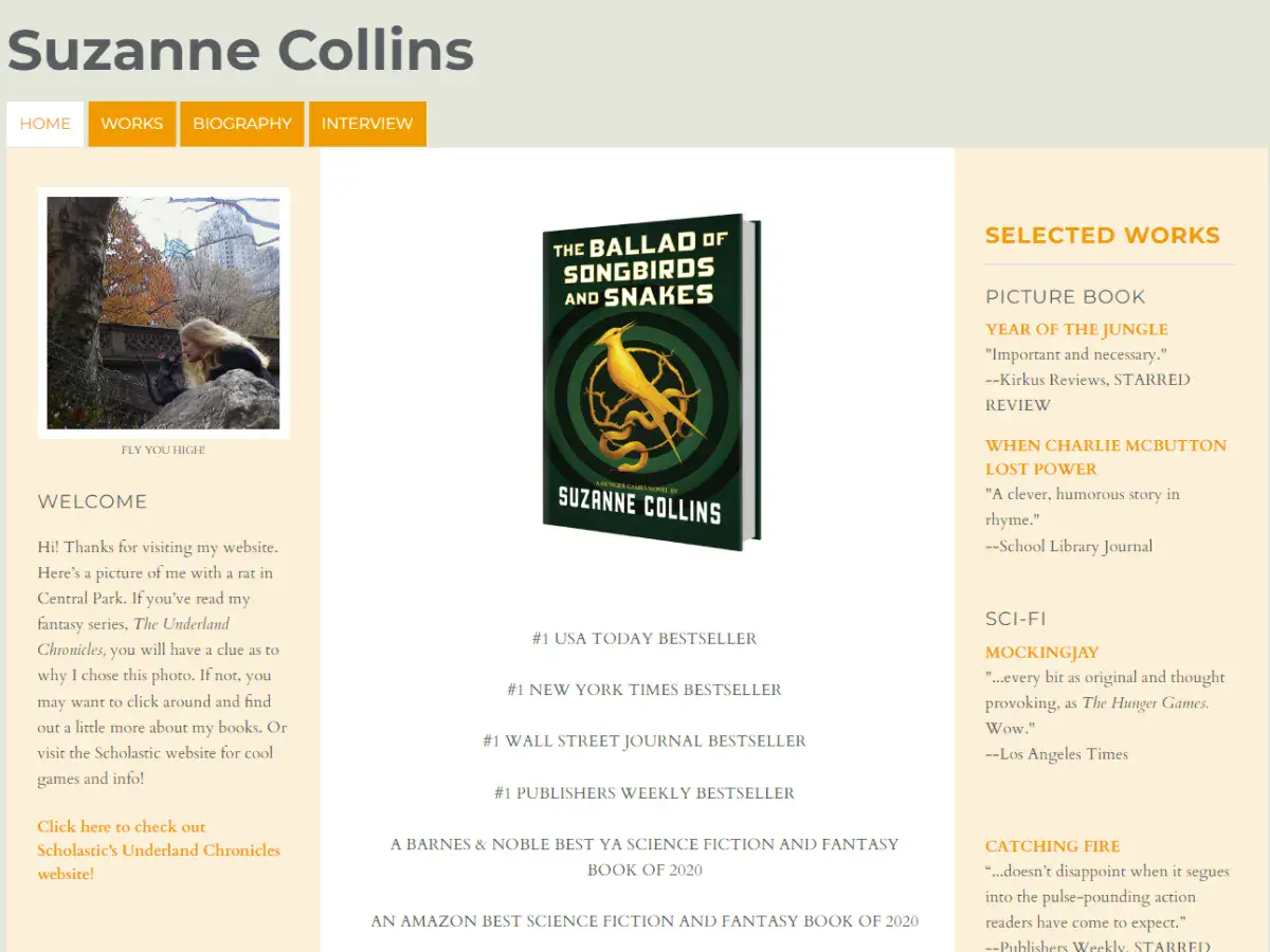
6. Suzanne Collins
Why it’s bad: We love Suzanne Collins as an author, but her website doesn’t hit the mark. The site feels like a free blog page rather than a robust portal to a world-class writer.
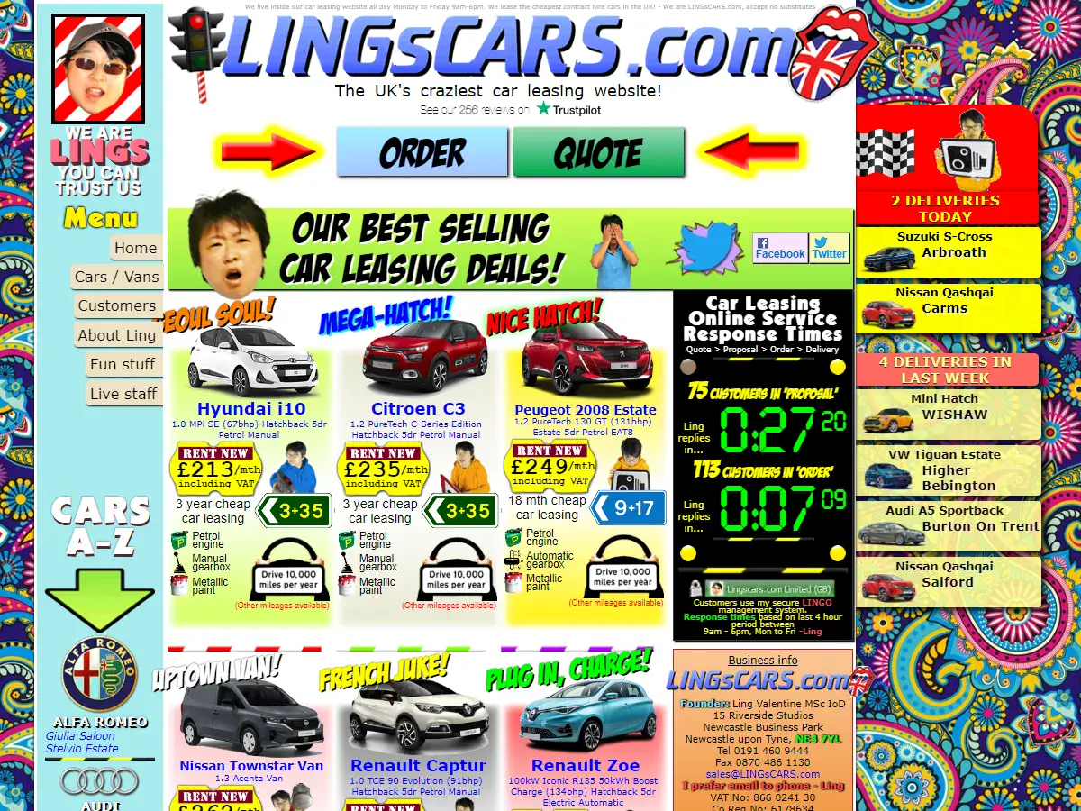
7. LINGsCARS
Why it’s bad: This website looks like it was designed on acid. This is, without question, the LAST design that you would expect from a car leasing company.
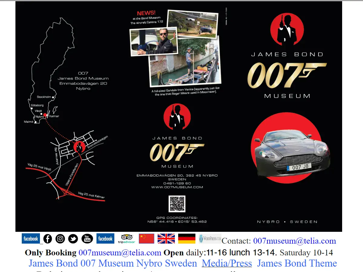
8. James Bond Museum
Why it’s bad: The website’s navigation is the main problem here. All of the content is packed on a single page that scrolls for what feels like forever.


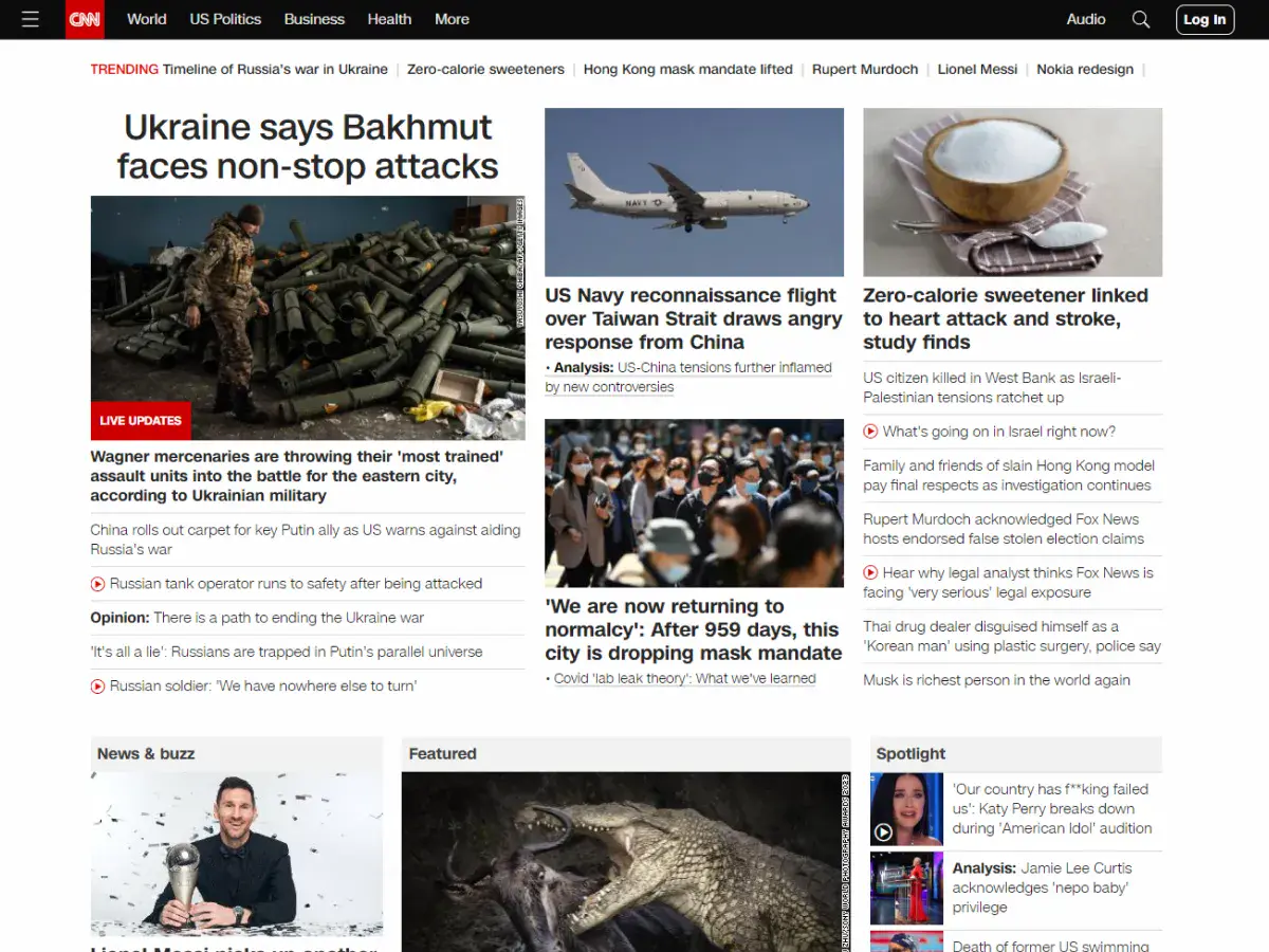
9. CNN
Why it’s bad: CNN’s website suffers from information overload. There is so much detail squeezed into each page that it’s difficult to process what’s going on and find a single thread to follow.
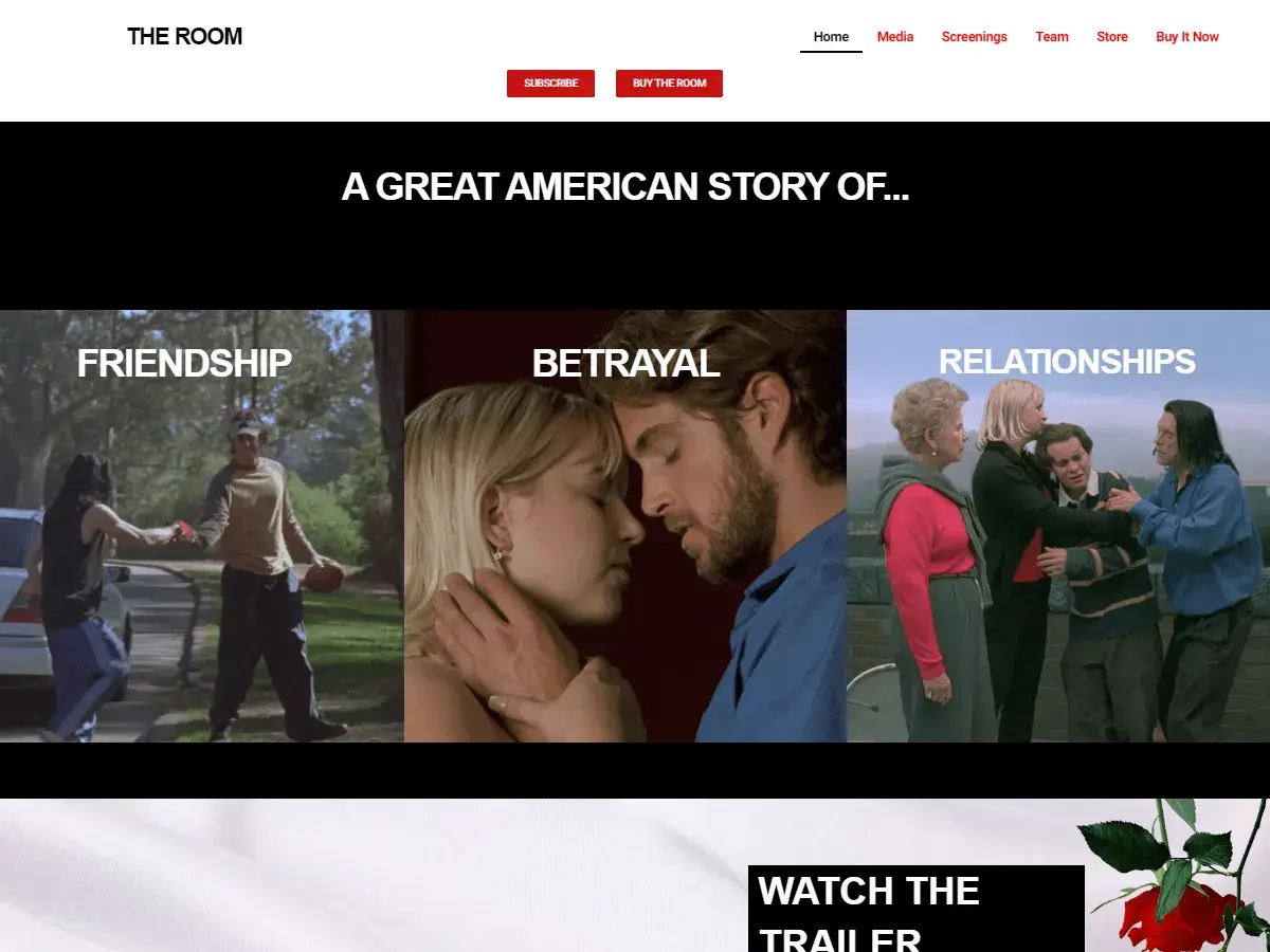
10. The Room
Why it’s bad: The design is very meat-and-potatoes and also pretty quirky. Then again, the quirkiness is undeniably appropriate. If you haven’t seen the movie, we recommend it.
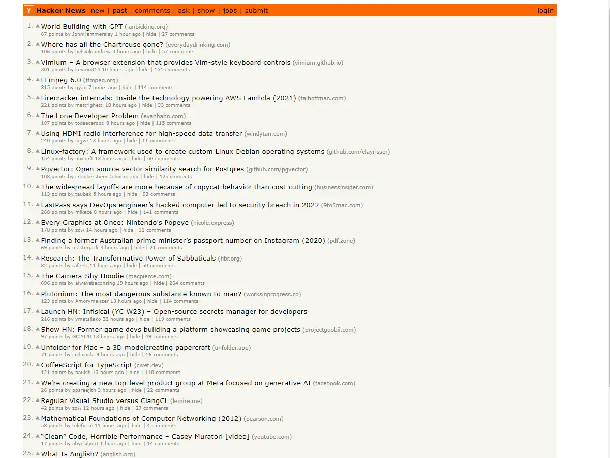
11. Hacker News
Why it’s bad: The small font and closely packed information make reading the content difficult.
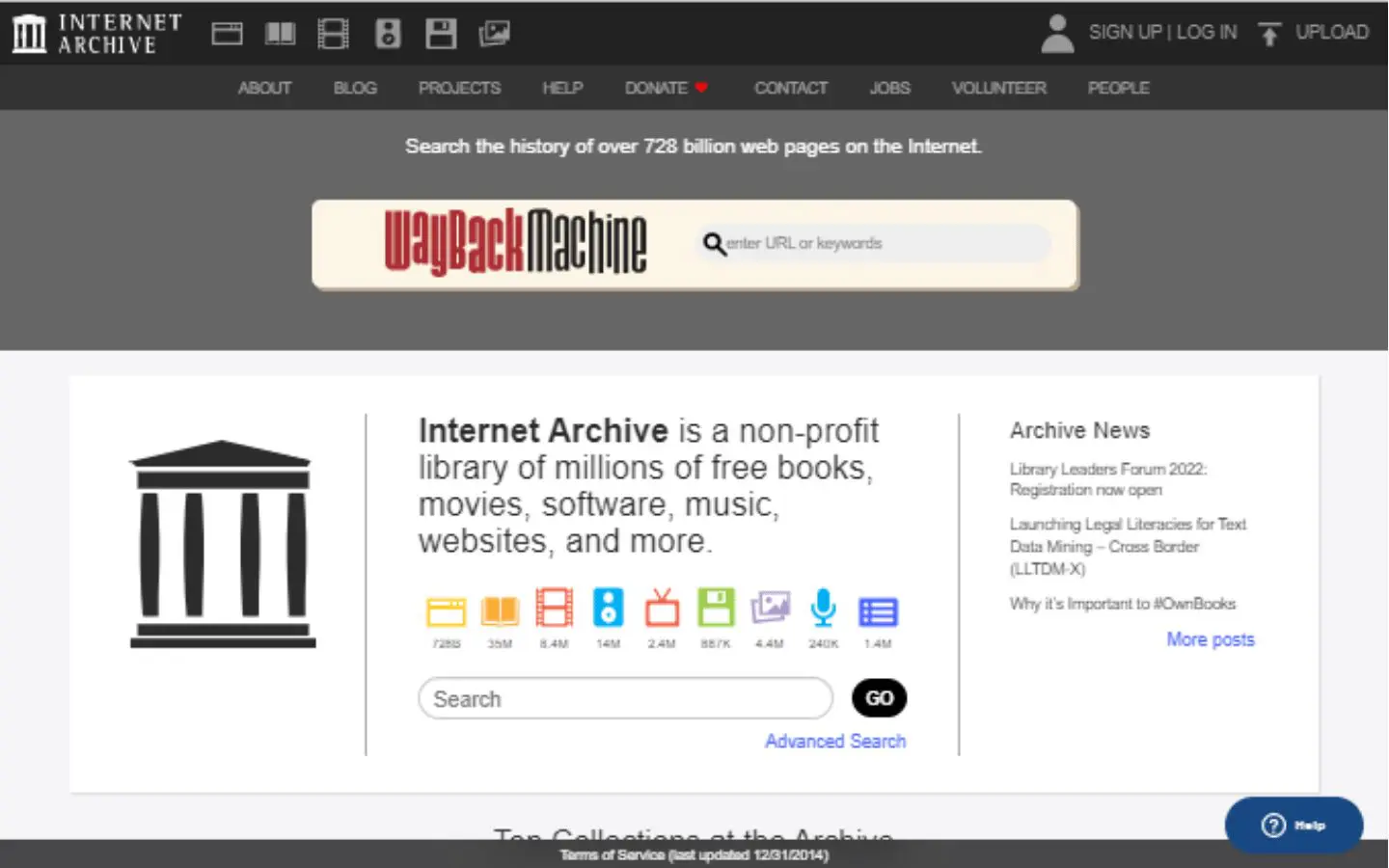
13. Internet Archive Wayback Machine
Why it’s bad: We love the Internet Archive, but the design is outdated, and the color scheme is very bland.

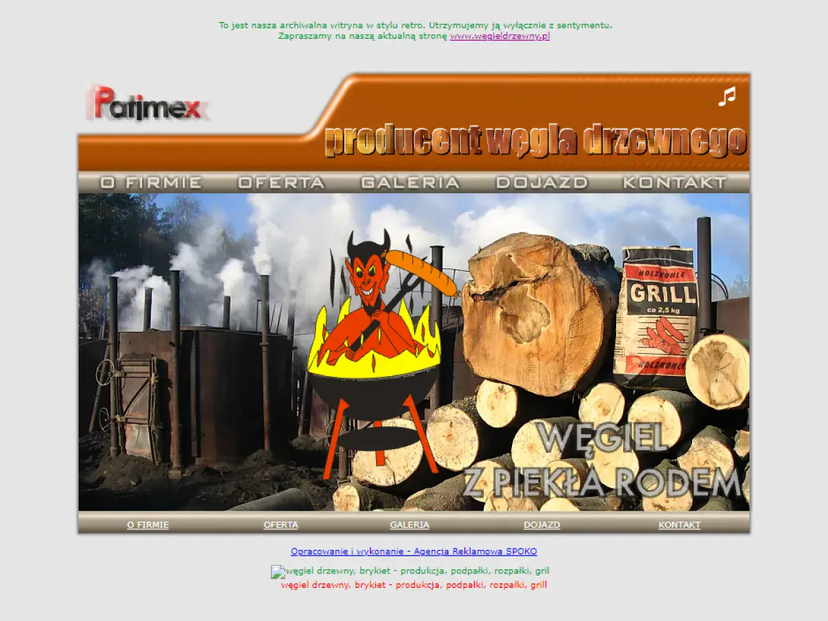
14. Patimex
Why it’s bad: This is a very sparse website with an out-of-place picture on its home page. The other pages contain very little information, although at least the contact page has the company’s hours of operation, address, and contact details posted.
15. Paul Graham
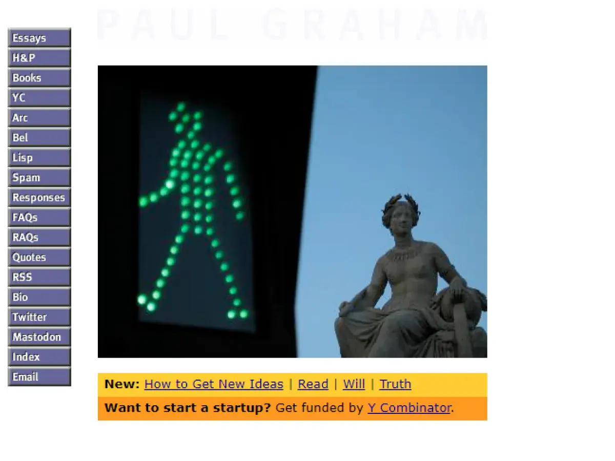
Why it’s bad: Tiny text and an overly condensed menu make this site unsightly and somewhat difficult to navigate.
16. ACME Laboratories
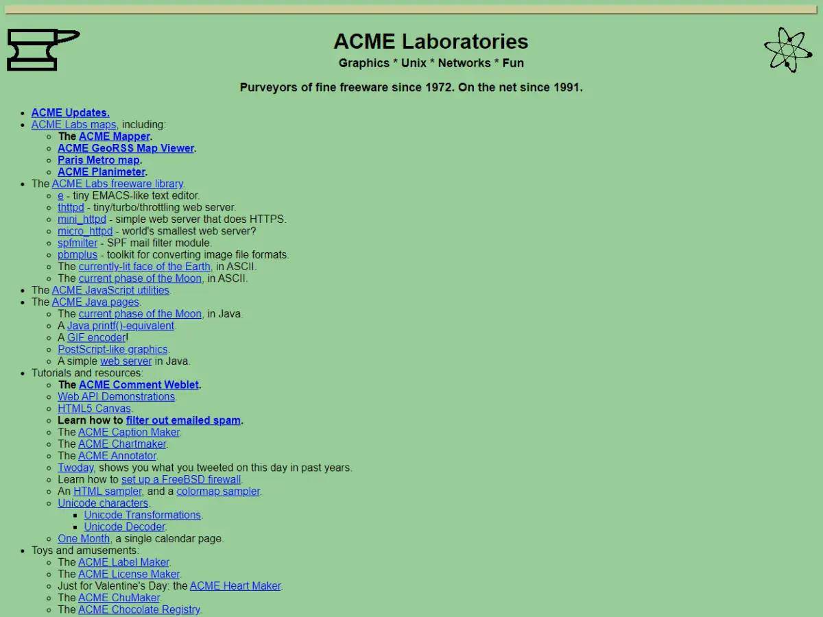
Why it’s bad: It has an outdated design that lacks the creative spark needed to generate interest from a younger audience.
17. The World’s Worst Website Ever
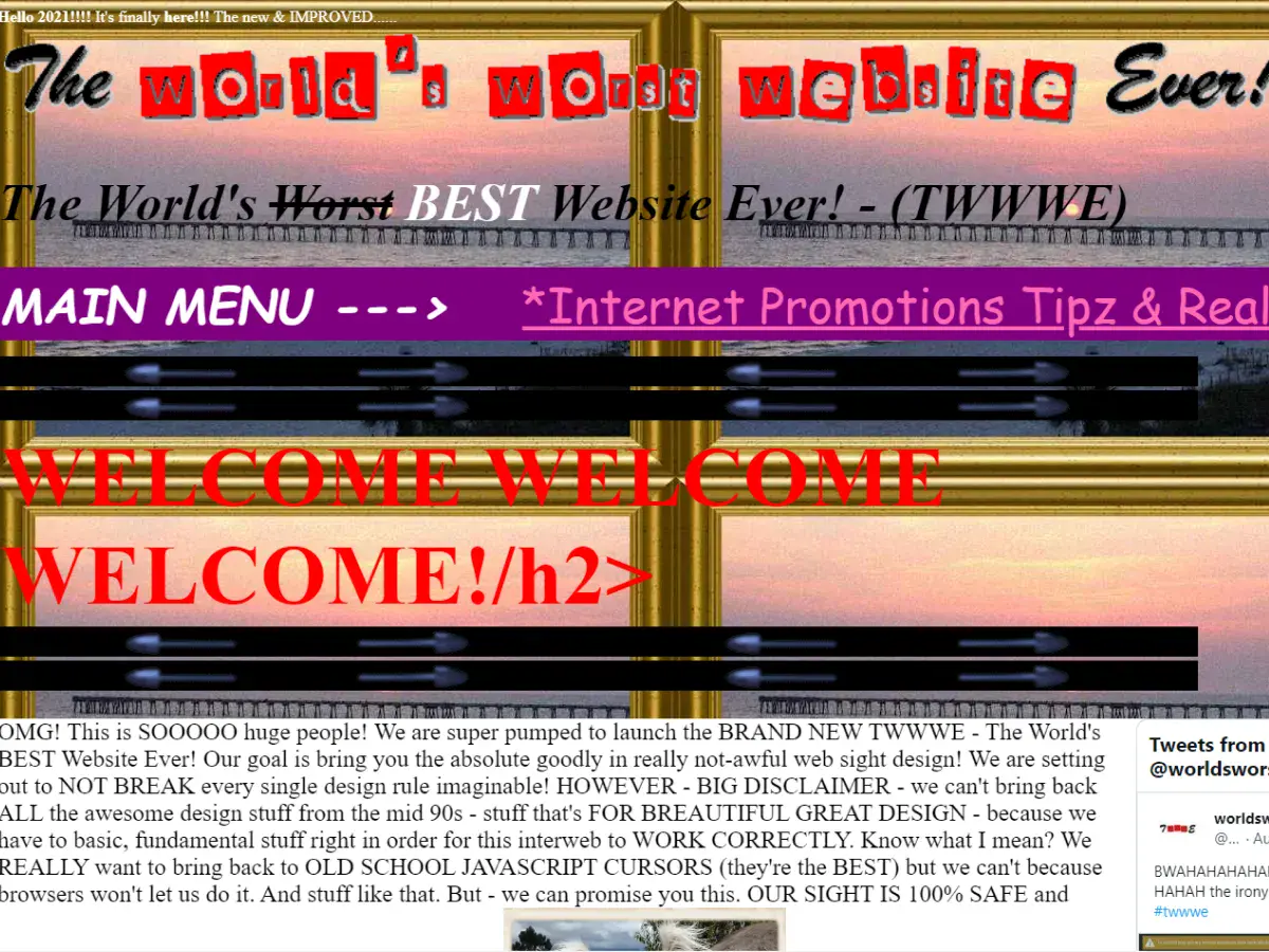
Why it’s bad: The design is bad on purpose, and boy, does it do its job. You have to see this for yourself.
18. Chester Tourist
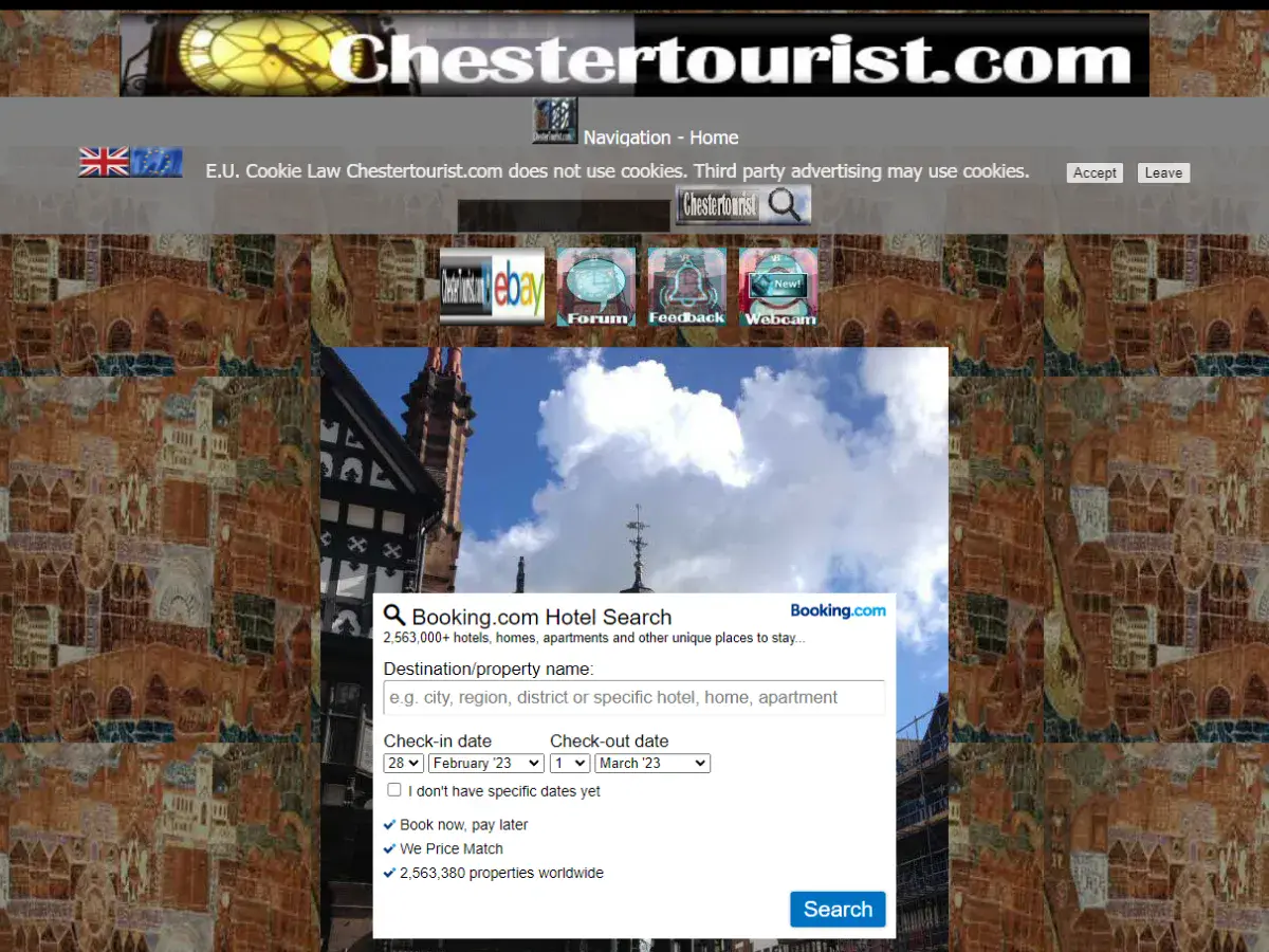
Why it’s bad: This website has a fairly convoluted background, in the center of which is a poorly placed navigation menu, low-resolution screenshots, and bland text.


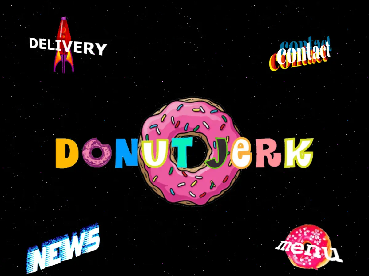
19. Donut Jerk
Why it’s bad: For some reason we like this design, although it’s objectively terrible. The design is very cartoonish, and the pages themselves aren’t very coherent. This is so bad, we almost want to order a dozen!
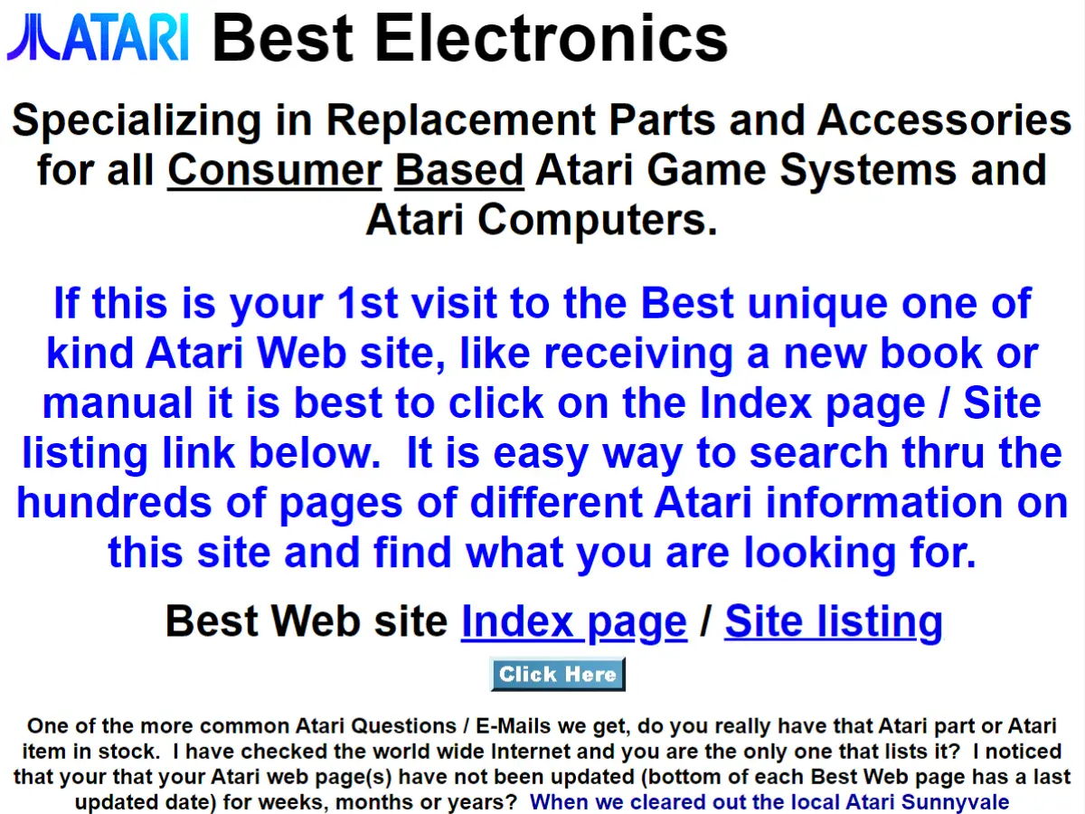
20. Atari Best Electronics
Why it’s bad: This site is essentially a giant wall of text with pictures and random hyperlinks interspersed throughout.
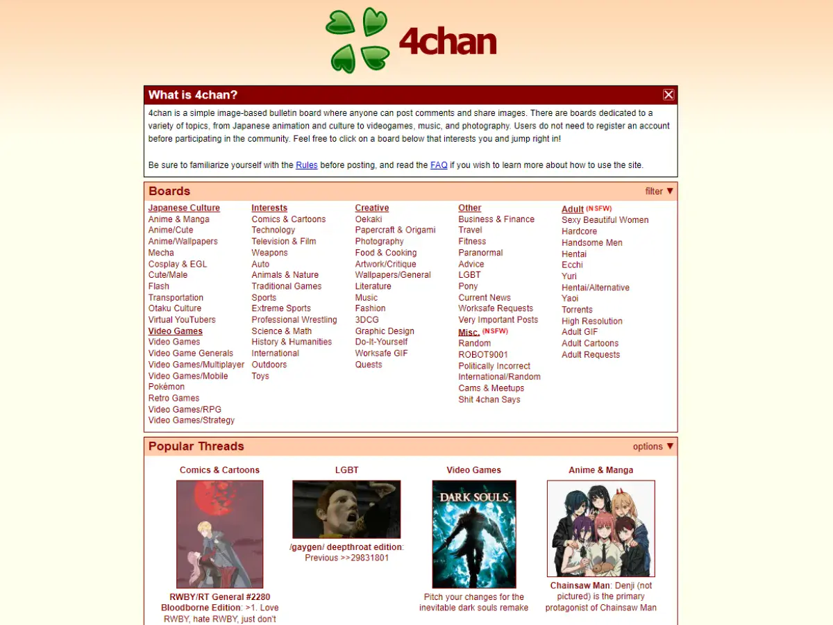
21. 4chan
Why it’s bad: The website has a very basic feel to it. While it’s not the worst design ever, it could use some sprucing up, especially given how popular the site is.
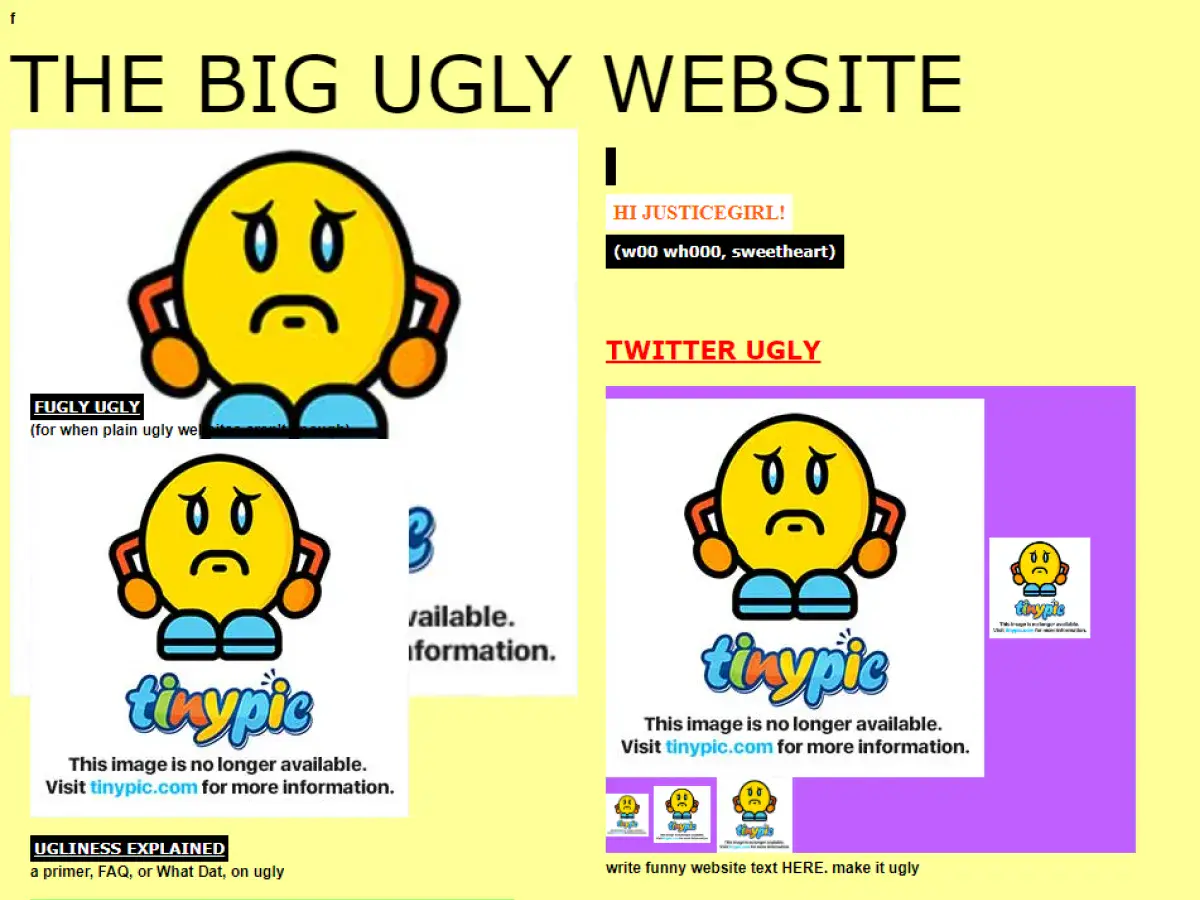
22. The Big Ugly Website
Why it’s bad: The website has a very basic feel to it. While it’s not the worst design ever, it could use some sprucing up, especially given how popular the site is.
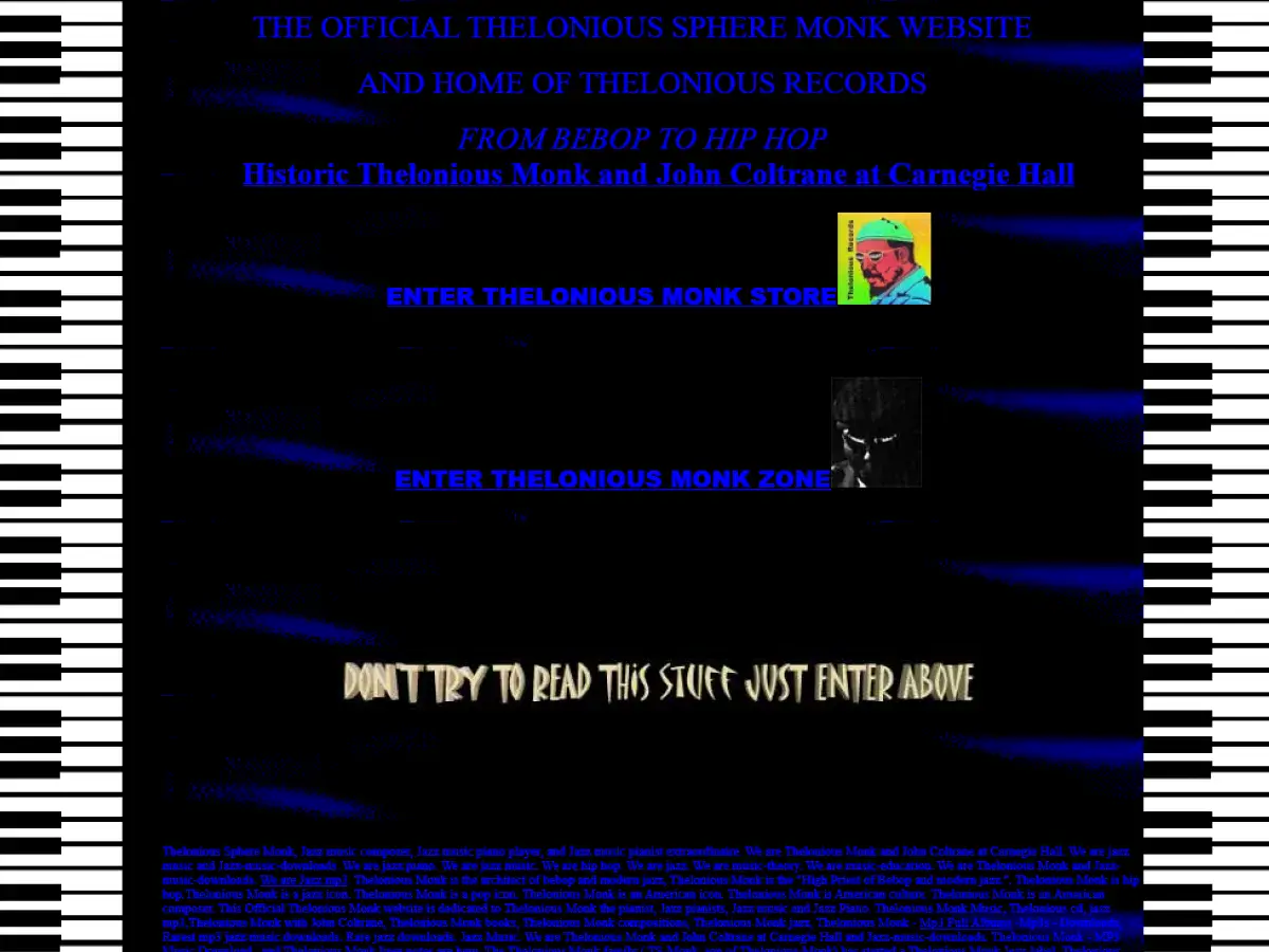
23. The Monk Zone
Why it’s bad: Busy backgrounds combined with long walls of text make this website difficult to read. Oh, our eyes!

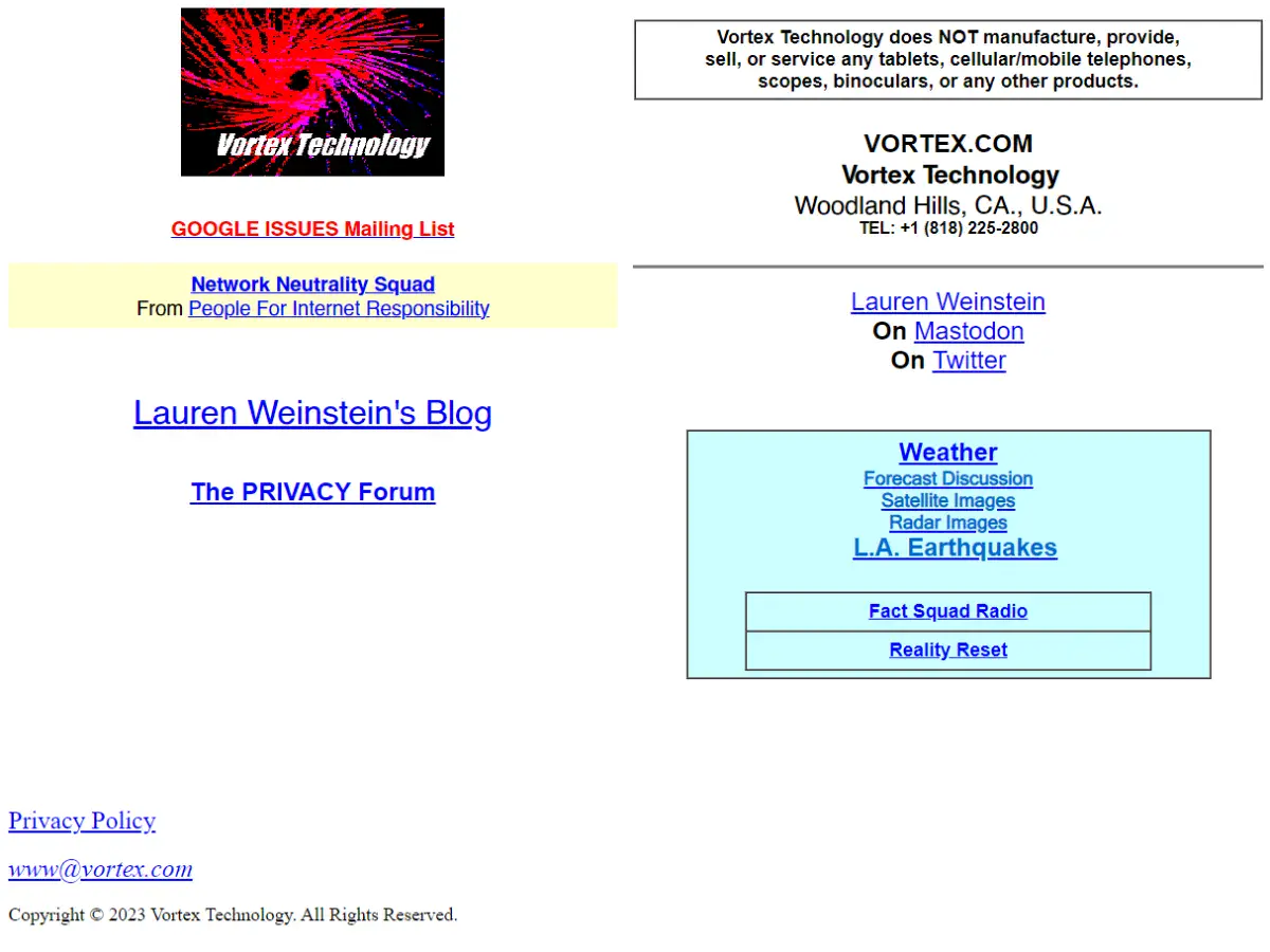
24. Vortex Technology
Why it’s bad: The website’s logo is probably one of the worst we’ve seen. It looks like a granulated infrared hurricane from an 80s computer screen, informed by fundamentally abysmal font.
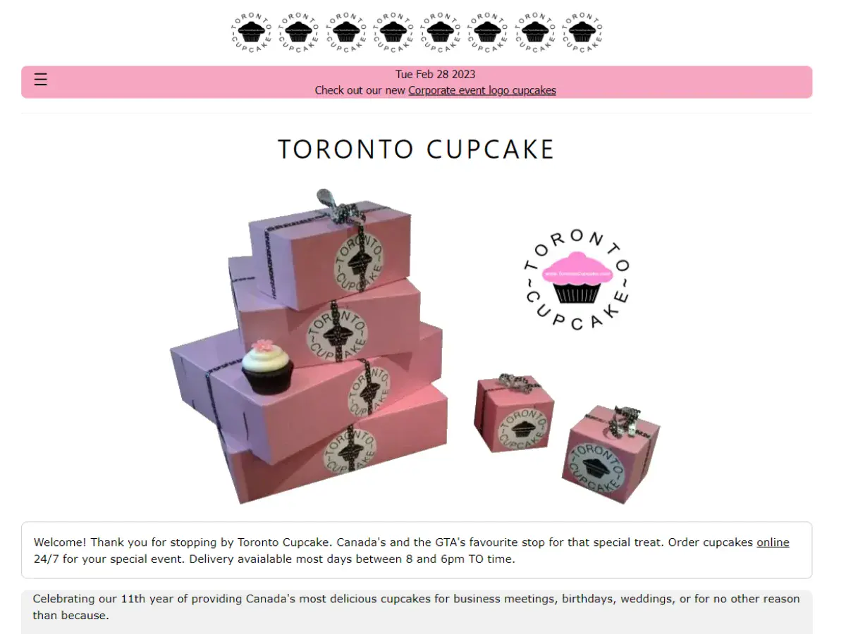
25. Toronto Cupcake
Why it’s bad: The design feels like it was cooked up using a pre-packaged template. Also, the picture on the home page is fuzzy. The products themselves look amazing! This site just needs some love.
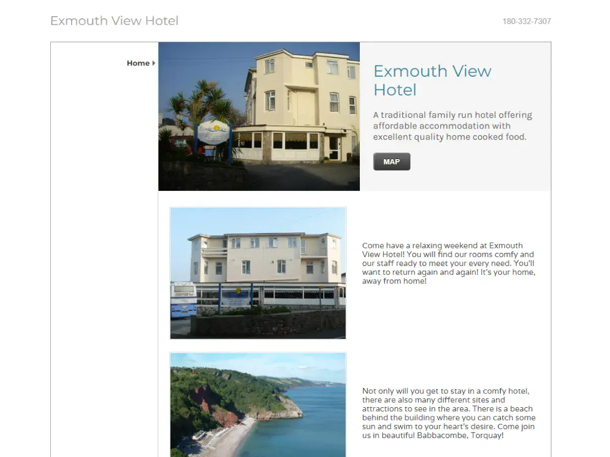
26. Exmouth View Hotel
Why it’s bad: The main problem with this design is that it doesn’t feel like a hotel website. It feels more like an obscure ad listing.
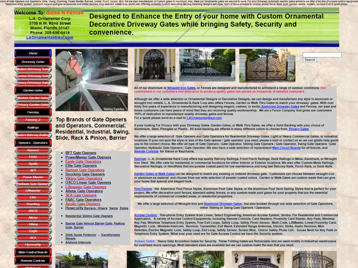
27. Gates N Fences
Why it’s bad: The website’s navigation menu is a million miles long, and there is too much text on each page. This seems like a great company and service, but their site design needs to be streamlined.
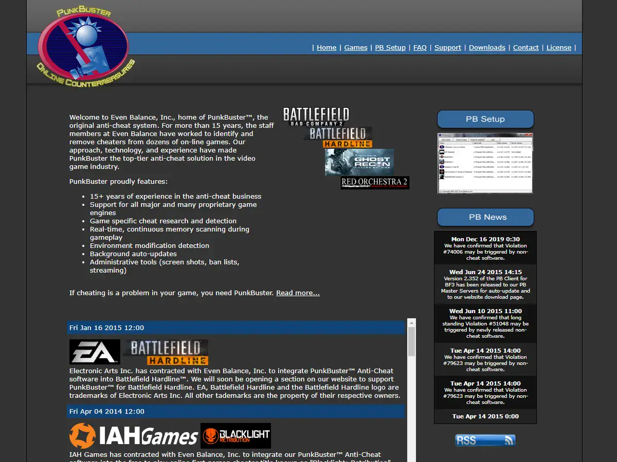
28. Even Balance
Why it’s bad: The design is extremely mechanical and subdued. A little bit of color to brighten up the empty gray background would do some good.

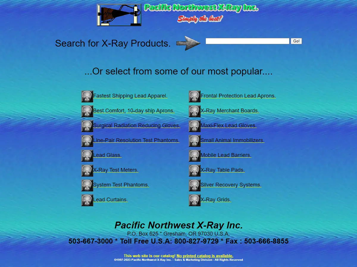
29. Pacific Northwest X-Ray Inc.
Why it’s bad: There is no “About” information on the website. Not to mention, the background looks like it was created while the designer was in a slight hypnotic trance.
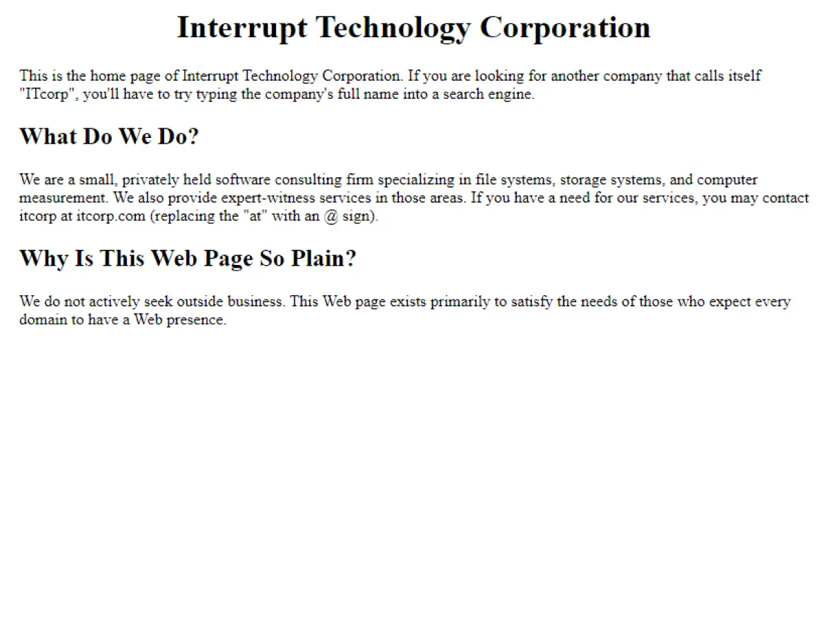
30. Interrupt Technology Corporation
Why it’s bad: This website is essentially a parking space for a company that doesn’t seek outside business.
Bad Websites – Conclusion
We hope you’ve enjoyed this list of 30 bad websites with terrible designs, some of which still manage to attract millions of visitors every year.
While having a bad website design may not necessarily result in low traffic, it is still crucial for website owners to prioritize the design and usability of their website. This is because a poorly designed website can negatively impact a user’s experience, potentially driving them away from the website and towards competitors with better designs. Ultimately, having a well-designed website is an important aspect of maintaining a successful online presence.
Looking to improve your website’s design and user experience? Contact Sage Digital today! Our team of experts can help you create a modern and user-friendly website that will attract and retain visitors. Don’t let a poor website design hold you back – let Sage Digital help you take your website to the next level.