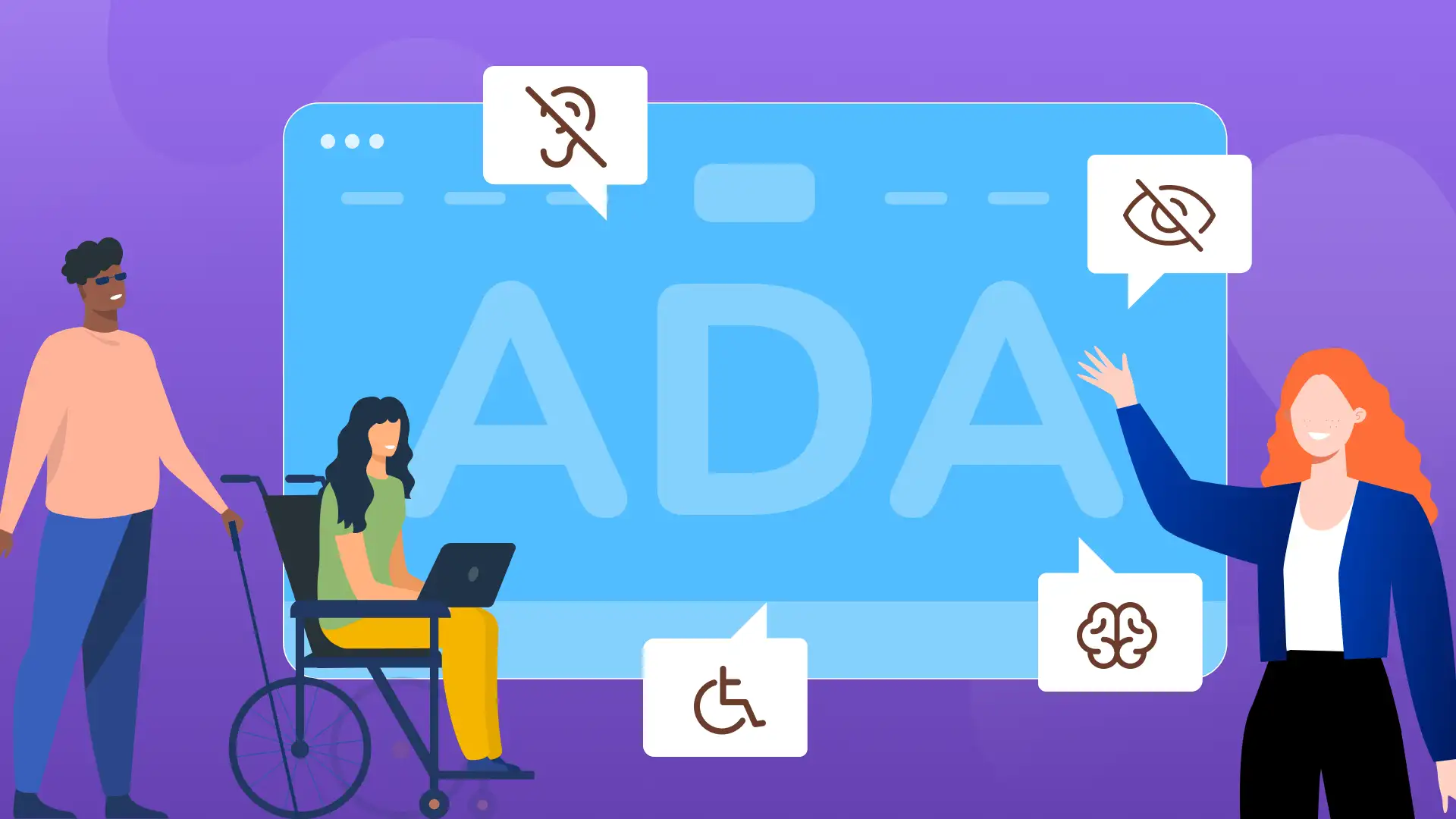
Website accessibility is how you make sure people with disabilities can use your site. That includes screen reader users, keyboard-only users, people with low vision, cognitive disabilities, motor impairments, and more.
In the U.S., the ADA applies to businesses open to the public, and courts consistently point to WCAG as the technical benchmark. WCAG 2.2 is the current W3C Recommendation. Content that conforms to 2.2 also conforms to 2.1 and 2.0.
If your website can’t be used by someone with a disability, you have a legal risk, a usability problem, and a revenue gap all at the same time.
Quick answers
Is website accessibility required by law?
For public entities (state/local government), yes. The DOJ’s 2024 Title II rule requires WCAG 2.1 AA conformance.
The original compliance deadline for large municipalities with populations of 50,000 or more was April 24, 2026.
Under the interim final rule, that deadline has been pushed back to April 2027 for larger jurisdictions and to April 2028 for smaller ones.
For private businesses, there’s no specific Title III web regulation naming a technical standard, but the DOJ says the ADA applies to businesses open to the public, and courts regularly use WCAG 2.1 AA as the measure.
What standard should my business target?
WCAG 2.2 Level AA. It’s backward compatible with 2.1, and it’s what the W3C recommends for new work. If you meet 2.2, you automatically meet 2.1 and 2.0.
Can a widget or plugin make my site compliant?
No. Overlays can surface some issues, but they don’t fix your underlying code, content, or design.
In 2025, the FTC finalized an enforcement action against accessiBe for claiming its product could make any website WCAG compliant. That claim was false.
Is there a tax credit for accessibility work?
Yes. Eligible small businesses can claim the IRS Disabled Access Credit (Section 44) for up to $5,000 per year. More on that below.
What is website accessibility?
Website accessibility means building and maintaining digital content so people with disabilities can perceive, navigate, and interact with it.
This covers visual impairments, hearing loss, motor disabilities, cognitive differences, and temporary conditions like a broken arm or a migraine.
Think of it the way physical spaces work. A restaurant has accessible ramps, reserved parking, and braille menus.
Websites need the digital equivalents: screen reader support, keyboard navigation, readable text, clear labels on forms, and captions on video.
Accessibility isn’t just for one group. Captions help people in noisy environments. Keyboard navigation helps someone with a broken wrist. High contrast helps anyone using a phone in direct sunlight.
Good accessibility tends to make sites easier for everyone.
Common barriers on business websites
Most accessibility issues come from a short list of problems.
WebAIM’s 2025 analysis found that 94.8% of homepages fail basic WCAG checks, and six violation types account for 96% of all failures:
- Low color contrast between text and background
- Missing alt text on images
- Empty links or buttons with no descriptive text
- Missing form input labels
- Broken heading structure (skipped levels or headings used just for styling)
- Missing document language
These are fixable. Most of them are code-level or content-level problems that a qualified team can address in a structured audit and remediation cycle.
ADA vs. WCAG vs. Section 508: what’s the difference?
People use these terms interchangeably. They’re not the same thing.
ADA (Americans with Disabilities Act): A federal civil rights law. Title II covers state and local government. Title III covers private businesses open to the public, which includes websites. The ADA is a legal obligation.
WCAG (Web Content Accessibility Guidelines): A technical standard published by the W3C. It defines specific, testable success criteria across three conformance levels: A, AA, and AAA. WCAG is how you measure whether you meet accessibility requirements. WCAG 2.2 has 13 guidelines and 86 success criteria.
Section 508: A federal procurement law that requires federal agencies and their contractors to make electronic and information technology accessible. If you do business with the federal government, Section 508 applies. It references WCAG 2.0 Level AA.
For most businesses, the relevant combination is ADA + WCAG 2.2 Level AA. The ADA is why you need to be accessible. WCAG is how you get there.
Does the ADA require an accessible website?
This is where it gets specific, and it matters to get it right.
Public entities (Title II)
Yes. The DOJ’s April 2024 rule requires state and local government websites and mobile apps to conform to WCAG 2.1 Level AA.
The original compliance deadline for large municipalities with populations of 50,000 or more was April 24, 2026.
Under the interim final rule, the deadline has been pushed back to April 2027 for larger jurisdictions and to April 2028 for smaller ones.
Non-compliance can lead to DOJ enforcement actions, administrative complaints, and private lawsuits.
Private businesses (Title III)
The DOJ has stated that the ADA applies to the websites of businesses open to the public. There’s no final Title III rule that names a specific WCAG version.
However, courts consistently apply WCAG 2.1 AA as the benchmark in ADA web accessibility lawsuits, and settlement agreements routinely require WCAG conformance.
The lawsuit numbers tell the story:
Over 5,000 digital accessibility lawsuits were filed in 2025, a 37% increase over 2024. New York and California remain the most active jurisdictions, with nearly 2,000 state-level cases filed between them.
However, this is a nationwide issue now. A small group of plaintiff firms files standardized complaints at scale, and 40% of federal filings in 2025 came from self-represented individuals.
The majority of these lawsuits don’t target large corporations. In 2024, roughly 67% targeted companies with less than $25 million in annual revenue.
Among the top 500 e-commerce retailers, more than one-third received at least one ADA accessibility lawsuit in 2025.
Treating accessibility as optional is a business risk you can measure.
Why website accessibility matters for your business
Accessibility is a user experience issue first. If someone can’t fill out your contact form, read your pricing page, or complete a purchase, that’s lost revenue.
It doesn’t matter how good your marketing is if part of your audience can’t use the site when they get there.
Usability and conversions
Accessible sites are easier to use for everyone.
Clear form labels reduce abandonment. Proper heading structure helps people scan content faster. Visible focus indicators tell keyboard users where they are on the page.
These improvements show up in your conversion metrics, not just your compliance reports.
Legal exposure
The lawsuit data is clear. If you have a website, you have exposure. Showing documented, proactive effort toward accessibility is the strongest position you can take if a demand letter shows up.
A site with no remediation history and no accessibility statement is an easier target than one with documented audits, a backlog, and ongoing maintenance.
SEO benefits
Accessibility and SEO share the same foundation. Proper heading structure, descriptive alt text, semantic HTML, logical navigation, and clean code all make pages easier for search engine crawlers to understand and index.
An accessible site tends to have better crawlability, cleaner markup, and more structured content. That can translate into stronger rankings and more organic traffic over time.
This is a secondary benefit, not the main reason to prioritize accessibility. But it’s real.
The biggest website accessibility myths
“We installed a plugin, so we’re covered”
This is the most common and most dangerous misconception. Accessibility overlays run on JavaScript.
If JavaScript fails to load, gets blocked by a browser extension, or is disabled, the overlay stops working. The underlying accessibility problems are still there. The overlay was just hiding them.
In 2025, the FTC finalized an order against accessiBe over claims that its plug-in could make any website WCAG compliant. That was not accurate.
Overlay widgets cannot fix missing semantic HTML, broken heading structure, inaccessible custom components, or poor content structure. Those require code-level remediation.
In 2025, hundreds of lawsuits were filed against websites that had an accessibility widget installed. Having an overlay didn’t prevent litigation.
Automated tools and overlays can help identify issues. They’re useful as an early audit step. But they are not a substitute for source-code fixes, manual testing, and human review.
“Passing an automated scan means the site is accessible”
Automated scanners catch about 30% of WCAG issues.
They’re good at finding missing alt text, contrast failures, and empty links. They can’t evaluate whether alt text is meaningful, whether tab order is logical, whether custom components work with a screen reader, or whether form error messages are clear.
WCAG was designed to be tested with both automated tools and human evaluation. A clean scan report is a starting point. It’s not a finish line.
“Accessibility is only for blind users”
Screen reader users are one audience.
Accessibility also covers people with low vision, color blindness, hearing loss, motor impairments, cognitive disabilities, and temporary conditions.
Accessibility includes keyboard-only users, people who use voice input, people who use switch devices, and people who rely on captions.
“Accessibility is a one-time project”
Every new page, blog post, product listing, pop-up, modal, form, or third-party widget can reintroduce accessibility issues.
Accessibility needs to be part of your content publishing process, your QA process, and your development workflow. It’s maintenance, not a launch deliverable.
Accessibility is easier to maintain with consistent website support.
“Our CMS or theme handles it”
Your CMS provides a framework. How you configure it, what content you add, how your templates are built, and which third-party tools you embed all affect accessibility.
A WordPress theme can meet WCAG standards at launch and break them with the first plugin install or content update.
What an accessible website includes
Semantic HTML and heading structure
Use heading tags (H1 through H6) in a logical order. Don’t skip levels. Don’t use headings for visual styling. Screen reader users navigate by headings the way sighted users scan a page visually. Broken heading structure breaks that navigation.
Every interactive element on your site needs to be reachable and usable with a keyboard alone. That means links, buttons, form fields, menus, modals, and custom components all need to work with Tab, Enter, Escape, and arrow keys.
Focus indicators need to be visible so the user knows where they are on the page.
Color contrast
WCAG requires a minimum contrast ratio of 4.5:1 for normal text and 3:1 for large text. Use a contrast checker during design. Low contrast is the single most common WCAG failure across the web.
Alt text
Every informative image needs a concise description. Decorative images need an empty alt attribute so screen readers skip them. Icon buttons need text alternatives. This is one of the easiest fixes and one of the most neglected.
Forms, labels, and error recovery
Every form input needs a visible label associated with it in the code. Error messages should identify which field has a problem and suggest how to fix it. Required fields should be marked. Instructions should be clear.
Menus, modals, and pop-ups
Dropdown menus, modal dialogs, and pop-ups need keyboard support. Modals should trap focus inside them until dismissed. Menus should expand and collapse with keyboard controls. Pop-ups should be dismissible with Escape.
Video captions and transcripts
All video content needs accurate captions. Pre-recorded audio needs transcripts. Auto-generated captions are a starting point, but they need to be reviewed and corrected.
PDFs and downloadable files
If you offer PDFs for download, they need to be accessible too. That means tagged structure, reading order, alt text on images, and form fields with labels. Scanned-image PDFs with no text layer are inaccessible by default.
Mobile touch targets and authentication
WCAG 2.2 added a minimum target size criterion. Touch targets (buttons, links, checkboxes) need to be at least 24×24 CSS pixels with adequate spacing. Authentication flows should not require cognitive function tests that block users with memory or processing difficulties.
What changed in WCAG 2.2
WCAG 2.2 became the W3C Recommendation in October 2023 and added nine new success criteria. The ones that affect most business websites include:
Focus not obscured (2.4.11, AA): When a user tabs to an element, sticky headers, cookie banners, or chat widgets can’t completely hide it. At least part of the focused element must remain visible.
Target size minimum (2.5.8, AA): Interactive targets need to be at least 24×24 CSS pixels, or have adequate spacing between them. This catches tiny mobile buttons and tightly packed link lists.
Dragging movements (2.5.7, AA): Any action that requires a dragging motion must have a single-pointer alternative. If your site uses drag-to-reorder or slider controls, there needs to be a click or tap alternative.
Consistent help (3.2.6, A): If you offer help mechanisms like chat, phone, or contact links, they should appear in the same relative location across pages.
Redundant entry (3.3.7, A): If the user already provided information in a process (like a multi-step form), don’t make them re-enter it. Auto-populate or let them select previously entered data.
Accessible authentication (3.3.8, AA): Login flows should not require cognitive function tests like remembering a password without any assistance. Support for password managers, passkeys, or email verification satisfies this.
If your site conforms to WCAG 2.2 Level AA, it automatically meets 2.1 and 2.0 as well. That’s the standard we recommend for new builds and redesigns.
Many accessibility issues are easier to prevent with the right web design approach.
Accessibility testing: what tools can and cannot do
Automated tools are the right first step. They scan your pages and flag the issues they can detect, such as:
- Missing alt text
- Contrast failures
- Empty links
- Missing form labels
- Duplicate IDs.
Tools like Google Lighthouse, WAVE, and axe DevTools can run these scans quickly and give you a prioritized list of problems.
But automated scanning covers roughly 30% of WCAG success criteria. It misses context-dependent issues like whether alt text is accurate, whether tab order is logical, and whether video captions are correct.
A proper accessibility evaluation combines automated scanning with manual testing. Manual testing means going through your site with a keyboard only, testing with a screen reader (like NVDA or VoiceOver), checking form workflows, and reviewing content structure.
For a thorough assessment, you need someone who understands WCAG criteria and knows what the automated tools can’t catch. A strategic consultation can help you clarify next steps.
How to improve accessibility on an existing website
You don’t need to fix everything at once. Start with the pages and workflows that matter most.
Prioritize by impact
Focus first on your highest-traffic pages, your main navigation, your contact and lead forms, and any checkout or scheduling flow. These are the paths where accessibility failures block the most users and create the most legal exposure.
Fix templates before individual pages
If your site uses templates (and most CMS-based sites do), fixing accessibility at the template level cascades across every page that uses it. Fix the header, footer, navigation, and page layouts first. That gives you the biggest return on the smallest number of changes.
Build a remediation backlog
Treat accessibility issues like any other bug list. Prioritize by severity (barriers that block access vs. issues that create friction), assign them, fix them, and verify the fix. Document the work as you go. That documentation has value if you ever face a demand letter.
Retest after every change
A site doesn’t stay accessible on its own. New content, new features, new third-party scripts, and CMS updates can all reintroduce problems. Build accessibility checks into your deployment process and your content review workflow.
Assign ownership
Someone on your team needs to own accessibility the way someone owns SEO or brand. Without clear ownership, accessibility tends to drift after the initial remediation pass. That person doesn’t need to be a developer. They need to be someone who can hold the process together across content, design, development, and QA.
Can small businesses get help with accessibility costs?
Yes. The IRS offers a tax credit specifically for small business accessibility spending.
The Disabled Access Credit (IRC Section 44) covers 50% of eligible accessibility expenditures between $250 and $10,250 per tax year. The maximum credit is $5,000 per year.
To qualify, your business needs to have had gross receipts under $1 million in the prior tax year or no more than 30 full-time employees. You claim it on IRS Form 8826.
The Architectural Barrier Removal Deduction (IRC Section 190) lets any business deduct up to $15,000 per year for expenses related to removing barriers for people with disabilities.
You can use both in the same tax year. The same dollar can’t be counted toward both, but if your spend exceeds $10,250, the credit covers the first portion and the deduction can cover the remainder.
Talk to your tax professional about eligibility and documentation. The credit applies to website accessibility work, not just physical modifications.
Frequently asked questions
What is website accessibility?
Website accessibility is the practice of building websites so people with disabilities can use them. That includes support for screen readers, keyboard navigation, sufficient color contrast, text alternatives for images, video captions, accessible forms, and clear page structure. The goal is that someone with a visual, hearing, motor, or cognitive disability can get the same information and complete the same tasks as any other user.
Is website accessibility required by law?
For U.S. public entities (state and local government), yes. The DOJ’s 2024 Title II rule requires WCAG 2.1 Level AA conformance. For private businesses open to the public, the ADA applies, and courts consistently use WCAG as the technical benchmark in accessibility lawsuits. There is no final Title III regulation naming a specific WCAG version, but the legal risk is real and well-documented.
What WCAG level should a business target?
WCAG 2.2 Level AA. It’s the current W3C Recommendation, it’s backward compatible with 2.1 and 2.0, and it covers the criteria that matter most for real-world usability. Level A is the minimum. Level AAA is aspirational for most sites. Level AA is where the law and best practices meet.
Can an accessibility widget make my website compliant?
No. Overlay widgets can provide some user-facing controls (like font size adjustment), but they don’t fix the underlying code, structure, or content issues that cause WCAG failures. In 2025, the FTC took enforcement action against an overlay vendor for making false compliance claims. Lawsuits have been filed against sites that had an overlay installed.
How often should a website be tested for accessibility?
At minimum, after every major site change: redesigns, new templates, new features, CMS updates, and third-party integrations. A quarterly automated scan plus an annual manual audit is a reasonable cadence for most business websites. If you publish content frequently, accessibility should be part of your content review workflow.
Does website accessibility help with SEO?
Yes. Accessible sites tend to have cleaner markup, better heading structure, descriptive alt text, and more logical navigation. Search engine crawlers interpret pages similarly to assistive technologies in some respects. The overlap between accessibility best practices and SEO best practices is significant, especially around semantic HTML and content structure.
Can small businesses claim a tax credit for accessibility improvements?
Eligible small businesses can claim the IRS Disabled Access Credit (Section 44) for up to $5,000 per year. Businesses can also deduct up to $15,000 per year under Section 190 for barrier removal. Both can be used in the same tax year. Talk to your tax professional about whether your business qualifies.
What is the difference between ADA and WCAG?
The ADA is a U.S. federal civil rights law that requires businesses and public entities to provide accessible services, including digital services. WCAG is a technical standard published by the W3C that defines how to make web content accessible. The ADA tells you that you need to be accessible. WCAG tells you how to get there and how to measure it.
What are the most common website accessibility mistakes?
The six most common WCAG failures account for 96% of all detected issues: low color contrast, missing image alt text, empty links, missing form labels, broken heading structure, and missing document language attributes. All of these are fixable with code and content updates.
What did WCAG 2.2 change?
WCAG 2.2 added nine new success criteria. The most relevant for business websites are minimum touch target sizes (24×24 pixels), focus visibility requirements, alternatives to dragging interactions, consistent placement of help mechanisms, reduced re-entry of previously provided information, and accessible authentication that doesn’t rely on memory-based cognitive tests.
What to do next
Accessibility is a process, not a one-time fix. If you’re starting from scratch or cleaning up years of accumulated issues, here’s a practical order of operations:
- Run an automated scan on your top 10 pages using Lighthouse or WAVE to get a baseline
- Schedule a manual audit with a team that can test with keyboard navigation and screen readers
- Fix your templates and shared components first for the biggest impact
- Address the six most common violations: contrast, alt text, links, labels, headings, language
- Review your forms, checkout flows, and any scheduling or booking tools
- Build accessibility into your content publishing and QA workflows
- Document your remediation efforts for legal defensibility
- Look into Section 44 tax benefits with your accountant
- Plan for ongoing maintenance and periodic re-audits
We handle accessibility audits, code-level remediation, and ongoing compliance monitoring for small and mid-sized businesses.
If your site needs attention or you want a clear picture of where you stand, reach out to our team for an assessment.