
Want to turn visitors to your website into paying customers? A good landing page will help. Keep reading to learn more!
» EXPLORE: For landing page design from Sage Digital, book a Discovery Call.
What is a landing page?
A landing page is a web page that prompts your visitors to do something specific, like buy your product or service.
Obviously, the whole point of a landing page is to persuade your potential customers to commit to some sort of action. This is why landing pages typically have fewer design elements than standard web pages.
Fewer distractions equate to a more focused and compelling message.
Why do you need a landing page?
If you’re a business owner, you may need a landing page for the following reasons:
Focused messaging
- A landing page directly addresses the needs and interests of your audience.
- A landing page matches the expectations set by your ad.
- A well-constructed landing page acts like a digital salesperson, providing key information to your visitors.
- A landing page addresses common questions so that your team can focus on complex queries.
- A landing page gives you an advantage over businesses that don’t have one.
Efficient ad spend
- A landing page helps ensure that your visitors end up on a page that aligns with your ad’s intended purpose, which makes your ad more efficient.
In summary:
Landing pages are better at addressing specific user intent and driving targeted actions than general web pages.
Ironically, despite this, many small to medium-sized businesses choose to send traffic to their homepages when running ads. We advise against this unless you have a specific reason for doing so.
What specific problems do landing pages solve?
A landing page, in theory, solves the fundamental problems caused by a homepage. These include:
- Users clicking around aimlessly due to the catch-all nature of homepages.
- Unnecessary distractions.
- Lack of lead generation (Landing pages are often better at generating leads.)
- No clear user flow for specific tasks (Landing pages, by contrast, offer a clearer path to action.)
- Difficulty running special offers. (While special offers can incentivize action, they can also clutter your homepage. Having a landing page makes running special offers easier.)
» MORE: Should you get a redesign or fix your landing page or website?
The ideal landing page design
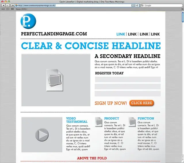
Landing page best practices ✅
Now that we’ve introduced what a landing page is and why you need one, check out these best practices to get the most out of your landing page.
1. Know why you’re building the landing page
Before you create a landing page, here are some good questions to ask:
- What is the purpose of the landing page?
- Who am I speaking to?
- What action do I want them to take?
- What is my business goal?
Once you can answer these questions, you’re ready to get started.
2. Keep your landing page visually simple
A visually simple landing page has the following qualities:
- A clean layout
- Consistent color palette
- Concise text
- Only one CTA (Avoid multiple CTAs, as this can confuse your visitors.)
- Intuitive flow
Remember that a minimalistic landing page keeps your visitors focused on your call-to-action (CTA), which is the whole point.
PS When we make landing pages for clients, we often remove the header and footer to minimize distractions. We also sometimes remove the navigation so that users will focus on the CTA.
3. Focus on the sales flow of your landing page
To engage your customers and start your sales flow, we suggest using a video testimonial and placing it prominently at the top of your landing page, above the fold.
In our opinion, this simple step is one of the better ways to set the tone of your page and explain your purpose.
More Technical Sales Flow Considerations
Beyond this suggestion, you might consider using tools like heatmaps and session recordings to better understand where your users spend most of their time and what content resonates with them.
Furthermore, A/B testing different versions of your landing page can be instrumental in refining your sales flow, as you can discern which elements and layouts are the most effective.
There are multiple steps in a good sales flow
These are not hard-and-fast rules, only a helpful guide ⬆️
If you try following all of the steps above, you might end up making your landing page too complicated. The point is to use these steps as a guide to introduce people to your call to action.
4. Use a clear and compelling CTA
Your call to action (CTA) should clearly express what you want your audience to do. While this might be obvious advice, we bring it up because it’s easy to get distracted by the aesthetics of your landing page and forget its core purpose.
See the example below for an idea of what a CTA can look like.
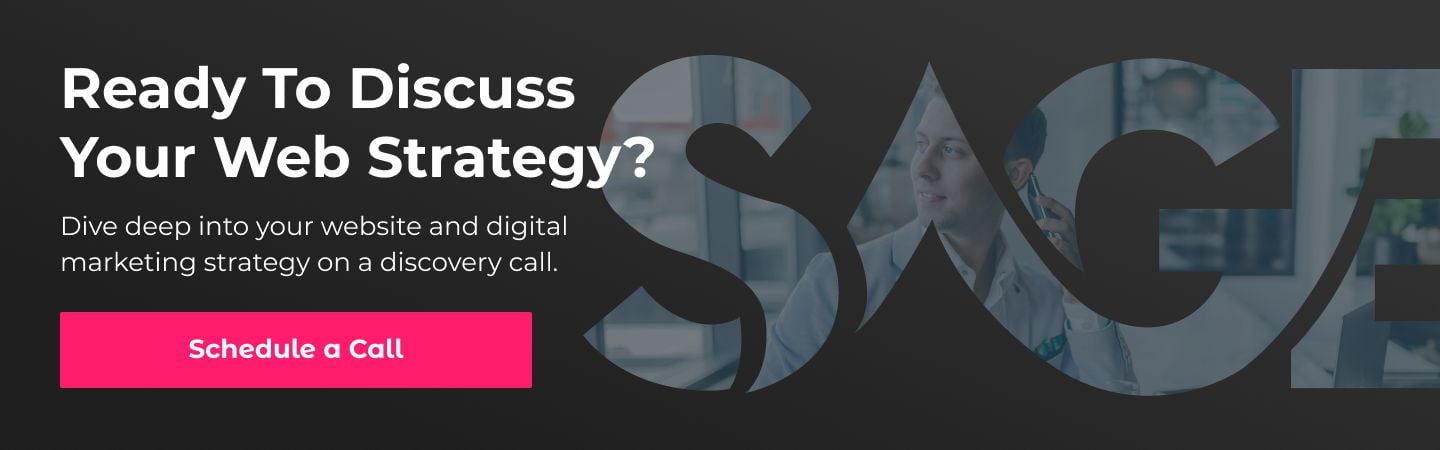
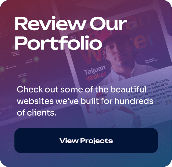
Click to navigate to Sage Digital Agency
As you can see, we’ve used a simple CTA to prompt our readers to call us. The intended action is clear, and all our readers have to do is click on the image to reach our contact page. It’s that simple!
What can you use a CTA for?
Calls to action can be used for multiple purposes, which include:
- Signing up for an event
- Joining a newsletter
- Downloading a PDF
- Requesting more information
- Calling your business
- Coming to your location
- Filling out a form
5. Illustrate your offer with a relevant image
Visual content often conveys information better than text and has a lasting impact on your viewer’s memory.
In addition to these advantages, there are other reasons why including a pertinent image can elevate your landing page:
Immediate engagement: An image can capture the interest of your potential customers almost instantly.
Relatability: A relevant image helps the viewer understand and relate to what you’re offering.
Simplification: Complex concepts or value propositions can be made easily understandable with the right visual representation.
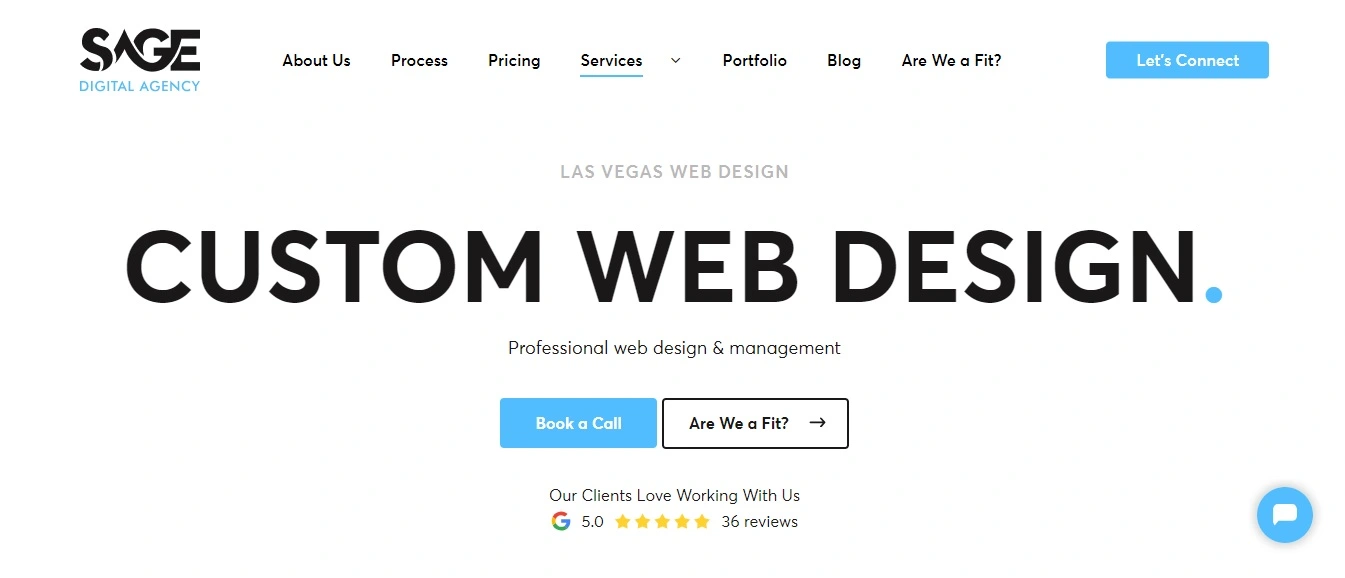
6. Put your most valuable information above the fold
The term “above the fold” comes from newspaper design and describes what readers can see without having to unfold the paper.
For a web page, above the fold means the part of the page that visitors can see without scrolling.
Check out the “above the fold” portion of Sage Digital’s homepage.
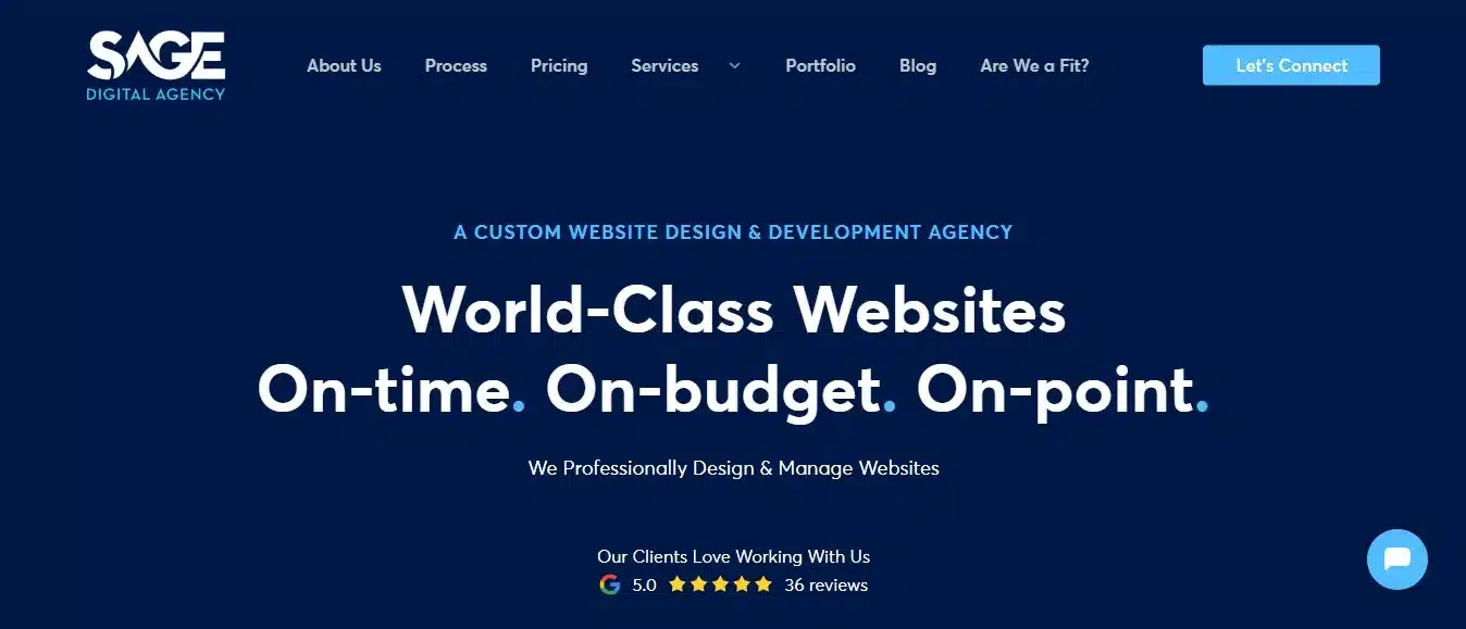
While this screenshot is from our homepage, it still contains some of the things you might see above the fold on a landing page, minus a lead form.
On a landing page, positioning a lead form above the fold means your visitors are less likely to miss your offering. Furthermore, given the diversity of screen sizes and mobile devices, an upfront lead form ensures universal accessibility.
If you have a lengthier landing page, then a scrolling lead form that moves with your users might be helpful.
7. Maintain a familiar design for your landing page
Most online stores have a common design structure: navigation menus on top, followed by product images, titles, prices, reviews, and related products.
This layout is familiar to users, so it’s smart to avoid introducing unconventional designs that could confuse your potential customers.
Now, we get that you might not want to use your landing page as a sales page, but whatever its purpose is, it’s helpful to maintain consistency with what is being used in your industry.
Here are some benefits of maintaining a familiar landing page design:
- Maintains consistency (With a familiar design, there is no need to recalibrate expectations or learn new navigational patterns.)
- Shortens the learning curve
- Reduces customer churn (Users are less likely to abandon a site out of frustration when the design is something they’re accustomed to.)
- Promotes accessibility
8. Create a hook with your headline
Your headline’s job is to clarify the purpose of your page and capture your audience’s attention. The question is, how do you write a headline that accomplishes this goal?
Here are some answers:
- Keep your message straightforward.
- Pose a relevant question to the audience.
- Use an active voice (Active voice generates interest, urgency, and a sense of directness.)
- Emphasize benefits and features equally (Highlighting what users stand to gain can be more enticing than just listing features.)
- Use numbers for precision, e.g., increase sales by 30%.
- Use positive or neutral language since this tends to engage better than negative phrasing.
- Speak your audience’s language, i.e., use words they would use.
- Use testimonials
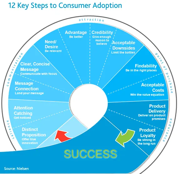
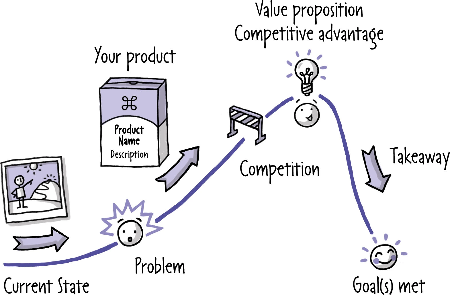
9. Hone your value propositions
One term frequently used in marketing is “value proposition,” which is just another way of expressing the core benefit or promise you’re offering to customers.
The top three things to keep in mind when writing a value proposition are:
- The benefits you offer
- How you differ from competitors
- Your social proof
See the following chart for a visual of a good value proposition flow.
Value proposition vs. mission statement
Just to clarify and avoid any potential confusion:
A value proposition describes what you offer customers and explains why they should hire you. A mission statement, on the other hand, outlines your organization’s purpose.
For example, Sage Digital Agency’s value proposition is “World-Class Websites. On-time. On-budget. On-point,” while our mission statement is “To transform your website to attract customers, stand out from competitors, and recruit top talent.”
Value propositions vs. slogans and taglines
It’s easy to not only mix up your value proposition with your mission statement but also with your slogan and tagline.
Bear in mind that slogans are catchy marketing phrases for products, while taglines express the essence of a brand. They are quite different from your value proposition.
For some real-world examples of slogans and taglines, let’s take a look at Coca-Cola.
Coca-Cola’s marketing campaigns have featured numerous slogans, some of which include:
“Things Go Better with Coke” (1963)
“Have a Coke and a Smile” (1979)
“Open Happiness” (2009)
While Coca-Cola has had many slogans over the years, one could argue that its enduring tagline is:
“It’s the Real Thing” (popularized in the 1970s).
While “It’s the Real Thing” has been used as a slogan in marketing campaigns, its enduring nature and representation of the brand’s identity have given it the weight of a tagline.
Note that the distinction between a slogan and a tagline isn’t always clear-cut. What’s crucial is the intent and how the brand employs the slogan or tagline in its messaging.
10. Strengthen your copy
Strong copy communicates your message and your value proposition, and it helps you connect with your audience. It is no doubt very important.
The problem is, if you’re not a writer, you might not know how to write effective industry-standard copy.
If that’s the case, our advice is to use an AI writing tool like ChatGPT Plus.
If you haven’t tried using ChatGPT Plus to write yet, here are some benefits of doing so:
- Instant creativity boost.
- Chameleon wordsmithing (Mimics any brand’s unique voice.)
- Seamless tonal flow across all your web content.
- Knowledge-packed prose (Taps into a world of data for rich, informed writing.)
With some help from ChatGPT Plus, you can generate solid copy, which you can then edit and adjust as needed. For editing, we recommend using Grammarly Premium.
11. Use video testimonials with real people on your landing page
Using video testimonials with real customers on your landing page is a game-changer. Let’s explore why that is.
Human connection
Humans are inherently social beings, and we gravitate towards stories and experiences we can relate to. When a real person shares their experience with your product or service, it feels a lot more genuine and relatable to your potential customers than just reading a wall of text.
Credibility and trust
Customers today seek out reviews and testimonials before making decisions. This is why having a real person on video attest to the value of your offerings is so valuable. We strongly suggest that you use video testimonials on your landing page.
Enhanced engagement
Videos tend to increase the time visitors stay on your page, which increases the chance of them engaging with your content.
12. Offer a giveaway
Giveaways are an effective way to prompt action from your users, as well as grow your mailing list. Most people, after all, are happy to provide their email address if your site is trustworthy and they see something that interests them.
And who knows? Today’s lead could be tomorrow’s loyal customer, all thanks to your initial giveaway.
When doing a giveaway, here are some pointers to keep in mind:
- Set clear terms and conditions
- Promote the giveaway on social media
- Limit the duration to create urgency
- Ask for minimal information (e.g., just an email)
- Ensure mobile optimization for entries
- Incorporate shareable elements
- Ensure GDPR compliance
- Engage participants with periodic updates or teasers
13. Use a thank you page
After a visitor completes a form on your landing page, it’s best practice to direct them to a thank you page.
Here’s why:
Strengthens the Customer Relationship
A simple thank you message shows you appreciate your customers.
Guides Customers on What to Do
You can use a thank you page to guide customers on what to do after responding to your CTA.
Collects Feedback & Tracks Conversions
A thank you page presents an excellent opportunity to ask for feedback about your product or service. Moreover, it can be used to track form submissions through Google Analytics.
14. Change the font
For a landing page, you want your font to be fairly large and easy to see, and you want your font color to contrast with your background color.
Check out this screenshot as an example of what your font should look like. While this isn’t a landing page, it still illustrates what you want to aim for.
As you can see from the screenshot, your landing page font should have the following qualities:
- Readability
- Consistency
- Contrast with the background
- Legibility
- Adequate spacing
- Relatively large size
15. Test your landing page design before you go live
Before publishing your landing page, you’ll want to test it to make sure it works. If someone can’t understand what your page is about within three seconds, then it’s not designed correctly.
In the event you run into this problem, ask yourself:
- What is the message I’m trying to convey?
- Is the headline clear and compelling?
- Is there too much clutter or unnecessary information?
- Is the call to action clear?
- Is the value proposition immediately evident?
What not to do when designing a landing page ❌
Now that we’ve looked at what to do when designing a landing page, let’s look at what not to do.
1. Don’t use bad stock images
Images play a big role in branding, so pick photos that truly represent your brand and send the right message. As a rule, avoid cliché stock photos like boardroom meetings or handshakes. Too many businesses use them.

As you can see, this isn’t the best image to put on a website, but it illustrates the point! ⬆️
There are plenty of sites that can give you good stock images. We find Pexels to be quite useful, for instance, but we believe that stock photos, no matter how good, should be used in limited quantities.
The disadvantages of stock photos include:
- Lack of originality
- Potential misalignment with your brand
- Less personal and authentic
- Licensing issues
- Overused images
2. Stay away from generic headlines
Generic or vague headlines have several unhelpful qualities, such as:
- Being overly broad and non-specific
- Lacking a unique selling point
- Using buzzwords without context
- Not addressing the target audience’s needs
- Failing to evoke any emotion or interest
To write a good headline, follow three simple rules:
(1) Be clear and concise about your offer. (2) Address the primary need or desire of your target audience. And (3) evoke emotion or curiosity.
3. Avoid overwhelming users with too much text
While content is crucial, an overabundance of text can intimidate and turn away potential leads.
With this in mind, your landing page should ideally have concise, focused content that communicates your message effectively without overwhelming your visitors.
4. Don’t overload your landing page with pop-ups
While pop-ups can be effective, overusing them can distract and even annoy your audience.
If you want to use pop-ups, our advice is to make sure they don’t auto-refresh, as this can be extra frustrating. Additionally, your pop-ups should be easy to close so they don’t bog down your landing page.
5. Avoid autoplay videos and audio
Autoplay videos and audio are a double-edged sword. While they can be attention-grabbing, they can also be intrusive and bog down your page.
We suggest giving your users the choice of whether they want to play your video or audio content.
6. Resist the urge to ask for too much information
While gathering data from leads is beneficial, asking for too much information will almost certainly ruin your potential conversions.
Keep forms short and only request essential information. Lengthy forms can be intimidating and may make visitors question why so much personal data is necessary.
» MORE: Ready to get started? Find out what to do before hiring a website designer
The different types of landing page design
Landing page design for email campaigns
When running an email campaign, our advice is, don’t send users to your homepage unless you have a specific reason for doing so.
Landing pages are usually better at generating leads for targeted campaigns, as they can be tailored to specific subjects.
Do you want Sage Digital to build you a focused landing page? If so, see our Website Design Pricing Guide for more information.
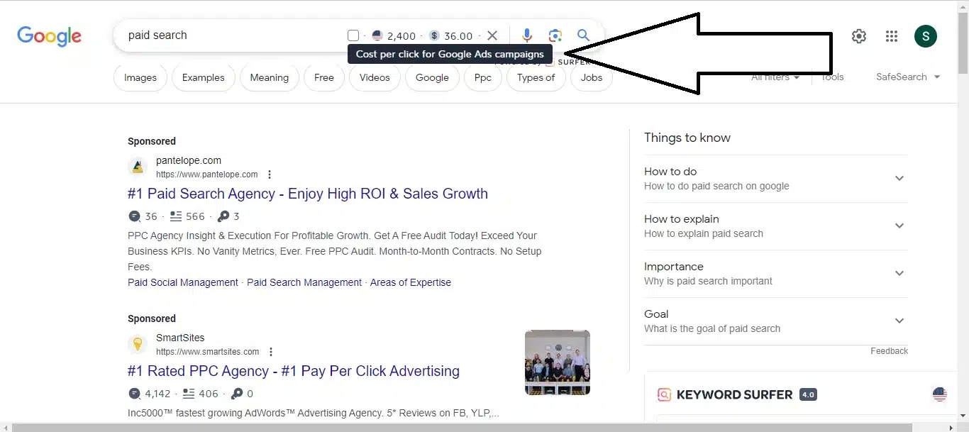
Landing page design for a paid search campaign
At Sage Digital Agency, we can use a landing page to capture traffic from your paid search campaign, which helps make the most of your ad spend. This is important because paid search campaigns are not cheap.
Check out this example to see what we mean. The Google Ads cost per click for the term “paid search” is $36, according to Keyword Surfer.
Landing page for Facebook ads
A landing page can be used for your Facebook Ads. There are different ways you can go about this.
One, you can direct users to a landing page, use analytics to understand their behavior, and then remarket to them on platforms like Facebook.
Two, you can send potential customers directly to a landing page from your Facebook ads.
Landing page design for remarketing campaigns
After a user visits your landing page and provides their information, you have an opportunity to retarget them with ads. It’s possible to set up ads so that your users see you on platforms like Instagram and Facebook.
When running a remarketing campaign, some things to keep in mind include:
- Consistency (Your ad should align with the original landing page’s design.)
- Segmentation
- Frequency
- Relevance
- Call to action
- Duration (Set a time limit for your retargeting ads to keep them relevant.)
Landing page design for A/B testing
Landing pages can boost your conversions and improve your client interactions. But to achieve the results you want, you might need to perform AB testing first.
For those unfamiliar, AB testing is when you create two different versions of a webpage (like a landing page) to compare their performance and determine which one is more effective.
Typically, one version of your landing page will be your current design (often referred to as the “control”), and the other version will contain one or more changes.
The power of a landing page is largely in its ability to be tested, as it can be more easily isolated, tweaked, and tested than a homepage or service page.
Landing page design with Sage Digital
A well-designed landing page can enhance your messaging, boost your conversions, and improve your email campaigns.
For expert landing page design, contact Sage Digital Agency.