
THE BLOG

The Dunning-Kruger Effect in Web Design: Why Everyone Thinks It’s Easy Read More
The Dunning-Kruger Effect in Web Design: Why Everyone Thinks It’s Easy
Read More
What to Ask When Hiring a Digital Marketing Agency: How to Choose the Right Agency
Read More
What to Ask When Hiring a Digital Marketing Agency: How to Choose the Right Agency
Read More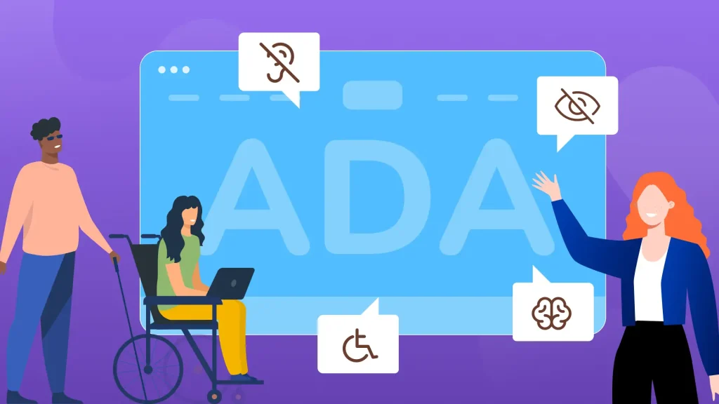
Website Accessibility in 2026: What Your Business Needs to Know About WCAG, ADA, and What Actually Works
Read More
Website Accessibility in 2026: What Your Business Needs to Know About WCAG, ADA, and What Actually Works
Read More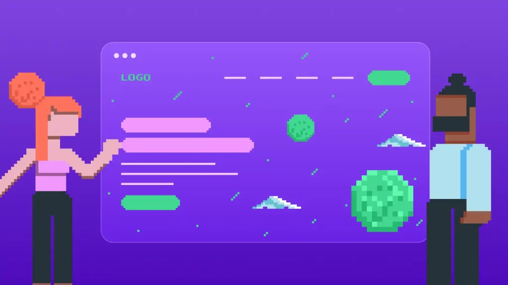
Retro Web Design Is Winning in 2026. But Here’s When Pixel Art Actually Belongs on Your Site
Read More
Retro Web Design Is Winning in 2026. But Here’s When Pixel Art Actually Belongs on Your Site
Read More
How to Recover a Deleted Website: A Practical 2026 Guide
Read More
How to Recover a Deleted Website: A Practical 2026 Guide
Read More
Results-Driven Marketing Starts With Trust and Proof
Read More
Results-Driven Marketing Starts With Trust and Proof
Read More
The Complete Website RFP Guide: How to Write, Send, and Evaluate Proposals for Maximum Success
Read More
The Complete Website RFP Guide: How to Write, Send, and Evaluate Proposals for Maximum Success
Read More
How to Build a Brand: 10 Important Steps to Take Read More
How to Build a Brand: 10 Important Steps to Take
 Read More
How to Choose a Web Design Agency to Work With
Read More
How to Choose a Web Design Agency to Work With
Read More
What is Wireframing in UX Design?
Read More
What is Wireframing in UX Design?
Read More
UX Design Checklist: Don’t Miss a Thing
Read More
UX Design Checklist: Don’t Miss a Thing
Read More
Discover 5 UI design tips to improve your website
Read More
Discover 5 UI design tips to improve your website
 Read More
What Do UI/UX Designers Do in Web Design?
Read More
What Do UI/UX Designers Do in Web Design?
Read More
Web Design for Local Businesses: 5 Best Practices
Read More
Web Design for Local Businesses: 5 Best Practices
Read More
What is a Modal in Web Design?
Read More
What is a Modal in Web Design?
Read More
Web Design for Mobile: 5 Best Practices
Read More
Web Design for Mobile: 5 Best Practices
Read More
Web Design for Small Businesses: 7 Best Practices
Read More
Web Design for Small Businesses: 7 Best Practices
Read More
11 Best Practices for Modern Web Design
Read More
11 Best Practices for Modern Web Design
Read More
Why is UX Design Important for a Website?
Read More
Why is UX Design Important for a Website?
Read More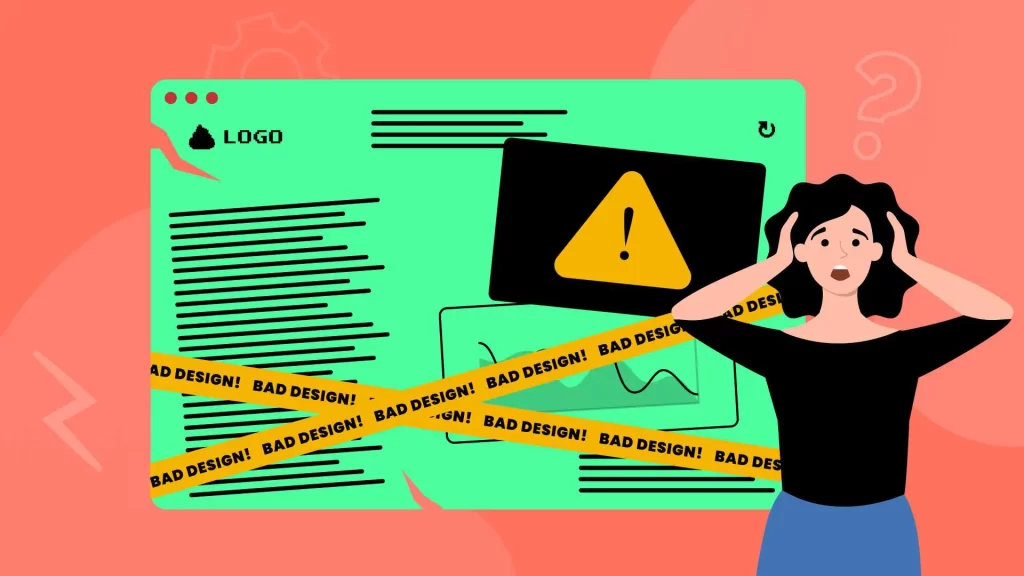
30 Bad Websites with Terrible Web Designs
Read More
30 Bad Websites with Terrible Web Designs
Read MoreRetro Web Design Is Winning in 2026. But Here’s When Pixel Art Actually Belongs on Your Site
Read More
Retro Web Design Is Winning in 2026. But Here’s When Pixel Art Actually Belongs on Your Site
Read More
5 Best Web Design and Social Media Tips From Our Experts
Read More
5 Best Web Design and Social Media Tips From Our Experts
Read More
What Do Web Designers Need Proficiency In Today?
Read More
What Do Web Designers Need Proficiency In Today?
Read More
5 Best Bespoke Web Design Examples + What Is Bespoke Web Design?
Read More
5 Best Bespoke Web Design Examples + What Is Bespoke Web Design?
Read More
WooCommerce vs Shopify – Why WooCommerce Is Better
Read More
WooCommerce vs Shopify – Why WooCommerce Is Better
Read More
What is Figma and Why Figma Is the Best Design Tool…. A Web Designer’s Perspective
Read More
What is Figma and Why Figma Is the Best Design Tool…. A Web Designer’s Perspective
Read More
Making Your Website Better with PHP Updates
Read More
Making Your Website Better with PHP Updates
Read More
Top 10 WordPress Errors
Read More
Top 10 WordPress Errors
Read More
15 Interesting Things You Can Do With Google Lens
Read More
15 Interesting Things You Can Do With Google Lens
Read More
Google History: From Stanford University to Global Dominance
Read More
Google History: From Stanford University to Global Dominance
Read More
14 Steps to Boost Your Google Business Profile + Categories List
Read More
14 Steps to Boost Your Google Business Profile + Categories List
Read MoreThe Definitive Guide to Using Web Archive: 2023 and Beyond
Read More
The Definitive Guide to Using Web Archive: 2023 and Beyond
Read More
11 Free SEO Tools To Help Increase Traffic To Your Site
Read More
11 Free SEO Tools To Help Increase Traffic To Your Site
Read More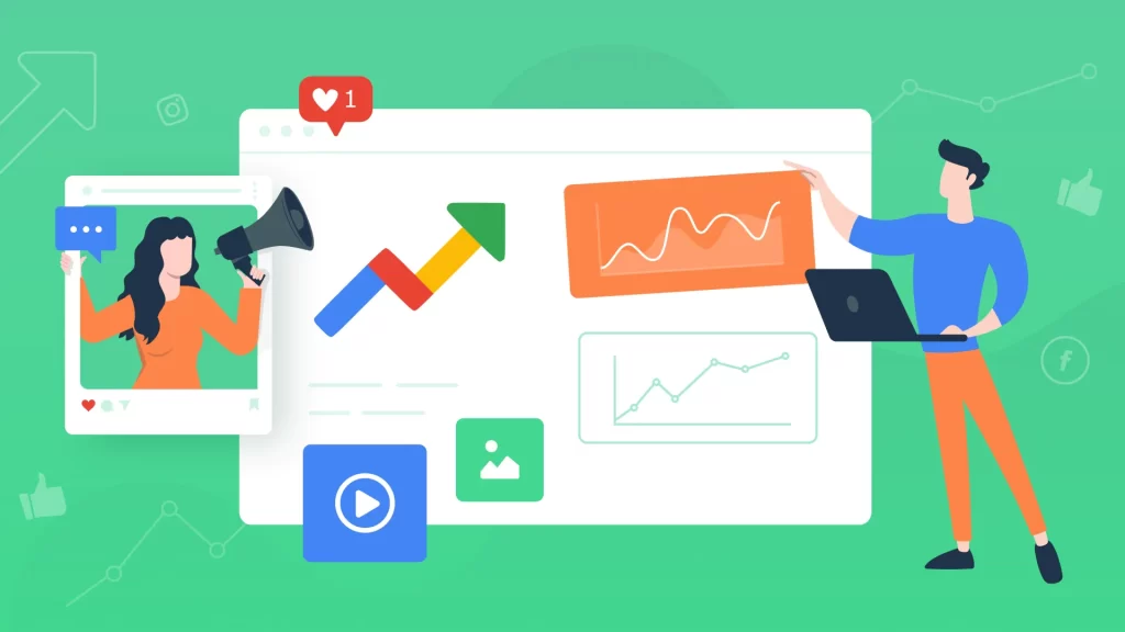
Google Trends: What Is Google Trends and How To Use It
Read More
Google Trends: What Is Google Trends and How To Use It
Read More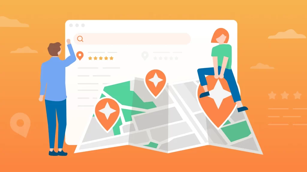
Google’s Local Guides Program: Everything You Need to Know
Read More
Google’s Local Guides Program: Everything You Need to Know
Read More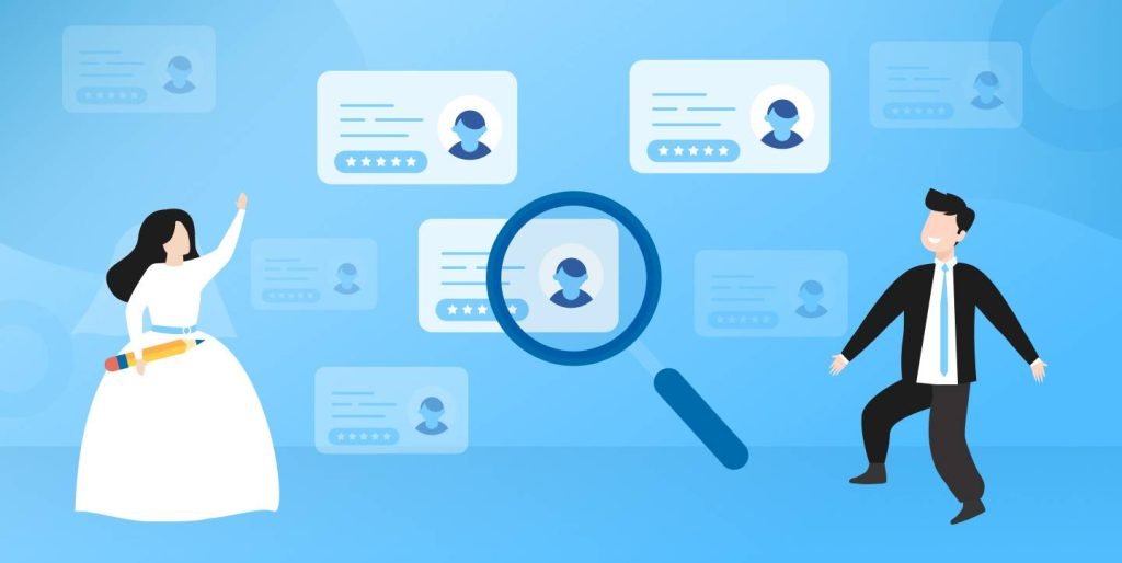
7 Steps to Follow Before You Hire A Website Designer
Read More
7 Steps to Follow Before You Hire A Website Designer
Read More
The Cost to Build a WordPress Website from the Ground Up
Read More
The Cost to Build a WordPress Website from the Ground Up
Read More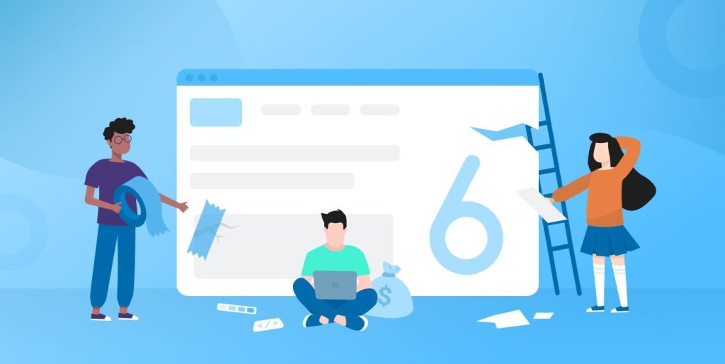
6 Mistakes To Avoid When Hiring A Web Design Consultant
Read More
6 Mistakes To Avoid When Hiring A Web Design Consultant
Read More
Beginner’s Guide to Landing Page Design
Read More
Beginner’s Guide to Landing Page Design
Read More
15 Tips for How to Improve Your WordPress Website Speed
Read More
15 Tips for How to Improve Your WordPress Website Speed
Read More
Protecting Your WordPress Website Against Security Threats
Read More
Protecting Your WordPress Website Against Security Threats
Read More
20 Questions To Ask A Web Design Company Before Hiring Them
Read More
20 Questions To Ask A Web Design Company Before Hiring Them
Read More
The Power of Managed Web Hosting + How Much Does It Cost?
Read More
The Power of Managed Web Hosting + How Much Does It Cost?
Read More