Every web designer needs a good UX design checklist. Hence, the reason for this post.
The following checklist is based on our experience in the web design industry, and we’re sharing it because we want to help our readers improve their websites.
Disclaimer: Some designers may find certain points in this checklist to be time-consuming, challenging to implement, or otherwise objectionable, particularly for smaller teams or projects with limited resources. We encourage designers to adapt the items to their needs.
» MORE: For modern web design instead of UX design, see 11 Best Practices for Modern Web Design
UX Design Checklist – Key Takeaways
Here is a brief summary of the UX design checklist for quick reference:
• Research & Planning: Holistic approach, user testing, competitive analysis, personas, journey maps, SMART objectives and KPIs.
• Visual Design: Aesthetics and functionality balance, color psychology, visual hierarchy, typography, whitespace, brand alignment.
• Accessibility & Inclusivity: Inclusive design, contrast ratios, alt text, keyboard and screen reader accessibility, error messages, diverse user needs.
• User Interface & Interaction: Consistency and innovation, micro-interactions, touch targets, feedback, adaptive interfaces, user control and flexibility.
• Content Strategy: SEO and user-friendly content balance, concise and relevant, visuals, governance plan, regular updates, scannable structure.
• CRO: Ethical persuasive design, optimized landing pages, clear CTAs, simplified forms, trust signals, and user behavior analysis.
• Navigation & IA: Simplicity, clear labels, breadcrumbs, intuitive and scalable IA, card sorting, consistency.
• Ecommerce: User-generated content, search and filtering, social proof, AI and human support, seamless checkout, product pages, wishlists, personalization.
• Developer Handoff: Checklist, adaptive and responsive design, documented decisions, design systems and component libraries, regular check-ins, detailed specs and assets.
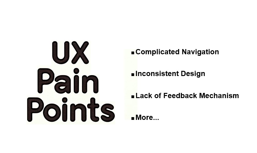
• UX Pain Points: Checklist, prioritization, analytics for identification and analysis.
The UX Design Checklist
This list contains 58 core items across 10 categories.
Research and Planning – Category 1

1. Adopt a holistic approach that integrates design and functionality
- Map user interactions across all touchpoints.
- Collaborate across departments (design, engineering, marketing, etc.)
- Use project management and workflow tools to streamline processes.
- Involve stakeholders from the start.
- Establish clear timelines and appoint a facilitator.
2. Conduct user testing with diverse participants to identify usability issues
- Use moderated in-person testing for in-depth insights.
- Leverage remote unmoderated testing for scalability.
- Try guerrilla testing for quick feedback from random users.
- Test with a diverse range of participants for inclusivity and accessibility.
- Identify usability issues, pain points, and areas for improvement.
3. Perform competitive analysis to understand industry standards
- Research direct and indirect competitors.
- Gather customer feedback on competitors.
- Conduct SWOT analysis on competitor strengths and weaknesses.
- Use prototyping and usability testing tools.
- Continuously monitor competitor activities and innovations.
4. Develop detailed user personas to guide design decisions
- Gather qualitative (interviews, ethnography) and quantitative (analytics, surveys) data.
- Analyze data to identify user segments and archetypal users.
- Create detailed persona profiles capturing demographics, goals, pain points, etc.
- Regularly update personas based on evolving user research.
5. Create user journey maps to visualize user interactions
- Map current-state journeys to understand existing user experiences.
- Develop future-state journeys to envision ideal experiences.
- Use day-in-the-life maps to understand daily user contexts.
- Continuously refine journey maps with user feedback and analytics.
6. Establish clear SMART objectives and KPIs aligned with business goals
- Establish SMART (Specific, Measurable, Achievable, Relevant, Time-bound) objectives.
- Define KPIs aligned with business goals (conversion, retention, engagement, etc.)
- Review and adjust objectives/KPIs regularly based on research insights.
Visual Design – Category 2

7. Balance aesthetics and functionality, ensuring usability and accessibility
- Use principles of visual hierarchy to prioritize elements by importance.
- Ensure consistency in design elements such as buttons, icons, and colors to enhance usability and reduce cognitive load.
- Incorporate user feedback and usability testing to refine the balance between aesthetics and functionality.
- Apply color psychology to influence user emotions and behaviors.
- Ensure buttons are distinguishable through shape and size, not just color, to improve accessibility for users with color vision deficiencies.
- Place buttons strategically to guide users towards desired actions, such as completing a purchase or signing up for a newsletter.
9. Maintain a visual hierarchy to guide user focus, aligning with natural reading patterns
- Use size, color, and spacing to create an intuitive visual hierarchy that guides user focus.
- Align design elements with natural reading patterns, such as the Z-pattern or F-pattern, to enhance readability and user experience.
- Employ contrast and alignment to highlight important information and create a structured flow.
10. Utilize consistent, readable typography that aligns with brand guidelines
- Choose fonts that align with brand guidelines and ensure readability across different devices.
- Pair fonts thoughtfully to maintain visual harmony and enhance readability.
- Use appropriate font sizes and line spacing to improve legibility and user experience.
11. Incorporate whitespace effectively to enhance readability and focus
- Use whitespace purposefully to enhance readability and focus, avoiding excessive scrolling or wasted space.
- Apply both micro and macro whitespace to organize content and create a balanced layout.
- Ensure whitespace helps to guide the user’s eye and improve the overall visual hierarchy.
12. Ensure visual elements align with brand guidelines, regularly updating as needed
- Create and maintain a brand style guide to ensure consistency in visual elements across all platforms.
- Regularly update visual elements to reflect current design trends and user preferences while staying true to the brand identity.
- Involve stakeholders in the review process to ensure alignment with business goals and user needs.
Accessibility and Inclusivity – Category 3

13. Create Inclusive Designs that Prioritize Accessibility
- Implement accessible design features such as proper color contrast, keyboard navigation, and screen reader compatibility.
- Test with diverse users, including those with disabilities, to ensure the design is accessible and usable for everyone.
14. Ensure Text is Readable with Appropriate Contrast Ratios
- Use tools like WebAIM Contrast Checker to ensure text and background colors meet optimal contrast ratios for readability.
- Test readability with diverse users, including those with visual impairments, to ensure text is easily readable.
15. Provide Alternative Text for Images and Media
- Write descriptive and meaningful alt text for all images and media to improve SEO and accessibility for users with visual impairments.
- Regularly audit your site to ensure compliance with accessibility standards and update alt text as needed.
16. Design for Keyboard and Screen Reader Accessibility
- Ensure the site is fully navigable by keyboard, providing keyboard shortcuts and focus indicators.
- Test with assistive technologies like screen readers to ensure compatibility and usability for users with disabilities.
17. Include Accessible Forms and Error Messages
- Design forms with clear labels, input fields, and error messages that are informative and help users correct mistakes.
- Gather feedback from diverse users to identify and fix accessibility issues in forms and error messages.
18. Consider the Needs of Users with Diverse Abilities and Backgrounds
- Accommodate different needs by designing for a wide range of abilities, including physical, cognitive, and sensory disabilities.
- Gather feedback from a diverse user base to ensure the design meets the needs of all users and continuously improve based on this feedback.
User Interface and Interaction – Category 4

19. Ensure Consistency in the User Interface While Considering Innovation
- Balance consistency with innovative design elements that enhance usability.
- Maintain uniformity in visual elements like colors, fonts, and icons across the interface.
- Introduce innovative features in non-essential areas to avoid disrupting core user flows.
20. Design Contextually Relevant Micro-Interactions to Enhance User Satisfaction
- Use micro-interactions to provide subtle feedback and guide user behavior without causing distractions.
- Ensure micro-interactions are purposeful and enhance the user experience by providing clear, immediate feedback.
- Examples include hover effects, button animations, and progress indicators.
21. Create Intuitive and Responsive Touch Targets
- Design touch targets with appropriate size and spacing to ensure ease of use on various devices.
- Ensure touch targets are large enough to be easily tapped on small screens and spaced adequately to prevent accidental taps.
- Test touch targets on different devices to ensure responsiveness and usability.
22. Implement Feedback Mechanisms for User Actions
- Provide feedback mechanisms like loading indicators, confirmation messages, and error notifications to keep users informed about their actions.
- Ensure feedback is immediate and relevant to the user’s actions to instill confidence and reduce uncertainty.
- Use visual, auditory, or haptic feedback to cater to different user needs and preferences.
23. Design Adaptive Interfaces for Various Devices
- Implement adaptive design principles to provide a consistent user experience across various devices and screen sizes.
- Use flexible grid systems, optimized images, and user-centered design to ensure interfaces adapt seamlessly to different devices.
- Test interfaces on multiple devices to ensure functionality and consistency.
24. Prioritize User Control and Flexibility in Interactions
- Give users control over their interactions with features like undo options and customizable settings.
- Ensure features are easy to find and use, enhancing user satisfaction and engagement.
- Provide options for users to personalize their experience, catering to individual preferences and needs.
Content Strategy – Category 5

25. Collaborate with Content Creators to Balance SEO and User-Friendly Content
- Integrate keywords naturally into content without sacrificing readability.
- Maintain a balance between SEO optimization and user-friendly, engaging writing.
26. Ensure Content is Concise, Clear, and Relevant
- Produce concise, clear content that avoids jargon and unnecessary complexity.
- Ensure content is relevant and aligned with user needs and search intent.
- Regularly update existing content to maintain accuracy and freshness.
27. Use Visual Content to Complement and Enhance Text
- Use relevant images, videos, and infographics to complement and enhance written content.
- Ensure visuals add value and improve content comprehension, not just decoration.
- Optimize visuals for the web with appropriate formats, sizes, and accessibility.
28. Implement a Content Governance Plan for Consistency
- Define roles, responsibilities, and workflows for content creation and management.
- Establish guidelines, standards, and policies for consistent, high-quality content.
- Regularly review and update the content governance plan as needed.
29. Regularly Update Content to Maintain Accuracy and Relevance
- Conduct regular content audits to identify areas for improvement.
- Analyze user feedback, engagement metrics, search data to prioritize updates.
- Update and refresh existing content to maintain relevance and performance.
30. Structure Content for Easy Scanning and Reading
- Use headings, bulleted lists, and short paragraphs for easy scanning and reading.
- Test content structure and formatting with real users for optimal readability.
- Ensure content structure and formatting are responsive across devices.
Conversion Rate Optimization (CRO) – Category 6

31. Consider the Ethical Implications of Persuasive Design in CRO
- Ensure CRO techniques align with user trust and do not manipulate or deceive users.
- Prioritize transparency, user control, privacy protection, and well-being in persuasive design.
- Follow ethical guidelines and regulations related to persuasive design practices.
32. Optimize Landing Pages through Effective Messaging and A/B Testing
- Craft compelling, benefit-focused messaging that resonates with the target audience.
- Conduct A/B tests with clear hypotheses to identify high-converting page variations.
- Ensure messaging matches the traffic source and user expectations for message match.
33. Use Clear and Compelling Calls to Action
- Optimize CTA placement, wording, and design (color, size, etc.) for maximum visibility.
- Test different CTA variations with users to ensure clarity and effectiveness.
- Guide users towards desired actions with prominent, hard-to-miss CTAs.
34. Simplify Forms to Reduce User Friction
- Minimize the number of form fields by only asking for essential information.
- Use clear field labels and provide inline form validation to reduce errors.
- Regularly test forms with users to identify and address issues causing drop-offs.
35. Implement Trust Signals like Security Badges and Testimonials
- Prominently display security badges, testimonials, guarantees, and other trust signals.
- Build user confidence by incorporating relevant trust elements that address concerns.
- Test different trust signal variations to identify the most effective ones.
36. Analyze User Behavior to Identify and Address Drop-Off Points
- Use web analytics to track user behavior and identify points of high drop-off.
- Conduct user research (surveys, heatmaps, session recordings) to understand drop-off reasons.
- Make data-driven improvements to address identified issues and optimize user flows.

- Minimize menu items to avoid overwhelming users.
- Use clear, descriptive labels that are easy to understand.
- Test navigation designs with users to ensure intuitiveness and ease of use.
- Ensure navigation labels are clear and descriptive to help users understand their options.
- Regularly update labels to keep them relevant and clear as content evolves.
- Use breadcrumb trails to accurately reflect the user’s location within the site hierarchy.
- Ensure breadcrumb trails are consistent across all pages to aid navigation and orientation.
40. Design Intuitive and Scalable Information Architecture
- Use card sorting to understand how users categorize information and design an intuitive structure.
- Employ tree testing to evaluate the findability of information and refine the architecture based on user feedback.
- Regularly test and refine the information architecture to ensure it scales with new content and features.
41. Conduct Card Sorting Exercises to Understand User Preferences
- Use a mix of open and closed card sorting to gather comprehensive insights into user preferences and mental models.
- Analyze the results to inform the design of a user-friendly information architecture.
- Regularly audit navigation elements to maintain consistency across the entire site.
- Ensure that navigation patterns and labels are uniform to provide a seamless user experience.
Ecommerce – Category 8

43. Incorporate and Moderate User-Generated Content in eCommerce Design
- Implement reviews, Q&As, ratings, and other user-generated content to build trust.
- Establish clear policies for content moderation to maintain quality and relevance.
- Ensure consistent enforcement of moderation policies across all user-generated content.
44. Implement Dynamic Search and Filtering Options for Easy Product Discovery
- Use autocomplete, faceted search, and filtering for easy product discovery.
- Regularly test search and filtering functionality to identify areas for improvement.
- Leverage AI and machine learning to enhance search relevance and filtering accuracy.
45. Incorporate Transparent and Authentic Social Proof
- Display user reviews, ratings, and testimonials as authentic social proof.
- Ensure social proof is relevant to the user’s purchase decision-making process.
- Maintain transparency by clearly distinguishing sponsored content from organic social proof.
46. Provide Comprehensive Customer Support with a Balance of AI and Human Touch
- Combine AI-powered chatbots for instant support with human agents for complex issues.
- Ensure a seamless handoff between AI and human support for consistent experience.
- Regularly train AI models with updated data to improve response accuracy.
47. Design a Seamless Checkout Process with Multiple Payment Options
- Minimize steps and streamline the checkout process for reduced friction.
- Offer multiple payment options to cater to diverse customer preferences.
- Regularly test and optimize the checkout process based on user feedback and analytics.
48. Optimize Product Pages with Detailed Descriptions and High-Quality Images
- Provide accurate, detailed product descriptions with key features and specifications.
- Use high-quality product images from multiple angles to showcase products.
- Implement video content, 360° views, and other interactive media where relevant.
49. Enable Wishlists and Save-for-Later Functionality
- Implement a wishlist and save-for-later functionality to enhance the shopping experience.
- Regularly update these features based on user feedback and usage data.
- Leverage saved items for personalized recommendations and retargeting campaigns.
50. Use Personalization to Enhance the Shopping Experience
- Implement personalized product recommendations and content based on user data.
- Respect user privacy by being transparent about data collection and usage.
- Continuously update personalization models with new data for improved accuracy.
Developer Handoff – Category 9

51. Create a Comprehensive Developer Handoff Checklist
- Include detailed design specifications, assets, and documentation in the checklist.
- Ensure the checklist is regularly updated to reflect any changes or new requirements.
- Use the checklist to streamline the handoff process and ensure all necessary information is provided.
52. Prioritize Adaptive and Responsive Design Strategies
- Implement both adaptive and responsive design strategies to ensure optimal performance across various devices.
- Test designs on multiple devices to identify and resolve any issues.
- Ensure the design adapts fluidly to different screen sizes and orientations.
53. Document Design Decisions and Rationale
- Provide clear, concise documentation that explains design decisions and the rationale behind them.
- Ensure documentation is accessible to all team members and stakeholders.
- Use visuals and annotations to enhance understanding and clarity.
54. Use Design Systems and Component Libraries for Consistency
- Create and maintain design systems and component libraries to ensure consistency across projects.
- Regularly update these systems and libraries to incorporate new components and design patterns.
- Ensure all team members are familiar with and use the design systems and component libraries.
55. Conduct Regular Check-Ins with Developers for Alignment
- Schedule regular check-ins with developers to ensure alignment and address any issues.
- Focus check-ins on resolving misalignments and ensuring the design vision is accurately implemented.
- Use these meetings to gather feedback and make necessary adjustments to the design.
56. Provide Detailed Specifications and Assets for Implementation
- Ensure all design specifications and assets are detailed, clear, and regularly updated.
- Provide high-quality asset files, including icons, images, and graphics, in the appropriate formats.
- Use organized and properly formatted files to streamline the development process and reduce errors.
UX Pain Points – Category 10

57. Develop a UX Pain Point Checklist and Prioritize Critical Issues
- Create a comprehensive checklist to identify and document UX pain points across your product.
- Prioritize pain points based on their severity and impact on the user experience.
- Categorize pain points into critical, high, medium, and low priority for focused resolution.
- Regularly review and update the checklist as new pain points emerge or priorities change.
58. Use Analytics to Identify and Analyze Pain Points
- Leverage web analytics tools like Google Analytics to track user behavior and identify potential friction points.
- Utilize session recording and heatmap tools like Hotjar to visualize user interactions and uncover usability issues.
- Analyze metrics such as bounce rates, exit rates, and conversion funnels to pinpoint drop-off points.
- Combine quantitative analytics data with qualitative user feedback for a comprehensive understanding of pain points.
UX Design Checklist – Conclusion
The purpose of this post is to provide an in-depth UX design checklist that you can adapt to your needs. For a full overview of the content, see the Key Takeaways section.
To improve your website with UX design, visit our Connect page and fill out our content form, or call us directly.


