






What is Wireframing in UX Design? Short Answer
Wireframing is the process of defining a digital product’s structure. In web design specifically, this allows designers to refine the UX before investing in the full design.
Key elements of wireframing in UX and web design
- Laying out the basic structure and hierarchy of the website.
- Defining the key elements.
- Establishing the navigation and user flow.
- Identifying core functionalities.
- Iterating and refining the design based on user feedback.
- Collaborating with stakeholders to ensure alignment with business goals.
- Creating a foundation for the visual design and development phases.
» MORE: Looking for modern web design instead of wireframing? Read 11 Best Practices for Modern Web Design
Different Types of Wireframes
Wireframes come in different fidelities, each of which serves a specific purpose.
Low-Fidelity Wireframes (Lo-Fi): These are simple, hand-drawn sketches or basic digital outlines that focus on layout and structure. They’re quick to create and ideal for early-stage ideation and exploration.
Mid-Fidelity Wireframes (Mid-Fi): These are more detailed than lo-fi wireframes. They include placeholders for content and basic visual elements, making them suitable for user testing and gathering feedback.
High-Fidelity Wireframes (Hi-Fi): These closely resemble the final product, with detailed visual elements, interactions, and content. Hi-fi wireframes are useful for final design approvals and developer handoff.
Example of a Low-Fidelity Wireframe
Click to expand the image
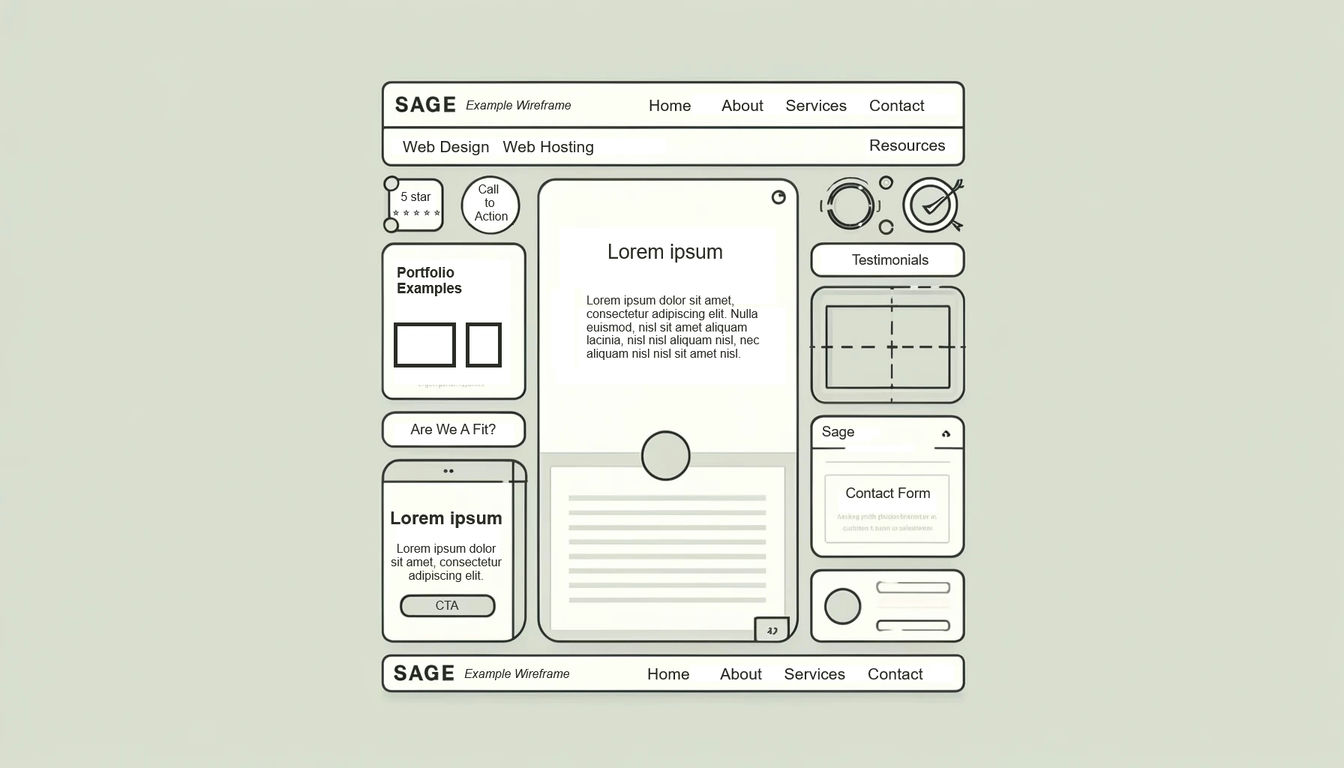
Wireframing is the first design step in every website we design.
Wireframing Is Important in UX Design
As you can see in the key elements of wireframing, wireframes are very important for UX design.
Without wireframes, you can’t easily communicate your design ideas, iterate on the layout, or gather feedback!
Note: Early-stage validation through Lo-Fi and Mid-Fi wireframes can help reduce the risk of costly design changes later in the development process.
Click to expand the image
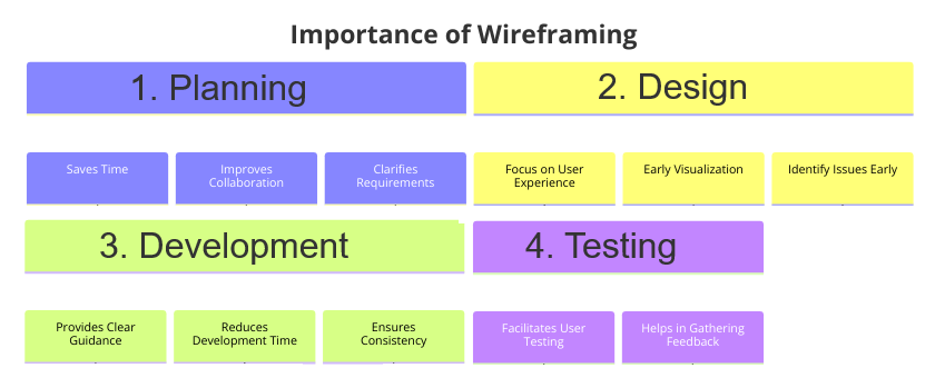
The bottom line: Wireframes are important because they provide clarity and facilitate communication and collaboration. ✅
How Wireframes and Tools Like Figma Facilitate Communication in UX Design
The question is, though, how do wireframes facilitate communication between designers, developers, stakeholders, and clients?
Answer: By facilitating discussions and feedback through tools like Figma.
Figma specifically allows multiple users to work on the same wireframe and provide feedback through comments. It is our recommended tool for wireframing in UX and web design.
However, other wireframing tools, such as Sketch, Adobe XD, and InVision, can also do the job.
Wireframing Improves Communication By Removing Distractions:
Ultimately, regardless of the tool, wireframing allows designers to focus on the layout and placement of elements WITHOUT getting distracted by colors, images, or excessive, fancy typography.
It’s certainly much easier to identify and address usability issues when you aren’t distracted.
This is fundamental because, in every project, there will be different voices and potentially competing priorities that need to be ironed out. Wireframing makes it easy for designers, other team members, and stakeholders to come together and understand what’s going on.
The Anatomy of a Wireframe in UX Design
We know that wireframing provides a skeleton of a digital product, but what are the specific components of a wireframe?
Here’s a breakdown:
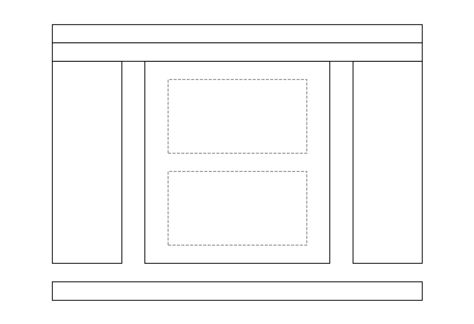
Layout and Structure
- Content Blocks are basic shapes that represent different sections of content.
- Grid Systems maintain alignment and consistency across the design.
- Placeholders indicate where images, videos, or other media will be placed.
Content Hierarchy
- Headings and Subheadings are represented by different font sizes or bolded text to indicate their level of importance.
- Text Blocks use placeholder text to show where paragraphs will go.
- Call to Action (CTA) Buttons are highlighted to draw user attention to key actions.
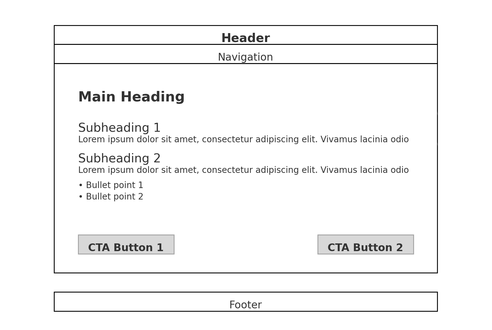
Navigation
- Navigation Bars are horizontal or vertical bars that contain links to the main sections of the site.
- Menus are dropdown or hamburger menus for additional navigation options.
- Breadcrumbs indicate the user’s current location within the site hierarchy.
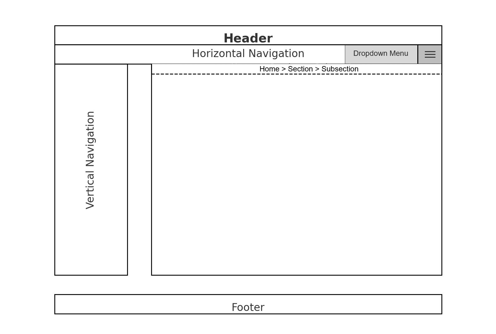
User Interaction
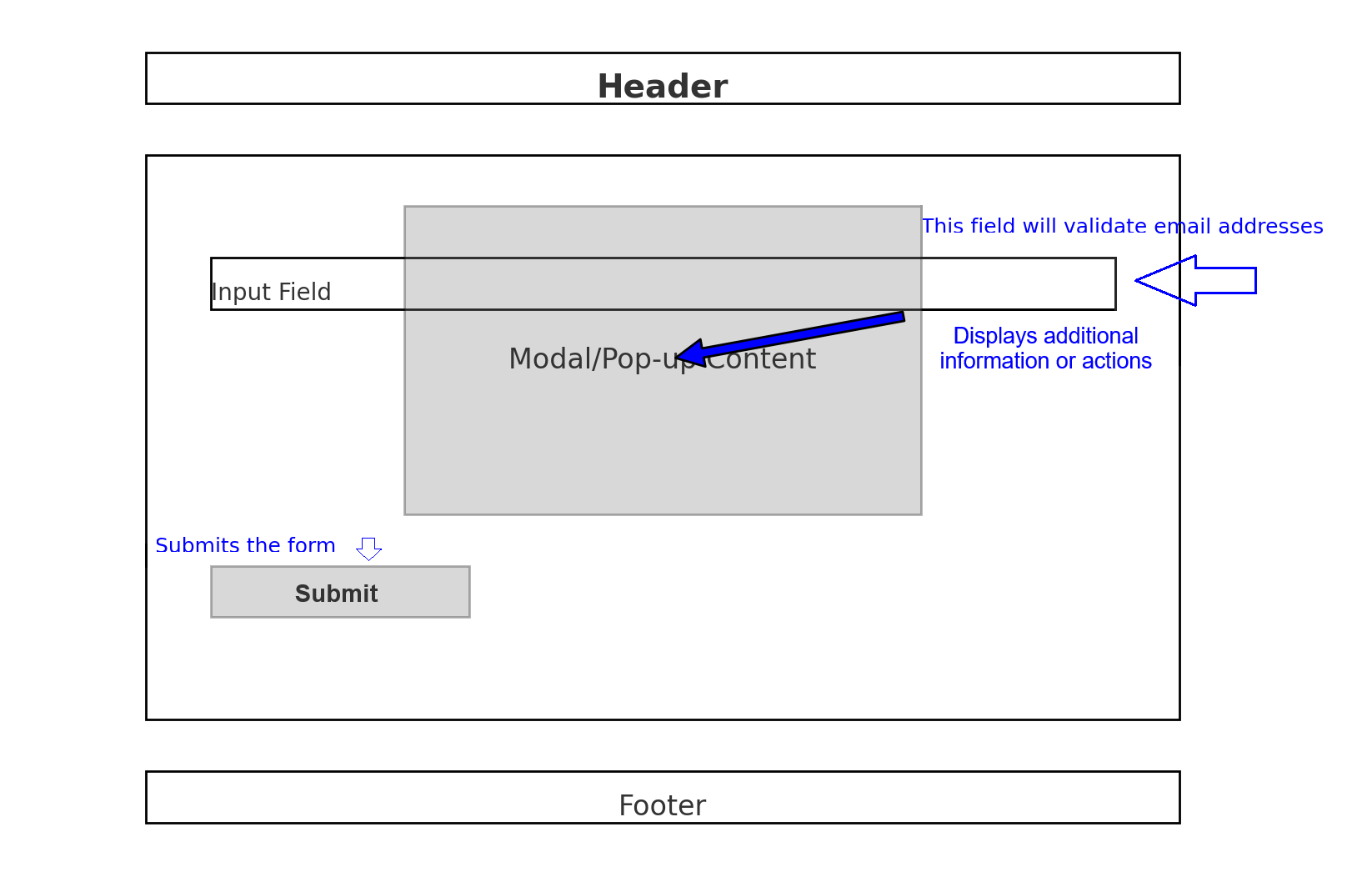
- Forms include input fields, checkboxes, and radio buttons for user data entry.
- Buttons are interactive elements like “Submit,” “Read More,” or “Buy Now.”
- Modals and Pop-ups are represented by overlay boxes to show where additional information or actions will appear.

Annotations
- Functionality annotations explain how a component should behave.
- Content annotations specify the type of content that will be displayed.
- Interaction annotations describe special interactions.
Responsiveness
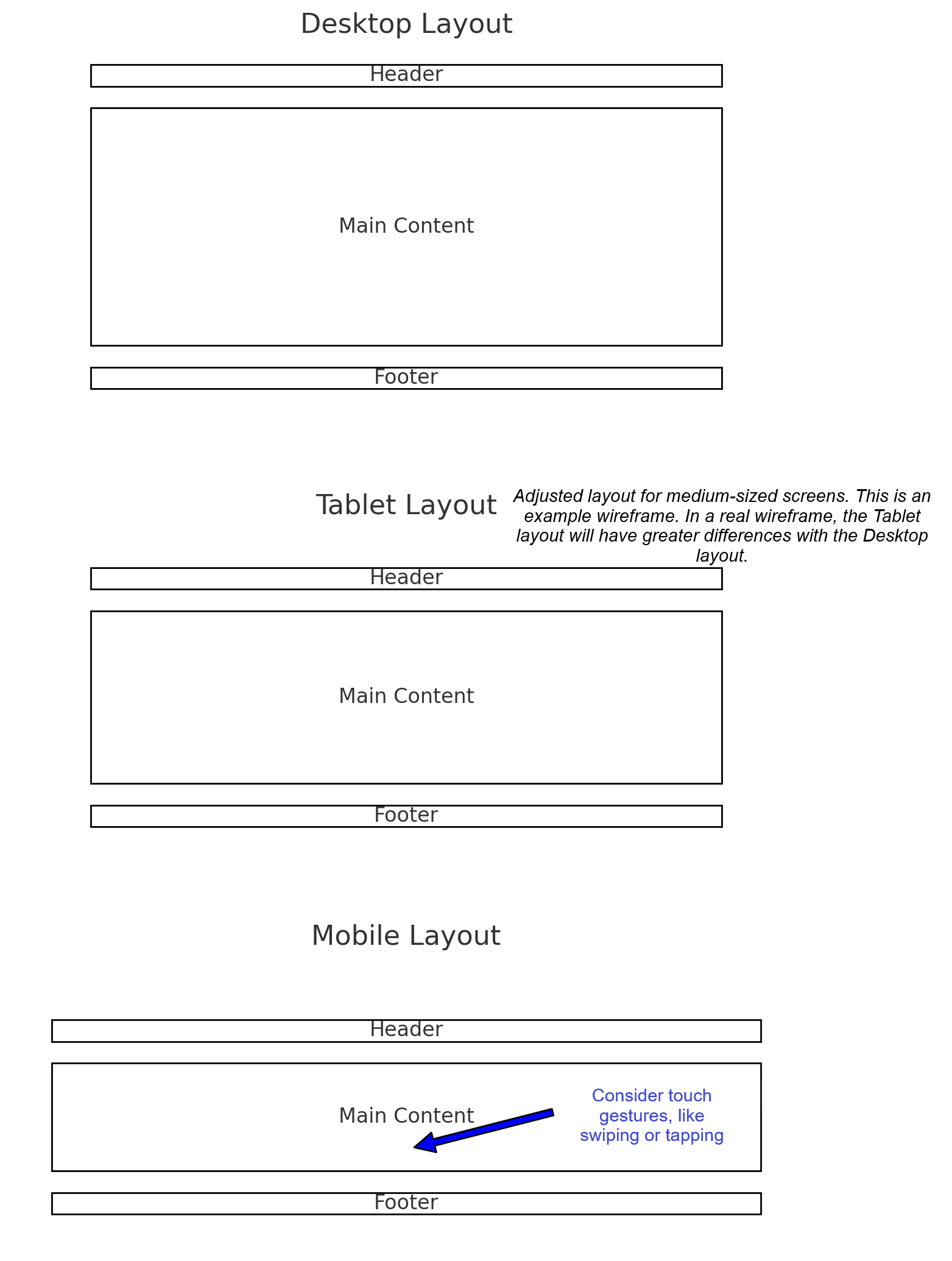
- Breakpoints are used to create wireframes for various screen sizes.
- Adaptive layouts adjust the placement and size of elements to fit different devices.
- Touch interactions consider how users will interact with the product on touchscreens.
Best Practices for Creating Wireframes
Understand Project Goals and User Needs
- Conduct research, create user personas, and map user journeys.
- Align wireframes with insights from user research.
Keep Wireframes Simple
- Focus on core functionality.
- Avoid unnecessary visual elements.
- Avoid investing time in polishing visual details early on.
Facilitate Collaboration
- Use wireframes to communicate the overall structure of the design.
- Seek feedback from stakeholders, developers, and other designers.
- Ensure everyone is on the same page to reduce misunderstandings and costly revisions.
- Make necessary revisions based on feedback.
Identify Usability Issues Early On
- Ask the question, will this design work for users?
Refine, Then Enhance
- Move on to higher-fidelity designs only after refining wireframes.
When to Use or Skip Wireframes in UX Design
As you can see from the best practices, there is a lot that goes into wireframes.
Ultimately, whether you use them or not depends on the project’s requirements and timeline and your team.
Here’s an infographic with a quick overview of when to use or skip wireframes:
Click to expand the image

IN OTHER WORDS
USE: Wireframes should be used in early design stages, brainstorming sessions, user testing, and projects that require collaboration among designers and stakeholders.
SKIP: Wireframes can be skipped for small updates to existing interfaces, or when very tight timelines are involved, or when stakeholders require functioning prototypes rather than wireframes.
What is Wireframing in UX Design – Conclusion
The purpose of this post is to answer the question, “What is wireframing in UX design?” as well as provide a brief overview of wireframing.
Looking to improve your website with UX design? Visit our Connect page and send us a message.