
Nowadays, B2B websites serve as an important bridge between companies and their clients.
Many web users today have high standards, so to make the right impression and drive sales, the best B2B websites need to utilize the latest and most cutting-edge design principles.
If you’re looking for B2B websites to inspire your next business website design, look no further. We’ve carefully curated a list of the 40 best B2B websites for your consideration.

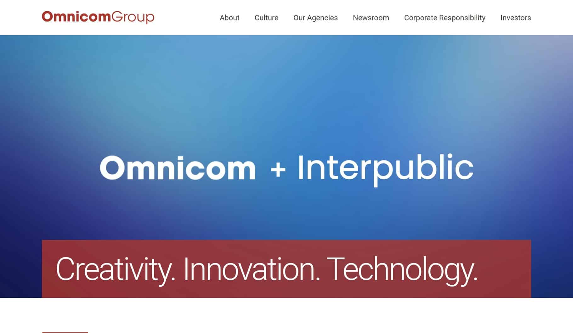
1. Omnicom Group
Why it’s good: Omnicom Group’s B2B website excels with its intuitive user interface and visually engaging layout. It neatly organizes essential information in a spare style and makes good use of photos that convey the company culture.
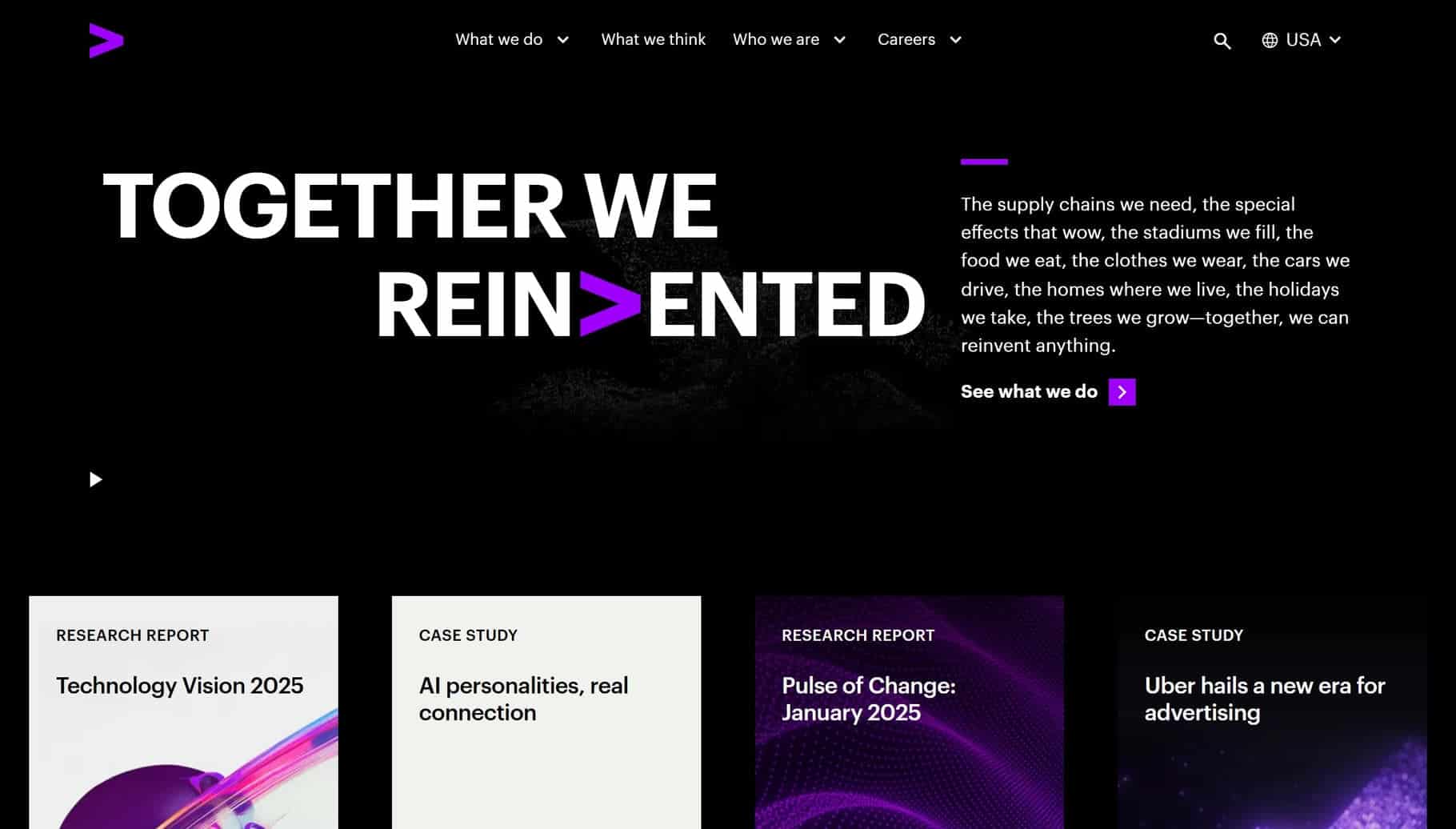
2. Accenture
Why it’s good: Accenture uses various creative design elements, such as cursor-responsive text, scroll-based interactions, and fixed backgrounds. This B2B website is quite large, with several in-depth pages featuring quality photos and videos
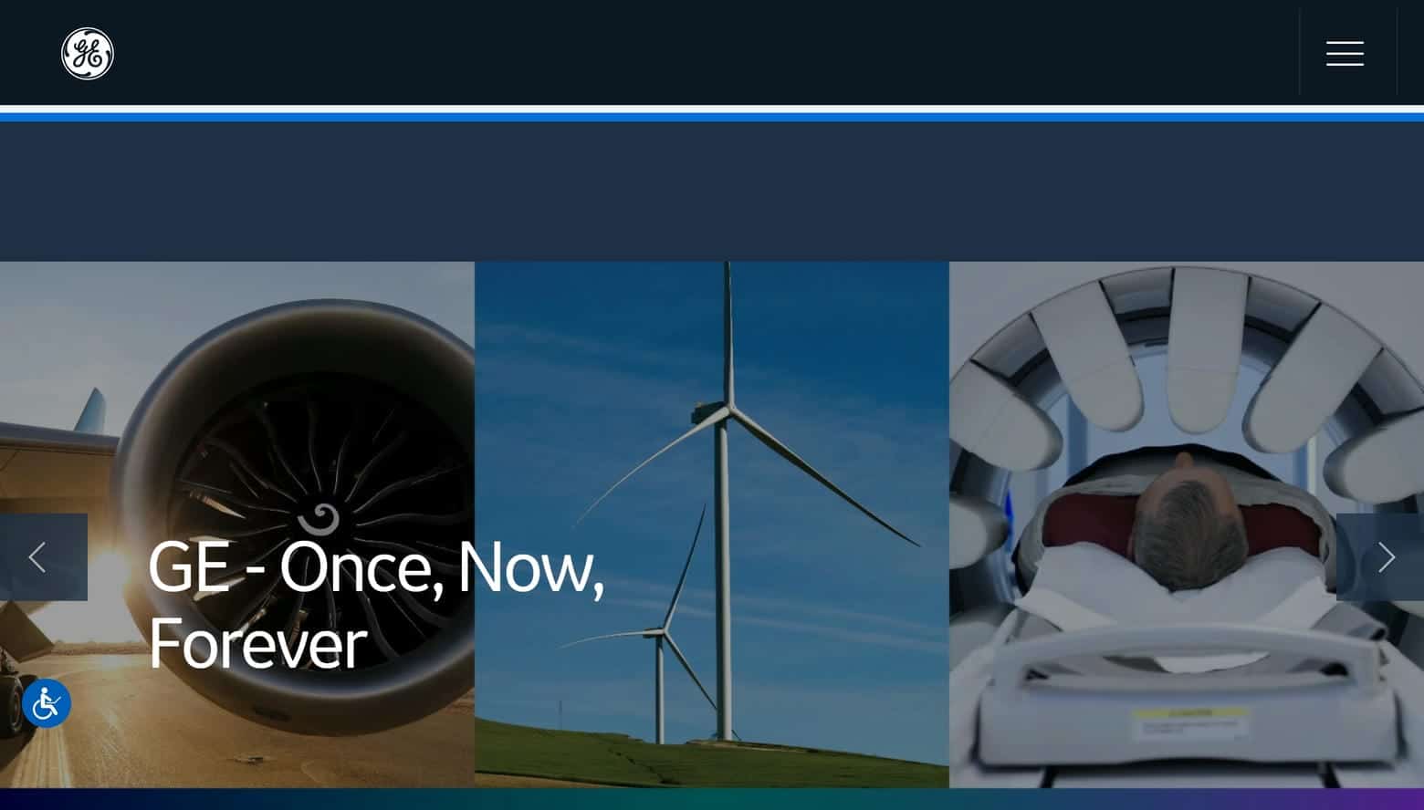
3. General Electric
Why it’s good: General Electric makes expert use of photos, fixed backgrounds, navigation cards, and a beautiful navy blue color scheme. We enjoyed scrolling through this polished B2B website.
4. Box
Why it’s good: Box has succinct content sections that effortlessly guide visitors through each page. The different pages feature custom photos, high-quality videos, easy-to-read fonts, interesting infographics, creative icons, and more.

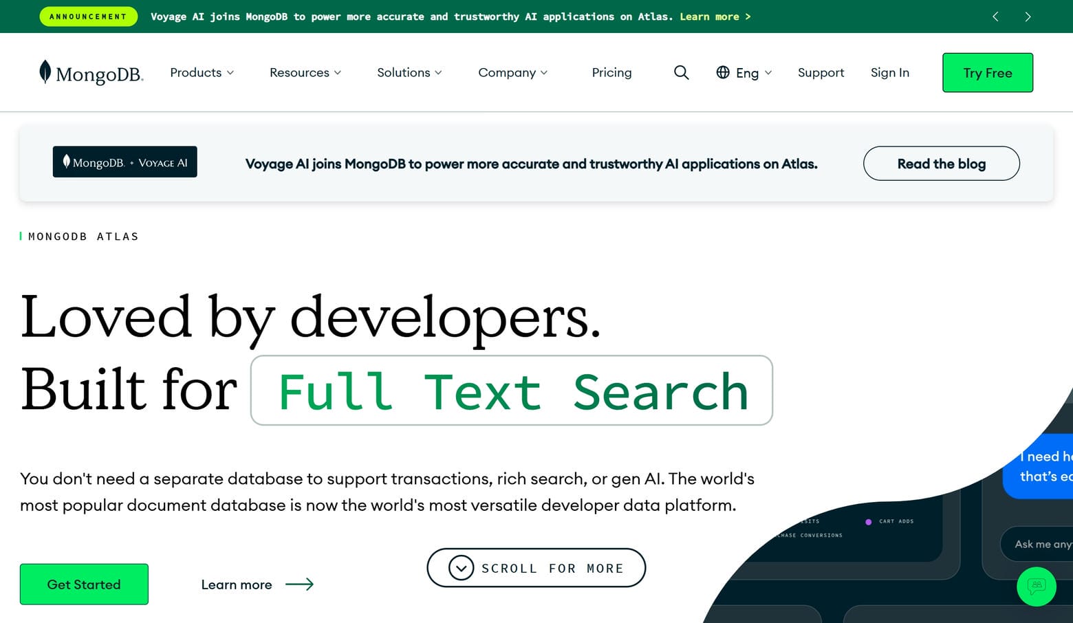
5. MongoDB
Why it’s good: MongoDB has a comprehensive navigation menu and rich, detailed pages that cover a broad range of relevant subjects. Page elements include looping animations, creative backgrounds, custom vector illustrations, content cards, and contact message integration.
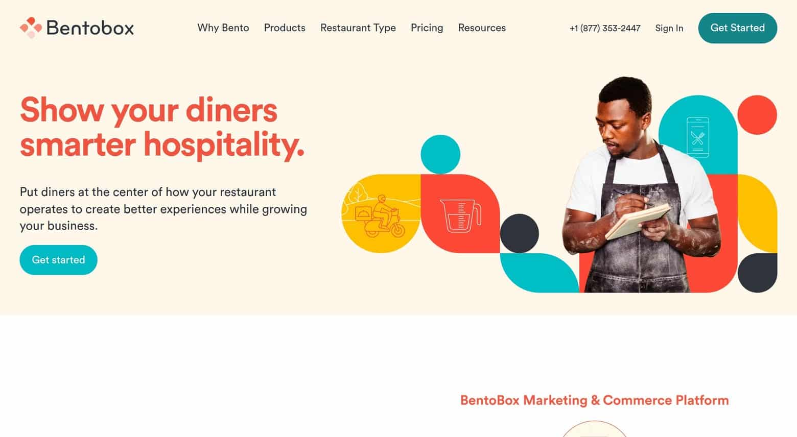
6. BentoBox
Why it’s good: BentoBox has an inviting pink, white, and coral color scheme that serves the site well. The pages are largely white, with splashes of color, graphic shapes, and authentic photos that add life to the design. The font choices on this B2B website are also quite good.
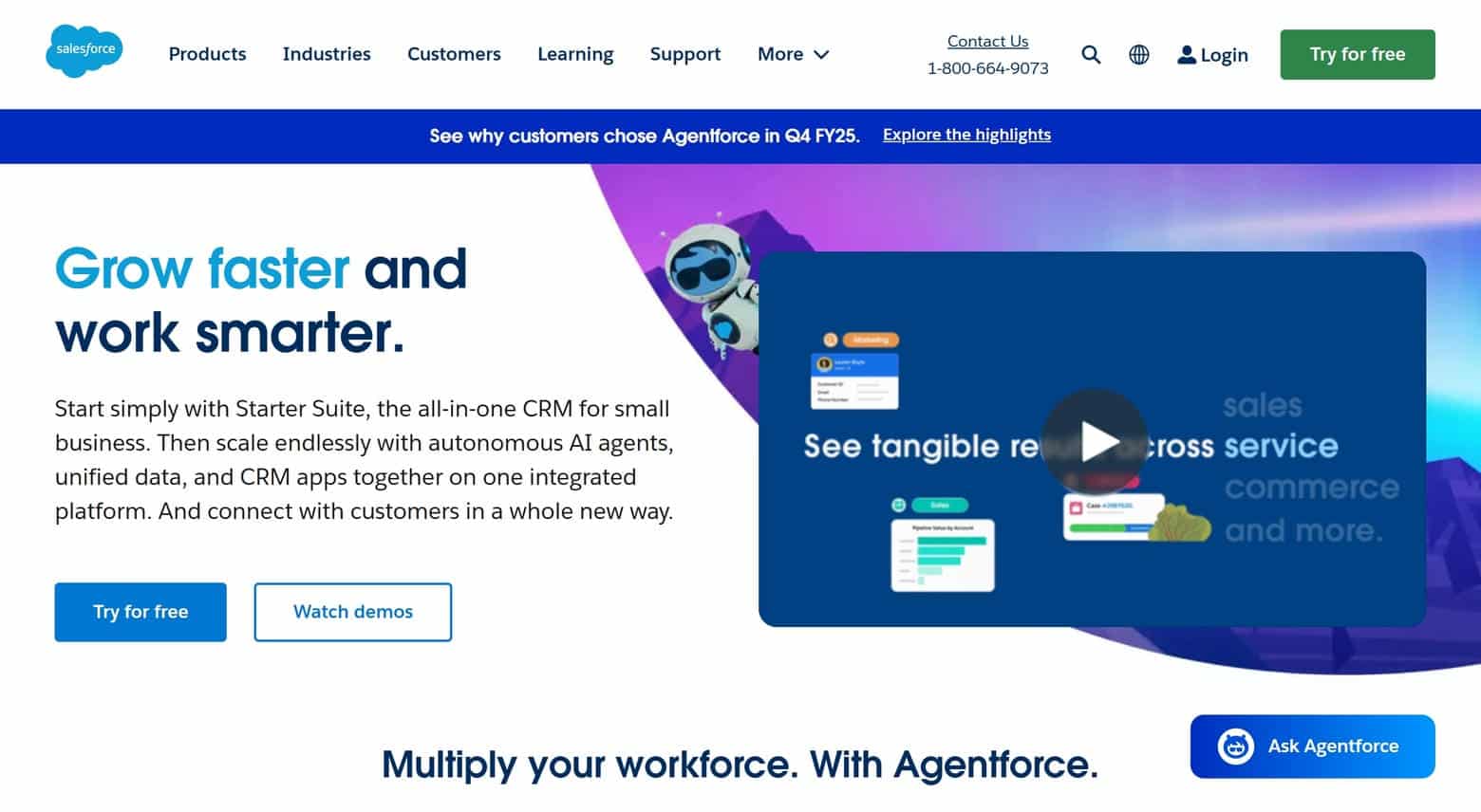
7. Salesforce
Why it’s good: Salesforce has a friendly design that balances light-heartedness with professionalism. Some specific attributes that make this B2B website great are spare text, cute icons, excellent content cards, and the occasional static cartoon animation.
TOP B2B WEBSITES
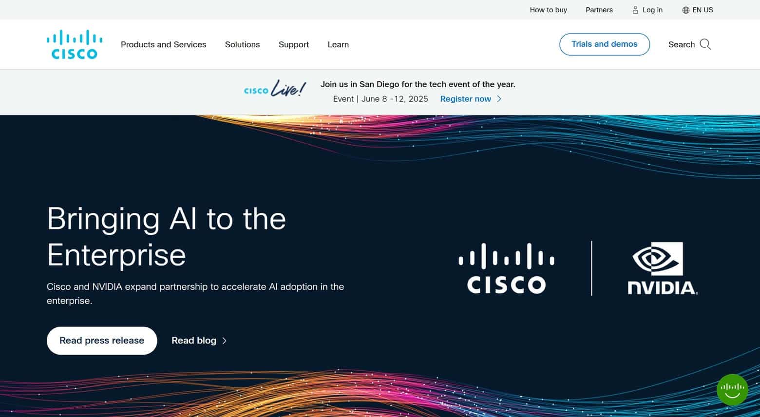
8. Cisco
Why it’s good: Cisco’s B2B website is so clean it deserves to be on the list. Its tightly organized pages and simple navigation make for an exceptionally effective design.
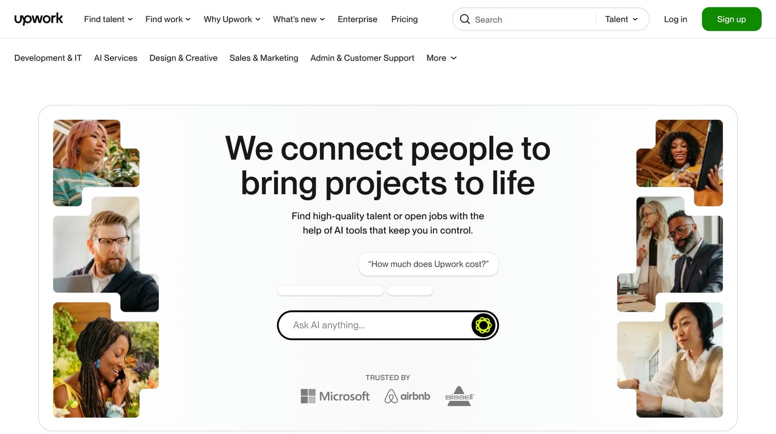
9. Upwork
Why it’s good: Upwork’s B2B website benefits from excellent branding, exceptional organization, and creative content sections. There is a lot worth emulating here.
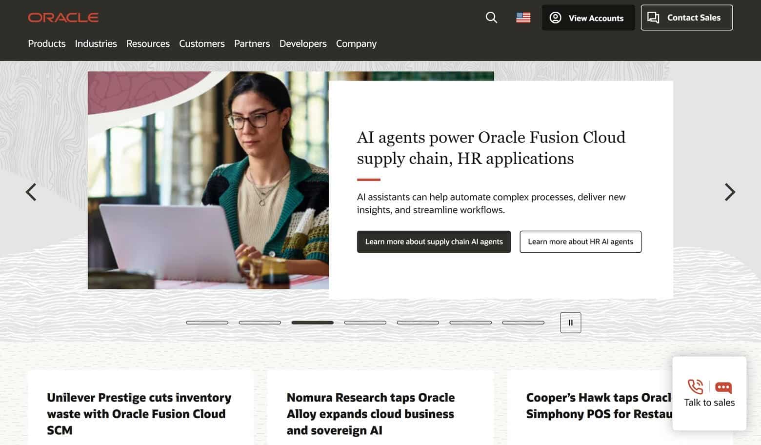
10. Oracle
Why it’s good: We love the overall aesthetic and appeal of Oracle. This B2B website balances various creative elements with true professional polish.
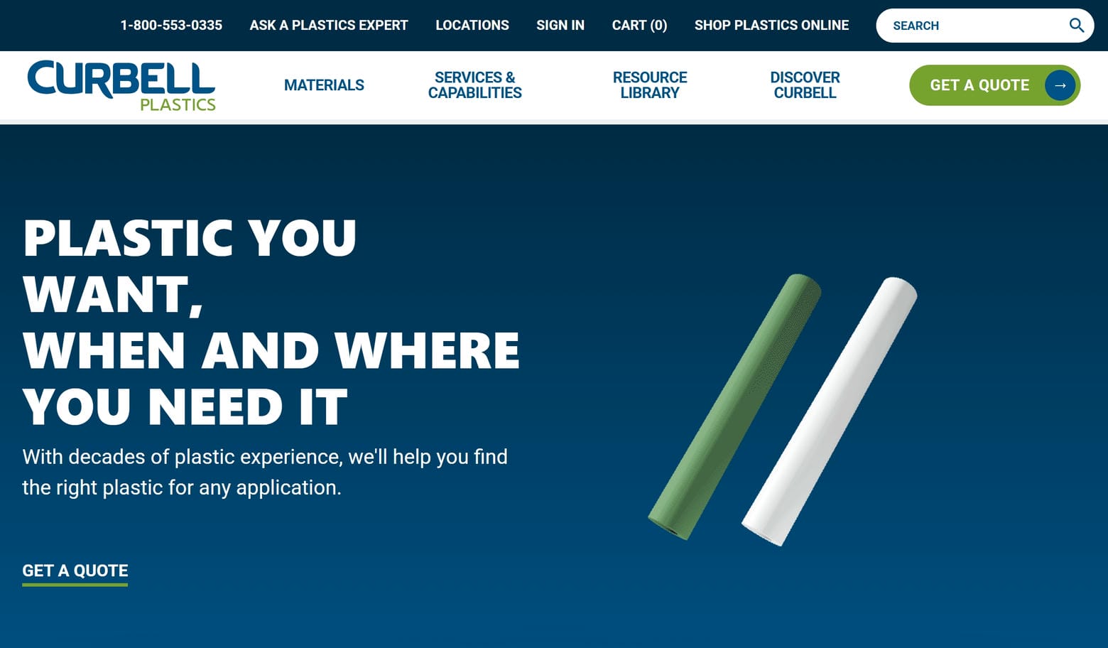
11. Curbell Plastics, Inc.
Why it’s good: If you’re looking to emulate B2B websites with an industrial feel, take a look at Curbell Plastics. It has excellent font choices, strategic calls-to-action, high-quality photos, custom icons, and well-organized pages.
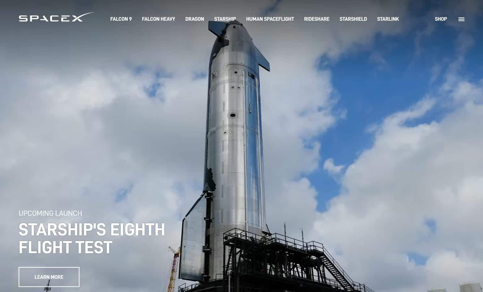
12. SpaceX
Why it’s good: The photos on SpaceX are absolutely stunning, which is why the site deserves to be on the list of best B2B websites. SpaceX utilizes multiple high-quality, full-width images in addition to some amazing full-width videos.
13. SAP
Why it’s good: SAP has a spacious design that makes good use of custom navigation icons, videos, infographics, and comprehensive navigation. There is a lot to appreciate here.

BEST B2B WEBSITES IN THE WORLD
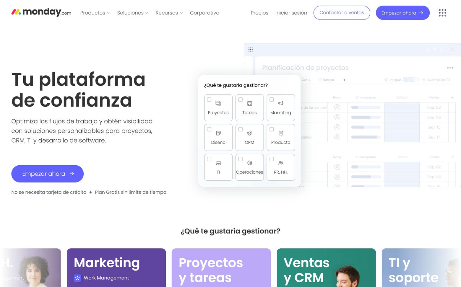
14. Monday
Why it’s good: Monday is unique among B2B websites in that it primarily utilizes a navy blue color scheme. By contrast, most websites in the genre use white. Monday’s web design is exceptional across the board in both color and design. This one is worth checking out!
15. Techstars
Why it’s good: Techstars has one of the best navigation menus we’ve seen on a B2B website. We also appreciate the site’s authentic photos, achievement highlights, and large legible fonts. Techstars’ website has excellent organization, and the content sections blend together beautifully.

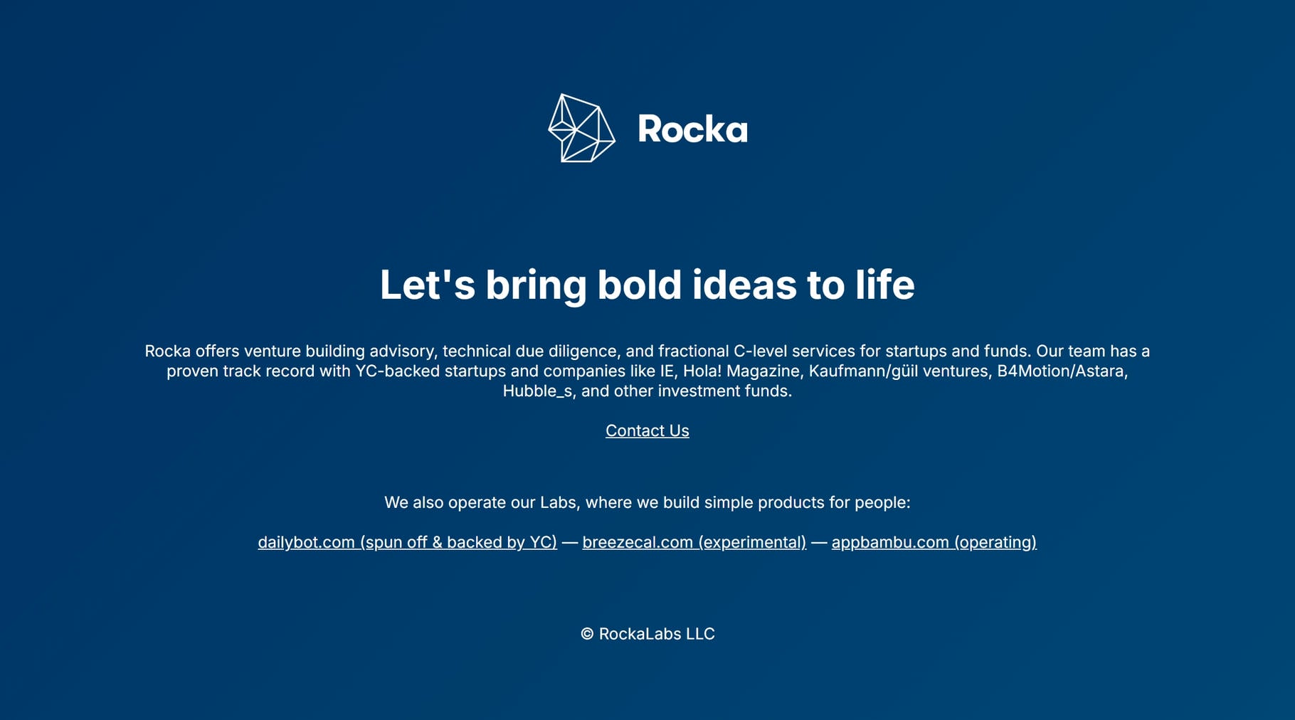
16. Rocka
Why it’s good: Rocka has an intriguing tech business website that effectively utilizes full-page sections. Each section comes in its own color and is accompanied by a clipped image of a Greek/Roman marble statue. The site excels at branding and remains very focused, with spare text and various creative elements that never overwhelm any of the pages.
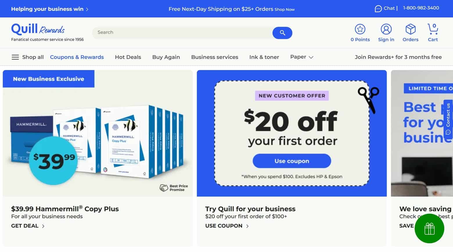
17. Quill
Why it’s good: Quill’s office supply website excels with exemplary organization, showcasing a masterfully structured layout that ensures easy navigation and product discovery. Its intuitive design categorizes thousands of items in a way that makes the search for every type of office supply a seamless experience for the user.
B2B WEBSITE EXAMPLES
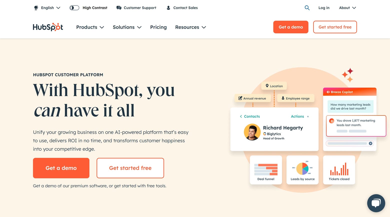
18. HubSpot
Why it’s good: HubSpot leverages helpful features, such as chat integration, to provide real-time customer service. Meanwhile, beautifully fashioned navigation cards guide users smoothly through different pages. And achievement highlights reassure customers of Quill’s expertise and reliability. Finally, stunning digital illustrations add an artistic flair, making the website visually appealing and engaging.
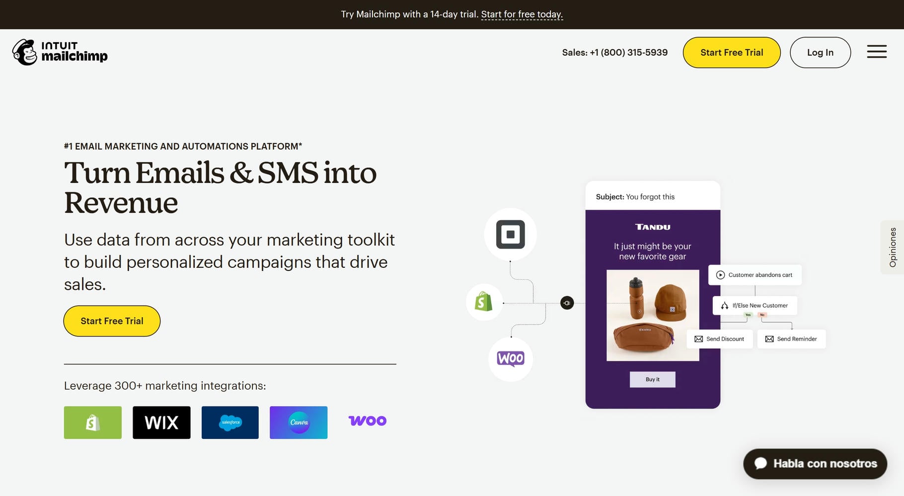
19. Mailchimp
Why it’s good: Mailchimp’s business website has a clean and smart design, highlighted by the centrally placed logo that immediately grounds users to the brand. Expert use of white space enhances readability and focus, while strategic Call-To-Actions (CTAs) guide users effectively toward their intended goals. Additionally, the site’s multifaceted pages use creative lazy loading elements, which make the site more interesting without compromising on loading speed or performance.
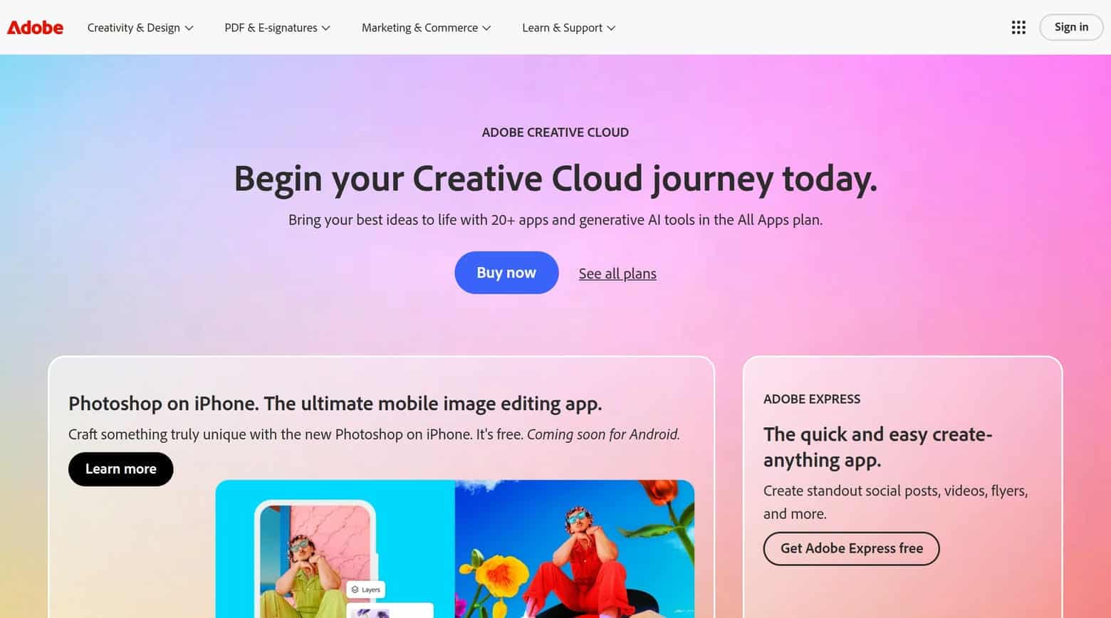
20. Adobe
Why it’s good: Adobe’s B2B website dazzles with graphically enhanced photos, transforming regular images into engaging visual stories that draw in the user. Meanwhile, the clever use of colors and gradients reflects the brand focus and provides clear visual cues for users. Another good feature is the detailed footer, which provides supplementary navigation options and information.
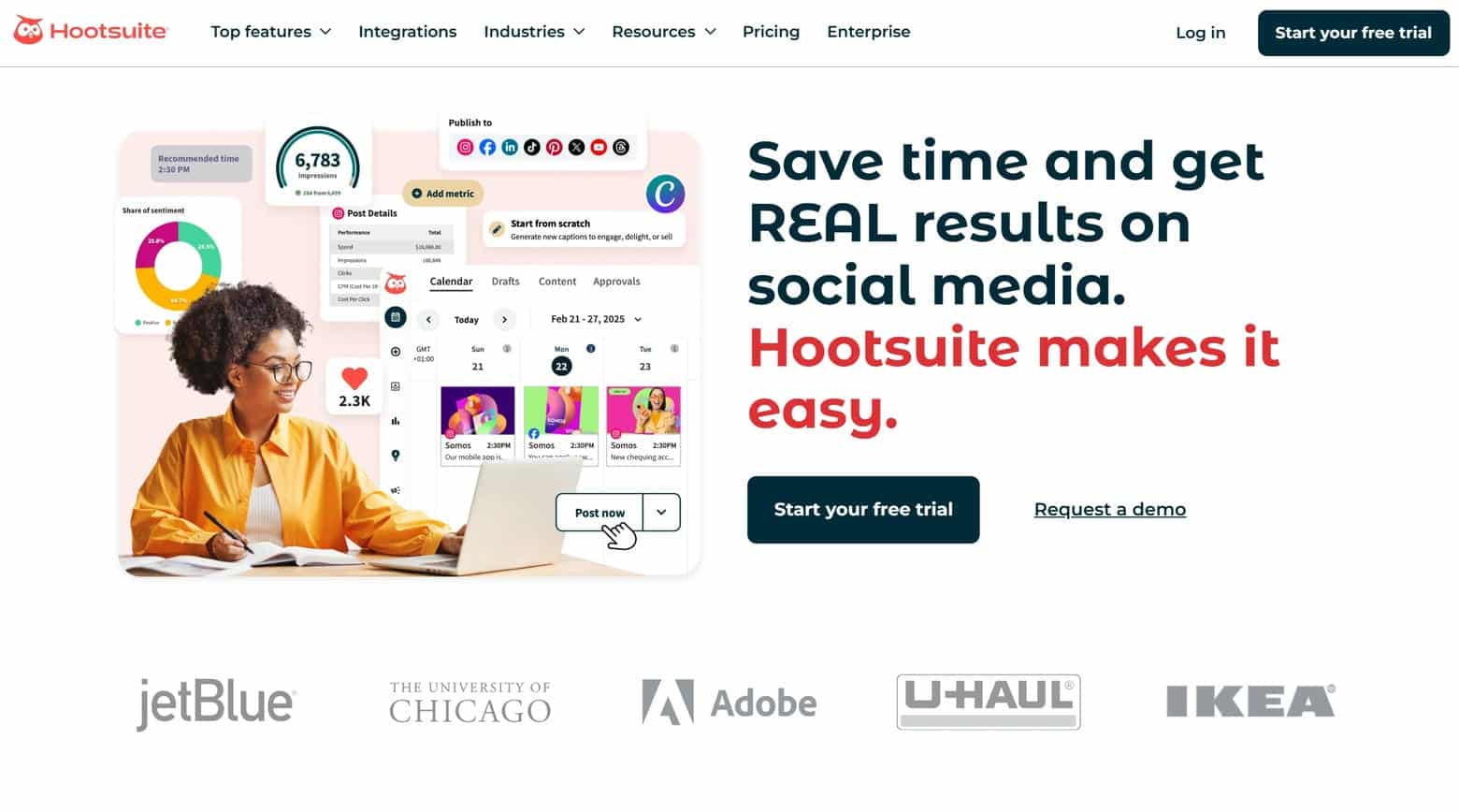
21. Hootsuite
Why it’s good: Hootsuite’s B2B website draws in visitors with friendly font choices that enhance readability and create an inviting atmosphere. The friendly design is further enhanced through the use of photos that have colorful graphic overlays, as well as integrated, click-to-expand sections. As users navigate the site, they come across compelling testimonials that build trust. Finally, tying it all together, is the unobtrusive hamburger menu.
BEST B2B WEB DESIGN
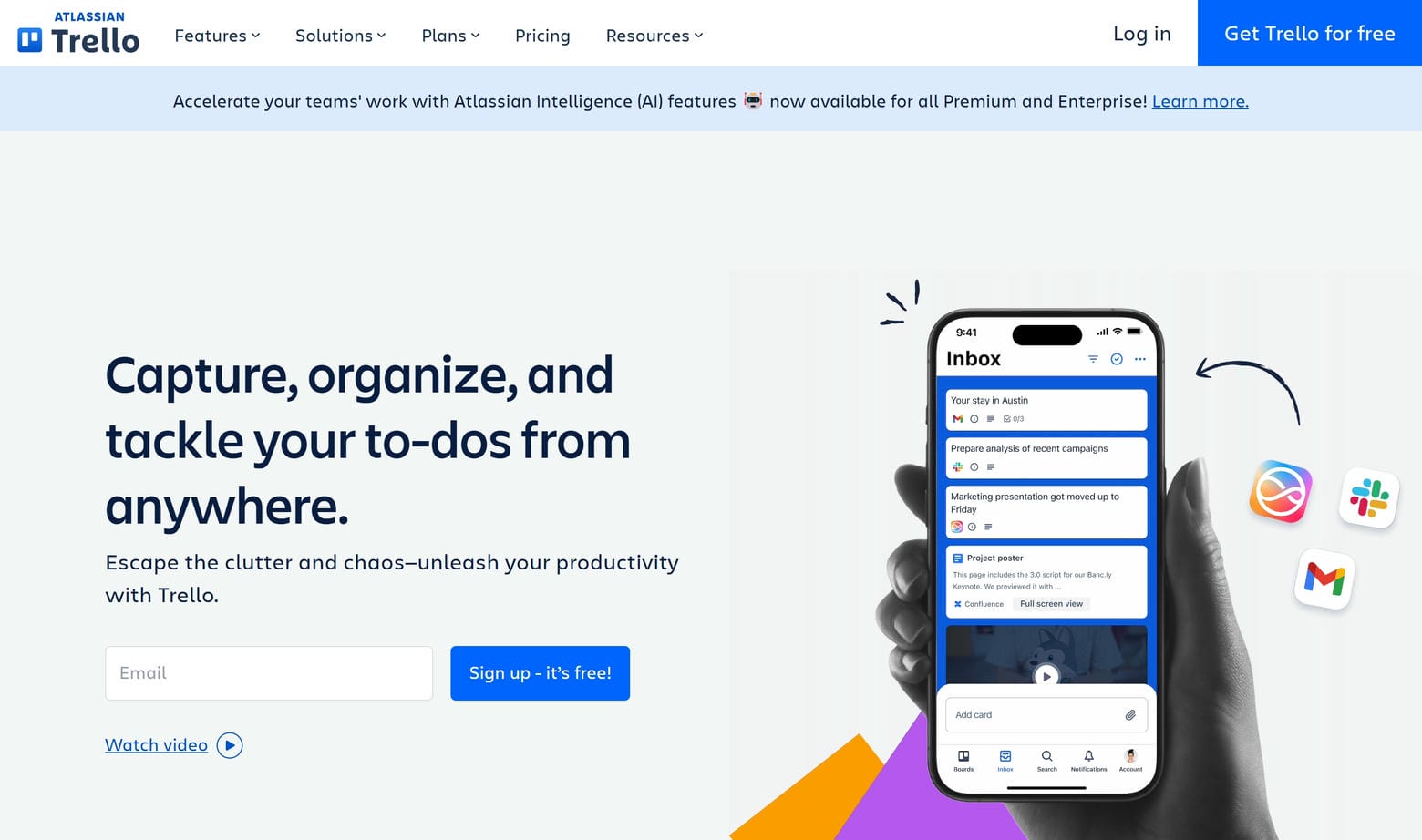
22. Trello
Why it’s good: Trello’s B2B website captivates visitors right from the start with a superb and inviting color scheme. The friendly atmosphere is complemented by creative background elements that add a playful yet professional twist to the site. As users explore the site, they find beautiful product photos, concise pricing cards, and digitally illustrated icons that highlight Trello’s offerings.
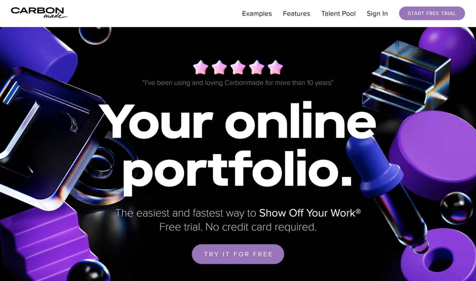
23. Carbonmade
Why it’s good: Carbonmade’s website instantly grabs your attention with its sleek wordmark logo, which is well positioned against a minimalist white background. Visitors are also treated to a neat looping video that adds dynamism to the site without detracting from its message. Other interesting features include creative lazy loading elements, a captivating array of 3D characters, and a fantastic portfolio showcase.
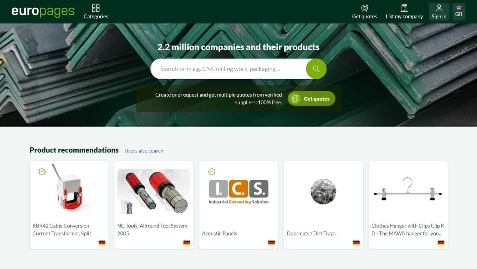
24. Europages
Why it’s good: Europages relies on a powerful centralized search function, which replaces a more traditional navigation menu that you find on most other B2B websites. This choice is a good one, given how many items can be searched on Europages. It’s clear that Europages’ focus is to provide a streamlined user experience. Some simple product cards, which present essential information in a clean, easily digestible format, speak to this fact.
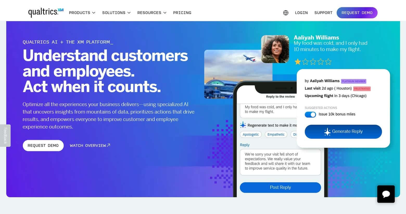
25. Qualtrics
Why it’s good: Qualtrics’ B2B website begins with a looping animation in the hero that expresses the brand’s creativity. This creative spirit is further reflected in the site’s diverse color choices and color gradients. As visitors delve deeper into the site, they discover visually dynamic text, strategic brand elements, and superb site organization.
26. Intel
Why it’s good: Intel’s web design arranges an enormous amount of information in a digestible way. For instance, the Products tab in the navigation menu contains more than three dozen sub-navigation menu options. It’s not easy organizing such a large volume of information, but Intel does a good job of it by using in-depth product pages.

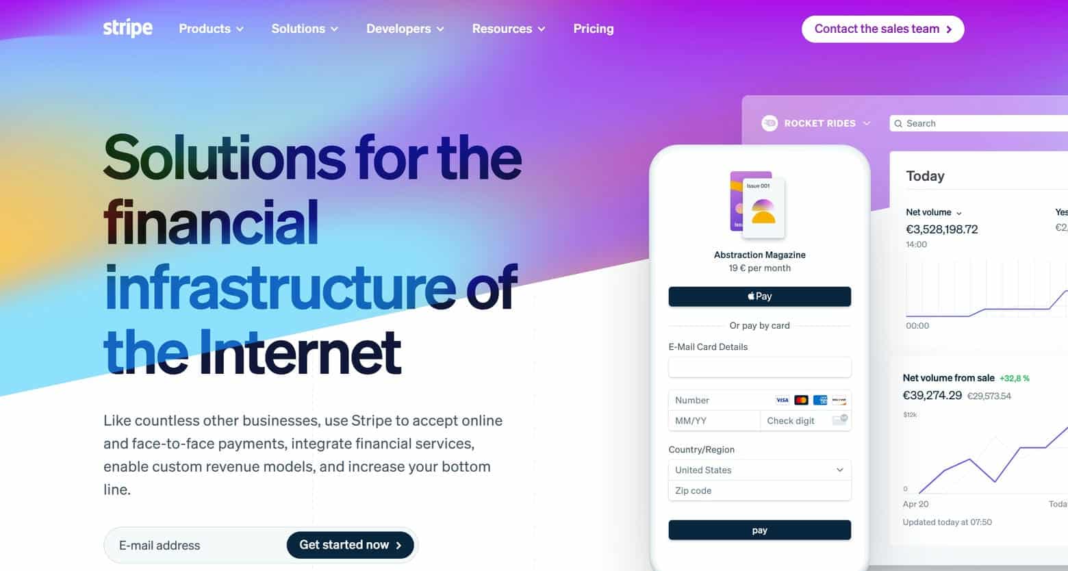
27. Stripe
Why it’s good: Stripe’s web design is where simplicity meets sophistication. It greets visitors with a clean and modern look, accented by a blend of bold typography, vibrant colors, and diverse background elements. Intricate animations create an engaging narrative, while strategically placed CTAs provide a clear sales path for customers. In summary, this B2B website is a visual masterpiece with a wealth of illustrative graphics and data visualizations.
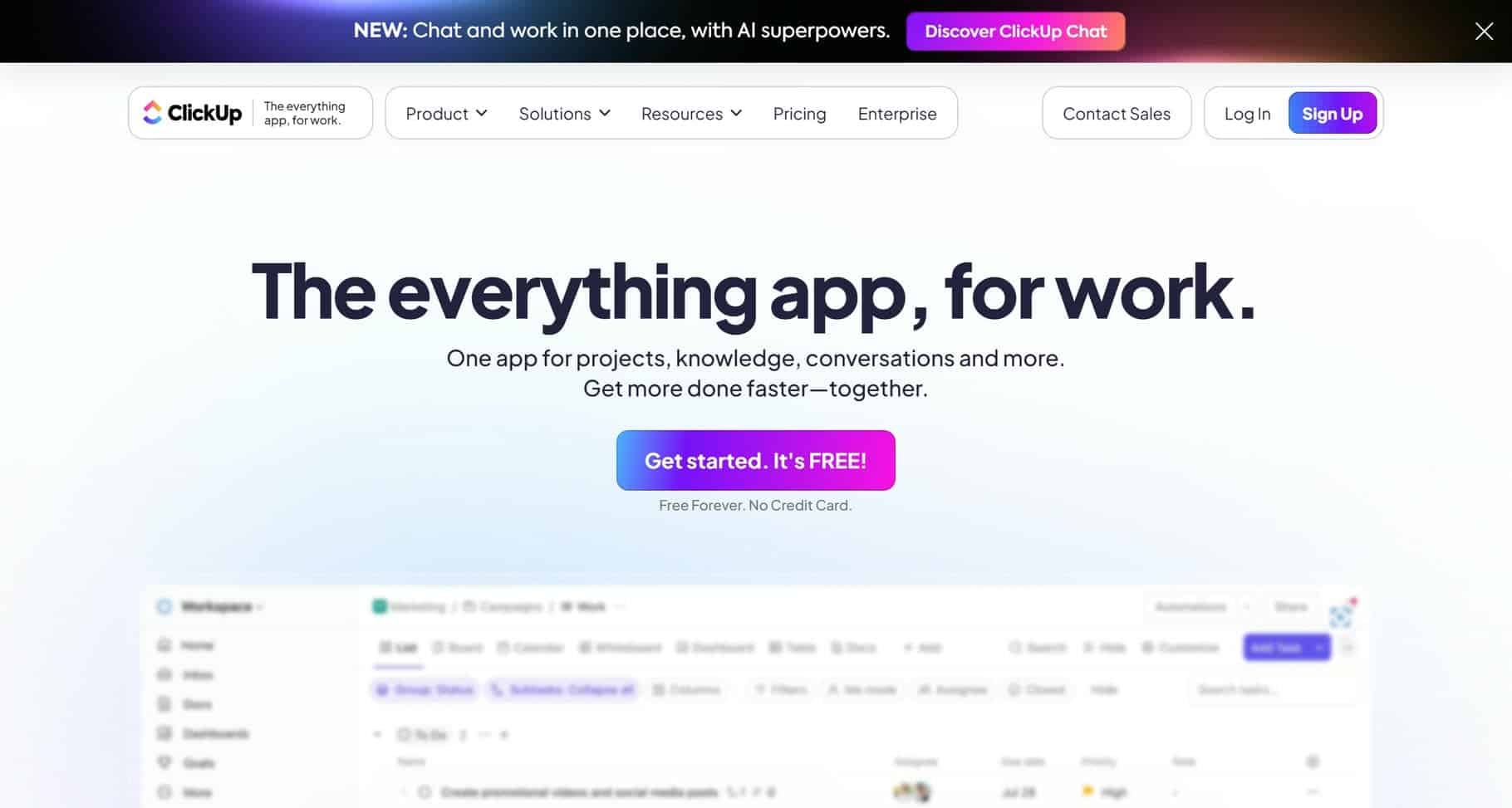
28. ClickUp
Why it’s good: ClickUp’s B2B web design seamlessly melds utility and artistry. Each element, from the bold colors and whimsical illustrations to the intuitive layout and dynamic animations, expertly walks the fine line between fun and functional. This makes ClickUp’s website interesting and compelling.
BEST B2B WEB DESIGN
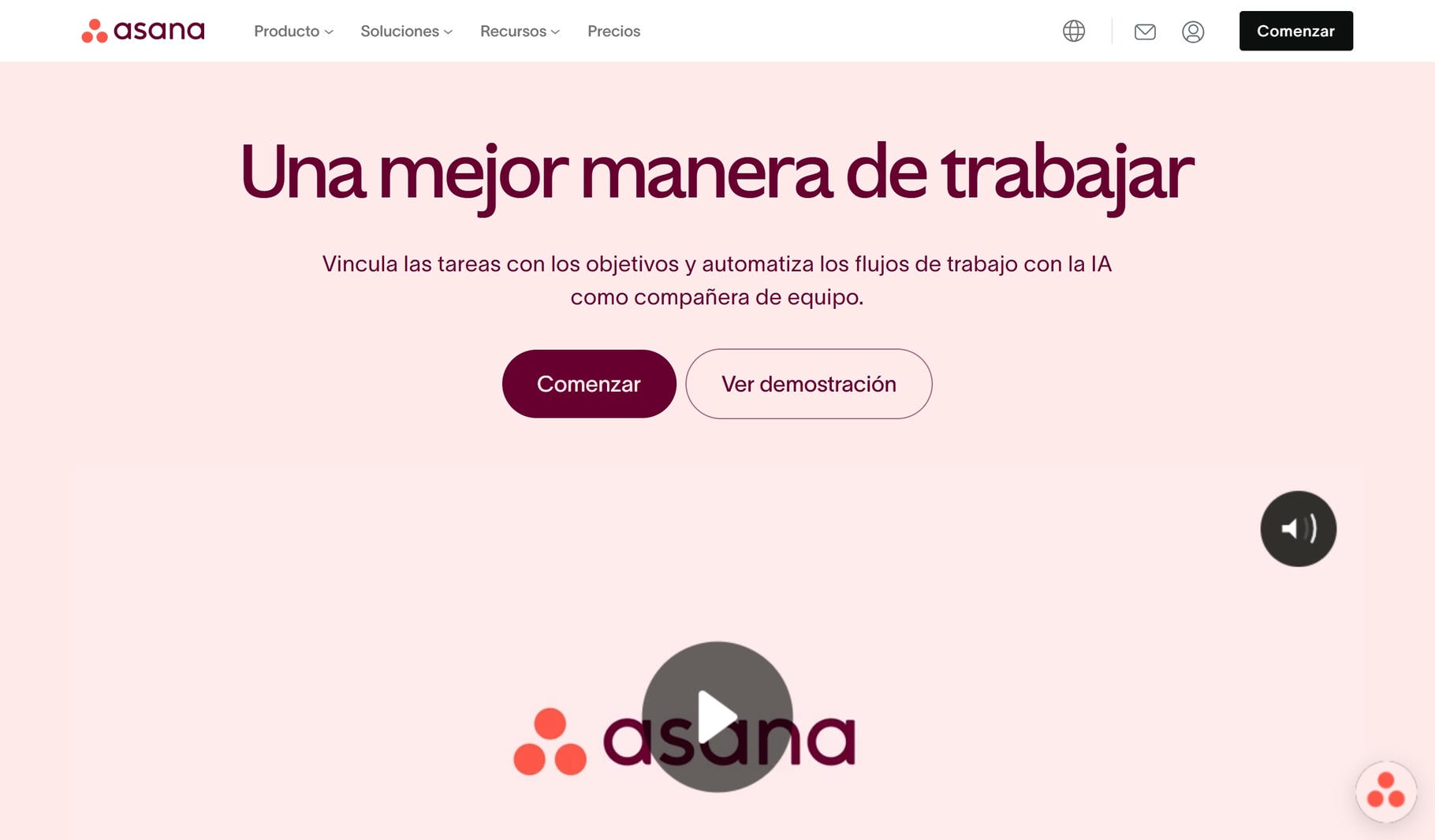
29. Asana
Why it’s good: Asana’s B2B website offers everything you’d expect from a high-profile platform. The live chat integration provides real-time assistance. The detailed navigation menu allows for easy site navigation. And the detailed footer at the bottom of the page serves as a comprehensive resource hub that enhances the site’s user-centric design.
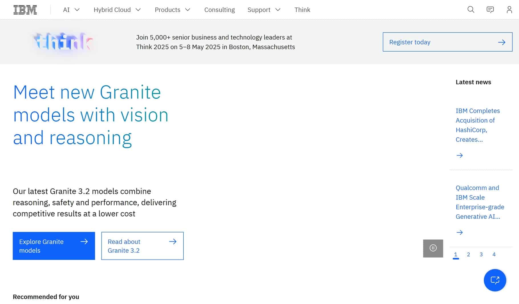
30. IBM
Why it’s good: IBM’s website is a masterclass in structured design, featuring an exquisite grid layout that just makes sense. Everything about this gorgeous B2B website revolves around the organization, including the main content area, which has super helpful, expandable content cards. These conveniently provide users with an overview of (and the option to delve into) important information on various topics. IBM’s site is perhaps the best-organized B2B website on this list.
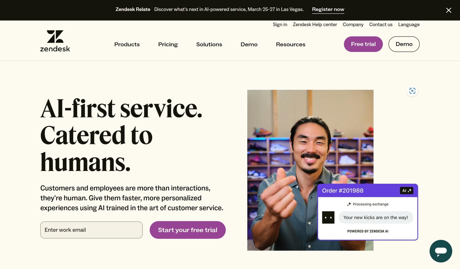
31. Zendesk
Why it’s good: Zendesk’s B2B website captures the eye with a soft pastel color palette, which adds life to an already lively design. Each page on the site is a playground of creativity, featuring elements such as scrolling call-to-action banners and an assortment of visually engaging photos.
32. Pixelgrade
Why it’s good: What immediately stands out to us on this B2B website are the colors and custom shapes, which are interspersed throughout the site at appropriate intervals. Another excellent touch is the web copy, which is detailed but never clutters the pages. Lastly, the site’s architecture, built on solid UX principles, ensures that visitors effortlessly find what they’re seeking.
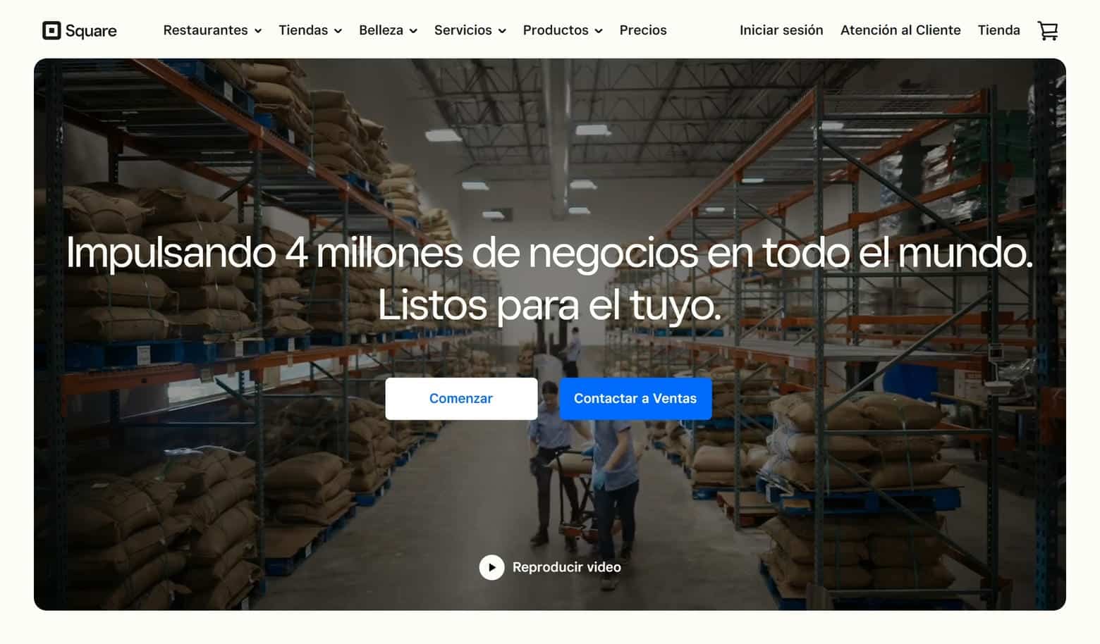
33. Square
Why it’s good: Square’s website has a lot of interesting design elements, such as scroll fade elements, 3D illustrative graphics, and a clean and organized interface. Complementing these elements is the site’s use of whitespace and its cohesive color scheme.
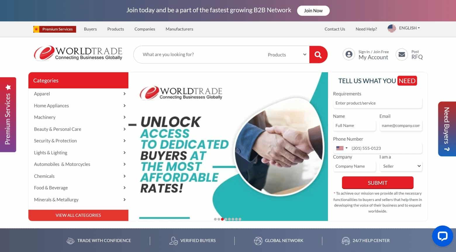
34. eWorldTrade
Why it’s good: eWorldTrade is a fascinating B2B marketplace website with a busy design that we like to describe as beautiful chaos. The site has a ton of different elements, although amidst the densely packed pages, a strong sense of organization prevails. A clear navigation structure guides users through the plethora of offerings, while intuitive filters allow for targeted exploration.
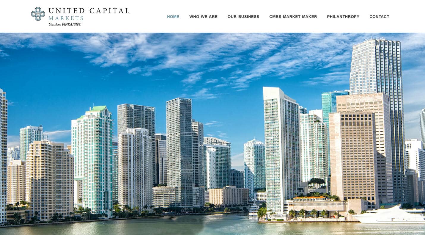
35. United Capital Markets
Why it’s good: Businesses that need a simple B2B website should take a look at United Capital Markets. It’s a great example of a website that gets the job done without indulging in all the bells and whistles that many B2B mega-corporation websites have. While we do have a couple of personal critiques of UCM’s website design, it’s still a very good place to find inspiration for your next project.
BEST B2B WEB DESIGN
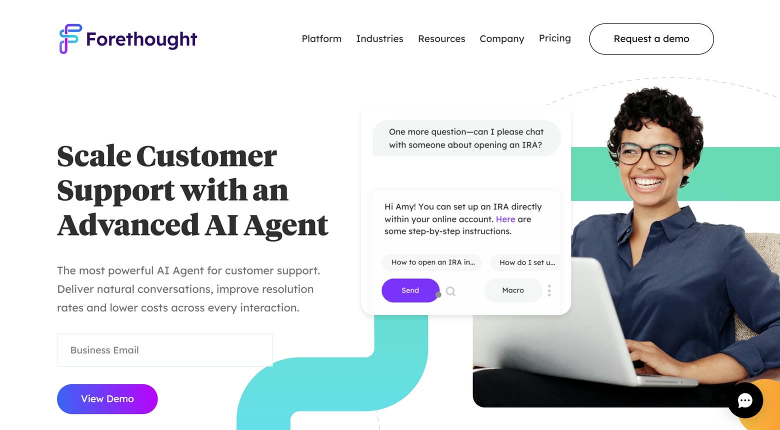
36. Forethought
Why it’s good: Forethought’s B2B website uses colors brilliantly, which really brings the pages to life. Gorgeous icons and computer illustrations add additional layers of visual intrigue while simplifying complex concepts. But what truly sets Forethought’s website apart is the outstanding sales funnel, which maintains a focused purpose throughout every page.
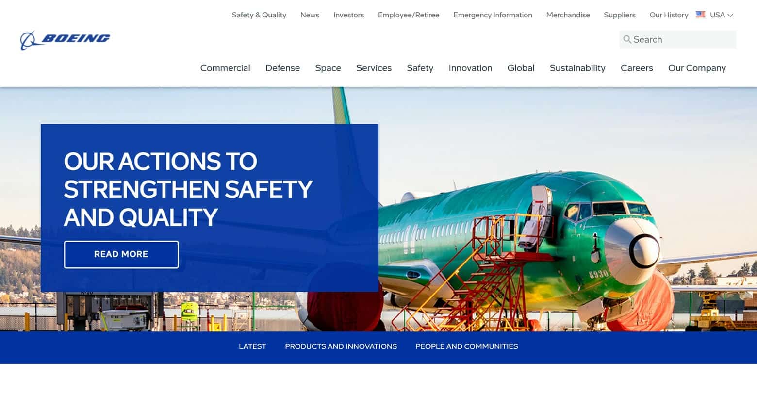
37. Boeing
Why it’s good: If you want an example of a B2B website that primarily relies on photos and videos to convey its core messages, check out Boeing. The site does a phenomenal job of using authentic content to tell a story.
38. Siemens
Why it’s good: Siemens’ website design is akin to an iceberg. The homepage, with its minimalistic layout and streamlined hamburger menu, belies the expansive breadth of content waiting to be discovered. This intricate network of information, much like the submerged part of an iceberg, is ingeniously tucked away within the navigation menu.

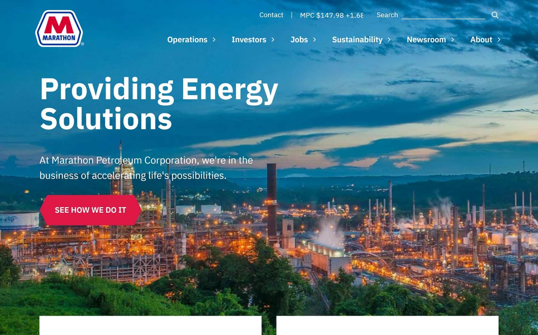
39. Marathon Petroleum Corporation
Why it’s good: Marathon Petroleum Corporation’s B2B website is a brilliant example of design fundamentals that have been impeccably executed. From the intuitive navigation menu to the clean typography, every element is meticulously crafted. The site stands as an excellent design example, showcasing how adherence to industry design principles can create an effective website.
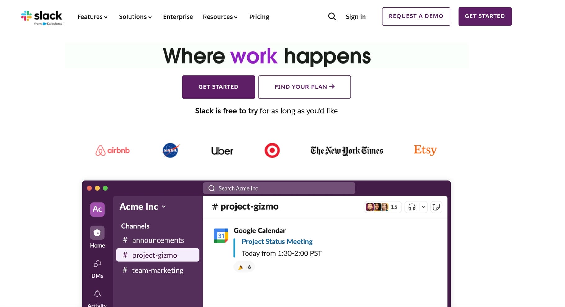
40. Slack
Why it’s good: Slack’s B2B website shines with a rock-solid, dynamic design. The vibrant color scheme, playful illustrations, and clear, friendly typography are the icing on the cake.
Best B2B Websites Ever
We hope you’ve found our list of the 40 best B2B websites inspiring! Or at least, perhaps there are a few elements that you’ve found intriguing and worth applying to your business website.
If this is the case, we invite you to visit our meeting page to schedule an entirely free consultation.
A well-designed B2B website isn’t just an interface; it’s a catalyst for business success. Ready to get started?