


Today, web design for mobile is a necessity because a HUGE number of internet users now access websites through their smartphones. But simply designing your website for mobile isn’t enough. There are certain best practices every mobile website should adhere to.
We’re sharing this list of 5 best practices because we believe they will help you create a mobile-friendly website that drives results. These suggestions are based on our experience designing websites for clients.
APPROACH TO THIS POST – This list covers less-discussed best practices. We chose these because we’ve all heard the typical suggestions, like using responsive design, optimizing images, and simplifying navigation. These tips are meant to bring you helpful and actionable information.
Let’s get started!
» MORE: For tips on modern web design rather than mobile web design, see our article: 11 Best Practices for Modern Web Design
Web design for mobile – Key takeaways
- Establish consistent design standards for spacing, typography, and color
- Reduce 3rd party components for mobile web design where possible
- Shrink your navigation font and use a narrower font
- Use a mobile-first, flexbox-driven approach for truly responsive design
- Leverage media queries and fluid rules
1st Best Practice – Establish consistent design standards for spacing, typography, and color
A cohesive mobile website needs set design standards. The following suggestions are a good starting point, although your site’s specific standards will likely differ based on your unique style.
Spacing standards
- Maintain consistent margins (e.g., 16px for mobile) and gutters (e.g., 16px) throughout the design
- Use a grid system (e.g., 4-point grid) to ensure consistent spacing between elements
- Ensure touch targets are at least 7-10mm in size with ample spacing for easy interaction
- Keep line height at 1.5 times the font size for optimal readability
- Maintain a minimum of 20 pixels of space between the status bar, navigation bar, and content
Code example with simplified HTML to demonstrate the spacing standards:
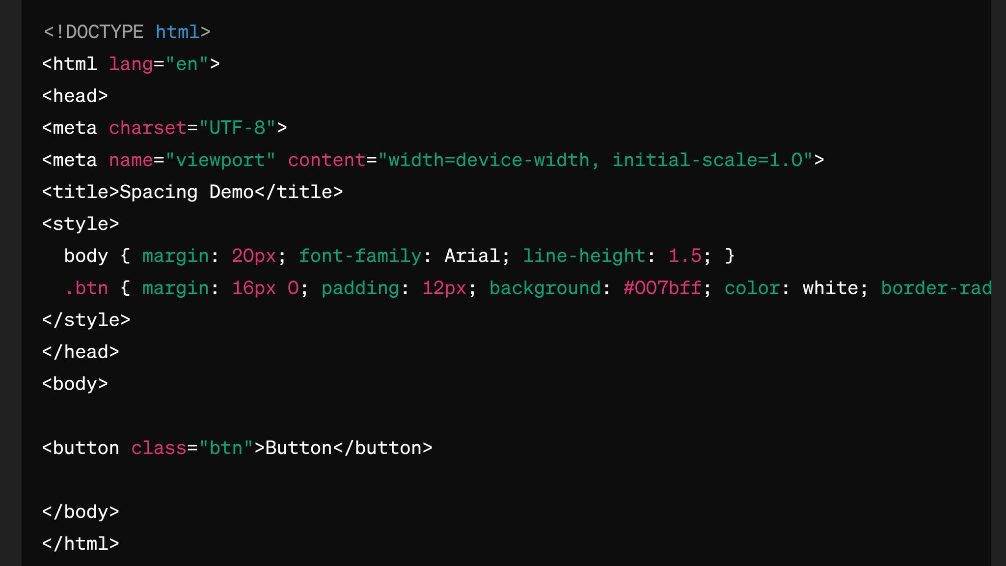
Note: Border-radius: 4px; }
Shortened Class Names: The .button class is now .btn to save space.
Streamlined CSS: Removed comments and combined CSS declarations to make the example more compact.
Typography standards
- Establish a typographic scale with a consistent ratio (e.g., 1.25, 1.333, or 1.618) for a harmonious hierarchy
- Use a maximum of three typefaces (e.g., one serif for headlines, one sans-serif for body text, and one accent typeface)
- Define consistent font sizes for each level of the hierarchy (e.g., H1: 24px, H2: 18px, Body: 14px)
- Maintain a minimum contrast ratio of 4.5:1 for normal text and 3:1 for large text (WCAG Level AA)
- Use font weights consistently (e.g., bold for headlines, regular for body text)
Color standards
- Create a color palette with 2-5 primary colors, including your brand colors and complementary hues
- Ensure a minimum contrast ratio of 4.5:1 between text and background colors (WCAG Level AA)
- Use color consistently across the design (e.g., blue for links, green for call-to-action buttons)
- Limit the use of bright or saturated colors to draw attention to key elements
- Consider accessibility and usability when selecting colors (e.g., avoid red/green for colorblind users unless your site is holiday-related)
Example screenshot of Sage Digital Agency’s color palette:

2nd Best Practice – Reduce 3rd party components for mobile web design where possible
Reducing third-party scripts and resources is a popular trend in mobile web design.
This is because third-party components can hurt websites, and removing them results in faster load times, better security, and other benefits.
How to reduce 3rd party components in mobile web design
While there are SEVERAL ways to tackle the problems caused by third-party components, perhaps the biggest is simply asking whether a component is needed.
For instance, websites often have social media buttons, which have third-party scripts, stylesheets, and even iframes. ⚠️
But often, a lightweight alternative works BETTER. Social media sharing buttons can be made using simple HTML, CSS, and lightweight JavaScript.
A designer could create a share button with the following code:
<a href=”https://twitter.com/share?url=https://example.com” target=”_blank” rel=”noopener noreferrer”>
<img src=”twitter-icon.svg” alt=”Share on Twitter”>
</a>
In this example, the sharing link is created with an HTML anchor tag, and the button’s appearance is controlled with CSS. The target=”_blank” attribute ensures the sharing link opens in a new tab, while rel=”noopener noreferrer” improves security by stopping the new page from accessing the original page’s JavaScript context.
Note: You can use icons or a plugin in conjunction with Google Tag Manager to handle third-party scripts, if desired.
Example: Social Media Sharing Buttons
What does Sage Digital Agency do to reduce 3rd party components in mobile web design?
The manual coding approach outlined above is a good solution. However, in full disclosure, Sage Digital Agency takes a different approach.
We use social media plugins with Google Tag Manager to manage third-party scripts instead of loading the scripts directly on the site. Google Tag Manager is the accepted standard in the industry.
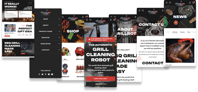
3rd Best Practice – Shrink your navigation font and use a narrower font
Your navigation can either pave the way to a great browsing experience or act as an unwelcome barrier. This brings us to our third suggestion: make your navigation font smaller.
Shrinking and narrowing your navigation font
Reducing font size and width in your navigation allows you to add more to your navigation bar. You might even be able to eliminate the sub-navigation menu entirely, which is very helpful for mobile web design.
It’s best practice, though, to choose fonts that are easy to read on smaller screens while maintaining a consistent look and feel with the desktop version.
On our Home page, we carefully select font sizes and types for our navigation menu.
Sage Digital Agency navigation menu mobile view:
Although our website is large and requires the use of submenus, careful font selections help us streamline the navigation.
4th Best Practice – Use a mobile-first, flexbox approach for responsive design
Did you know that using CSS flexbox is one of the best strategies for creating a responsive website? It’s an amazing way to design flexible, adaptable layouts that adjust to almost any screen size.
What is flexbox?
For those unfamiliar with it, flexbox is a CSS layout module that does not require float or positioning. Instead, you can create containers that expand or shrink based on screen size, dynamically wrapping and reordering elements as needed.
Flexbox also simplifies common layout tasks, such as vertical and horizontal centering and equal-height columns.
Key concepts and properties in flexbox include:
Two primary elements: flex containers and flex items. A flex container is an element that has the display property set to flex or inline-flex, while flex items are the immediate children of a flex container.
Flex direction: The flex-direction property sets the primary axis of the flex container, either horizontally (row or row-reverse) or vertically (column or column-reverse).
Flex wrap: The flex-wrap property determines whether flex items should move to the next line when there’s insufficient space (wrap, nowrap, or wrap-reverse).
Justify content: The justify-content property positions flex items along the main axis, managing the distribution of space between and around items (flex-start, flex-end, center, space-between, space-around, or space-evenly).
Align items: The align-items property positions flex items along the cross axis, which is perpendicular to the main axis (flex-start, flex-end, center, baseline, or stretch).
Align content: The align-content property positions flex lines within a flex container when there’s additional space on the cross-axis (flex-start, flex-end, center, space-between, space-around, or stretch).
Flex grow and shrink: The flex-grow and flex-shrink properties control how flex items expand or contract relative to each other when there’s extra or limited space in the container.
Flex basis: The flex-basis property sets the initial size of a flex item before any available space is distributed.
Order: The order property enables you to change the order of flex items within a container without modifying the original HTML structure.
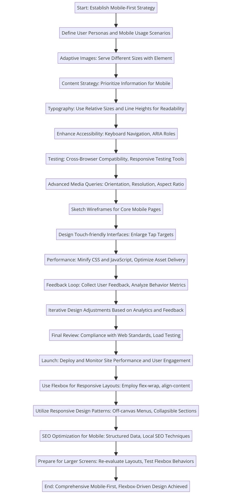
Flowchart overview of a mobile web design with flexbox
Read more about flexbox in this complete guide to flexbox by Chris Coyier.
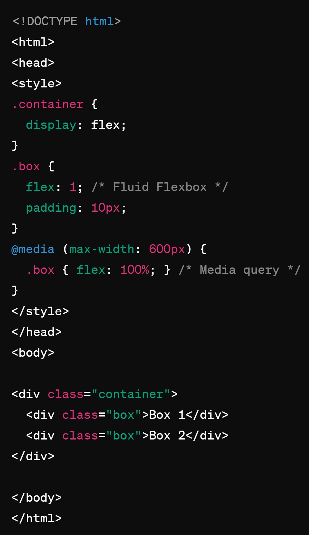
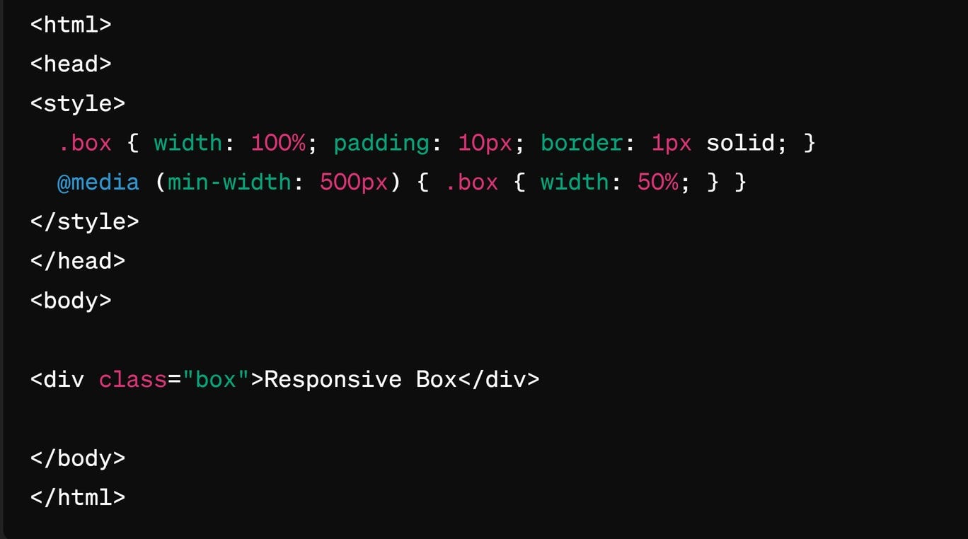
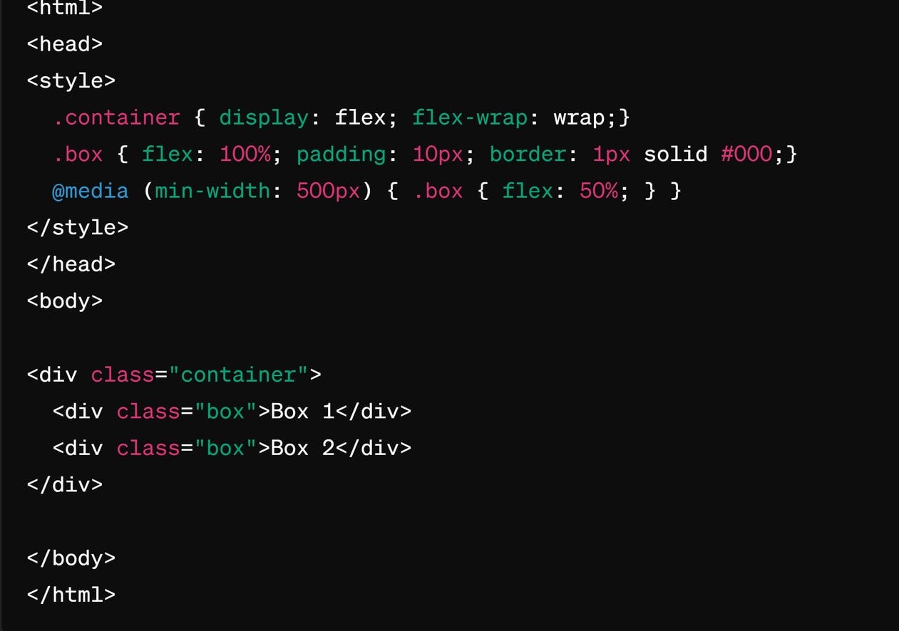
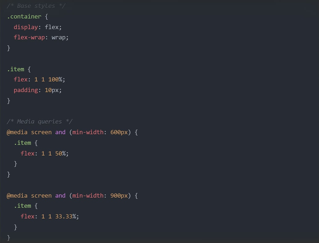
5th Best Practice – Leverage media queries and fluid rules
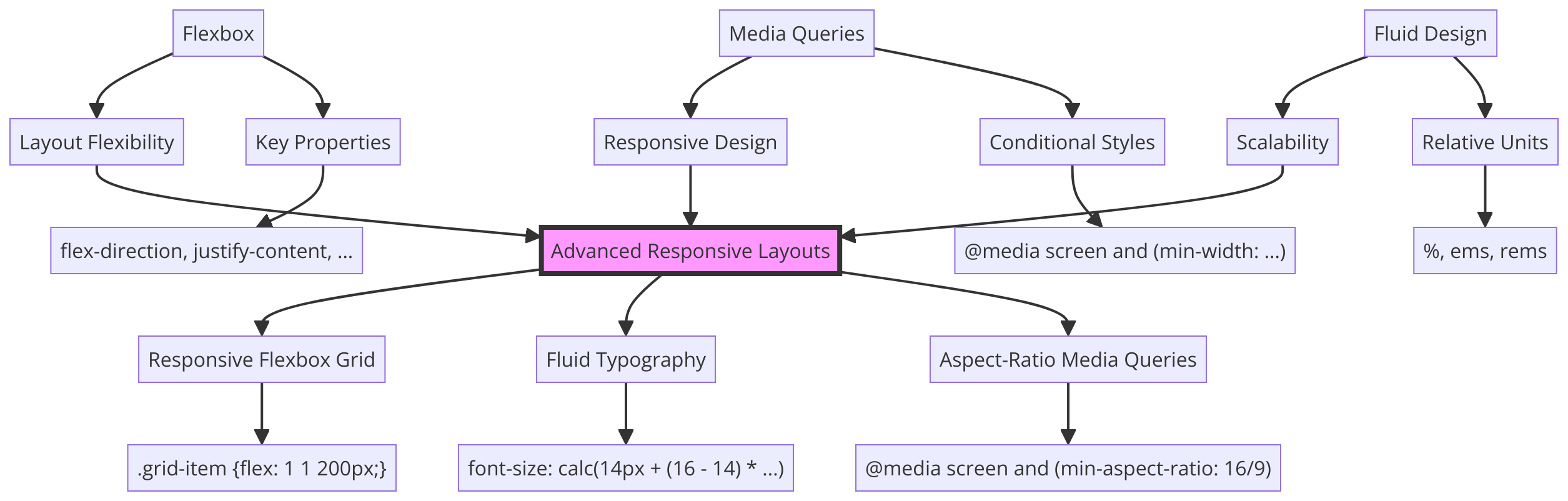
In contrast to flexbox, media queries and fluid rules are complementary CSS techniques that enhance a responsive and mobile web design.
Here’s the distinction: Flexbox provides a flexible layout system, while media queries allow you to apply specific CSS styles based on the device’s viewport size. Fluid rules, meanwhile, ensure that elements scale proportionally within the flexbox layout.
Click the image gallery to see how media queries, fluid rules, and flexbox relate*
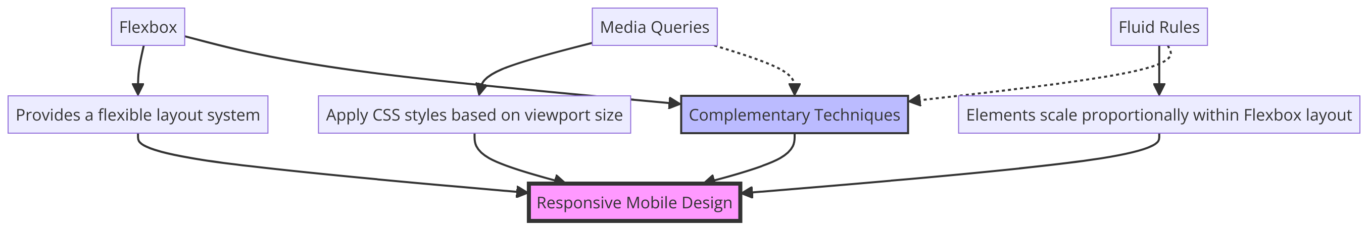
Translation: When you use media queries, you’re essentially telling your website to check the size of the screen it’s being viewed on. Based on that information, you can create different sets of CSS styles to be applied when certain conditions are met.
So, you might have one set of styles for mobile phones, another for tablets, and yet another for desktop computers. This allows you to customize the layout and design of your site to best fit each screen size.
Fluid rules, meanwhile, are a way of setting the sizes of elements on your page using relative units like percentages instead of fixed units like pixels. This means that as the screen size changes, the elements will grow or shrink proportionally, maintaining their relative size and position within the layout.
Click the image gallery to expand images to see code examples of media queries, fluid rules, and flexbox*
Frequently asked questions related to web design for mobile
Q: What are some best practices for designing touch-friendly interfaces on mobile?
A: One key best practice is to ensure all interactive elements have adequately sized touch targets. While the recommended size varies per platform (e.g., 44×44 pt for iOS, 48×48 dp for Android), the principle remains the same: touch targets should be large enough to accommodate many different users.
Another best practice is placing primary interactive elements within the thumb’s reach, typically at the bottom of the screen.
Q: How can I optimize images for mobile devices without sacrificing quality?
A: Consider using responsive images with the srcset and sizes attributes, which allow you to serve different image sizes based on screen size. Additionally, use WebP and implement lazy loading.
Q: What are some best practices for designing mobile-friendly forms?
A: Keep them short and simple, asking for only essential information. Use clear and concise labels, and place them above the input fields for better readability. Also, use large, easily tappable buttons for form submissions.
Web design for mobile best practices – Conclusion
Best practices for mobile web design include establishing consistent design standards for spacing, typography, and color, reducing reliance on third-party components, and making your navigation font smaller and narrower. Additionally, you might consider adopting a mobile-first, flexbox-driven approach and leveraging media queries.
For a full overview of the key points covered in this article, see the Key Takeaways.
For expert assistance in creating a web design for mobile that delights users and supports your business goals, contact Sage Digital Agency. We’d love to hear about your project!