

User-friendly websites require the use of interactive elements that enhance UX. One such element, pivotal in modern web interfaces, is the modal.
But what is a modal in web design?
Keep reading to find out! Our team has successfully implemented modals across a range of projects, so we’re using this post to provide an overview of what we’ve learned. This guide will explain what modals are and help you improve the quality of modals on your website.
Modals are a super helpful addition to modern web design because they can benefit your website in important ways, so let’s get started and learn more about them!
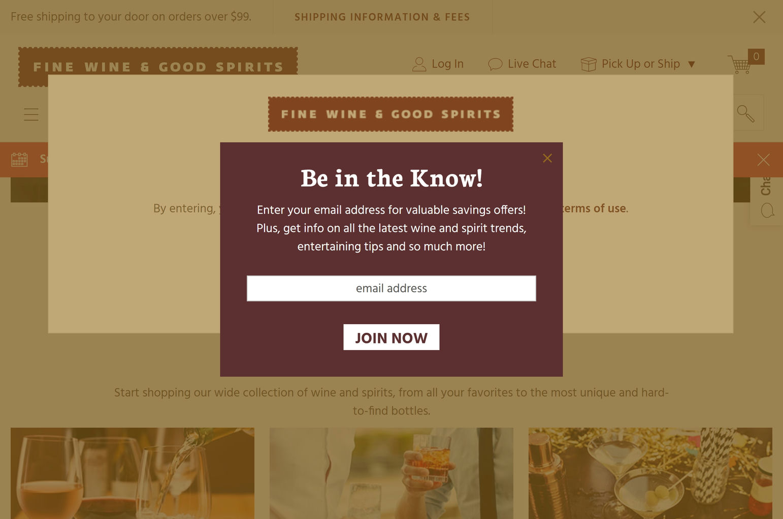
Example of a modal in web design
Modal in web design – Key takeaways
- A modal in web design is a window that appears in front of a website’s main content and disables the rest of the screen until addressed.
- Modals serve various purposes, although they are primarily used to grab attention and guide users toward completing important actions.
- The main difference between modals and pop-ups is that modals disable the screen until completed, while pop-ups do not disable the main content. Another difference is that modals are often used for important messages, while pop-ups are used for ads, promos, etc.
- There are three primary types of modals in web design — informational modals, interactive modals, and media modals.
- The main benefit of modals (when implemented correctly) is an improved UX.
- Best practices for modals include but are not limited to simplicity, proper sizing, and an easy closing mechanism.
What is a modal in web design? Explored
In web design, a modal window is one that appears in front of and disables the main content. It also requires you to take an action, such as confirming your age, before it reenables the site.
Modal windows are used to ensure website compliance, as well as convey important information and choices to users in a direct manner. Additionally, modals are sometimes used to prompt newsletter sign-ups, provide tutorials, and offer other optional interactions.
Main characteristics of a modal:
- Visually distinct from the main content.
- Different background colors or borders to separate from the rest of the page.
- Clear and concise title conveying the purpose of the modal.
- Prominent close-out button or intuitive closing mechanism.
- Instantly directs attention to essential tasks or messages without the distractions of the main content.
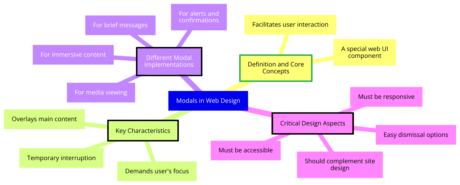
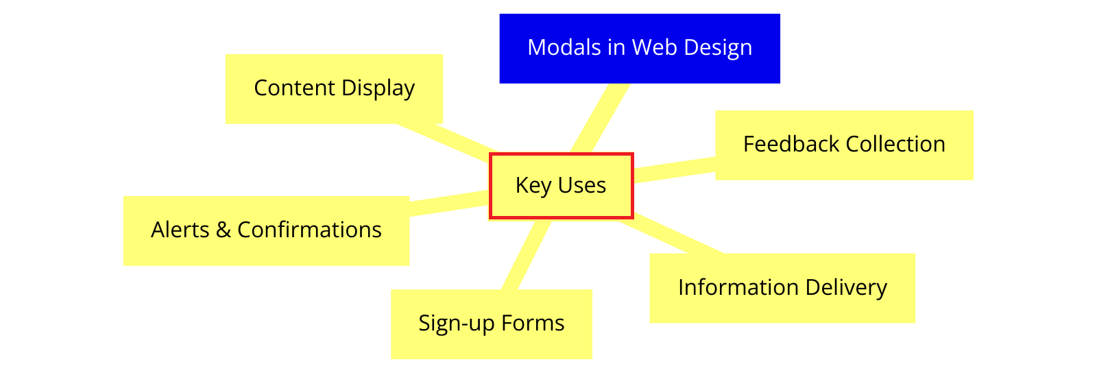
Modals in web design mind map
This is a diagram showing the different aspects of a modal in web design, including definition and core concepts, key characteristics, critical design aspects, and different modal implementations.
Click to expand image*
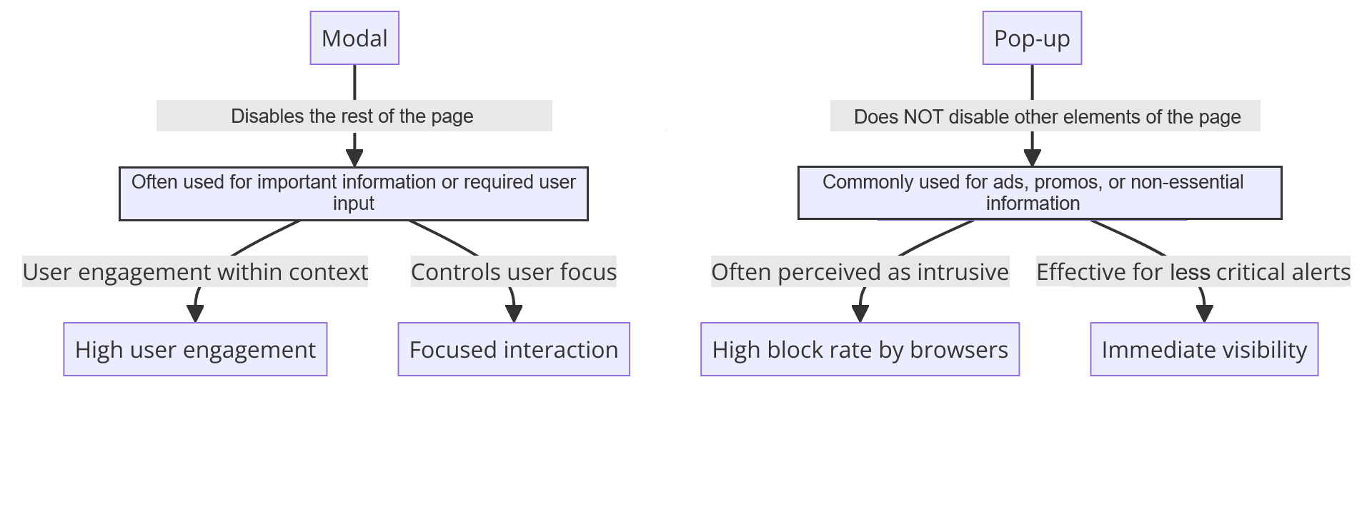
Modals vs pop-ups in web design
Did you know that modals are not the same thing as pop-ups? Although some people conflate the two, they are quite different in purpose and function. Here are the main differences between them:
Interaction with the main content
- Modals: Modals disable the main content, requiring users to interact with the modal before continuing.
- Pop-ups: Pop-ups do not disable the main content, allowing users to interact with both the pop-up and the main page simultaneously.
Purpose
- Modals: Modals are often used for important information, critical alerts, or required user input.
- Pop-ups: Pop-ups are commonly used for advertisements, promotions, or non-essential information.
User experience
- Modals: Modals are generally designed to enhance the UX, although they can still be disruptive.
- Pop-ups: Pop-ups are not inherently designed to enhance the UX and can be disruptive and distracting.
Closing mechanism
- Modals: Modals typically have explicit close buttons or require specific user actions to be dismissed.
- Pop-ups: Pop-ups often have a close button, but they may also disappear automatically after a certain time or when users click outside the pop-up area.
Aesthetics and design
- Modals: Modals are usually designed to blend with the website’s overall look and feel.
- Pop-ups: Pop-ups may have a distinct design that differs from the main website, as they are often used for external content or third-party promotions.
Modal vs pop-up comparison chart
Click to expand the image*

Types of modals in web design
Modals are diverse and can be tailored to suit almost any website’s needs.
With this in mind, let’s dive into the main categories of modals and their distinct roles within web design.
Simple diagram with the types of modals used in web design:
Click image to expand*
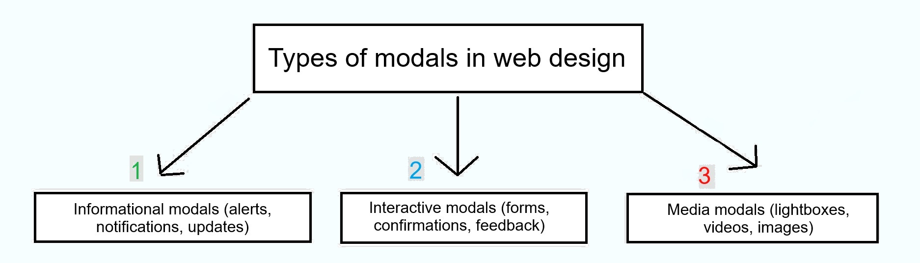
1. Informational modals (alerts, notifications, updates)
Alerts:
Alert modals draw attention to important information or warnings. They usually require the user to acknowledge the message or take some sort of action before proceeding.
Notifications:
Notification modals inform users about information that doesn’t require immediate action. However, these notifications are still considered important enough to present to users.
Updates:
Update modals are specifically used to inform users about updates to a website, such as a new version release. These modals may include details on what’s new and how users can benefit from the updates.
2. Interactive modals (forms, confirmations, feedback)
Forms:
Form modals collect user input without navigating away from the page. They’re commonly used for login forms, registration forms, and contact forms.
Confirmations:
Confirmation modals require users to verify an action before completing it. This is useful for actions that are irreversible, such as deleting an account.
Feedback:
Feedback modals collect user feedback within the website. They can be triggered by user actions or appear after certain conditions are met, such as spending x amount of time on a page.
3. Media modals (lightboxes, videos, images)
Lightboxes:
Lightbox modals display media content in a larger, more focused view. When a user clicks on a thumbnail or media link, the lightbox modal opens, dimming the background content to highlight the media.
Videos:
Video modals present video content in a modal overlay. This allows users to watch videos without leaving the page or redirecting to a video hosting platform.
Images:
Image modals allow users to view a larger version of an image, often with the ability to zoom in for more detail.
Best practices for modal design: When to use and other considerations
When creating a modal, two main things to consider are when and how to implement them.
When to use modals
Here are some good questions to ask when deciding whether you should use a modal in your web design:
- Does it get the user’s attention for important actions or decisions?
- Does it encourage user engagement?
- Does it support the overall user experience (UX)?
- Does it display additional content without losing context?
- Does it break complex actions into a simple step-by-step process?
Modals in web design – specific use cases
- Sign-up or login forms
- Confirmation of critical actions (e.g., deleting an account)
- Presenting essential terms and conditions or privacy policies
- Larger images or videos related to the main content
- Detailed product information or specifications
- Help documentation or tooltips
- Newsletter subscription forms
- Special offers or discount codes
- Feedback or survey forms
- Success or error messages after form submission
- System status updates or maintenance notifications
- Warnings about unsaved changes or session timeouts
- Multi-step forms or wizards
- Guided tutorials or onboarding flows
- Sequential decision-making processes
Other considerations for modals in web design
Now that we’ve covered when to use modals, here’s a table with tips to ensure your modals are user-friendly, accessible, and appealing: ✅
| Purpose and presentation | – Maintain a clear and specific purpose. – Keep the steps easy to follow. – Minimize the number of choices presented within the modal to avoid confusion. |
| Sizing and positioning | – Modals should be appropriately sized so as not to overwhelm the user. – Position the modal in the center of the screen or where it is easily noticeable. |
| Accessibility and closing mechanisms | – Provide a clear and prominent close button, typically located in the top-right corner of the modal. – Ensure that the close button is easily clickable and has sufficient contrast for visibility. – Allow users to close the modal by clicking outside the modal area or pressing the “Esc” key. |
| Responsive design | – Design modals to be responsive and adapt to different screen sizes and devices. – Test the modal on various devices to ensure readability and usability. – Consider using device-specific interactions, such as swipe gestures, for closing modals on mobile devices. |
| Colors for modals in web design | – Use colors that complement and align with your website’s overall color scheme and branding. – Employ high-contrast color combinations for better readability. – Use colors to create a visual separation between the modal and the main content. – Utilize accent colors to draw attention to buttons within the modal. |
Q: Are there any accessibility concerns with using modals in web design?
Answer: Yes, modals can be challenging to users with visual impairments or those who rely on assistive technologies. To ensure accessibility, keyboard navigation support, ARIA attributes, and WCAG guidelines for color contrast and text readability will help.
Q: How can I prevent modals from being disruptive to the user experience?
Answer: To minimize disruption, use modals only when necessary and design them with easy-to-find close buttons. For less important content, consider using alternatives like slide-out panels or inline expandable sections.
Q: Can I use modals for marketing purposes, such as promoting special offers or discounts?
Answer: Yes, but caution is needed. Modals can be frustrating to users, so you should give them the option to dismiss the modals easily.
Q: Are there any performance considerations when using modals in web design?
Answer: Yes, modals can hurt a website’s performance if not implemented correctly. We suggest avoiding large, unoptimized images or videos within modals.
Modal in web design – Conclusion
The purpose of this post was to answer the question, “What is a modal in web design?” as well as offer supplementary information about modals.
We covered what a modal is, its use cases in web design, its benefits, and more. For a full overview of the article, see the Key Takeaways.
Ready to take your web design to the next level with engaging and effective modals? Our team is here to help. Connect with Sage Digital Agency today!


